Design history · 1940s–1970

Emil Ruder

The Basel typography teacher whose 1967 textbook still sets the terms for systematic typographic practice.

Emil Ruder (1914–1970) is the Swiss typographer who built the typography department at the Allgemeine Gewerbeschule Basel and wrote Typographie (1967) — one of the three canonical Swiss-school textbooks. Alongside Armin Hofmann he made the Basel School of Design internationally influential, and his insistence that typography is a systematic craft (not decoration) still shapes professional practice.
Emil Ruder, Swiss typographer
Emil Ruder (1914–1970), typographer and head of typography at the Allgemeine Gewerbeschule Basel. · Photo: Manuel Schmalstieg. CC BY-SA via Wikimedia Commons.

Key facts

Born
20 March 1914, Zürich, Switzerland
Died
13 March 1970, Basel, Switzerland
Nationality
Swiss
Era
Swiss Style · Basel School · Systematic typography
Studios
Allgemeine Gewerbeschule Basel (typography department head, 1947–1970) · Typografische Monatsblätter (editor)
Known for
Typographie / Typography (1967 textbook) · Basel typography pedagogy · Introducing Univers to Swiss teaching (1957)

01

Biography

Emil Ruder was born in Zürich in 1914. He apprenticed as a compositor between 1929 and 1933 — a hot-metal training that grounded his subsequent thinking in the physical constraints of setting type. Through the 1930s he worked in Swiss and Paris print shops while studying at the Kunstgewerbeschule Zürich under Alfred Willimann.

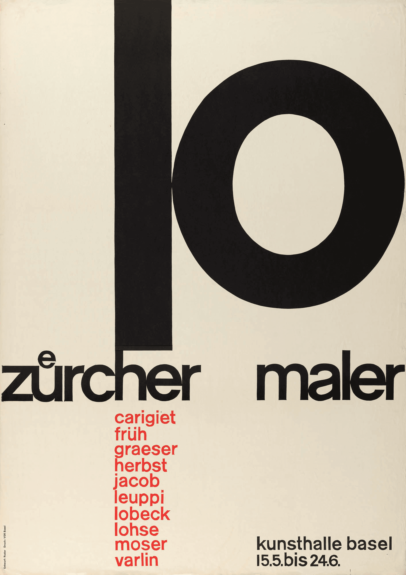
In 1942 he moved to Basel and in 1947 he joined the Allgemeine Gewerbeschule to head the typography department — a role he would hold for twenty-three years until his death. His teaching partner was Armin Hofmann, who joined the graphic-design faculty the same year; together they built what became known internationally as the Basel School of Design.

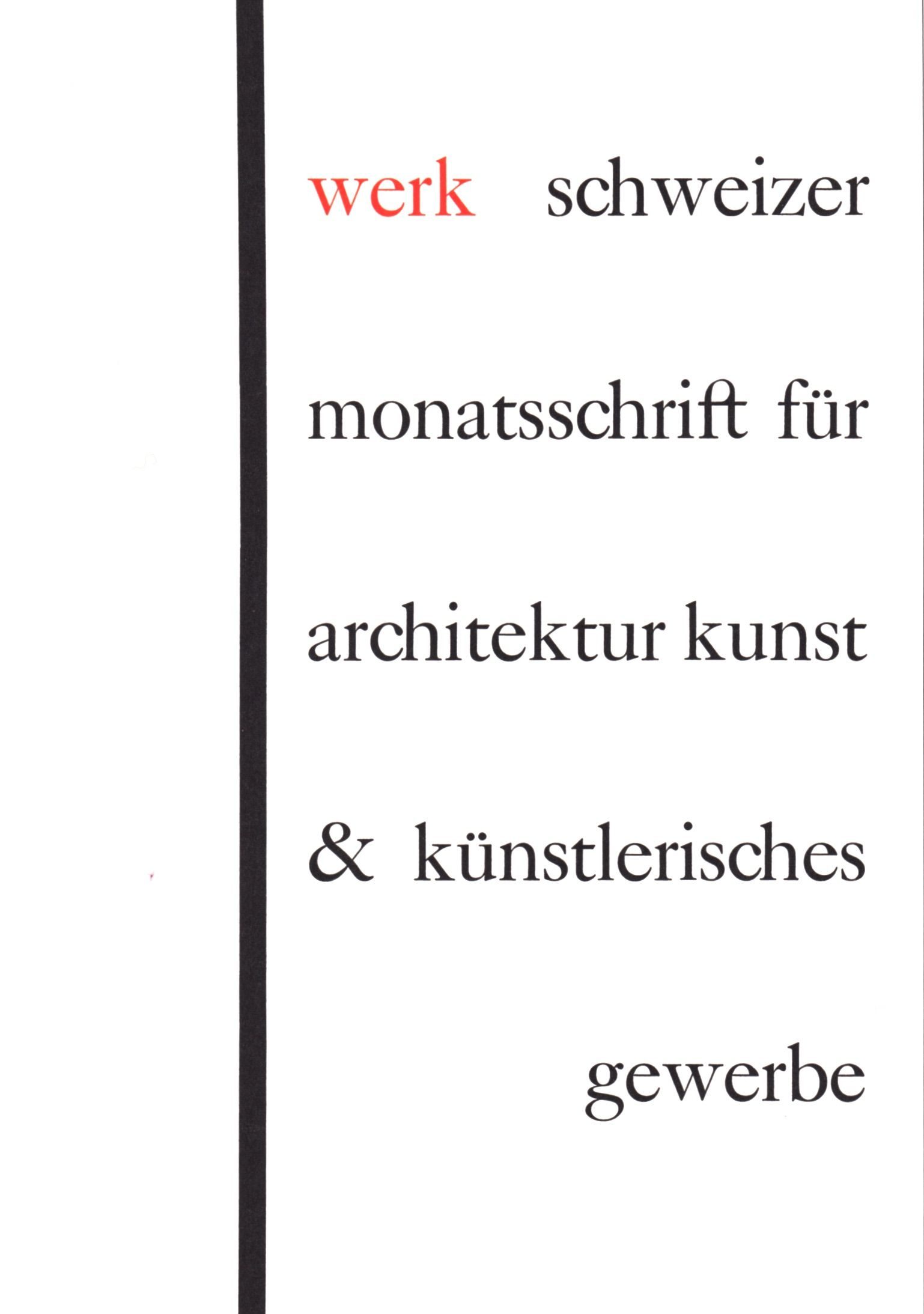
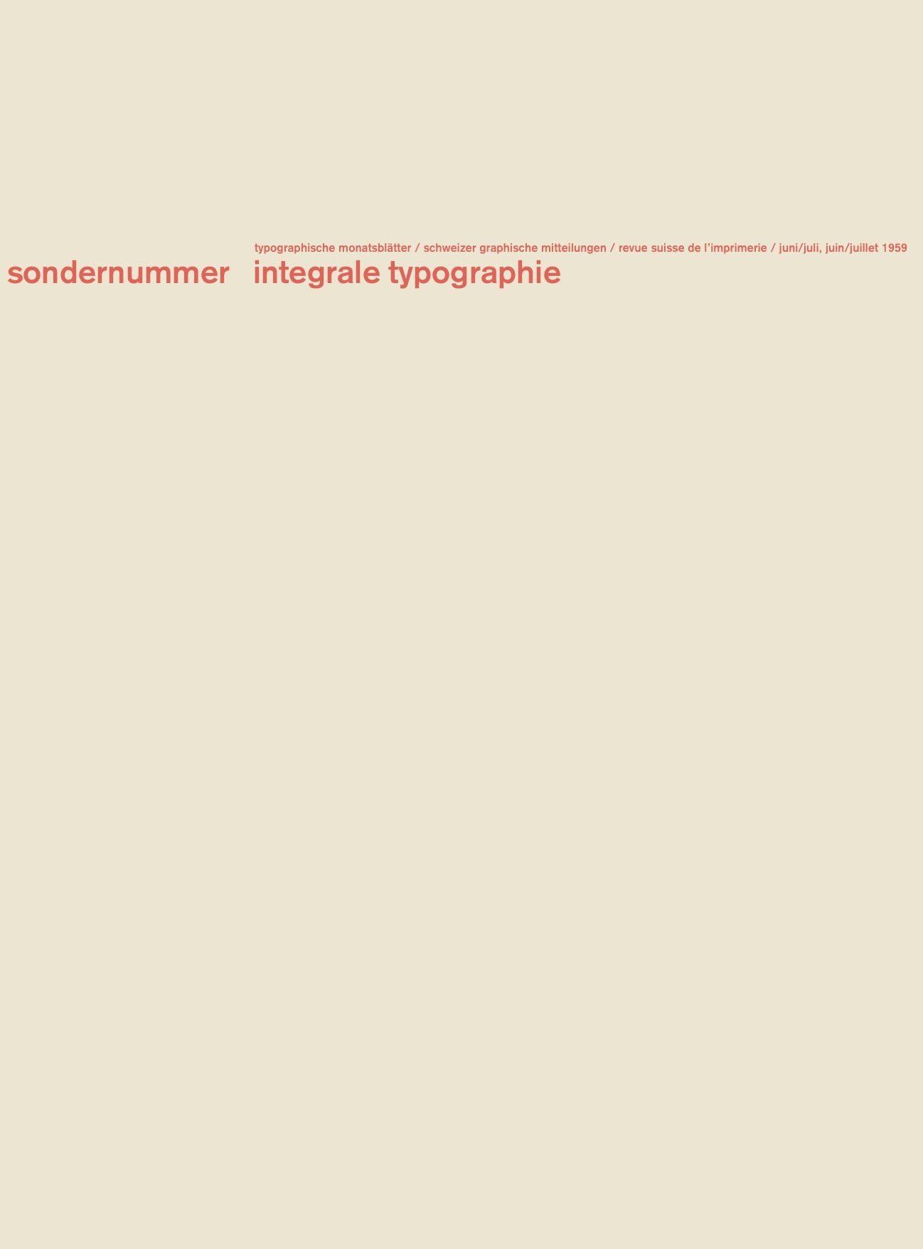
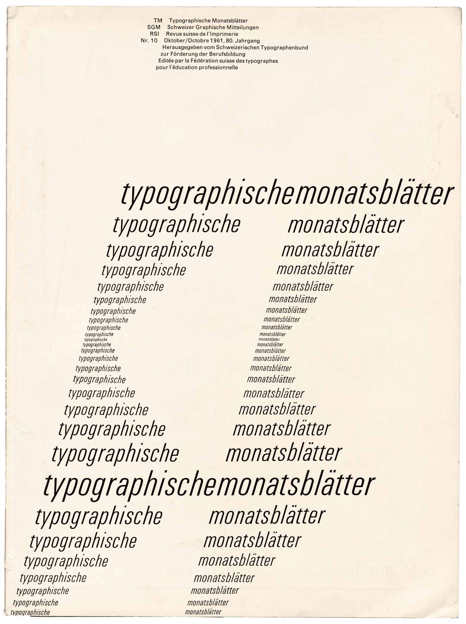
When Adrian Frutiger released Univers in 1957, Ruder immediately incorporated it into the Basel curriculum — the first school to teach type as a numerical weight-and-width matrix rather than a list of named fonts. Throughout the 1960s he edited issues of Typografische Monatsblätter ™, the Swiss typography journal, using it as a publishing platform for his essays on legibility, rhythm and systematic typographic structure.

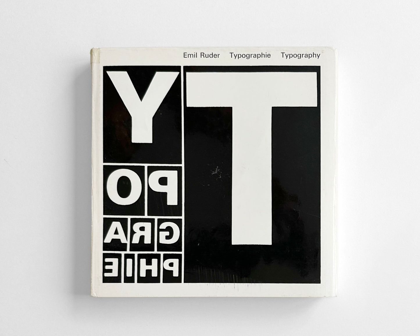
He completed Typographie: A Manual of Design in 1967, three years before his death. He died in Basel in 1970, aged fifty-five.

02

Design philosophy

Ruder’s position was that typography is functional before it is expressive — the typographer’s first duty is to the reader, not to the designer’s creative signature.

“Typography has one plain duty before it and that is to convey information in writing. No argument or consideration can absolve typography from this duty. A printed work which cannot be read becomes a product without purpose.” — Emil Ruder, Typography: A Manual of Design (1967)

From that premise he derived a systematic curriculum. The exercises in Typographie move through proportion, rhythm, contrast, structure and integration — each element taught in isolation before being combined. The method assumes typography is a craft with its own grammar, and that the grammar can be taught explicitly.

His second premise was that constraint generates form. The Basel curriculum worked primarily in a limited palette — one or two typefaces, restricted colour, fixed formats — because those constraints forced the student to find compositional interest in type size, weight, spacing, alignment and hierarchy rather than decorative addition.

His third, often-quoted premise was that the function of beauty is clarity. A well-set page is beautiful because it is legible; legibility is the aesthetic argument.

03

Key works

Basel typography curriculum (1947–1970) — Ruder’s primary output was pedagogical rather than client-facing. The Basel department he ran produced generations of Swiss and international typographers whose work carried his method into studios across Europe and North America.

Typographie: A Manual of Design (1967) — bilingual textbook, published by Niggli. Structured as a sequence of exercises: unit, line, word, rhythm, proportion, point, plane, contrast, form, function. The textbook most widely assigned in typography courses alongside Müller-Brockmann’s grid book.

Typografische Monatsblätter editorial direction (1958–1970) — Ruder’s essays in TM were the running theoretical commentary behind the Basel teaching. Many were later anthologised in the textbook.

Univers teaching adoption (1957) — Ruder was the first major typography programme to treat Frutiger’s 21-weight Univers as the core teaching typeface, organising student exercises around its numerical matrix rather than named fonts.

Iconic works

Werk magazine cover designed by Emil Ruder, 1948

Werk magazine cover

1948

Cover design for Werk, the Swiss architecture and art journal, completed in 1948. One of Ruder's earliest documented cover commissions. The composition uses a spare typographic layout that demonstrates the grid-and-whitespace discipline he was simultaneously developing in the Basel classroom — the cover functions as a working proof of the method, not a decorative exercise. Documented in Ruder Typography — Ruder Philosophy (Lars Müller Publishers).
Cover for Werk magazine (1948). Typographic layout, Emil Ruder. · Emil Ruder, 1948. Public domain. Wikimedia Commons via Lars Müller Publishers scan. · Public domain
Kunsthalle Basel exhibition poster for Bodmer and Hartung, designed by Emil Ruder, 1952

Kunsthalle Basel — Bodmer / Hartung exhibition poster

1952

Exhibition poster for a two-artist show at Kunsthalle Basel featuring Walter Bodmer and Hans Hartung (February–March 1952). Set in a grid of rules and sans-serif type with minimal colour — a direct application of the systematic approach Ruder was then codifying in the Basel curriculum. The poster was reproduced in the November 1955 special issue of Werk on Swiss graphic design, edited by Karl Gerstner, which established the international audience for Basel-school typography.
Kunsthalle Basel — Bodmer / Hartung exhibition poster (1952). Emil Ruder. · Emil Ruder, 1952. Public domain. Wikimedia Commons. · Public domain
Emil Ruder Basel School typography curriculum — 10 Zürcher Maler poster for Kunsthalle Basel 1957

Basel School typography curriculum

1947/1970

Twenty-three years of teaching at the Allgemeine Gewerbeschule Basel. Ruder organised the curriculum around constraint: one or two typefaces, restricted colour, fixed formats. Exercises moved through legibility, rhythm, proportion and grid before combining them. Specimen sheets and student exercises from the programme are held in the archive of the Schule für Gestaltung Basel (the Allgemeine Gewerbeschule's successor) and examples are in the MoMA collection. The programme trained Wolfgang Weingart, Steff Geissbühler and generations of Swiss typographic specialists whose work carried the method into studios across Europe and North America.
10 Zürcher Maler, Kunsthalle Basel (1957) — a poster from Ruder's Basel teaching period. · Emil Ruder, 1957. Museum für Gestaltung Zürich Plakatsammlung. Via Typeroom. · AU statutory
Die gute Form Schweizerischer Werkbund identification seal designed by Emil Ruder, 1956

Die gute Form — Schweizerischer Werkbund identity

1956

Identification seal designed for the Swiss Werkbund (Schweizerischer Werkbund) annual award programme, Die gute Form (The Good Form). The award singled out objects of considered functional design shown at the Basel Mustermesse (trade fair). Ruder's mark — typographic, geometric, without ornament — was itself an argument for the values the award was meant to recognise. The identity ran through the late 1950s and into the 1960s, appearing on product labels, exhibition material and print advertising across Switzerland.
Die gute Form — Schweizerischer Werkbund identity mark (1956). Emil Ruder. · Emil Ruder, 1956. Public domain. Wikimedia Commons. · Public domain
Typografische Monatsblätter June July 1959 cover designed by Emil Ruder

Typografische Monatsblätter — June / July 1959 cover

1959

Cover for issue 6/7, 1959 of Typografische Monatsblätter (TM), the Swiss typography journal Ruder both contributed to and guest-edited across the 1950s and 1960s. The cover is set in Akzidenz-Grotesk — the journal's house face before Ruder's championing of Univers — and demonstrates the spare, rule-and-type grid language that distinguished TM covers from commercial periodical design of the period. Scanned from Ruder Typography — Ruder Philosophy (Lars Müller Publishers).
Typografische Monatsblätter, issue 6/7 (June/July 1959). Cover design, Emil Ruder. · Emil Ruder, 1959. Public domain. Wikimedia Commons via Lars Müller Publishers scan. · Public domain
Typografische Monatsblätter October 1961 issue 10, Emil Ruder editorial direction

Typografische Monatsblätter (editorial direction)

1958/1970

TM was founded in 1933 and published from Basel — the longest-running specialist typography periodical in the German-speaking world. Ruder contributed essays from the mid-1950s and guest-edited issues from 1958 until his death. His pieces on legibility, rhythm, proportion and grid were the running theoretical commentary behind the Basel teaching; many were later incorporated into Typographie (1967). His editorial work made TM one of the main channels through which Basel typographic thinking reached studios across Europe and North America in the 1960s.
Typografische Monatsblätter, issue 10 (October 1961). Emil Ruder, editorial direction. · Emil Ruder, 1961. From Letterform Archive collection via Fonts In Use. · AU statutory
Typographie Typography A Manual of Design by Emil Ruder, Niggli 1967

Typographie / Typography — A Manual of Design

1967

Bilingual textbook published by Arthur Niggli AG, Teufen, Switzerland, German and English text set on facing pages. The book sequences exercises across nine structural concepts — unit, line, word, rhythm, proportion, point, plane, contrast, form, function — and incorporates student specimen work from the Basel programme. It is the most technically specific of the three canonical Swiss-school texts alongside Hofmann's Graphic Design Manual (1965) and Müller-Brockmann's Grid Systems (1981): where those two address form and layout structure broadly, Ruder's book addresses typography as a craft with its own systematic demands. The book remains in print.
Typographie / Typography — A Manual of Design (Niggli, 1967). Emil Ruder. · Arthur Niggli AG, Teufen, 1967. Publisher image via This Is Display bookshop. · Museum editorial

04

Influence & legacy

Ruder’s influence runs primarily through his students and his textbook. Wolfgang Weingart — the designer who broke Swiss typography open in the 1970s — was Ruder’s student and successor at Basel; so were Steff Geissbühler, Peter Teubner and generations of Swiss typographic specialists. Through the Basel summer programme and its Yale extension, American designers including April Greiman and Dan Friedman absorbed the method directly.

The three-volume Swiss-school canon — Müller-Brockmann’s Grid Systems (1981), Hofmann’s Graphic Design Manual (1965) and Ruder’s Typographie (1967) — is still the foundational reading list for any serious typography curriculum. Ruder’s volume is the most technical of the three: where Hofmann wrote about form in general and Müller-Brockmann about layout structure, Ruder wrote specifically about typography as a craft with its own systematic demands.

MoMA holds examples of his teaching-programme specimens. The Schule für Gestaltung Basel (the Allgemeine Gewerbeschule’s successor institution) maintains his archive.

Learn at TGDS

Ruder’s systematic approach to typography — function before expression, constraint generating form — underlies how we teach type at TGDS:

Courses

Further reading

Books

  • Emil Ruder, Typographie: A Manual of Design / Typographie: Ein Gestaltungslehrbuch (Niggli, 1967).
  • Helmut Schmid (ed.), Emil Ruder: Typography — The Manual (Niggli, 1981; reissue).
  • Robin Kinross, Modern Typography (Hyphen Press, 1992 / 2nd ed. 2004) — Basel School coverage.
  • Kerry William Purcell, Swiss Graphic Design: The Origins and Growth of an International Style, 1920–1965 (Yale University Press, 2006).

Get Started.

You can enrol any day of the year. We are online and study is self-paced, there is no pressure. Enrol when you are ready to start, from anywhere in the world. If you would like to chat or email, feel free to get in touch.

Brochures, Phone Calls & Questions

You can download a free brochure, book a phone call with one of our course advisors, or simply ask a question.

Other ways to get in touch

Australia 1300 655 485

International +61 1300 655 485

Ask Anything info@thegraphicdesignschool.com

Get a quote accounts@thegraphicdesignschool.com

Acknowledgement of Country
The Graphic Design School acknowledges the Traditional Custodians of Country throughout Australia and their continued spiritual connection to land.
We pay respect to Elders past, present and emerging.
Always was, always will be.
RTO Provider № 91706