Design history · 1950s–1990s

Adrian Frutiger

The Swiss type designer who drew the alphabets we read every day.

Adrian Frutiger (1928–2015) designed the letterforms that structure much of European public life — Univers, Frutiger, Avenir, OCR-B. Charles de Gaulle airport, NHS signage, Swiss federal roads, Apple's San Francisco: his work and its descendants are the underlying infrastructure of postwar typography.
Adrian Frutiger at the Linotype showroom in Amsterdam, 1990
Adrian Frutiger at the Tetterode Linotype showroom, Amsterdam, 1990. · Henk Gianotten, 1990. Wikimedia Commons, public domain.

Key facts

Born
24 May 1928, Unterseen, Switzerland
Died
10 September 2015, Bremgarten bei Bern, Switzerland
Nationality
Swiss
Era
Swiss Style · Type design · Wayfinding
Studios
Deberny & Peignot, Paris (1952–1967) · Atelier Frutiger + Partner, Bern (1962–2008)
Known for
Univers (1957) · Frutiger (1976) · OCR-B (1968) · Avenir (1988)

01

Biography

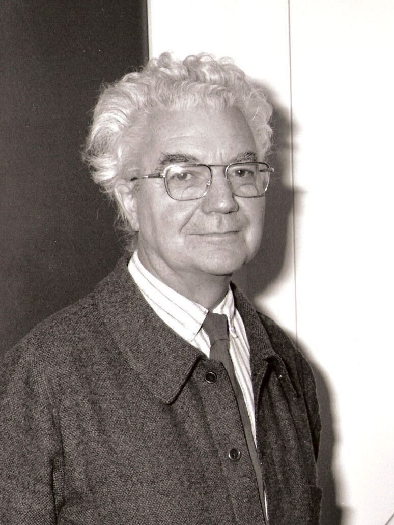
Adrian Frutiger was born in Unterseen, near Interlaken, in 1928. He apprenticed as a compositor in Interlaken from 1944 and studied at the Kunstgewerbeschule Zürich from 1949 to 1951. His diploma project — an essay on the evolution of Western letterforms — already contained the question he would spend the next sixty years answering: what makes a Roman capital read as a Roman capital?

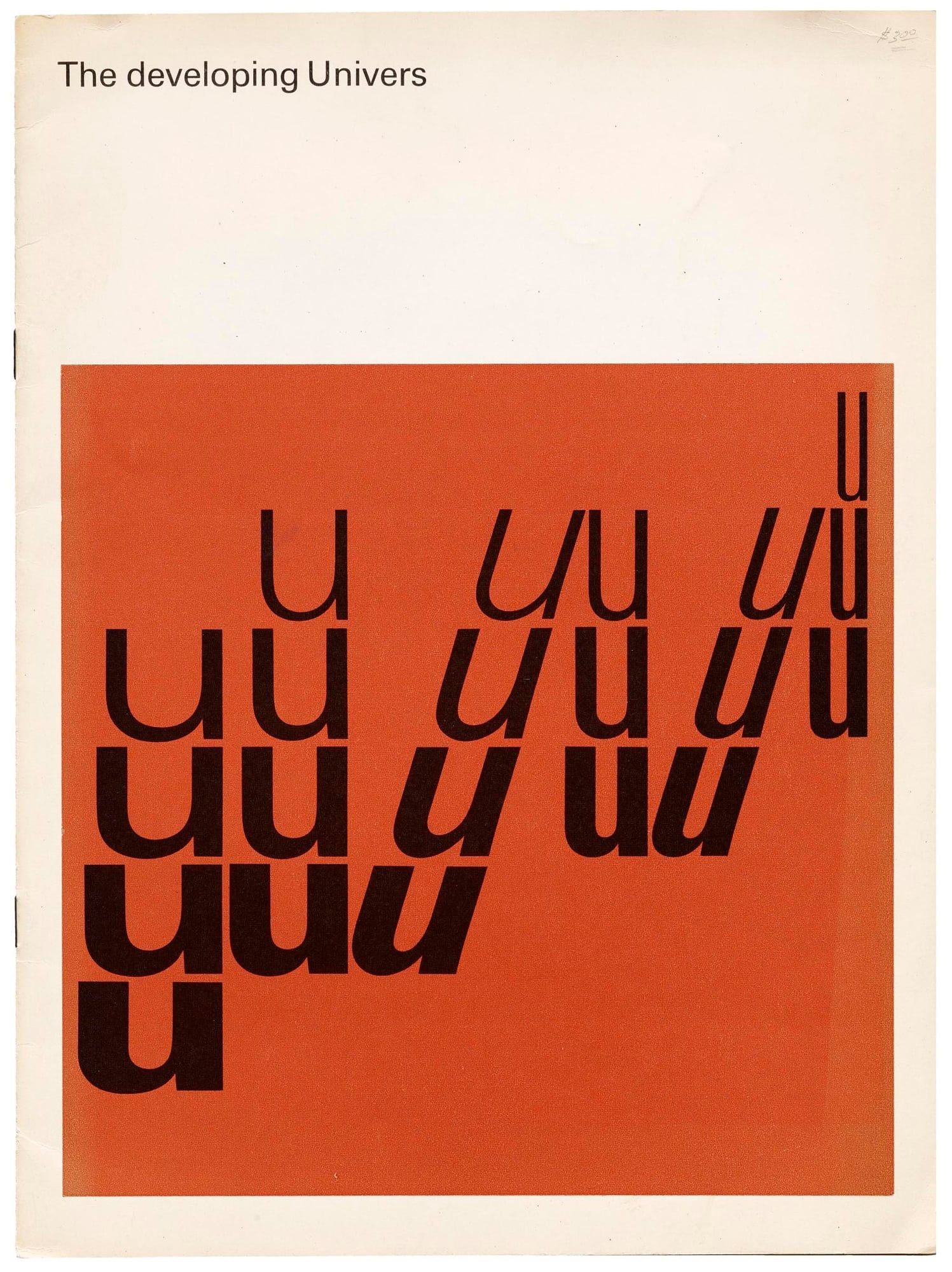
In 1952 Charles Peignot brought him to Deberny & Peignot in Paris. Over fifteen years there he designed President, Méridien, Ondine, Phoebus — and, in 1957, Univers, the typeface that reorganised the type-design field around a numerical matrix. When Deberny & Peignot was absorbed by Haas in 1967, Frutiger continued as an independent designer, keeping a long consulting relationship with Linotype.

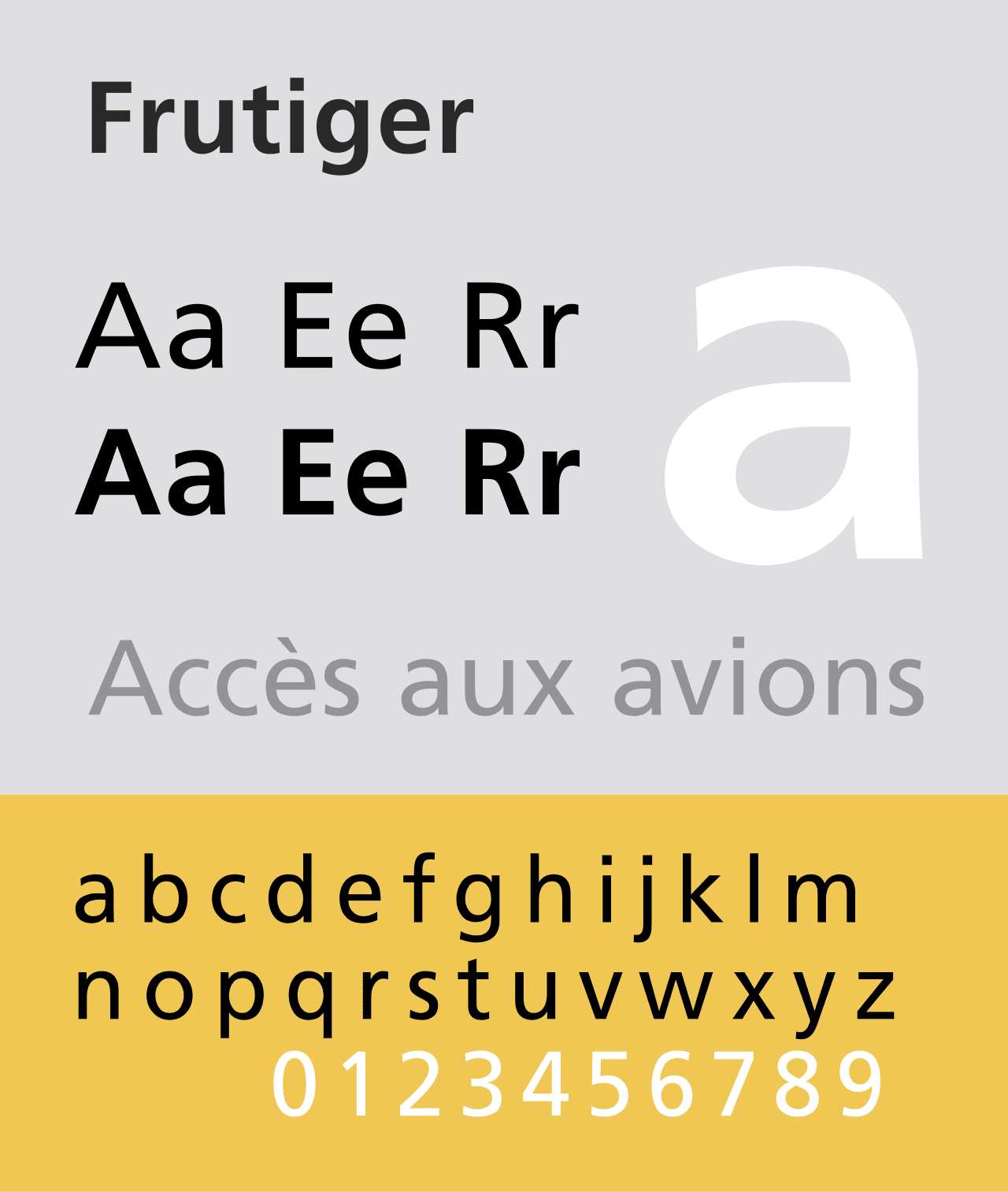
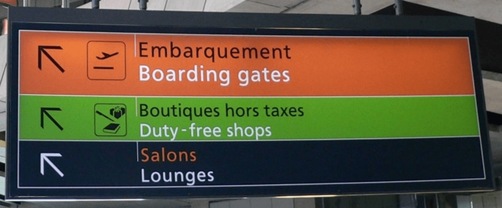
The commission for the Charles de Gaulle airport signage system in the early 1970s produced the typeface Linotype released commercially in 1976 as Frutiger. That typeface became the template for humanist wayfinding sans-serifs for the next fifty years — Swiss federal signage, British NHS signage, Oslo airport, dozens of transport systems worldwide.

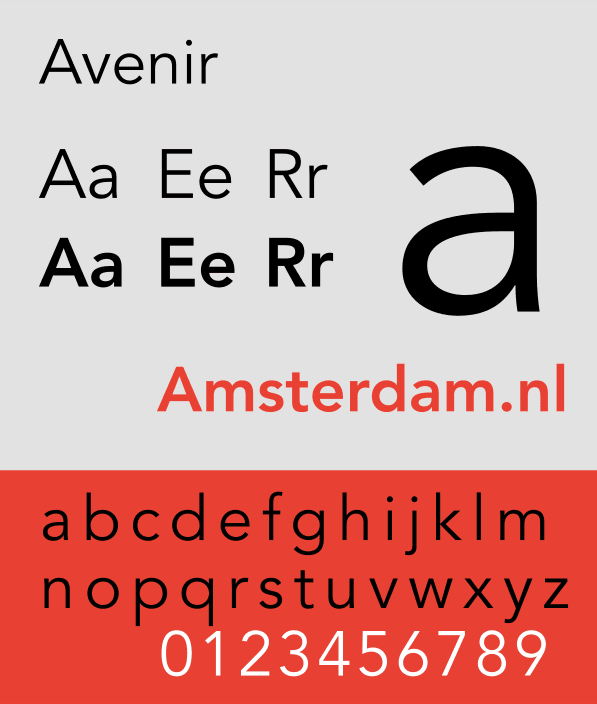
He continued designing type and writing about letterform theory into his eighties, including Avenir (1988), Vectora (1990) and the revised Frutiger Serif (2008). He died in Bremgarten in 2015, aged 87.

02

Design philosophy

Frutiger’s central position was that legibility is the criterion — not novelty, not expression, not personal style. Type exists to be read, and the designer’s job is to disappear behind the reader’s comprehension.

“The whole essence of my work could be described as the shaping of the counter-space, the shaping of the white. In the end it is always the space that we see — not the letterform.” — Adrian Frutiger

He was uninterested in the designer-as-auteur posture. His typefaces are named functionally (Univers, Frutiger, Avenir), his writings technical rather than polemical, and his interview persona was that of a craftsman describing a workbench. The cumulative effect was disproportionate influence delivered without fanfare.

His second premise was that a typeface is a system, not a drawing. Univers’s 21-member grid — weights on one axis, widths on the other — treated type families as coordinate spaces. Every subsequent grotesque superfamily (Neue Haas, DIN 2014, San Francisco, Inter) inherits Univers’s organising logic.

03

Key works

Univers (1957) — 21 weights across a numerical grid, released by Deberny & Peignot. The marketing argument was that the matrix was the typeface — a coordinate system rather than a list of variants. Extended by Linotype Univers (1997) to 59 weights.

OCR-B (1968) — optical-character-recognition typeface commissioned by the European Computer Manufacturers Association, adopted as ISO 1073-2 in 1976. Still the typeface on the bottom of your passport.

Frutiger typeface (1976) — humanist sans-serif originally designed for Charles de Gaulle airport signage. By the 2000s one of the most widely licensed signage typefaces in the world.

Avenir (1988) — geometric sans-serif; Frutiger’s humanist reworking of Paul Renner’s Futura. Revised with Akira Kobayashi as Avenir Next (2004).

Charles de Gaulle airport wayfinding (1974) — complete signage system for Roissy terminal 1. The project that produced the Frutiger typeface and became a template for public-space wayfinding.

Vectora (1990) — text-grade sans-serif bridging humanist warmth and grotesque neutrality; released by Linotype. Less visible than his headline faces but widely used in European corporate typography.

Méridien (1957) — classical text serif, revised as Méridien Next (2013). Less famous than his sans-serifs but used in French book publishing for decades.

Iconic works

Univers 55 type specimen card, 1957

Univers

1957

Twenty-one-member sans-serif family released by Deberny & Peignot. Frutiger used a numerical grid — 55 Roman, 65 Bold, 75 Black on one axis; 45–57 condensed-to-extended on the other — so any weight could be specified by number rather than name. It was the first typeface marketed as a system rather than a list.
Univers 55 type specimen (1957). James Puckett / Wikimedia Commons, CC BY 2.0. · James Puckett, Boulder USA. Wikimedia Commons. · CC BY
OCR-B typeface specimen showing optical character recognition letterforms

OCR-B

1968

Optical-character-recognition typeface commissioned by the European Computer Manufacturers Association. Adopted as ISO 1073-2 in 1976 and still the standard letterform on passports, cheques and identity documents worldwide. The design had to satisfy both machine readers and human readers — the two requirements pulled in opposite directions.
OCR-B (1968). Wikimedia Commons, CC BY-SA. · Vector typeface specimen from Wikimedia Commons. · CC BY-SA
Frutiger typeface specimen showing the humanist sans-serif

Frutiger typeface

1976

Humanist sans-serif designed for the wayfinding system at Charles de Gaulle airport. Linotype released it commercially in 1976 under the designer's name. It became the basis for NHS signage in Britain, Swiss federal road signs, Oslo airport, and dozens of other transport wayfinding systems — all drawn to the same humanist logic of open apertures and even stroke weight.
Frutiger typeface specimen (1976). Wikimedia Commons, public domain. · Wikimedia Commons, public domain. · Public domain
Avenir typeface specimen showing the geometric sans-serif

Avenir

1988

Geometric sans-serif released by Linotype. Frutiger took Futura's geometric skeleton and softened it — raising the crossbar on the e, opening the apertures, varying the stroke weight slightly. He had been planning something in this space since the 1950s; Avenir was the thirty-year answer. Revised with Akira Kobayashi as Avenir Next in 2004.
Avenir typeface specimen (1988). Wikimedia Commons, public domain. · Fynn5808, Wikimedia Commons. · Public domain
Frutiger typeface in use on Charles de Gaulle airport signage, terminal 1

Charles de Gaulle airport signage

1974

Complete wayfinding system for Aéroport de Paris-Charles-de-Gaulle, terminal 1, which opened in 1974. The typeface was originally called Roissy; Linotype released it commercially as Frutiger in 1976. The project is the clearest case study in the genre: a typeface designed for a specific spatial context that turned out to work well enough to become a standard.
Frutiger typeface in use at Charles de Gaulle airport (1974). Parisian Fields / editorial. · Photograph of Frutiger typeface in use at Charles de Gaulle Airport. Parisian Fields memorial article, 2015. · AU statutory
Type Sign Symbol by Adrian Frutiger, 1980 first edition, ABC Verlag

Type Sign Symbol

1980

Essay collection on letterform, signage and symbol design, published by ABC Verlag, Zürich. The book is where Frutiger set out his theory of the sign most systematically — moving from the Roman capital through wayfinding symbols to abstract marks. Widely used as a teaching text in German- and French-speaking Europe.
Type Sign Symbol (1980, ABC Verlag). First edition. The Print Arkive. · Product photography of the 1980 first edition (ABC Verlag). The Print Arkive, UK. · AU statutory

04

Influence and legacy

Frutiger’s influence runs through two channels: the typefaces themselves and the grid system behind them. Open any contemporary type specimen and the weight-and-width matrix is there, usually without a credit. Every sans-serif superfamily designed since 1960 — Neue Helvetica, DIN 2014, San Francisco, Inter, Neue Montreal — inherits Univers’s organising logic.

The Frutiger typeface is close to ubiquitous in European public signage. The NHS, Swiss federal government, Royal Mail, Oslo airport and many others use either Frutiger directly or signage typefaces drawn in conscious descent from it — Wayfinding Sans, Transport, FF Info. Most people who read these signs have no idea who designed them, which is how Frutiger wanted it.

His writings — Type Sign Symbol (1980) and Signs and Symbols (1978) — shaped generations of typography teaching in German- and French-speaking Europe. Robin Kinross’s Modern Typography (1992) treats Frutiger as one of the two pivotal figures of postwar type design, alongside Hermann Zapf.

Learn at TGDS

Frutiger’s work underlies how we teach typography and wayfinding. The most direct next steps are:

Courses

Further reading

Books

  • Adrian Frutiger, Type Sign Symbol (ABC Verlag, 1980).
  • Adrian Frutiger, Der Mensch und seine Zeichen / Signs and Symbols (Studio Editions, 1989; originally three volumes, 1978–1981).
  • Heidrun Osterer & Philipp Stamm, Adrian Frutiger — Typefaces: The Complete Works (Birkhäuser, 2008).
  • Robin Kinross, Modern Typography (Hyphen Press, 1992 / 2nd ed. 2004).

Get Started.

You can enrol any day of the year. We are online and study is self-paced, there is no pressure. Enrol when you are ready to start, from anywhere in the world. If you would like to chat or email, feel free to get in touch.

Brochures, Phone Calls & Questions

You can download a free brochure, book a phone call with one of our course advisors, or simply ask a question.

Other ways to get in touch

Australia 1300 655 485

International +61 1300 655 485

Ask Anything info@thegraphicdesignschool.com

Get a quote accounts@thegraphicdesignschool.com

Acknowledgement of Country
The Graphic Design School acknowledges the Traditional Custodians of Country throughout Australia and their continued spiritual connection to land.
We pay respect to Elders past, present and emerging.
Always was, always will be.
RTO Provider № 91706