Design history · 1950s–1980s

Josef Müller-Brockmann

The Swiss designer who made the grid a thinking tool, not a set of rules.

Josef Müller-Brockmann (1914–1996) systematised the International Typographic Style through two decades of Tonhalle Zürich concert posters and his 1981 textbook Grid Systems in Graphic Design — still in print, still the most widely assigned grid-systems text in design education.
Josef Müller-Brockmann, Swiss graphic designer, 1914–1996
Josef Müller-Brockmann, 1987. Rochester Institute of Technology. · Rochester Institute of Technology, RIT News and Events, Vol. 19 No. 5, November 1987. Public domain via Wikimedia Commons.

Key facts

Born
9 May 1914, Rapperswil, Switzerland
Died
30 August 1996, Unterengstringen, Switzerland
Nationality
Swiss
Era
Swiss Style · International Typographic Style · Objective design
Studios
Müller-Brockmann & Co., Zürich (founded 1951) · IBM Europe (design consultant, 1966–1988)
Known for
Tonhalle Zürich concert posters (1951–1972) · Grid Systems in Graphic Design (1981) · Neue Grafik journal (co-founder, 1958)

01

Biography

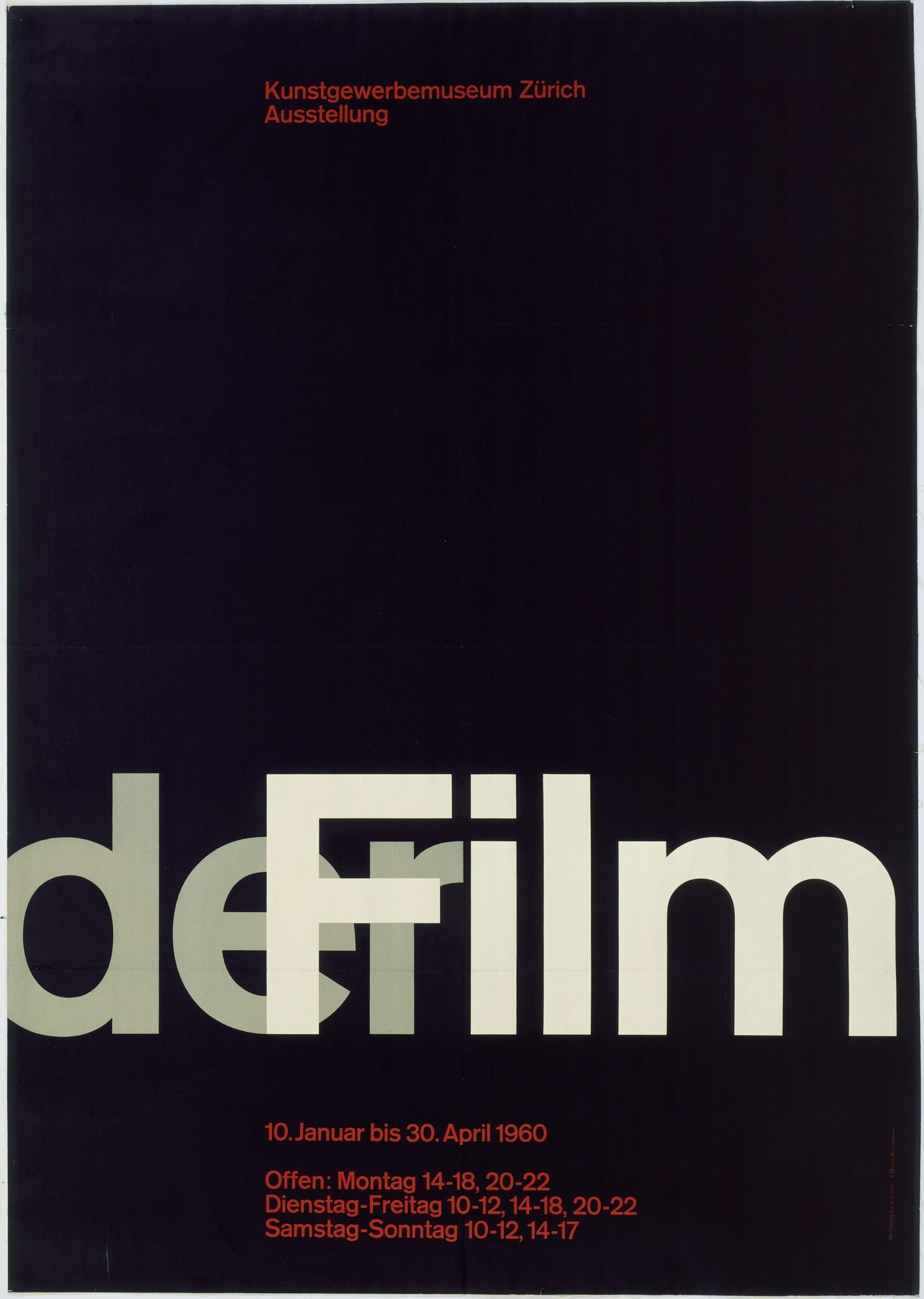
Josef Müller-Brockmann was born in Rapperswil on Lake Zürich in 1914. He trained as a design and typography apprentice before studying at the Kunstgewerbeschule and University of Zürich. His early practice covered illustration, exhibition design and stage set work — a period he later described as pre-systematic, personal rather than objective.

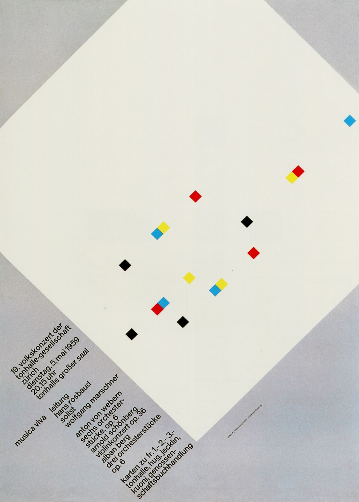
The break came in stages. In 1951 he took the commission to design posters for the Tonhalle-Gesellschaft Zürich. Working with Akzidenz-Grotesk and a strict column grid, he developed a visual language that reduced musical performance to geometry: concentric arcs for Beethoven, overlapping circles for Musica Viva. The series ran until 1972 and produced more than seventy posters. His wife Verena, a violinist, died in a car accident in 1958; in the years that followed, Müller-Brockmann moved further from illustration and further into what he called objective design.

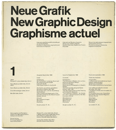
From 1957 he taught at the Kunstgewerbeschule Zürich. In 1958 he co-founded the journal Neue Grafik / New Graphic Design with Richard Paul Lohse, Hans Neuburg and Carlo Vivarelli — a trilingual quarterly that became the vehicle for exporting Swiss design thinking internationally. From 1966 until 1988 he worked as design consultant to IBM Europe, applying systematic identity logic across European applications.

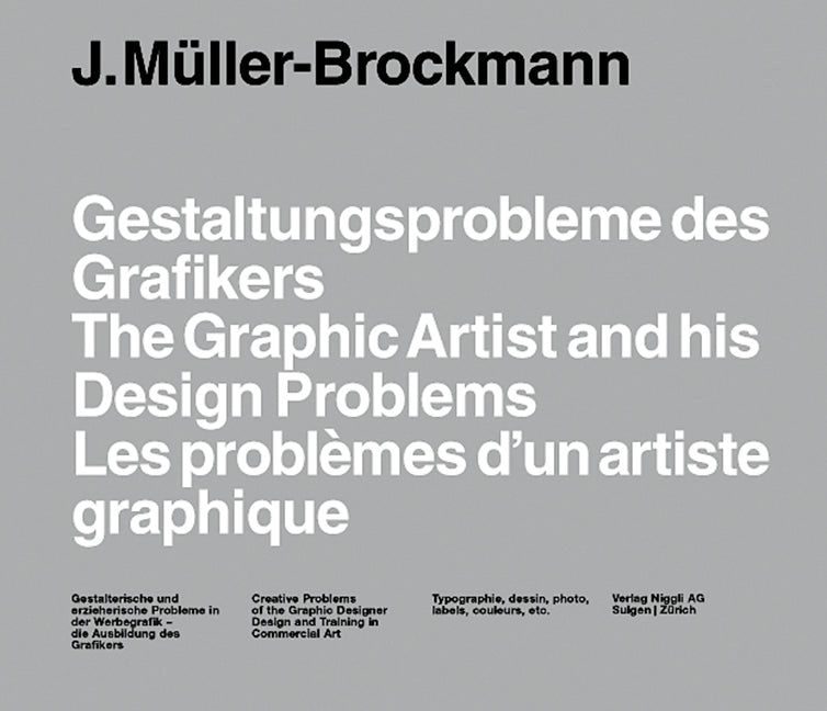
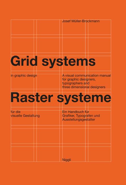
His 1981 book Grid Systems in Graphic Design arrived late in his career but became his most widely read work. He died in Unterengstringen in 1996.

02

Design philosophy

Müller-Brockmann held that graphic design is a discipline of objective visual communication — and that objectivity is achieved through systematic construction, not personal expression.

“The grid system is an aid, not a guarantee. It permits a number of possible uses and each designer can look for a solution appropriate to his personal style. But one must learn how to use the grid; it is an art that requires practice.” — Josef Müller-Brockmann, Grid Systems in Graphic Design (1981)

He treated the grid as a thinking tool. The proportions of a column, the baseline rhythm, the relationship between type size and measure — all of this exists to serve legibility. When the grid is working, the designer’s hand disappears and the content comes forward.

His second premise: form is constructed, not decorated. The Tonhalle concert posters use no ornament, almost no colour beyond their systematic palette, and a single typeface family (Akzidenz-Grotesk through the 1950s, Helvetica later). What structures the composition is geometry — circles, arcs, nested rectangles — arranged to make visual rhythm legible.

03

Key works

Tonhalle Zürich concert posters (1951–1972) — more than seventy posters produced for the Tonhalle-Gesellschaft Zürich. The 1955 Beethoven poster (concentric arcs on black) and the 1959 Musica Viva poster (overlapping circles in red, black, and white) are the two most studied. Both work through the same logic: geometry as a carrier of rhythm, type as a separate, disciplined element.

“Schützt das Kind!” (1953) — Swiss Automobile Club road-safety poster. A black-and-white photomontage of a child crossing in front of a motorcycle, with minimal type. The series also included “Weniger Lärm” (Less Noise, 1960). Standard references in Swiss-school curricula for the use of photomontage in public-information design.

Der Film (1960) — exhibition poster in which the letterforms themselves become the composition. DER at the top, FILM scaled across the lower third, black ground throughout. Type as form, not just carrier of meaning.

Neue Grafik journal (1958–1965) — co-founded with Lohse, Neuburg and Vivarelli. Eighteen trilingual issues. The journal’s own layout — modular grid, Akzidenz-Grotesk throughout — was the demonstration object.

Grid Systems in Graphic Design (1981) — bilingual textbook that took the Swiss-school method out of the classroom and into subsequent generations of design practice. Niggli keeps it in continuous print.

IBM Europe (1966–1988) — exhibition graphics, brochures, trade-fair stands. Less discussed than Rand’s American IBM work but drawing on the same systematic identity logic applied across European markets.

Iconic works

Beethoven concert poster for Tonhalle Zürich, Josef Müller-Brockmann, 1955

Tonhalle Zürich concert poster series

1951/1972

More than seventy posters for the Tonhalle-Gesellschaft Zürich, produced between 1951 and 1972. Müller-Brockmann stripped the concert poster to its structural logic: concentric arcs stood in for musical tone, a strict column grid organised the type, and Akzidenz-Grotesk carried both title and programme text. The 1955 Beethoven poster — this image — pares the composition to radiating circles on black with a single weight of white sans-serif. No illustration, no ornament. Originals are held at the Museum für Gestaltung Zürich and in the MoMA collection, New York.
Beethoven concert poster, Tonhalle-Gesellschaft Zürich, 1955. · Josef Müller-Brockmann, 1955. CC BY-SA 4.0 via Wikimedia Commons. · CC BY-SA
Musica Viva concert poster, Josef Müller-Brockmann, 1959

Musica Viva concert poster

1959

A lithograph poster for the Tonhalle Musica Viva contemporary-music series, 1959. The composition works through overlapping concentric arcs — not a depiction of sound but a structural translation of it. Circles in red, black, and white expand across the field and pull the eye to the type block at the lower right. The image sits alongside the Beethoven poster as the most-studied example of Müller-Brockmann's method: geometry as the carrier of expressive weight, typography held apart and disciplined.
Musica Viva concert poster, 1959. · Josef Müller-Brockmann, 1959. Public domain via Wikimedia Commons. · Public domain
Der Film poster, Josef Müller-Brockmann, 1960

Der Film

1960

Offset lithograph poster for the exhibition Der Film (The Film), 1960. Where the Tonhalle posters used geometry to evoke sound, here Müller-Brockmann worked with letterforms as a compositional field — stacking and scaling type to create a visual explosion across the black ground. DER anchors the top; FILM lands at scale across the lower third. No illustration. This remains one of the sharpest examples in his work of type used not to carry text but to organise visual force.
Der Film poster, 1960. · Josef Müller-Brockmann, 1960. Public domain via Wikimedia Commons. · Public domain
Swiss Automobile Club traffic-safety posters, 1953/1960

Swiss Automobile Club traffic-safety posters

1953/1960

"Schützt das Kind!" (Protect the Child!, 1952/53) used photography by Ernst A. Heiniger alongside spare typography to deliver a road-safety message without sentimentality. The series, commissioned by the Swiss Automobile Club between 1953 and 1960, also included "Weniger Lärm" (Less Noise, 1960). The posters are a standard reference in Swiss-school curricula for the use of photomontage in public information design.
Swiss Automobile Club traffic-safety posters (1953/1960). · Full-resolution direct link from Fonts in Use case study; typographic context + 5-poster Swiss Automobile Club series (1953–1958) included on same page. · Museum editorial
Gestaltungsprobleme des Grafikers / The Graphic Artist and His Design Problems, 1961

Gestaltungsprobleme des Grafikers / The Graphic Artist and His Design Problems

1961

Published by Verlag Arthur Niggli, Teufen, in 1961, in a German/English bilingual edition under the English title The Graphic Artist and His Design Problems. The book laid out the theoretical case for objective, systematic graphic design, covering typography, layout, poster design and exhibition graphics. It preceded Grid Systems in Graphic Design (1981) as the first full written statement of Müller-Brockmann's method.
Gestaltungsprobleme des Grafikers / The Graphic Artist and His Design Problems (1961). · Josef Müller-Brockmann, Verlag Arthur Niggli, 1961. Public domain via Wikimedia Commons. · Public domain
Grid Systems in Graphic Design / Raster Systeme für die visuelle Gestaltung, 1981

Grid Systems in Graphic Design / Raster Systeme für die visuelle Gestaltung

1981

Published in 1981 by Verlag Arthur Niggli, Niederteufen, under the parallel German title Rastersysteme für die visuelle Gestaltung (ISBN 978-3-7212-0145-1). The book sets out, in systematic detail, how to construct and apply column grids, modular grids, and baseline grids to print and multi-page publication design. It has remained in continuous print since first publication and is the most widely assigned grid-systems textbook in design education.
Grid Systems in Graphic Design / Raster Systeme für die visuelle Gestaltung (1981). · Josef Müller-Brockmann, Verlag Arthur Niggli. Publisher image, statutory educational licence. · Museum editorial
A History of Visual Communication, 1971

A History of Visual Communication

1971

Published by Verlag Arthur Niggli, Teufen, in 1971, in a trilingual edition (German, French, English). The book surveys the history of written and visual communication from prehistoric mark-making through the development of printing and into twentieth-century graphic design practice. It remains one of the few comprehensive one-volume histories of visual communication written by a practising designer.
A History of Visual Communication (1971). · Josef Müller-Brockmann, Verlag Arthur Niggli, 1971. Publisher product image, statutory educational licence. · Museum editorial
Neue Grafik / New Graphic Design (journal), 1958/1965

Neue Grafik / New Graphic Design (journal)

1958/1965

Published under the trilingual title Neue Grafik / New Graphic Design / Graphisme actuel between 1958 and 1965, with eighteen issues in total. Co-founded by Müller-Brockmann with Richard Paul Lohse, Hans Neuburg, and Carlo Vivarelli, and printed by Verlag Otto Walter. The journal's own layout, a strict modular grid set in Akzidenz-Grotesk, served as a live demonstration of the design principles it published. Lars Müller Publishers issued a facsimile reprint of all eighteen issues in 2014.
Neue Grafik / New Graphic Design (journal) (1958/1965). · Neue Grafik issue no. 16. Carlo Vivarelli, cover design. From Fonts in Use professional design archive. · Museum editorial

04

Influence & legacy

The Swiss-school method that Müller-Brockmann systematised has been in continuous use since the 1950s, absorbed into design education and then into software. It was resisted during the postmodern break of the 1980s — Cranbrook-school designers pushed hard against the grid as imposed authority — and came back with the digital design-systems era of the 2000s. Every modern web layout framework, from early CSS grid approaches through Bootstrap and Tailwind, is downstream of the grid logic Grid Systems in Graphic Design described in print.

The direct line runs through IBM, through the designers who trained at Zürich in the 1960s, and through the Neue Grafik readers who exported the method into British publishing, Japanese post-war identity design, and American corporate communications. Massimo Vignelli, Wim Crouwel and Michael Bierut have all named him as a primary reference.

The Museum für Gestaltung Zürich holds the primary poster archive. MoMA New York holds significant examples. The Phaidon monograph by Kerry William Purcell (2006) remains the most complete English-language survey.

Learn at TGDS

The grid-as-thinking-tool principle runs through how we teach layout at TGDS — systematic construction before decoration, type as structure:

Courses

Further reading

Books

  • Josef Müller-Brockmann, Grid Systems in Graphic Design / Raster Systeme für die visuelle Gestaltung (Niggli, 1981).
  • Josef Müller-Brockmann, The Graphic Artist and His Design Problems (Niggli, 1961).
  • Josef Müller-Brockmann, A History of Visual Communication (Niggli, 1971).
  • Kerry William Purcell, Josef Müller-Brockmann (Phaidon Press, 2006) — the definitive monograph in English.
  • Neue Grafik / New Graphic Design (Verlag Otto Walter, 1958–1965) — all 18 issues; Lars Müller Publishers reissue, 2014.

Get Started.

You can enrol any day of the year. We are online and study is self-paced, there is no pressure. Enrol when you are ready to start, from anywhere in the world. If you would like to chat or email, feel free to get in touch.

Brochures, Phone Calls & Questions

You can download a free brochure, book a phone call with one of our course advisors, or simply ask a question.

Other ways to get in touch

Australia 1300 655 485

International +61 1300 655 485

Ask Anything info@thegraphicdesignschool.com

Get a quote accounts@thegraphicdesignschool.com

Acknowledgement of Country
The Graphic Design School acknowledges the Traditional Custodians of Country throughout Australia and their continued spiritual connection to land.
We pay respect to Elders past, present and emerging.
Always was, always will be.
RTO Provider № 91706