
The Best of European Typography... Ooh la la!
Originally published 2009. Updated March 2026.
European typography has always punched well above its weight. While American design culture dominated the post-war decades, it was Swiss, Dutch, French, and German designers who were quietly building the typographic foundations that the whole profession still stands on. This is a curated tour of some of the projects and practitioners that continue to make European type culture worth paying attention to.
For a deeper look at the foundries producing this work, see our posts on Contemporary Type Foundries Part 1 and Part 2.
The Superscript
Flag Type — a typeface generated from the movement of a flag. We love the conceptual rigour here: instead of designing letterforms directly, the Superscript team worked with the physical motion of fabric as a generative input. Sound interactivity, audio sequencing, and motion capture are all in their toolkit. This is experimental typography that earns its complexity.

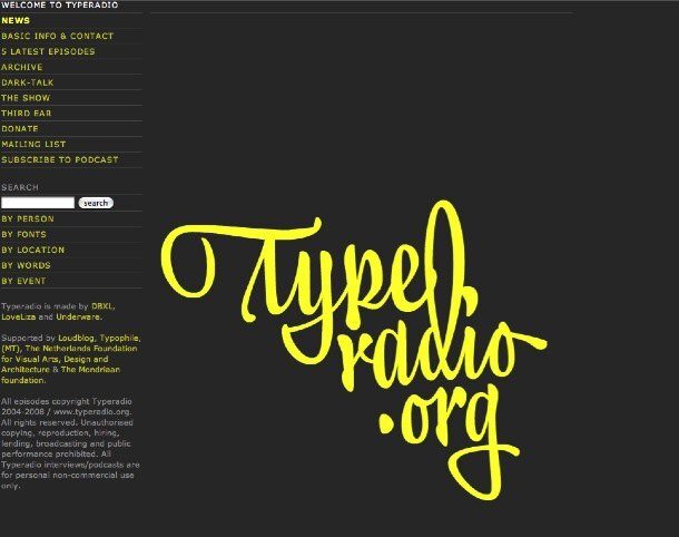
Typeradio
Radio for type people — Typeradio is a podcast and internet radio station dedicated entirely to type and typography. Since 2004 they have been visiting design events worldwide, sitting down with designers, and recording the kinds of conversations that rarely make it into print. If you have ever wanted to hear designers talk candidly about their craft rather than their output, this is the place.

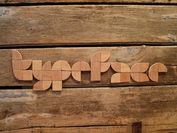
The Superscript (again)
Minimal Bloc — a typeface made of two shapes: squares and quarter circles. We could not resist featuring The Superscript twice. Minimal Bloc is applied here to wood, and the result is something that sits between typeface and object. The other application examples are worth seeing.

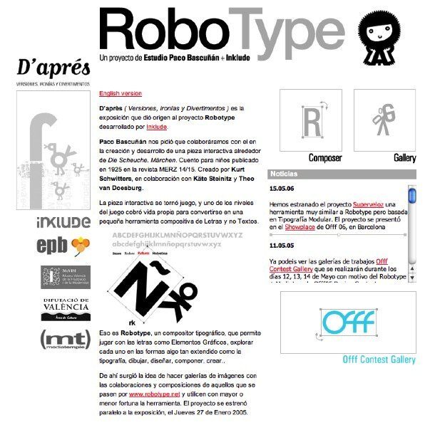
Robotype
Interactive gallery — use the interactive gallery at Robotype to build your own character or scene using classic fonts: Univers, Bodoni, Futura, Helvetica. It is playful and educational at once — a tool that makes you look at these canonical typefaces in a completely different way. We played for a long time.

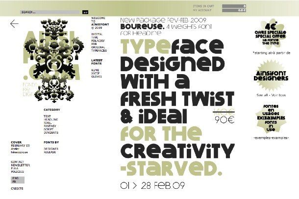
Ainsifont
Boureuse — a headline font from the commercial French type site Ainsifont, which carries an extensive library of original typefaces. Their ‘fonts in use’ section is particularly useful for seeing how these faces behave in real contexts, which is always a better test than the specimen sheet.

Molotro
Minotype — a stencil typeface designed by Italian type designer Luciano Perondi. The urban experiments conducted by graphic design students using Minotype are genuinely interesting — stencil type has always had a life beyond the studio, and these examples show it working hard in public space.

Barney Carroll
Garamond vs Garamond — an educational article breaking down the differences between the many versions of Garamond that exist under that single name. Francesco Simoncini’s Garamond is the starting point, but the piece unpacks the physiological differences between the variants available to designers with real care. Originally published in French for Le Monde, translated into English by Barney Carroll. Required reading for anyone working through module 4 at TGDS.

Julia Sysmäläinen
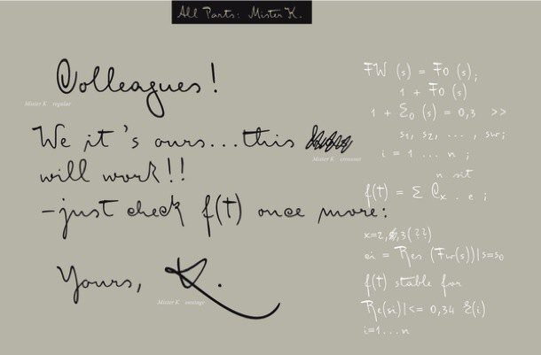
FF MisterK OT — Finnish graphic and type designer Julia Sysmäläinen became so absorbed in the manuscripts of Franz Kafka that she converted his handwriting into a digital script typeface. The result is FF MisterK: a face with unusually strong calligraphic characteristics, shaped by the specific idiosyncrasies of Kafka’s hand. It is one of those typefaces that carries a genuine narrative — you can see the source material in every letterform.
FF MisterK is available through MyFonts, following FontFont’s acquisition by Monotype.

Just van Rossum
FF Dynamoe — we encounter label makers every day without registering that the letterforms they produce are typefaces in their own right. Just van Rossum’s FF Dynamoe changes that. Suddenly you can label your world with a typeface designed for it — no refills needed. JVR’s site is also a visual delight in its own right.
FF Dynamoe is available through MyFonts via Monotype.

WhatTheFont
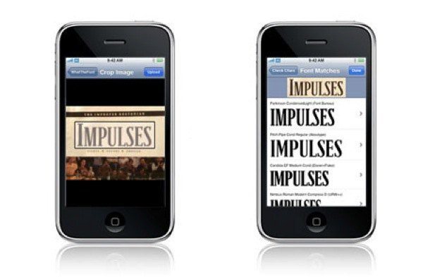
Font identification in your pocket — this has nothing to do with European typography trends, but we could not resist. WhatTheFont (from MyFonts) lets you identify a typeface by photographing it. It is the Shazam of the type world. Available on iOS and Android, and genuinely useful in the field when a piece of signage or packaging catches your eye and you need to know what you are looking at.
In 2026, AI-assisted font identification has improved further — tools like Adobe Fonts’ font detection and various browser extensions can match typefaces from a screenshot with impressive accuracy. But WhatTheFont remains one of the cleanest implementations.

Erik van Blokland
Trixie HD — Dutch designer Erik van Blokland takes typewriter realism to another level altogether. A new vectorisation technique was developed to push the level of detail, creating realistic typewriter effects that hold up in print and on screen. Over 17 million points in the release. It is extraordinary work, and the video below shows how it was made.
European typographic culture runs deep — centuries of printing tradition, national design movements, and, in the digital era, some of the most inventive independent type designers working anywhere. The foundries and practitioners shown here are a starting point, not a complete picture.
If you want to understand how to work with type at a professional level, the best thing you can do is look at this kind of work regularly and ask yourself why it holds up. That habit — of looking carefully and asking why — is one of the things we build into our courses at The Graphic Design School.
Explore our Certificate IV in Graphic Design and see how we approach typography from the ground up.
Ready to start your design career?
Study graphic design online, at your own pace, with 1:1 support from our Support Angels. Accredited RTO since 2008.
Explore our courses