
Visual Culture :: Brazil
Originally published 2010. Updated March 2026.
Brazil is a design culture worth knowing about. The work that emerged from its studios and freelancers in the 2000s and 2010s had something distinct about it — not the polished Helvetica-neutral of European agency work, but something with more heat. More colour, more energy, more willingness to use the full visual register. Here is some of the best of it.
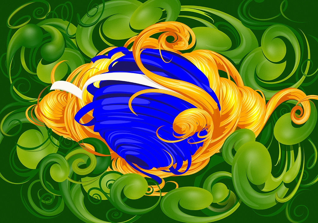
Latin Ascent: Typography

This deceptively simple — yet structurally complex — letterform by Jackson Alves was created at the Letaria typography workshop in Brazil. Brazilian typographers have long shown a willingness to push letterforms past the point of conventional legibility, treating type as visual object rather than mere communication vehicle.

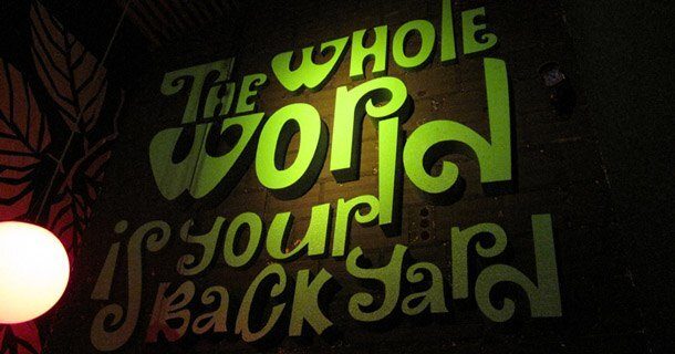
Ultra-impactful signwriting by Nomad Ink for Curitiba-based restaurant Wonka Bar. Though zany in spirit, compositional control has been maintained throughout. This is the difference between expressive and chaotic — a distinction worth studying.
Graphic Design

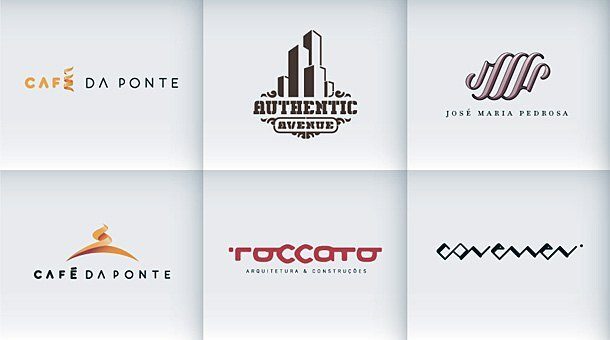
Brazilian designers are perfectly capable of delivering clean, well-ordered logotypes alongside the more expressive work. These logos demonstrate that range — the same sensibility that produces vivid illustrative work can also produce something measured and refined when the brief calls for it.

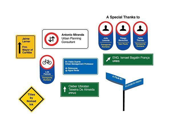
A road sign-based response to a brief for a documentary about Curitiba’s Bus Rapid Transport system by Nomad Ink. These signs function as documentary titles — an elegant piece of conceptual thinking that connects the visual language of the subject matter directly to the work.
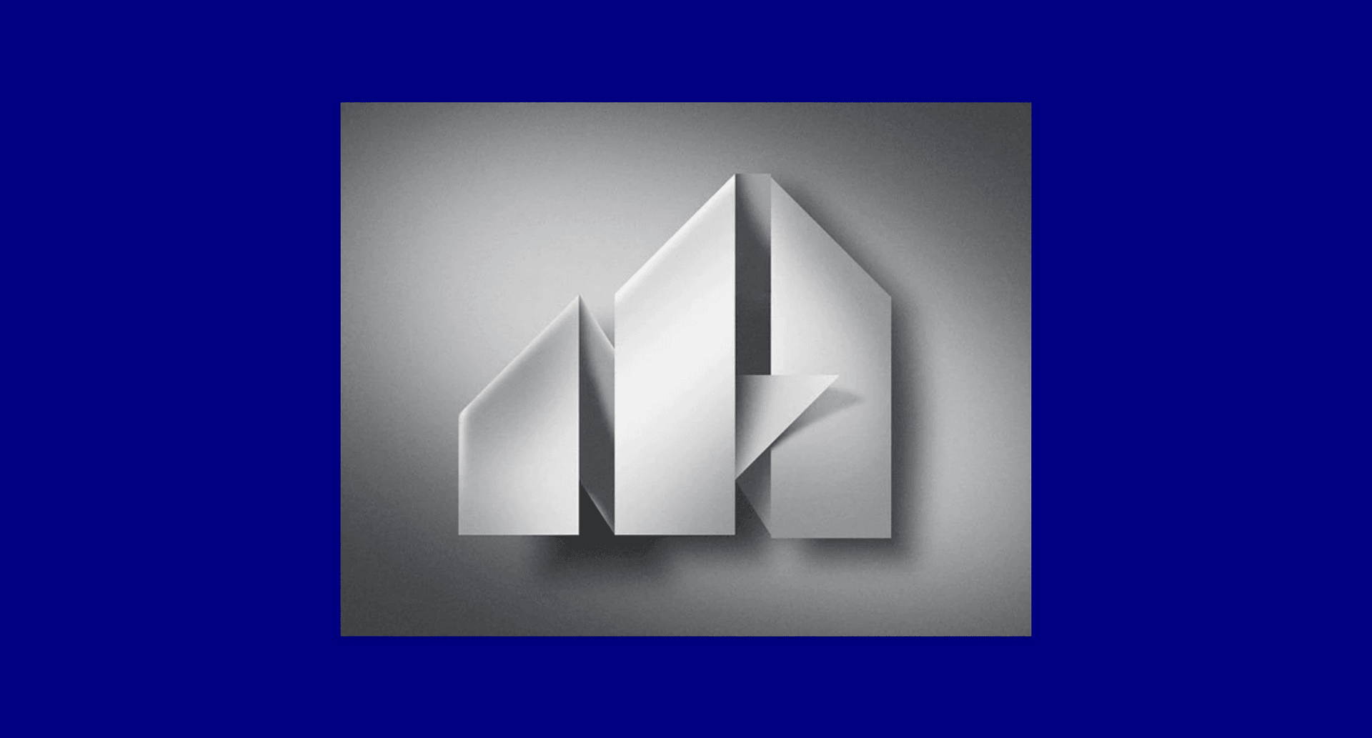
Built Environment

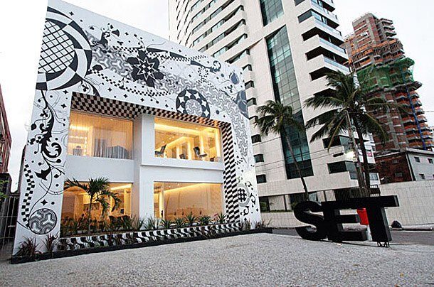

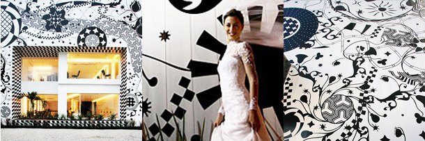
In the hands of a lesser studio it could so easily have gone garish. This is staggering yet unobtrusive environmental design for Brazilian beauty centre Set. The scale is ambitious; the execution is restrained. That balance is difficult to strike, and rarer than it should be.
Branding

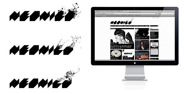
Identity and website for men’s fashion brand Neonico. Note the triptych of explosive effects on the last characters of the logotypes — a detail that rewards a second look. This is the kind of considered graphic wit that elevates branding from functional to memorable.

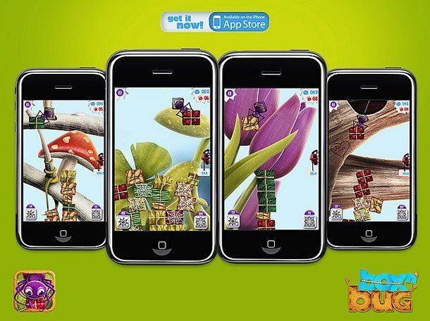

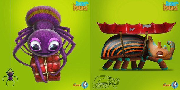
These images, which demonstrate bundles of imagination, are part of an extensive branding project by Rodrigo Bellão for iPhone game developer 99ft Jetpack’s first game, Box n’ Bug. The project shows how strong conceptual thinking can make even a small-studio brief feel world-class.
Illustration

Illustration with type for a T-shirt design by Rafael Nascimento. No matter how far you travel, homages to Helvetica and all things Swiss are never far away — which is either a sign of its timelessness or its stranglehold on design education, depending on your point of view.

Beautiful vector illustration on the theme of gay rights for Metropole magazine, also by Rafael Nascimento. The restraint of the palette makes the emotional force of the subject matter carry without visual overstatement. This is illustration that trusts its message.
In Sum
Keep an eye on Brazil. The design culture here is not a peripheral influence — it draws on European modernism, Afro-Brazilian visual traditions and a genuine local irreverence that produces work unlike anywhere else. With output of this calibre across typography, branding, illustration and environmental design, Brazil’s reputation as a creative powerhouse has been well earned.
For more international design culture, explore our Focus: French Graphic Design and European Websites posts. Ready to develop your own design practice? Our Certificate IV in Graphic Design builds the skills to work at this level.
Ready to start your design career?
Study graphic design online, at your own pace, with 1:1 support from our Support Angels. Accredited RTO since 2008.
Explore our courses