Focus - French Graphic Design
Originally published 2014. Updated March 2026.
Even in France itself, graphic design burns less brightly than the other arts — yet its influence on the country’s wider visual culture is by no means insignificant. A high creative output flows from both established and emerging designers and ateliers. France resists the seductive Esperanto of globalised design more successfully than most nations, retaining a particular élan that rewards a closer look. Here is a tour through its national résumé.
L’Histoire du Vingtième Siècle — “Twentieth Century History” for those who don’t speak French.
Bazooka

Throughout the twentieth century, proponents of core French themes — liberty, protest, subversion — used design to communicate their messages. The Agitprop posters of Atelier Populaire are well known, but other notable groups include Bazooka and Grapus.
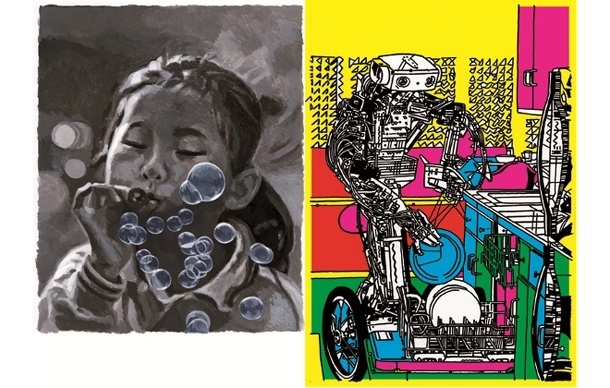
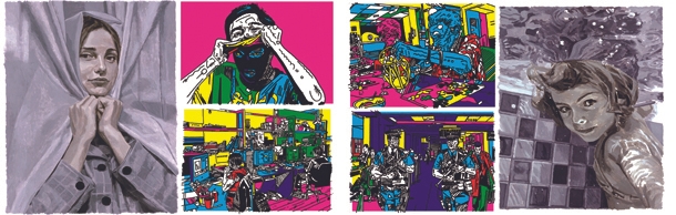
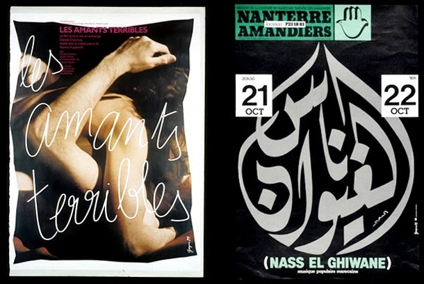
Bazooka were a mixed-sex collective with an alternative take on punk graphic design. Coming together at art school in Rouen in 1974, they absorbed ideas from across the graphic design and art intersection — particularly Dadaism and neo-Dadaism. They learned to print their own material and published a number of radical zines. Sexy and confrontational, their work remains worth further investigation.

Grapus

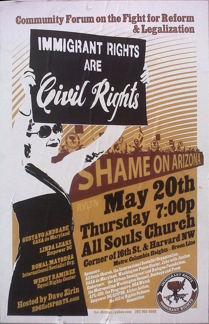
Grapus was a collective of graphic artists who worked together between 1970 and 1991, before internal struggles ended the project. Fiercely political, Grapus produced searing posters with social intent. Their work has a urgency that feels uniquely French — placed alongside those of Atelier Populaire, the context becomes sharp and undeniable.

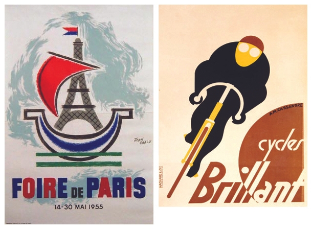
It is through no fault of their own that the graphic design of artists like Jean Carlu and A.M. Cassandre now appears clichéd. Their style has been borrowed to death, their posters proliferated, reproduced and collected on a grand scale. See the originals and the quality reasserts itself immediately.

Havas City

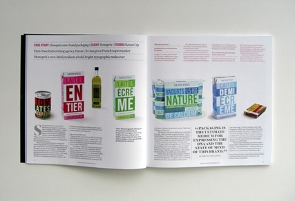
Bringing things up to date: Paris-based agency Havas City was commissioned to redesign French supermarket Monoprix’s own-brand range of over 2,000 grocery products — a substantial task for any studio. They chose a bold, no-nonsense typographical treatment, dispensing with imagery and package windows, and combining colourful type with witty messages.
Reported widely in the British design press, the result demonstrates that wit and rigour are not mutually exclusive. The French instinct for intellectual playfulness found a perfect outlet in the supermarket aisle.
Grapheine

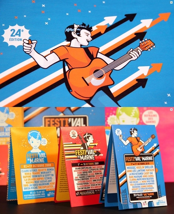
Design studio Graphéine produced an impactful visual identity for the Festival de Marne — proving that French studios can deliver clean, globally legible graphic design with the best of them. Echoes of anime are apparent in the illustrations. A dilution of Gallic flair? A positive move toward a worldwide graphic aesthetic? The debate is part of what makes French design interesting to follow.
Toffe

Not much known outside French design circles, Toffe — a nom de plume for Christoph Jacquet — is an important and original graphic designer with a following in Paris, where he was born and still works. His work “bristles with contradictions,” as Rick Poynor observed: ugly default computer settings combined with intricate fleurons and flourishes in jarring juxtapositions that resist easy categorisation.

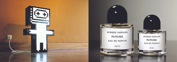
M/M

M/M are graphical stars in France, combining design, art and format with dazzling originality and an almost innocent sense of experimentation. Their posters, typefaces and alphabets have had wide coverage, but it is worth looking at how inventive they are when working on installations, models and set design.
Nothing seems beyond the pale for M/M — they have even turned their hand to fragrance. In an industry at risk of taking itself too seriously, M/M remind us that design works best when it retains a sense of wit and spontaneity.

What French Design Teaches Us
The throughline from Cassandre to Grapus to M/M is not a single style but a consistent commitment to ideas — to design as a vehicle for something beyond decoration. French designers have always seemed willing to let their work carry weight: political, cultural, intellectual.
That is not a bad model for any designer, wherever they are working. The best work communicates something worth saying.
If you are drawn to design cultures like this — the history, the theory, the visual argument — you might enjoy exploring our European typography and studio websites posts. Or, if you are ready to build your own practice on these foundations, take a look at our Certificate IV in Graphic Design.
Ready to start your design career?
Study graphic design online, at your own pace, with 1:1 support from our Support Angels. Accredited RTO since 2008.
Explore our coursesRelated articles