Focus :: Contemporary Type Foundries :: Part 2
Originally published 2011. Updated March 2026.
In Part 1 we covered Dalton Maag, Emigré, Tiro Typeworks, Fontsmith, and OurType. Here are six more foundries that deserve a place in any designer’s reference list.
Exljbris

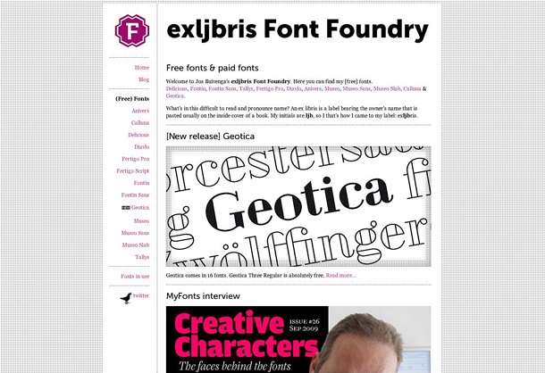

Described on its blog as a ‘one-person Dutch font foundry’, Exljbris was founded by Jos Buivenga. For years, online visitors could follow the development of his typefaces and download them at no cost.
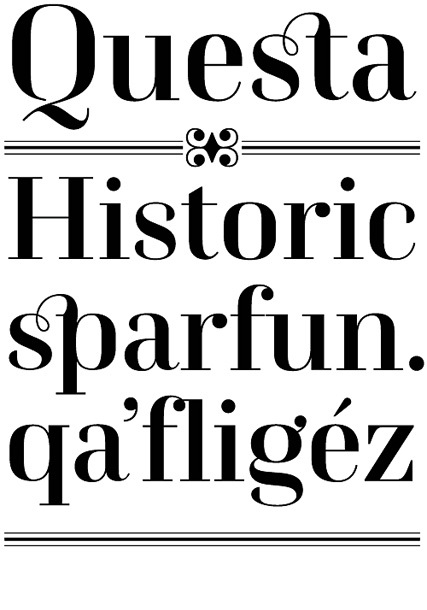
In 2008, while still working as an art director at an advertising agency, he released his first commercial typeface Museo, with several weights offered free. That strategy paid off handsomely — Museo became a bestseller and Jos now works full-time as a type designer. The Questa project, a collaboration with respected type designer Martin Majoor, is among his most refined work.
Exljbris is a good example of a model that has become more common: a highly skilled individual practitioner building an international reputation through a combination of generosity (free weights) and quality (premium releases). Worth following closely.

Linotype


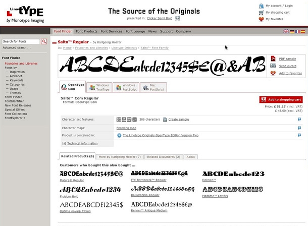

Linotype requires little introduction. Since Ottmar Mergenthaler demonstrated the first line-casting machine to the New York Tribune in 1886, the company has been at the centre of typographic innovation — through hot metal, phototypesetting, and now the digital era. Today it is part of Monotype, one of the world’s largest type companies.
The Linotype library contains over 10,000 typefaces. The website’s search tools are particularly useful: visitors can filter by intended use (text, corporate, screen), by type foundry, and by character set. The Form Finder tool lets you reshape a sample to hunt for a particular style.
For students building a broader awareness of type history, Linotype is an essential resource. The sheer breadth of the catalogue — spanning decades and design movements — makes it one of the most educational sites in the profession.
HypeForType

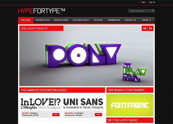


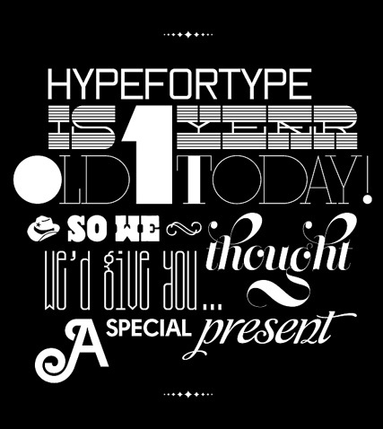
“A labour of love for founder Alex Haigh” is how HypeForType describes itself — and that warmth comes through in the curation. The shop carries high quality retail faces alongside genuinely esoteric and unusual ones, and their practice of collaborating with well-known designers to produce exclusive releases sets them apart.
The blog is worth bookmarking in its own right: competitions, interviews, and announcements sit alongside type specimens designed with real care. For students interested in how independent type retail works as a business, this is an instructive example.
LucasFonts


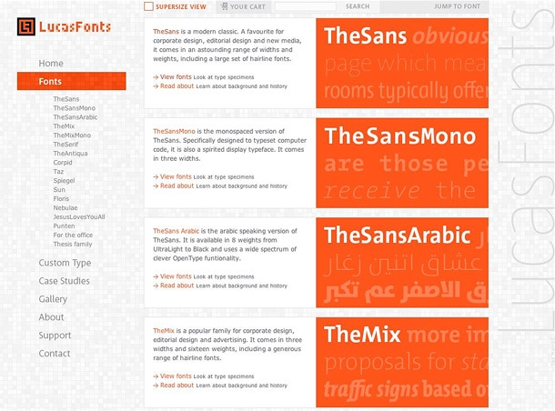

Lucas de Groot founded his own foundry, LucasFonts, in 2000, with the stated aim of making typefaces “that look good and work well under any circumstances and in many languages.” The website notes that designers are drawn to his fonts’ “functionality and friendly appearance and love the enormous range of possibilities that each family offers.”
LucasFonts has a sister company, FontFabrik, specialising in custom typefaces. Their client list includes Microsoft, Heineken, Siemens, and Volkswagen — a reminder of how central bespoke type has become to serious brand design.
The website’s design itself embodies the Swiss/International Style influence visible in de Groot’s type. Worth studying as a design object as much as a type catalogue.
SMeltery


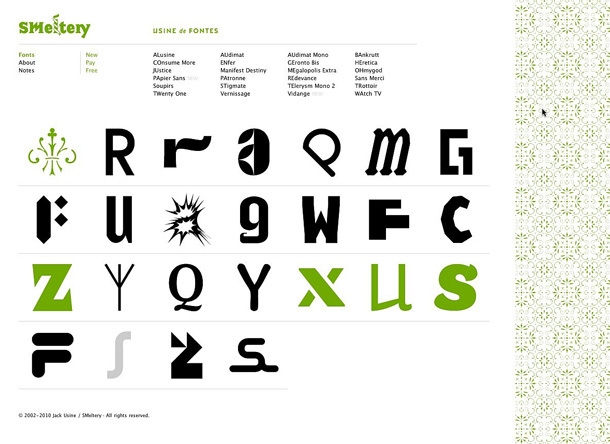

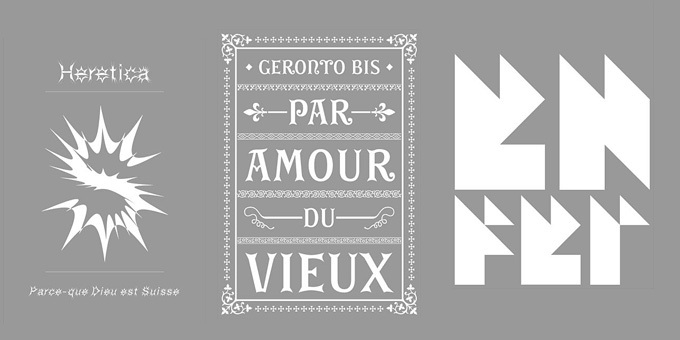

SMeltery is a French type foundry founded in 2002 by Bordeaux-based graphic designer Jack Usine. The catalogue leans towards display faces with genuine personality — Heretica, Geronto Bis, and Enfer among the highlights. There are gems in the free section too.
Jack also maintains a vigorous involvement in other aspects of visual culture, which comes through in the energy of SMeltery’s output. These are not neutral typefaces — they carry a point of view. For editorial and cultural projects where the type itself needs to do expressive work, SMeltery is a worthwhile stop.
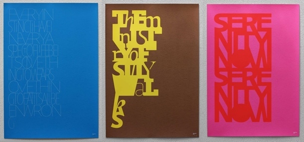
Typonine


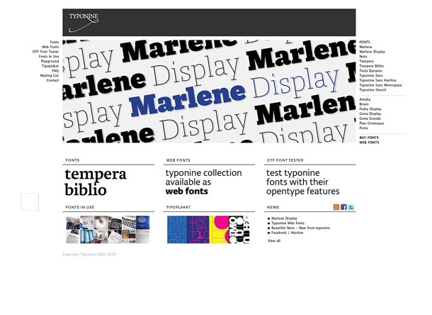

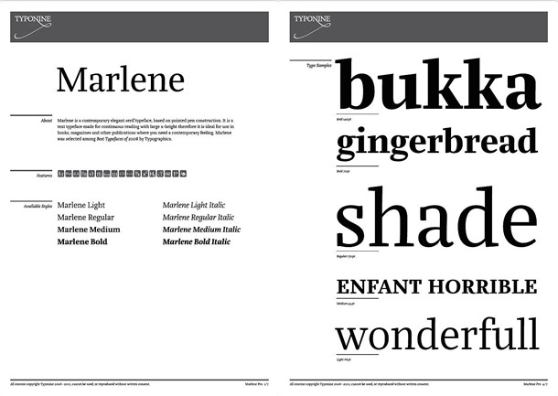

Typonine is a digital type foundry and graphic design studio based in Croatia and The Netherlands, run by type and graphic designer Nikola Djurek. Their fonts have a precision and tension about them that makes them a strong choice for demanding typographic contexts — corporate identities, cultural institutions, publications where type has to carry real weight.
The Playground section of their website is a worthwhile detour: a space dedicated to type experiments and projects. And through Tipoplakat, customers can order typographic posters designed by Djurek and his collaborators — a genuinely unusual offering from a foundry that operates with the sensibility of a design studio as much as a type house.
Summary
Type foundries have made the transition from old trade to digital practice with considerable élan. They are a vital pillar of the modern design profession — indispensable to studios and clients commissioning bespoke work, but equally valuable to students and emerging designers.
Even when you cannot afford the fonts, knowing what foundries are releasing trains your typographic eye. You develop an instinct for quality. And occasionally you become so convinced of a face’s suitability for a particular job that you can make the argument to a client — or find the purchase worth making yourself.
In 2026, the variable font era means that a single well-chosen licence can give you a surprisingly wide typographic range. Foundry websites are also a window into how type design works as a craft and a business. Spend time in them.
Enjoyed this? Read Part 1 for six more foundries, or explore The Best of European Typography for a broader view of what the continent produces.
Typography is a craft you develop over a career, not a semester. At The Graphic Design School, it sits at the centre of everything we teach. Explore our Certificate IV in Graphic Design to see how we approach it.
Ready to start your design career?
Study graphic design online, at your own pace, with 1:1 support from our Support Angels. Accredited RTO since 2008.
Explore our coursesRelated articles