Focus :: Contemporary Type Foundries :: Part 1
Originally published 2010. Updated March 2026.
Many emerging designers work only with what came pre-installed on their system — or with a disc’s worth of dubious free fonts downloaded years ago. You can produce decent work that way (some argue Helvetica alone will take you far), but the wise designer keeps an eye on what independent type foundries are releasing.
Between them, these foundries put out beautifully crafted, carefully considered font families every year. Some are expensive; others are surprisingly reasonable; a handful offer outstanding faces for free. And beyond the fonts themselves, foundry websites offer a window into a fascinating craft. That is what I aim to show here, in the first of two articles.
What Is a Type Foundry?
A type foundry designs and distributes typefaces. Originally, foundries manufactured metal and wood type for letterpress printers. Today’s digital foundries distribute fonts created by type designers, often providing custom design services for brands requiring something bespoke.
In 2026, the type landscape has shifted further: many foundries now offer variable fonts — single files that span multiple weights, widths, and optical sizes — as well as web font licences optimised for screen use. It is worth asking foundries directly about their licensing terms, as these vary considerably.
Dalton Maag

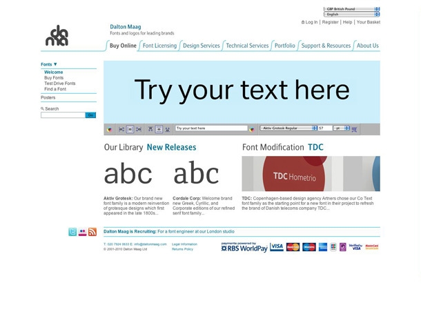
London-based Dalton Maag has been designing fonts and supporting typographic practice since 1991. What makes them remarkable is their commitment to multilingual typography — with studios and projects extending into Cairo and Brazil, their work encompasses the Arabic alphabet and South American languages alongside extensive Latin families.
Their client list reads like a who’s who of global brands: Nokia, Ubuntu, Airbnb. If you have ever used a smartphone, you have almost certainly used a Dalton Maag typeface. The website is a thoughtful showcase of their process, and worth an extended visit.


Emigré

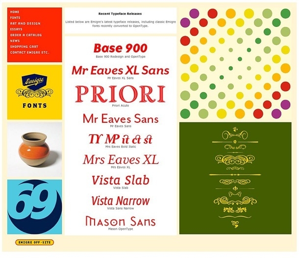
Yes, that Emigré — the iconic design journal that reshaped graphic design discourse from the mid-1980s onward. Many design schools focus so much on the cultural significance of the publication that they neglect to mention the entity still exists, at emigre.com, with an archive of journal articles, a well-stocked shop, and a large collection of their distinctive typefaces available for purchase.
The Emigré library is diverse and often esoteric. One quality that runs through much of it is the jaunty, rule-bending treatment of serifs — faces like Mrs Eaves and Filosofia remain influential decades after their release. For students studying type history, spending time here is genuinely worthwhile.

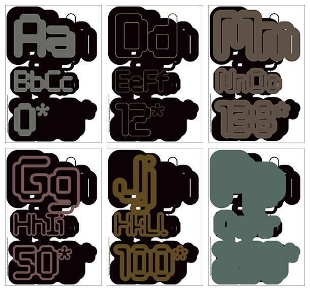
Tiro Typeworks


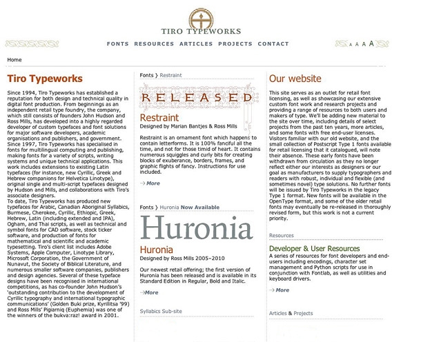
Tiro Typeworks was established in 1994 by John Hudson and Ross Mills, and has built a formidable reputation in multilingual computing and publishing. Their expertise covers extensions to Latin typefaces and new typefaces for Arabic, Canadian Aboriginal Syllabics, Burmese, Cherokee, Cyrillic, Ethiopic, Greek, Hebrew, Ogham, and Tahi scripts. The scope of this work is extraordinary.
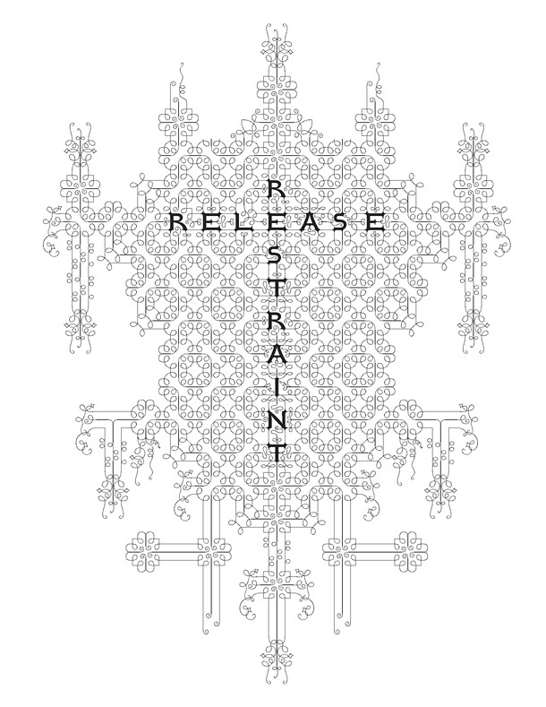
An ornamental typeface worth seeking out is Restraint, described as “an ornamental font which happens to contain letterforms. It is 100% fanciful all the time and not for the timid of heart.” That description should tell you everything you need to know. A tour through their site, and especially the breadth of their script work, is highly recommended.

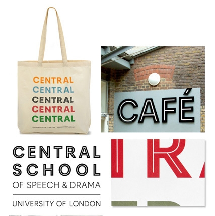
Fontsmith


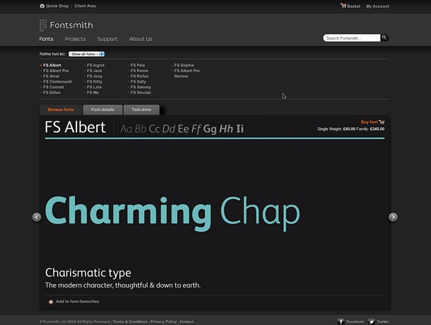

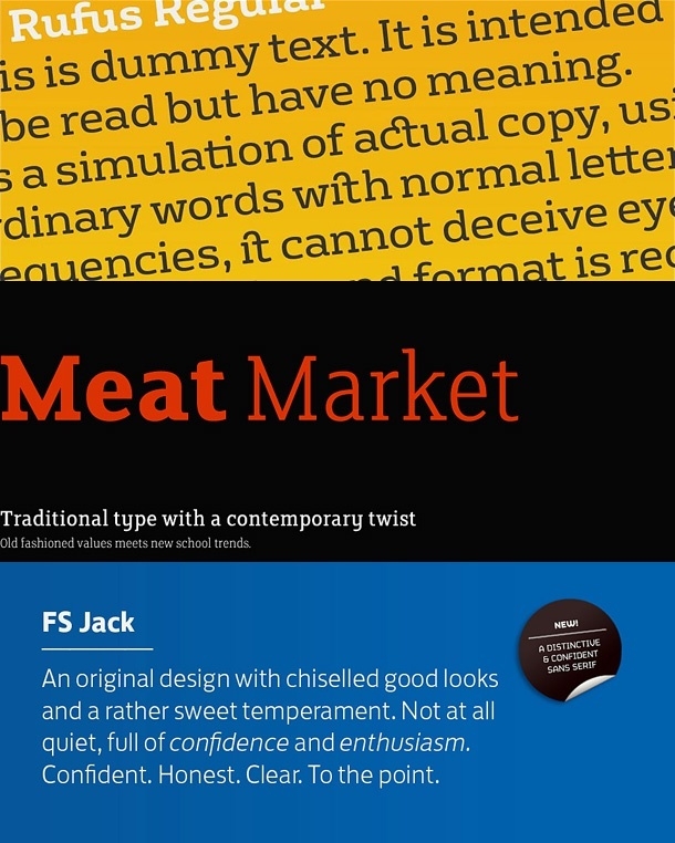
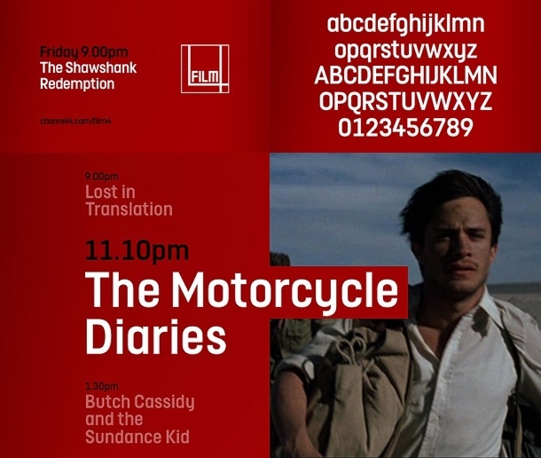
Fontsmith is a leading London type design studio, founded in 1999 by Jason Smith. The team designs both retail typefaces and bespoke fonts for international clients. Their custom work is particularly impressive: they have designed typefaces for Channel 4, Mencap, and BBC One, among others.
It is worth noting that custom type design — commissioning a bespoke typeface for a brand — is one of the most powerful tools in a designer’s kit. When a client’s type is unique to them, it cannot be diluted by another brand using the same face. Fontsmith’s Film4 commission, shown below, illustrates how effectively a bespoke typeface can anchor a visual identity.
I use Fontsmith’s Clerkenwell in my own identity work. It holds up well at every size, which is ultimately what you want from a working typeface.

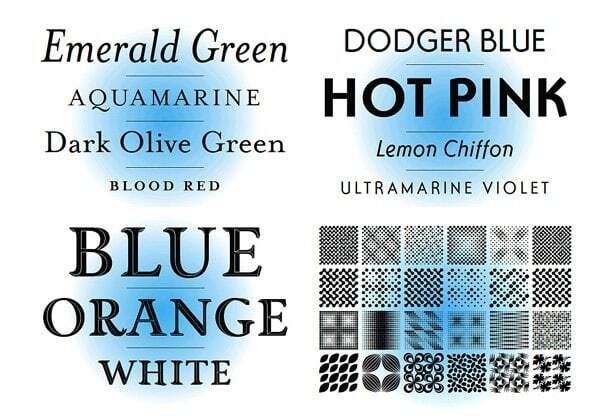
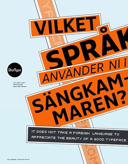
OurType


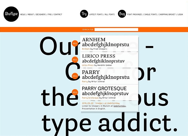
Founded in 2002, OurType articulates its philosophy clearly: it “publishes newly designed fonts that are tailored to contemporary needs. Yet it respects traditional values, and strives for the highest quality of product. So it stands equally apart from those who are enslaved to the new and those who merely try to recreate the past.”
That is a precise and honest description of what good independent type design looks like. OurType’s catalogue is contemporary without being gimmicky, and their fonts hold up well in demanding typographic contexts. The website has a pleasing sense of movement about it.


To be continued...
Six more foundries follow in Contemporary Type Foundries Part 2. And if European typography in particular interests you, take a look at The Best of European Typography — a curated overview of the continent’s most inventive type work.
Type foundries are easy to overlook when you are focused on producing work. But staying aware of what is being released — even when you cannot afford to buy it yet — trains your eye and expands your reference library in ways that only strengthen your practice.
Ready to build your typographic foundations? At The Graphic Design School, typography is central to everything we teach — not as a module you get through, but as a discipline you develop over the entire course. Explore our Certificate IV in Graphic Design and see what that looks like in practice.
Ready to start your design career?
Study graphic design online, at your own pace, with 1:1 support from our Support Angels. Accredited RTO since 2008.
Explore our coursesRelated articles