

Originally published 2009. Updated March 2026.
Print is experiencing a genuine renaissance. In an era of digital overload, there is something subversive — and commercially sharp — about a piece of design you can hold. Brands that invest in exceptional print material signal something screens cannot: permanence, intention, craft.
Print graphic design encompasses everything from advertising campaigns and editorial spreads to luxury catalogues and postage stamps. We have scoured the corners of Europe and beyond to bring you work that reminds you why this medium still matters.
eBoy
Los Angeles Times Magazine spread. Based in Berlin, eBoy is Steffen Sauerteig, Svend Smital and Kai Vermehr. They build complex, extensible artwork from re-usable pixel objects — a discipline that requires meticulous planning and a very particular kind of patience. Clients like Adidas, Nike, Adobe and Diesel prove the approach has crossed squarely into the mainstream, without losing any of its edge.

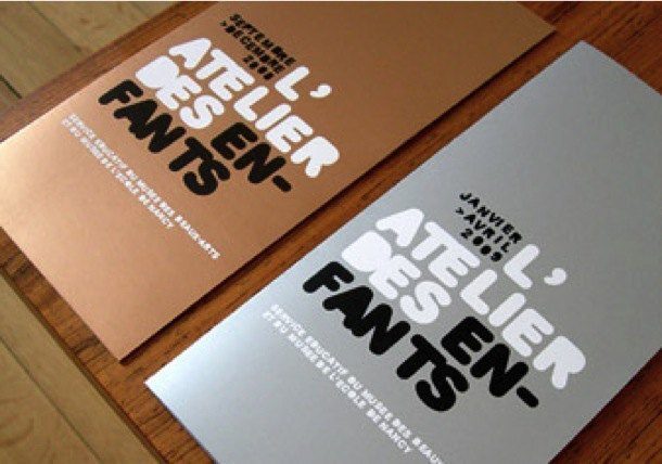
Studio Punkat
Nancy Fine Art & Music Museum. Hugo Roussel works from Nancy, France, with communication as the organising principle of every project. The result is print work that is clean, precise and thoroughly brief-led — which is harder than it looks. Good print design is never decoration. It is argument, made visible.

Prada
Spring/Summer 2009 Look Book. Fashion print at its most considered. The SS09 catalogue is a study in restraint: the photography drives the narrative, the typography steps back, and the whole thing lands with the weight of a well-made object. It is a reminder that luxury is not about decoration — it is about editing.
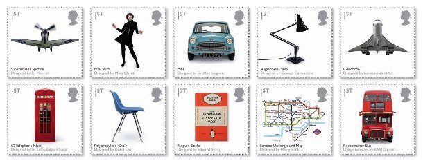
Royal Mail England
Best in British Design stamp set. The Royal Mail has a long tradition of commissioning serious designers for its stamp programme — the brief is exacting and the format unforgiving. This set celebrating British design is a miniature gallery. Proof that even the most utilitarian print object can carry genuine craft.

Jung von Matt
International Watch Co. Schaffhausen — ‘Passion for Detail’ campaign. Hamburg agency Jung von Matt have always understood that great advertising is a form of argument. This campaign for IWC earns its wit through precision: the concept rewards attention, which is exactly what a watch ad should do. Their body of print work rewards careful study.


Digital Temple
Magazine. Digital Temple is a French magazine covering graphic design, photography and fashion — translated into English for international readers. TGDS students can find back issues in the school e-library. It is exactly the kind of publication that rewards regular reading: the curation is sharp, the production values high.
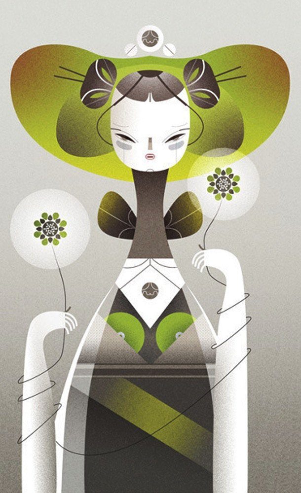
Malota Projects
Postcard sets. Mar Hernandez works from Valencia, Spain. Her illustration work is immediately recognisable — bold, warm, and full of a very particular kind of joy. The postcard format suits her perfectly: she makes small things feel considered. A great example of how print design and illustration reinforce each other.

La Perla
Autumn/Winter 2009–10 Catalogue. Print does not get more considered than La Perla’s catalogue work. The photography is meticulous, the models are styled with restraint, and the layouts communicate stile classico without ever tipping into excess. The design team earns every bit of the investment this kind of print production demands.


Leagas Delaney
Maglite — ‘World’s Smallest Light’. Hamburg-based agency Leagas Delaney have always had a talent for deadpan humour. This Maglite campaign is a fine example: the concept is simple, the execution is confident, and the joke lands without explanation. Consensus at TGDS has always been that it is probably not terribly responsible — but it definitely made us laugh.


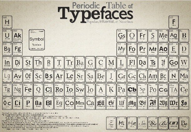
Squid Spot
Periodic Table of Typefaces. Designed by Cam at Squid Spot, this poster applies the format of the periodic table to 100 of the most influential typefaces in print history. The conceit is obvious in retrospect — which is always the mark of a strong concept. It belongs on every design student’s wall.

Why Print Still Matters in 2026
We are living through a print revival. After years of every brand rushing headlong into digital, the conversation has turned. Sustainability-conscious consumers are questioning disposable digital advertising. Physical mail has higher open rates than email. Tactile marketing stands out precisely because so little of it is done well.
The work above was made between 2007 and 2010. Most of it still holds up — not as nostalgia, but as evidence that the fundamentals of print graphic design do not change. Composition, colour, typography, material: these are the craft elements that survive every platform shift.
At TGDS, print design is taught alongside digital — not as an alternative, but as a complement. The disciplines inform each other. A designer who understands how ink sits on paper thinks differently about pixels on a screen.
Want to develop your print design skills? Explore our graphic design courses and see how we teach print and digital together.
Related reading: When Times Are Tough, Graphic Designers Get Tactile — on the enduring appeal of tactile print. Your Business Card Is Crap (Not Quite) — on the most personal piece of print you will ever design.
Ready to start your design career?
Study graphic design online, at your own pace, with 1:1 support from our Support Angels. Accredited RTO since 2008.
Explore our courses