

When Times Are Tough, Graphic Designers Get Tactile
Originally published 2010. Updated March 2026.
There is an argument that the tougher things get, the more designers reach for something physical. When the recession hit in 2008–09, the industry’s response was not to retreat into digital minimalism. It was to double down on craft — on textures, substrates, and the kind of print experiences that a screen simply cannot replicate.
That argument has only grown stronger in the AI era. When algorithmically generated images flood every feed, a piece of print that you can smell, tear, or unfold becomes something rare. Tactile graphic design appeals to the senses that screens cannot reach: touch, smell, even taste.
TGDS has been watching designers push well beyond the flat print form — into territory that starts to look more like engineering than layout. Below is a showcase of some of the most inventive tactile advertising we have encountered.
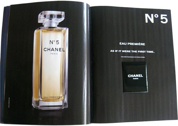
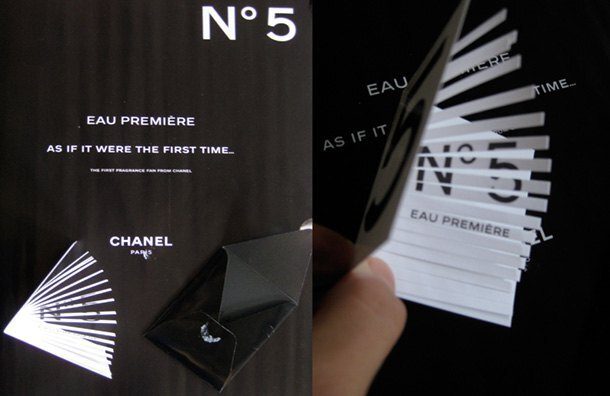
CHANEL N°5
Chanel’s sample card is deceptively simple — until you hold it. The sculptural form is part of the communication: the card itself is the argument for the fragrance. When a piece of print makes you stop and admire its physical presence before you have read a single word, the design has done its job.


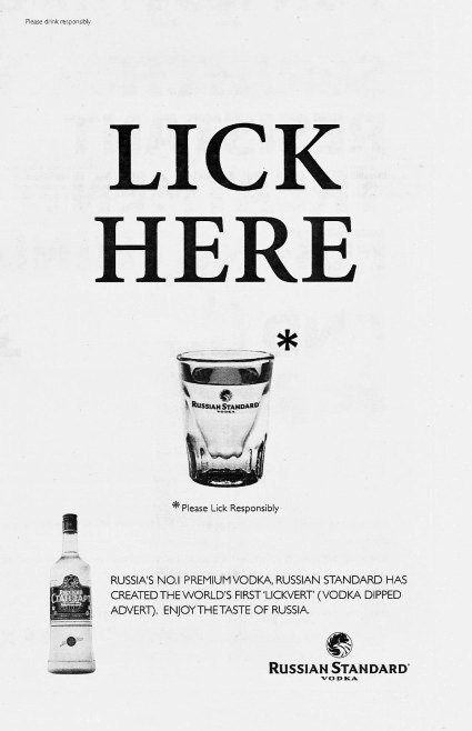
Russian Standard Vodka
Not smell-o-vision — lick-o-newspaper. A scratch-and-taste insert that is either inspired or completely unhinged, depending on your mood. Reportedly an April Fools’ Day stunt. Whether it ran or not is almost beside the point: the concept alone demonstrates how far tactile advertising can stretch the brief.

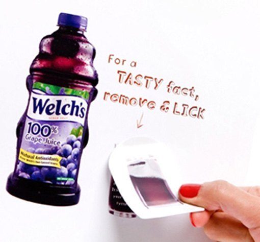
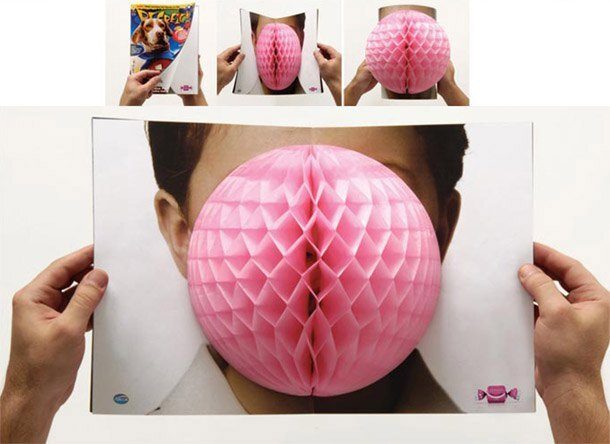
Welch’s
“A lot of people won’t lick a magazine no matter how good it tastes,” said Chris Heye, Welch’s marketing chief at the time. He was probably right. But many more would talk about it — and word of mouth is the metric that advertising budgets dream of. This insert ran in People magazine and gave the brand the kind of attention that conventional print rarely delivers.

Arcor Bubble Gum

Leo Burnett in São Paulo created this for Arcor — a piece of print that functions as both ad and product sample. The concept is tight: the medium and the message are the same thing.
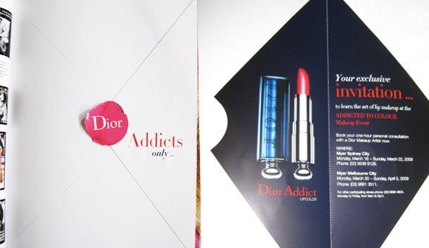
Dior
The Dior Addict makeup line has always leaned into the scandalous side of its name. This print insert goes the other way: it is restrained, elegant, and tactile — an envelope format that opens out to an invitation for a personal consultation at the counter. The physical handling of the piece mirrors the brand’s positioning. Sell, sell, sell — but do it with finesse.

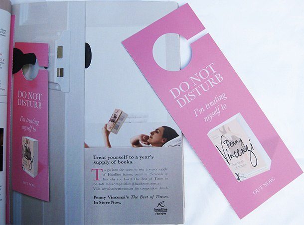
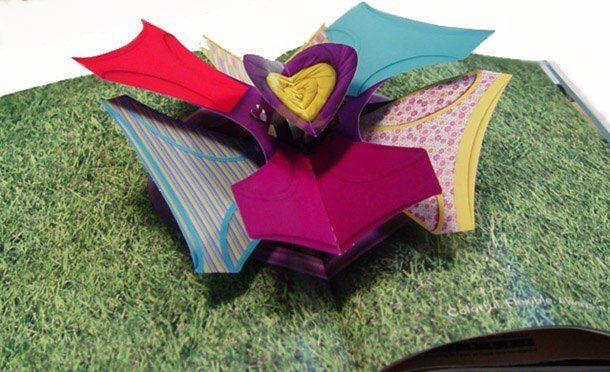
Headline Review
A lift-out insert that tells the children to take a hike while their parent enjoys a bath and a novel. The target audience identification here is precise to the point of being ruthless. That is not an accident — it is craft. Knowing exactly who you are designing for, and giving them exactly what they want, is a skill worth studying.

The Sopranos

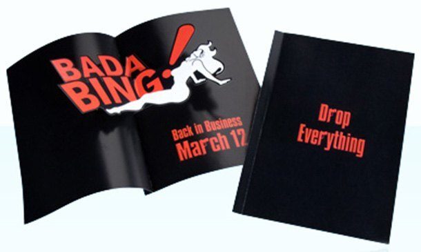
“Bada Bing!” A magazine insert used to promote the latest season of The Sopranos. The physical format reinforces the show’s tactile, old-school sensibility. Good product design and good advertising are not so different — both serve the object they represent.
Fruit of the Loom

Undies so fresh they smell like flowers. The scent strip is not a new format — but applying it to underwear is a decision that required someone in a room to say “yes” with a straight face. That person deserves credit.
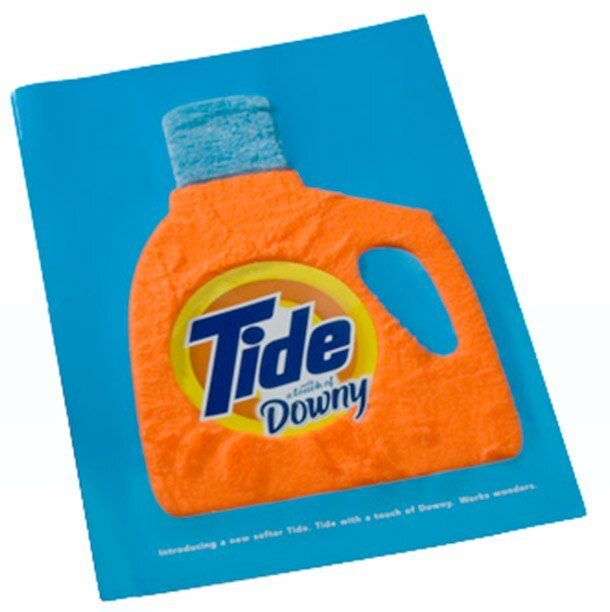
Tide
Three-dimensional texture on a fabric softener ad. The material choice does the conceptual work: the print feels soft, which is the entire point of the product. This is what happens when the production specification becomes part of the brief.

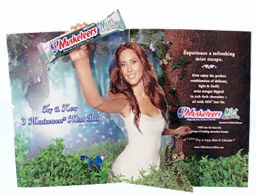
3 Musketeers
A pop-up chocolate sample, extra tactile. The engineering here is modest — but the effect is genuinely delightful. Opening a magazine page to find a miniature pop-up chocolate bar is the kind of surprise that makes people call someone else over to look. That is advertising doing its job.

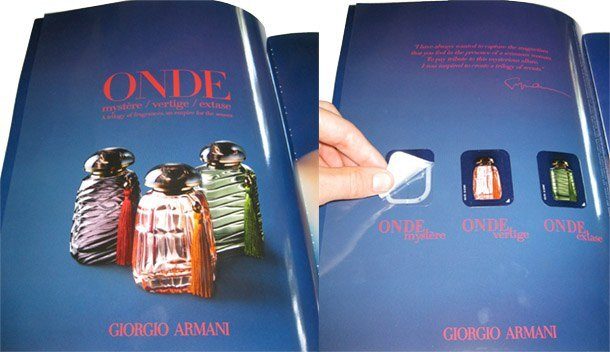
Giorgio Armani Onde
For the launch of the Onde perfume series, Armani committed six pages of Harper’s Bazaar to a triple-scent sampling experience. The investment signals something: this brand takes print seriously as a luxury medium. The design follows through — unhurried, precise, unmistakably Armani.

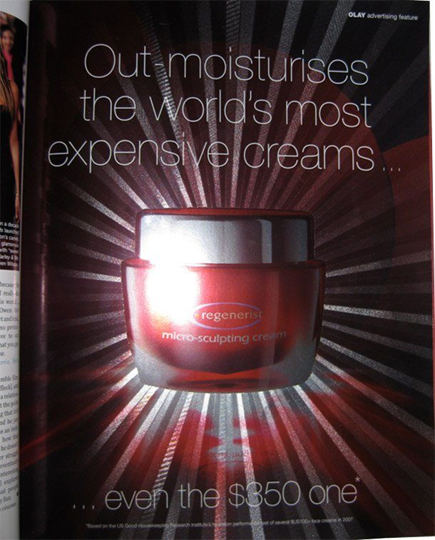
Oil of Olay
Specially textured light-catching paper that catches and reflects to suggest the luminosity of the product. No complex mechanism, no scratch-and-sniff chemistry — just a clever material choice that earns its impact through restraint. Nice work.

Absolut
Absolut has always understood that the most interesting advertising is about ideas, not products. This campaign — “In an Absolut World, currency will be replaced with acts of kindness” — takes tactile print into conceptual territory.
Visionaire
Visionaire is not a magazine in the conventional sense. It is a multi-format art and fashion publication, produced in numbered limited editions three times a year, each with a different theme and physical format. Issue 55, “Surprise,” was engineered by Bruce Foster and uses complex 3D pop-up techniques. Contributors include Sophie Calle, Andreas Gursky, Yayoi Kusama, Steven Meisel and Mario Testino.
This is print taken to its absolute limit. The result is less publication than object — which is exactly the point.
Why Tactile Design Matters More Now
In 2010, tactile design was a response to recession. In 2026, it is a response to saturation.
When AI can generate a polished image in seconds, physical craft becomes the differentiator. A scented insert, a die-cut fold, a paper stock chosen for exactly the right hand-feel — these are things that cannot be replicated by a model, faked by a filter, or scrolled past in 0.3 seconds.
Designers who understand materials — who know what a substrate can and cannot do, who think about how a piece will feel in the hand — have a skill set that is genuinely difficult to automate. That is worth cultivating.
At TGDS, we teach print craft alongside digital — not as nostalgia, but because the fundamentals are the same. Understanding proportion, weight, and material in print makes you a better screen designer too.
Want to develop your craft? Explore our graphic design courses and see how we teach both disciplines together.
Related reading: Print Design Showcase — a curated collection of European print work worth studying. Get Off the Mac, Roll Up Your Sleeves — on why hands-on making improves digital design.
Ready to start your design career?
Study graphic design online, at your own pace, with 1:1 support from our Support Angels. Accredited RTO since 2008.
Explore our courses