Design history · 2000s contemporary practice

Stefan Sagmeister

The conceptual designer who put the body, the mind and the seven-year sabbatical onto the design agenda.

Stefan Sagmeister (born 1962) is the Austrian graphic designer who turned contemporary practice into a vehicle for ideas about happiness, beauty and creative renewal. His album art for Lou Reed and Talking Heads, the Casa da Música identity, his self-imposed seven-year sabbaticals and his text-based Things I Have Learned project have placed him among the most-discussed working designers of his generation.
Stefan Sagmeister, Austrian graphic designer
Stefan Sagmeister at Beyond Tellerrand Hamburg, May 2022. Photo: Norman Posselt. · Photo: Norman Posselt, CC BY-SA 4.0. Via Wikimedia Commons.

Key facts

Born
6 August 1962, Bregenz, Austria
Nationality
Austrian (working in New York since 1991)
Era
Contemporary practice · Conceptual graphic design · Authorship
Studios
Sagmeister Inc. (founded 1993) · Sagmeister & Walsh (2012–2019) · Sagmeister Inc. (sole practice, 2019–present)
Education
University of Applied Arts, Vienna (Diplom, 1986) · M.F.A., Pratt Institute, New York (Fulbright scholar)
Known for
Lou Reed / Talking Heads / Rolling Stones album art · The Happy Show (2012) · Things I Have Learned in My Life So Far · sabbatical practice · 2× Grammy Awards · 2013 AIGA Medal

01

Biography

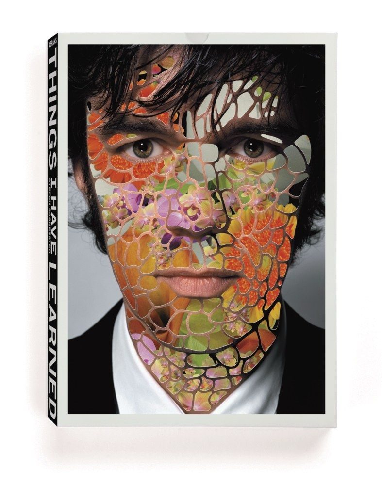
Stefan Sagmeister was born in Bregenz, on the western edge of Austria, in 1962. He started writing for Alphorn, a small left-wing magazine, at fifteen — and quickly discovered that laying out the magazine was more satisfying than writing for it. He earned his diploma from the University of Applied Arts in Vienna in 1986, and won a Fulbright scholarship to Pratt Institute in New York — where he completed his M.F.A. — shortly after.

Restless from the start, he took a job at the Leo Burnett Hong Kong Design Group in 1991 — a posting that gave him a taste for working across cultures rather than within one. Back in New York he sought out Tibor Kalman of M&Co, whose conceptual approach to commercial practice became the template for Sagmeister’s own studio. He worked at M&Co briefly in 1993 before founding Sagmeister Inc. in his East Village apartment that same year.

Through the 1990s the studio specialised in album art for Sagmeister’s musical heroes: Lou Reed, David Byrne, Talking Heads, Mick Jagger, Aerosmith, Brian Eno, Pat Metheny. Two Grammys followed (2005, 2010). In 2000 he closed the studio for a year-long sabbatical — a practice he has repeated every seven years since, and the most widely copied structural idea he has introduced to the profession.

In 2012 he made Jessica Walsh, then twenty-five, a partner; the studio became Sagmeister & Walsh until its amicable dissolution in 2019. Sagmeister has continued solo practice from the same New York studio. He was awarded the AIGA Medal in 2013, and teaches in the M.F.A. Designer as Author program at the School of Visual Arts.

02

Design philosophy

Sagmeister’s working position is closer to that of an artist or writer than a brand designer: design is a tool for asking questions, not just a vehicle for selling product. His early motto “Style = Fart” announced the position bluntly — surface alone is not the work.

“You should do everything twice. The first time you don’t know what you’re doing. The second time you do. The third time it’s boring.” — Tibor Kalman, quoted as Sagmeister’s working maxim

Three commitments anchor his practice. First, the body. Sagmeister has repeatedly used his own body as the design substrate — most famously the carved-into-skin AIGA Detroit poster (1999) and the eat-100-junk-foods Sagmeister on a Binge exhibition (2003). The body is honest in a way commissioned work is not.

Second, time off as creative practice. The seven-year sabbatical — first in Bali (2000–2001), then again in Indonesia (2008–2009) — is treated as project, not break. Each sabbatical produced one of his major bodies of work: Things I Have Learned came directly out of the first.

Third, beauty as function. The Beauty Show (2018) made the explicit case that beauty in design improves outcomes — that an attractive subway map is read more often, that beautiful interfaces get used. A position with deep roots in Swiss modernism, restated for a profession that had drifted into pure utility.

03

Key works

Lou Reed — Set the Twilight Reeling (1996) — handwritten lyrics across Reed’s face. The cover that made Sagmeister’s reputation as the designer who took album art seriously again, after the cardboard-CD indifference of the early 1990s.

AIGA Detroit lecture poster (1999) — the lecture details cut into Sagmeister’s bare torso. Photographed by Tom Schierlitz. Endlessly reproduced; widely misunderstood as shock for shock’s sake. Sagmeister’s own framing was simpler: pain is the most reliable signal of seriousness.

Casa da Música identity (2007) — Porto concert hall identity built from a single 3D representation of the Rem Koolhaas building. Six colours generated procedurally from photography of each programme; the identity changes every event but stays unmistakable.

Things I Have Learned in My Life So Far (2002–2008) — twenty large-format typographic installations of Sagmeister’s own diary maxims, executed in materials ranging from sliced bananas (Deitch Projects, 2008) to inflatable monkeys to coffee beans. Collected in the 2008 Abrams book.

The Happy Show (2012) — touring ICA Philadelphia exhibition turning a decade of personal happiness research into an interactive designed environment. The clearest expression of Sagmeister’s shift from commissioned client work to self-authored long-form projects.

Iconic works

Lou Reed — Set the Twilight Reeling album art, 1996

Lou Reed — Set the Twilight Reeling album art

1996

Cover for Reed's sixteenth solo record, released on Warner Bros. Records in 1996. Song lyrics are handwritten directly across a close-up portrait of Reed's face, treating the sleeve as confessional document rather than promotional packaging. The project marked Sagmeister's entry into major-label album art; personal gesture as design material became the studio's defining working method from this point forward.
Lou Reed — Set the Twilight Reeling album art (1996). Design: Sagmeister Inc. · Promotional poster version featured in PRINT Magazine's 'Image of the Day' column; design-focused publication. · Museum editorial
AIGA Detroit lecture poster, 1999

AIGA Detroit lecture poster

1999

Promotional poster for a 1999 AIGA lecture at Cranbrook Academy of Art, Michigan. Event typography was carved into Sagmeister's bare torso by his studio assistant, then photographed by Tom Schierlitz. The image circulated through design publications and conference contexts into the early 2000s. The original poster is held in the permanent collection of SFMOMA, San Francisco.
AIGA Detroit lecture poster (1999). Design: Sagmeister Inc.; photo: Tom Schierlitz. · AGI (Alliance Graphique Internationale) archive; official documentation of the 1999 AIGA Detroit lecture. · Museum editorial
Casa da Música identity, 2007

Casa da Música identity

2007

Identity programme for the Porto concert hall designed by Rem Koolhaas of OMA (Office for Metropolitan Architecture), which opened in 2005. A three-dimensional representation of the building's irregular polyhedron form generates six colour variants of the mark, one per programme type, with photographic versions produced automatically from concert photography. The system is represented in the permanent collection of the Cooper Hewitt, Smithsonian Design Museum, New York.
Casa da Música identity (2007). Design: Sagmeister Inc. Nine colour variants of the polyhedron mark. · Behance portfolio by Virginia Donelli; shows faceted logo variations with colour applications from the system. · Museum editorial
The Happy Show installation view, ICA Philadelphia, 2012 — Stefan Sagmeister

The Happy Show

2012

Touring exhibition that opened at the Institute of Contemporary Art, Philadelphia, in April 2012, drawing on Sagmeister's personal research into happiness through meditation, cognitive therapy and mood tracking conducted over the preceding decade. Interactive environments, hand-lettered typography and graphs of Sagmeister's own mood data filled the ICA galleries before the show travelled internationally. It marked his clearest shift from client commissions to self-authored, long-form public work.
The Happy Show, ICA Philadelphia, 2012. Installation view. · Installation photograph via sagmeister.com; The Happy Show, ICA Philadelphia, 2012. · Museum editorial
Sagmeister & Walsh — Beauty exhibition view, MAK Vienna, 2018

The Beauty Show

2018

Joint exhibition by Sagmeister & Walsh, presented at the MAK (Museum für angewandte Kunst) in Vienna from October 2018 to March 2019. The work argued, through visual research and case studies, that aesthetic quality in designed objects and environments produces measurable functional outcomes. A Phaidon monograph, "Sagmeister & Walsh: Beauty", was published concurrently. The exhibition was staged after the partners had announced the studio's dissolution.
Sagmeister & Walsh: Beauty, MAK Vienna, 2018–19. Exhibition view. · Photo: Aslan Kudrnofsky/MAK Wien. Press image from Museum Angewandte Kunst Frankfurt. · Museum editorial
Things I Have Learned in My Life So Far, 2008

Things I Have Learned in My Life So Far

2008

Harry N. Abrams monograph collecting twenty large-scale typographic installations of personal diary maxims executed between 2002 and 2008, in materials ranging from coffee beans and sliced bananas to inflatable forms and stacked coins. Among the maxims: "Worrying solves nothing" and "Trying to look good limits my life." The installations were sited in locations from New York to Guadalajara and Amsterdam before being collected in this 2008 volume; ISBN 978-0-8109-9529-1.
Things I Have Learned in My Life So Far (Abrams, 2008). Book cover. · Communication Arts portfolio entry for the 2008 Abrams monograph; authoritative design-press source. · Museum editorial
Made You Look, 2001

Made You Look

2001

First studio monograph, published by Booth-Clibborn Editions, London, in 2001. The book covers Sagmeister Inc.'s output from 1993 to 2001, with candid project notes and process photography throughout. The die-cut cover in the shape of a dog is among the more unusual physical objects in graphic design publishing of that period.
Made You Look (Booth-Clibborn, 2001). First edition with red transparent slipcase. · The Print Arkive; first edition with red transparent slipcase, die-cut dog cover visible. · Museum editorial

04

Influence & legacy

Sagmeister’s most copied innovation is structural: the sabbatical year. Studios across the design world (and well beyond it — tech companies, consultancies, individual freelancers) now build extended time off into their operating model with explicit reference to Sagmeister’s example. The 2009 TED talk in which he made the case has been viewed millions of times.

He also helped establish a particular author-designer posture that shaped a generation of practitioners — including former Sagmeister Inc. designers Matthias Ernstberger, Joe Shouldice, Richard The and Jessica Walsh, who became his partner and now leads &Walsh. The model: take commercial work to fund self-initiated investigations, then let the investigations seed the next round of commercial commissions.

For students entering the profession today, Sagmeister is a working counter-example to the assumption that “graphic designer” must mean “graphic designer for hire”. The career he has built — alternating between commissioned identity work, self-authored exhibitions, books and lectures — is now a recognisable career shape for designers at every scale.

05

On generative AI

Sagmeister has become one of the more pointed designer voices on generative AI, and a useful counterweight to its enthusiasts. His argument runs straight out of the Beauty thesis he developed with Jessica Walsh: that design’s value lies in qualities — beauty, meaning, a human point of view — that a prompt does not supply on its own. In interviews he has described the current tools as still immature for genuinely conceptual work, and has argued for honest disclosure when work is AI-assisted rather than passing it off as wholly human-made.

It is a position, not a verdict, and he is not against the tools as such — but it sits at the sceptical end of a debate the field has not settled. For the wider context, and the opposing view from designers who embrace the tools, see Graphic design in the age of AI.

Learn at TGDS

Sagmeister’s author-designer model — self-initiated work alongside client commissions, typography as material — maps to two TGDS courses:

Courses

  • Certificate IV in Design (CUA40720) — covers the typography, identity and conceptual-thinking foundations that underpin author-designer work.
  • Intensive Foundation Course — 11 modules in typography, layout and image-making. The same craft Sagmeister applies to the author-designer projects he’s known for. Certificate of completion, not the Cert IV.

Further reading

Books

  • Stefan Sagmeister, Made You Look (Booth-Clibborn, 2001).
  • Stefan Sagmeister, Things I Have Learned in My Life So Far (Abrams, 2008).
  • Stefan Sagmeister, Sagmeister: Another Book About Promotion & Sales Material (Abrams, 2008).
  • Stefan Sagmeister & Jessica Walsh, Sagmeister & Walsh: Beauty (Phaidon, 2018).

Online

Get Started.

You can enrol any day of the year. We are online and study is self-paced, there is no pressure. Enrol when you are ready to start, from anywhere in the world. If you would like to chat or email, feel free to get in touch.

Brochures, Phone Calls & Questions

You can download a free brochure, book a phone call with one of our course advisors, or simply ask a question.

Other ways to get in touch

Australia 1300 655 485

International +61 1300 655 485

Ask Anything info@thegraphicdesignschool.com

Get a quote accounts@thegraphicdesignschool.com

Acknowledgement of Country
The Graphic Design School acknowledges the Traditional Custodians of Country throughout Australia and their continued spiritual connection to land.
We pay respect to Elders past, present and emerging.
Always was, always will be.
RTO Provider № 91706