Design history · 1960s

Saul Bass

The designer who turned opening credits into a creative commission.

Saul Bass (1920–1996) turned film opening credits into a design discipline and shaped the logo systems of postwar American business. His title sequences for Preminger and Hitchcock established what a graphic designer could do with thirty seconds of screen time. His identities for AT&T, United Airlines and Quaker Oats showed that the same principles — reduction, precision, form as meaning — worked at any scale.
Saul Bass, graphic designer and filmmaker, photographed at RIT, 1979
Saul Bass at Rochester Institute of Technology, 1979. · Rochester Institute of Technology photograph, 1979. Cropped from RIT NandE Vol.11 No.19. Public domain.

Key facts

Born
8 May 1920, The Bronx, New York
Died
25 April 1996, Los Angeles, California
Nationality
American
Era
Mid-century modern · motion graphics
Studios
Buzza-Cardozo (1946) · Saul Bass & Associates (1950) · Bass/Yager (1978)
Known for
Film title sequences (Preminger · Hitchcock · Scorsese) · AT&T, Bell, United Airlines, Quaker Oats identities

01

Biography

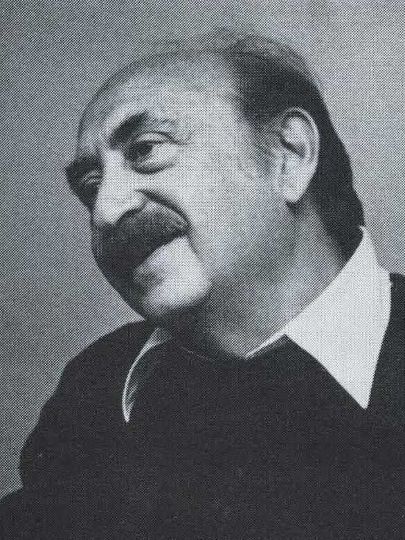
Saul Bass was born in the Bronx in 1920 and came to design through evening classes at the Art Students League of New York, where he studied briefly with the Hungarian émigré designer György Kepes. His early career was in New York advertising. He moved to Los Angeles in 1946 looking for film work and stayed for the rest of his life.

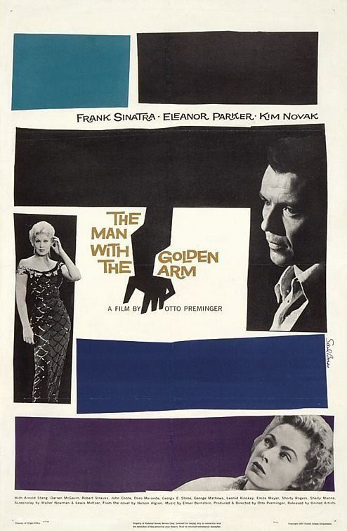
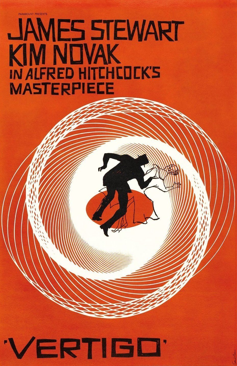
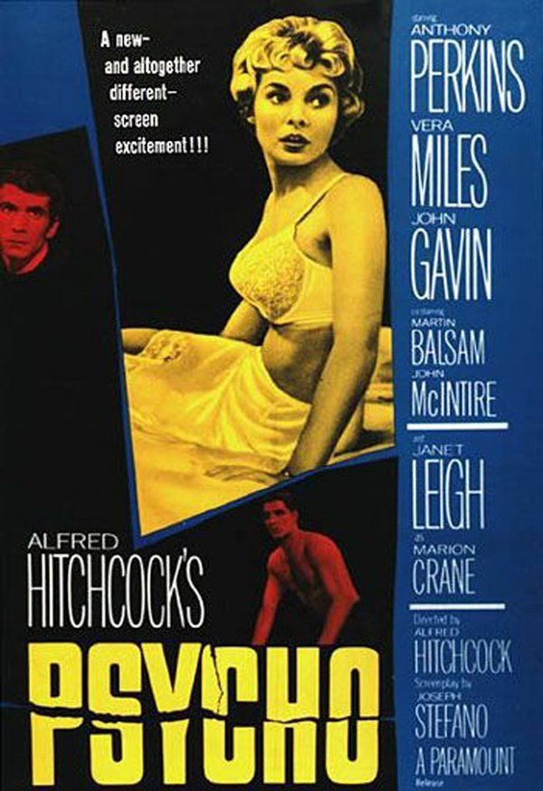
In 1954 Otto Preminger commissioned him to design the poster for Carmen Jones, then extended the brief to the opening titles. The following year, Bass’s sequence for Preminger’s The Man with the Golden Arm — white rectangular bars animated against flat typography, resolving into a rigid bent arm — treated the opening credits as a prologue rather than a formality. Studios noticed. Hitchcock hired him for Vertigo (1958), North by Northwest (1959) and Psycho (1960). Bass directed each sequence; the visual logic in each one was his.

Alongside the film work, he ran an identity practice from the same Los Angeles studio. Over four decades he designed marks for AT&T, Bell, United Airlines, Continental, Quaker Oats, Warner Communications, the Girl Scouts, Exxon, Celanese and others. Several remain in use in modified form.

He ran the studio from the late 1970s onward with his wife and creative partner Elaine Bass, who co-directed the later Scorsese sequences. His final film collaboration, Casino (1995), came one year before his death in Los Angeles in April 1996.

02

Design philosophy

Bass’s stated position, consistent across every interview and lecture he gave, was that design is an act of reduction under pressure. A title sequence has thirty seconds to establish mood. A logo has one glance to establish trust. Anything that doesn’t earn its place is noise.

“Symbolise and summarise. My initial thoughts about what a title could do was to set mood and the prime underlying core of the film’s story, to express the story in some metaphorical way.” — Saul Bass

He described title sequences as the transition between the audience’s daily life and the world of the film — not decoration, but a threshold. What interested him was economy of means: the fewest possible elements, doing the most possible work. The sharp horizontal bars of Psycho read as knives before the shower scene confirms it. The spiralling Lissajous figures of Vertigo read as obsession before the plot does. Bass treated graphic form as a narrative instrument that could work ahead of the story rather than illustrating it after the fact.

03

Key works

The Man with the Golden Arm (1955) — White rectangular bars animate against flat typography, resolving into the silhouette of a bent arm. Done frame-by-frame at a Los Angeles optical house. The sequence that changed what opening credits were for.

Anatomy of a Murder (1959) — The human body cut into separate paper pieces and animated as falling, reassembling cutouts. The same fragmented silhouette carried across poster, trade ad and Duke Ellington’s soundtrack sleeve. A graphic identity that extended the film beyond the screen.

Psycho (1960) — Horizontal bars slice the title text apart and snap it back together. A precise graphic preparation for what follows.

Vertigo (1958) — Directed with John Whitney, whose repurposed WWII anti-aircraft fire-control calculator generated the spiral Lissajous figures. Bass directed the sequence; Whitney’s machine generated the forms.

AT&T globe (1983) — The striped sphere designed after the Bell system breakup, in continuous use until 2005.

United Airlines tulip (1974), Quaker Oats (1972), Continental globe (1968), Girl Scouts (1978) — The corporate identity commissions that ran in parallel with the film titles across Bass’s peak decades, each demonstrating the same reduction principle applied to a different brief.

Casino (1995) — Bass’s final Scorsese sequence, designed with Elaine Bass. A falling figure through neon light and flame.

Iconic works

The Man with the Golden Arm (1955) poster by Saul Bass — white bars and bent-arm silhouette on black

The Man with the Golden Arm (title sequence)

1955

Title sequence for Otto Preminger's United Artists film about heroin addiction. Bass animated white rectangular bars against flat typography, building a rhythm that resolves into the silhouette of a bent, rigid arm. The sequence ran on a modest budget at a Los Angeles optical house and treated the opening credits as narrative rather than housekeeping — the first time a mainstream Hollywood film had done so consistently.
The Man with the Golden Arm (1955), United Artists. Poster by Saul Bass. · Theatrical poster. Public domain (US copyright not renewed). Wikimedia Commons. · Public domain
Vertigo (1958) poster by Saul Bass — spiral Lissajous figure with falling silhouette figures

Vertigo (title sequence + poster)

1958

Title sequence for Alfred Hitchcock's Paramount film, made in collaboration with engineer and artist John Whitney. Whitney used a mechanical analogue computer — a repurposed WWII anti-aircraft fire-control calculator — to generate the spiral Lissajous figures that open the film. Bass directed the sequence and designed the poster, combining the spiral motif with silhouetted falling figures. The mechanical origin of the spirals was not publicised at the time; Bass received sole design credit.
Vertigo (1958), Paramount Pictures. Poster by Saul Bass. · Poster image from ELEPHANT magazine editorial feature. Statutory educational licence. · AU statutory
Psycho (1960) title sequence by Saul Bass — racing horizontal bars slicing through credit text

Psycho (title sequence)

1960

Title sequence for Alfred Hitchcock's Paramount film. Bass cut parallel horizontal bars across the frame at high speed, fragmenting the credit text and then snapping it back together. The cuts were designed to feel like the slicing action the film's shower scene makes explicit — a graphic preparation for what follows rather than a decorative preamble. Bass also provided visual storyboards for the shower sequence itself, an early case of a title designer working as a visual consultant on the body of a film.
Psycho (1960), Paramount Pictures. Title sequence by Saul Bass. · Promotional still. Statutory educational licence. · AU statutory
Anatomy of a Murder (1959) poster by Saul Bass — dismembered human silhouette in black, red and orange

Anatomy of a Murder (poster + title sequence)

1959

Poster and title sequence for Otto Preminger's courtroom drama. Bass cut the human body into separate pieces — head, torso, limbs — and animated them as paper cutouts reassembling on a neutral ground. The same fragmented silhouette carried across the theatrical poster, trade advertising and the LP sleeve for Duke Ellington's jazz score, giving the campaign a unified graphic identity that extended well beyond the film itself.
Anatomy of a Murder (1959), Columbia Pictures. Poster by Saul Bass. · Theatrical poster. Public domain (US copyright not renewed). Wikimedia Commons. · Public domain
AT&T globe mark (1983) by Saul Bass — striped sphere in 12 horizontal bands

AT&T logo (globe mark)

1983

Identity mark commissioned after the 1982 consent decree required AT&T to divest its regional Bell operating companies. The striped sphere is formed from 13 horizontal bands of graduating width, suggesting a globe seen through horizontal blinds. Designed by Bass/Yager & Associates, it replaced the pre-divestiture Bell bell mark in 1984 and remained AT&T's primary identity until 2005.
AT&T globe mark (1983), Bass/Yager & Associates. · SVG reconstruction. Wikimedia Commons. Public domain (simple geometric shapes). · Public domain
United Airlines tulip logo (1974) by Saul Bass — two overlapping U-shapes forming a tulip in red, white and blue

United Airlines tulip logo

1974

Identity for United Airlines, formed from two letter U shapes overlapping at a 68-degree angle to produce a tulip and globe form in red, white and blue. The mark replaced United's earlier shooting-star identity and remained in service from 1974 until the airline's merger with Continental in 2010 — thirty-six years in continuous use, which puts it among the longer-lived Bass identity commissions.
United Airlines tulip logo (1974), Bass & Associates. · Logo Histories / LogoArchive. Statutory educational licence. · AU statutory
Quaker Oats smiling Quaker figure (1972) — Saul Bass simplified redesign

Quaker Oats logo (smiling Quaker)

1972

Redesign of the Quaker Oats Company's trademarked Quaker figure, introduced in 1972. Bass removed peripheral detail from the face and collar, strengthening legibility at small sizes and on supermarket packaging without altering the character's recognisability. The simplified mark remained the primary Quaker brand identity for decades.
Quaker Oats brand mark (1972 introduction), Bass & Associates. · Logo archive. Statutory educational licence. · AU statutory
Casino (1995) title sequence by Saul and Elaine Bass — human figure falling through neon light and flame

Casino (title sequence)

1995

Title sequence for Martin Scorsese's Universal Pictures film about Las Vegas organised crime, designed by Saul and Elaine Bass. A human figure falls through a field of neon light and flame, the colour palette drawn from the Las Vegas strip. It was the fourth and final title sequence Bass completed for Scorsese, following Goodfellas (1990), Cape Fear (1991) and The Age of Innocence (1993), and demonstrated that the formal language he had developed in 1955 remained viable across four decades of change in cinema and graphic design.
Casino (1995), Universal Pictures. Title sequence by Saul and Elaine Bass. · Still from Art of the Title documentary entry. Statutory educational licence. · AU statutory

04

Influence & legacy

Before 1955, film opening credits were a legal requirement — names, studios, unions — set in standard type and screened while audiences found their seats. After The Man with the Golden Arm, they became something a director could commission as creative work. Bass didn’t invent the idea; some European films had done interesting things with credits earlier. But he made it routine in Hollywood and gave it a formal vocabulary that the entire industry adopted.

His direct lineage runs through the studios he influenced: Pablo Ferro, Dan Perri, Kyle Cooper, R/GA’s film titles, Imaginary Forces, MK12. Working title designers still point to specific Bass sequences as the point where they understood what the job could be.

The logo work had a parallel influence. The AT&T globe, the United tulip, the Quaker figure and the Continental jetstream became reference points for postwar American corporate identity — cited alongside Paul Rand’s IBM and Chermayeff & Geismar’s Chase as examples of what reduction achieves at scale.

Bass made a significant contribution to broadening what graphic designers were hired to do on a film set. He provided storyboards for the Psycho shower scene and directed documentary material for Spartacus (1960). These were specific commissions, not a general licence — Hitchcock directed Psycho. The contribution was real; the scope is sometimes overstated.

Learn at TGDS

Bass’s economy-of-means — reduction under pressure, form as narrative instrument — runs through our typography, logo design and motion-design modules:

Courses

Further reading

Books

  • Pat Kirkham, Saul Bass: A Life in Film and Design (Laurence King, 2011) — the definitive monograph, co-authored with Elaine Bass’s archive.

Get Started.

You can enrol any day of the year. We are online and study is self-paced, there is no pressure. Enrol when you are ready to start, from anywhere in the world. If you would like to chat or email, feel free to get in touch.

Brochures, Phone Calls & Questions

You can download a free brochure, book a phone call with one of our course advisors, or simply ask a question.

Other ways to get in touch

Australia 1300 655 485

International +61 1300 655 485

Ask Anything info@thegraphicdesignschool.com

Get a quote accounts@thegraphicdesignschool.com

Acknowledgement of Country
The Graphic Design School acknowledges the Traditional Custodians of Country throughout Australia and their continued spiritual connection to land.
We pay respect to Elders past, present and emerging.
Always was, always will be.
RTO Provider № 91706