Design history · 1960s–1970s

Herb Lubalin

The New York designer who treated letterforms as characters — and rewrote expressive typography.

Herb Lubalin (1918–1981) is the American graphic designer who turned typography into emotional communication. His Mother & Child logo, the Avant Garde Gothic typeface, and U&lc magazine reshaped how editors, art directors and type designers thought about letterforms for two generations.
Herb Lubalin working at his drawing board in his New York studio, 1975
Herb Lubalin at his studio, New York, c.1975. · Photographer unknown, c.1975. Statutory educational licence.

Key facts

Born
17 March 1918, New York City, USA
Died
24 May 1981, New York City, USA (aged 63)
Nationality
American
Era
American mid-century · Expressive typography · Editorial design
Studios
Sudler & Hennessey (art director) · Herb Lubalin Inc. (founded 1964) · International Typeface Corporation (co-founder, 1970)
Known for
Mother & Child logo (1965) · Avant Garde Gothic (1970) · U&lc magazine (1973) · Eros / Fact / Avant Garde magazines for Ralph Ginzburg

01

Biography

Herb Lubalin was born in New York City in 1918 into a Jewish family whose parents had emigrated from the Russia–Lithuania border region. He enrolled at Cooper Union at seventeen and graduated in 1939 — a school whose free tuition shaped generations of American designers, and to which Lubalin would return as patron and teacher.

His early career was in advertising. He spent nearly two decades at Sudler & Hennessey, the pharmaceutical and medical-advertising agency, rising to art director. The commercial discipline shaped him: Lubalin learned to solve communication problems at speed and to make typography carry the full weight of an idea when budgets ruled out photography or illustration.

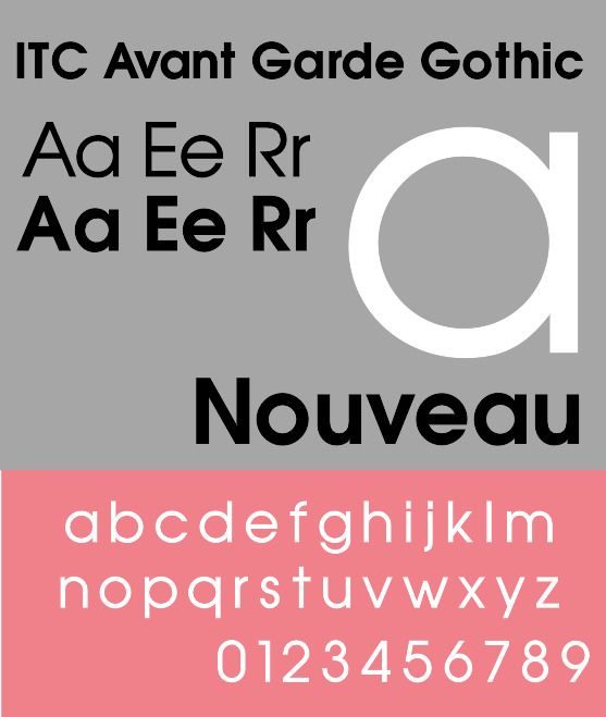
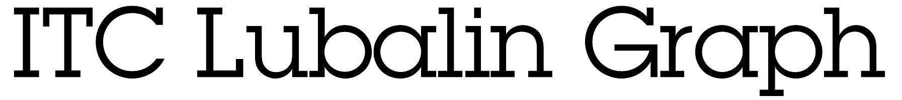
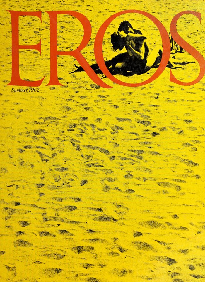
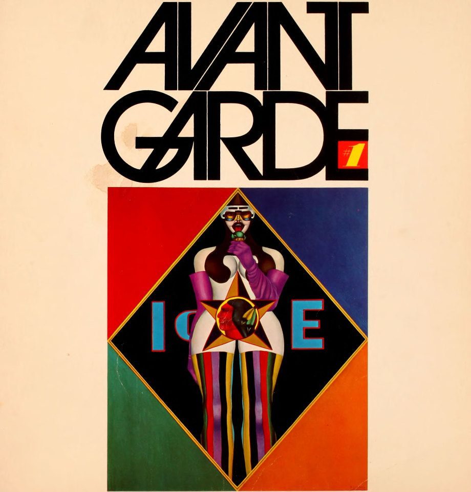
In 1964 he opened Herb Lubalin Inc. His magazine work with publisher Ralph Ginzburg — Eros (1962), Fact (1964) and Avant Garde (1968) — defined his public voice: tight, ligatured display type used as image. In 1970 he co-founded the International Typeface Corporation with Aaron Burns and Ed Rondthaler, one of the first type foundries built around the economics of photo-typesetting licensing.

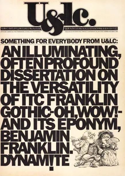
From 1973 he edited U&lc, ITC’s tabloid-format house journal, which reached a peak circulation in the hundreds of thousands. He received the AIGA Medal in 1980. He died in New York in 1981, aged 63.

02

Design philosophy

Lubalin’s governing idea was that letterforms are characters — that type carries meaning not only through what it spells but through how it behaves on the page. Where the Swiss school treated typography as a neutral instrument for information, Lubalin treated it as performance.

His working vocabulary — tight letterspacing, aggressive ligatures, overlapping forms, counters used as pictorial space — came out of the technical possibilities of photo-typesetting. Photo-type let designers kern letters to collision in ways hot-metal could not. Lubalin saw the opportunity immediately and built an expressive grammar on top of it.

The second premise: editorial typography is an argument. His magazine mastheads for Ginzburg, his Mother & Child mark, the Marriage and Families identities — each one compresses an editorial thesis into a single typographic gesture. Type, for Lubalin, is not the vehicle for content; it is content.

03

Key works

Mother & Child logo (1965) — designed for a proposed magazine that was never launched. The ampersand curves into a foetal form inside the “O” of “Mother”. A textbook example of typography-as-image, and the original is held at the Herb Lubalin Study Center at Cooper Union.

Eros, Fact and Avant Garde magazines (1962–1971) — three publications for publisher Ralph Ginzburg, each a platform for expressive editorial typography. Eros was shut down after four issues when Ginzburg was convicted under a federal obscenity statute — the Supreme Court upheld the ruling in Ginzburg v. United States (1966) — and he served eight months in prison. Fact and Avant Garde continued Lubalin’s experiment with the magazine page as typographic composition.

ITC Avant Garde Gothic (1970) — geometric sans-serif designed with Tom Carnase, drawn from the Avant Garde masthead. Its set of 26 alternate ligatures became one of the defining display looks of the 1970s.

International Typeface Corporation (1970) — co-founded with Aaron Burns and Ed Rondthaler. ITC was among the first type licensing houses built for the photo-typesetting era, and controlled an enormous share of commercial display type through the 1970s and 1980s.

U&lc magazine (1973–1999) — oversized tabloid quarterly designed and edited by Lubalin until his death in 1981. It functioned as ITC’s marketing vehicle, a type specimen, an editorial platform and the field’s most-read typographic journal simultaneously.

ITC Lubalin Graph (1974) — slab-serif companion to Avant Garde Gothic. Lubalin adapted the geometric skeleton of Avant Garde Gothic by adding rectangular bracketed serifs of equal stroke weight. One of the most licensed slab-serif designs of the photo-type era.

Iconic works

Mother and Child logo by Herb Lubalin and Tom Carnase, 1965

Mother & Child logo

1965

Logotype designed for a proposed magazine that was never launched. In the single mark, the ampersand curves into a foetal form nestled inside the counter of the "O" in "Mother", with the word "Child" set in small capitals beneath it. The original artwork is held at the Herb Lubalin Study Center of Design and Typography at Cooper Union, New York. It is among the most cited examples in typographic scholarship of letterform used as image — a single gesture that carries the editorial thesis of an entire magazine concept.
Mother & Child logo (1965). Herb Lubalin and Tom Carnase. · Communication Arts. Reproduced for educational purposes under statutory educational licence. · AU statutory
ITC Avant Garde Gothic typeface specimen showing letterforms and numerals

ITC Avant Garde Gothic

1970

Geometric sans-serif designed with Tom Carnase and released through the International Typeface Corporation in 1970. Its proportions and ligature set grew directly from the masthead Lubalin drew for Avant Garde magazine in 1968: letters fitted at near-zero tracking, with a set of 26 alternate ligatures where adjacent capitals share a common stroke. Originally issued in four weights, the family was later extended by other designers and remains commercially available through Monotype.
ITC Avant Garde Gothic typeface specimen (1970). · Typeface specimen by Inferno986return, 2014. CC BY-SA 3.0. Rasterised from SVG. Wikimedia Commons. · CC BY-SA
ITC Lubalin Graph typeface specimen showing the geometric slab-serif letterforms

ITC Lubalin Graph

1974

Slab-serif companion to Avant Garde Gothic, released through the International Typeface Corporation. Lubalin adapted the geometric construction of Avant Garde Gothic by adding rectangular bracketed serifs of equal stroke weight — a design decision that makes the two families interchangeable at the paragraph level. Later weights were completed by Joe Sundwall. The design remains commercially available and is one of the most licensed slab-serif typefaces of the photo-typesetting era.
ITC Lubalin Graph typeface specimen (1974). · Typeface specimen by VanishingDuck, 2009. CC BY-SA 3.0. Rasterised from SVG. Wikimedia Commons. · CC BY-SA
U&lc magazine Vol. 7 No. 1, March 1980 — ITC Franklin Gothic issue

U&lc (Upper and lower case) magazine

1973/1999

Tabloid-format house journal of the International Typeface Corporation, published from 1973 to 1999. Lubalin designed and edited each issue from launch until his death in 1981, treating every spread as a typographic composition in its own right. Each issue ran 16–24 pages at broadsheet scale, filled with specimen settings, editorial essays and visual experiments in the ITC type library. At peak circulation the journal reached approximately 200,000 readers worldwide — an unusual reach for a trade publication in the typographic field.
U&lc Vol. 7 No. 1 (March 1980), ITC Franklin Gothic issue. · People's Graphic Design Archive. Statutory educational licence. · AU statutory
Eros magazine No. 2, Summer 1962 — cover with red Eros logotype on yellow ground

Eros magazine

1962

Quarterly magazine published across four issues from Spring 1962 through late 1963. Ralph Ginzburg commissioned Lubalin as art director; the result was a 13 × 10-inch format printed on varying papers, using oversized display type at tight letterspacing as its governing visual language. Ginzburg was indicted under a federal obscenity statute — the charge centred not on the content of any single issue but on the deliberate targeting of a sexually suggestive mailing address when distributing the publication. The Supreme Court upheld his conviction in Ginzburg v. United States, 383 U.S. 463 (1966), and he served eight months in prison. The four-issue run is documented in Gertrude Snyder and Alan Peckolick's 1985 Lubalin monograph.
Eros No. 2, Summer 1962. Art direction and typography: Herb Lubalin. · Wikimedia Commons. Public domain. · Public domain
Avant Garde magazine issue 1, January 1968 — cover with the iconic interlocking masthead lettering

Avant Garde magazine masthead

1968

Masthead drawn with Tom Carnase for the first issue of Avant Garde magazine, published in January 1968. The interlocking capital letters — "A" sharing a stroke with "V", "G" merging into "A", the paired letters fitted to near-zero tracking — were the direct source for the ITC Avant Garde Gothic typeface released two years later. The magazine ran to 14 issues before closing in 1971; a digitised archive of all issues is held at avantgarde.110west40th.com, curated by Mindy Seu in collaboration with the Herb Lubalin Study Center at Cooper Union.
Avant Garde magazine issue 1, January 1968. Masthead — Herb Lubalin and Tom Carnase. · Avant Garde magazine archive (avantgarde.110west40th.com), curated by Mindy Seu in collaboration with the Herb Lubalin Study Center at Cooper Union. Statutory educational licence. · AU statutory

04

Influence & legacy

Lubalin’s influence runs through every designer who has ever set display type for emotional rather than informational effect. His direct collaborators — Ed Benguiat, Tom Carnase, Tony DiSpigna and Tony Stan at ITC — carried his working methods into the next decade. His editorial vocabulary reached further still, through the 1970s and 1980s magazine boom and into the digital type revival of the 1990s.

The Cooper Union — Lubalin’s own school — maintains the Herb Lubalin Study Center of Design and Typography, which holds his archive and runs public programmes. It remains one of the most active research centres for twentieth-century American graphic design.

ITC as an institution outlived him, and through the licensing of Avant Garde, Lubalin Graph, Serif Gothic and dozens of other families put his typographic vocabulary on letterheads, paperbacks and storefront signs worldwide. The tight-tracked, ligature-driven headline remains a legible mark of his influence, wherever it appears.

Learn at TGDS

Lubalin sits at the root of how we teach expressive typography and editorial design. His tight-lettered, ligature-driven approach maps directly to two courses:

Courses

Further reading

Books

  • Gertrude Snyder and Alan Peckolick, Herb Lubalin: Art Director, Graphic Designer and Typographer (American Showcase, 1985) — the primary monograph, compiled by close collaborators.
  • Adrian Shaughnessy, Herb Lubalin: American Graphic Designer (Unit Editions, 2012) — the definitive contemporary survey.
  • Steven Heller and Gail Anderson, The Typography Idea Book (Laurence King, 2016) — contextualises Lubalin within expressive editorial typography.
  • U&lc: Influencing Design & Typography (Mark Batty Publisher, 2005) — an anthology surveying the magazine’s full run.

Get Started.

You can enrol any day of the year. We are online and study is self-paced, there is no pressure. Enrol when you are ready to start, from anywhere in the world. If you would like to chat or email, feel free to get in touch.

Brochures, Phone Calls & Questions

You can download a free brochure, book a phone call with one of our course advisors, or simply ask a question.

Other ways to get in touch

Australia 1300 655 485

International +61 1300 655 485

Ask Anything info@thegraphicdesignschool.com

Get a quote accounts@thegraphicdesignschool.com

Acknowledgement of Country
The Graphic Design School acknowledges the Traditional Custodians of Country throughout Australia and their continued spiritual connection to land.
We pay respect to Elders past, present and emerging.
Always was, always will be.
RTO Provider № 91706