Design history · 1910s–1930s

El Lissitzky

The Russian artist-architect who fused Suprematism with typography and built the visual grammar of the avant-garde book.

El Lissitzky (1890–1941) was a Russian-Jewish artist, architect and typographer who brought Suprematist geometry into graphic design. His 1919 poster Beat the Whites with the Red Wedge, his PROUN paintings, and his 1923 book For the Voice with Vladimir Mayakovsky set the template for avant-garde typography that still reads as radical today.
El Lissitzky, Russian graphic designer
El Lissitzky, 1924. · El Lissitzky. Wikimedia Commons / public domain

Key facts

Born
23 November 1890, Pochinok, Smolensk Governorate, Russian Empire
Died
30 December 1941, Moscow, Soviet Union (tuberculosis)
Nationality
Russian / Soviet (Jewish)
Era
Suprematism · Constructivism · De Stijl
Training
Technische Hochschule Darmstadt, architecture (1909–1914)
Known for
"Beat the Whites with the Red Wedge" (1919) · PROUN series (1919–1923) · "For the Voice" with Vladimir Mayakovsky (1923)

01

Biography

Lazar Markovich Lissitzky was born in 1890 in Pochinok, a small town in the Pale of Settlement in the Russian Empire, and grew up in Vitebsk and Smolensk. Barred by Imperial Russia’s Jewish quota from studying architecture in St Petersburg, he travelled to Germany and enrolled at the Technische Hochschule Darmstadt in 1909, graduating as an engineer-architect in 1914.

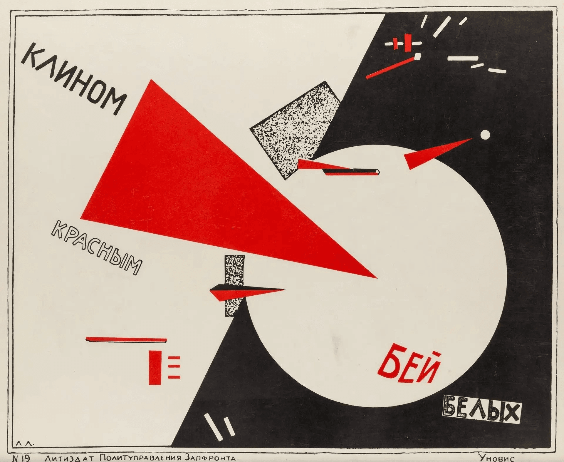
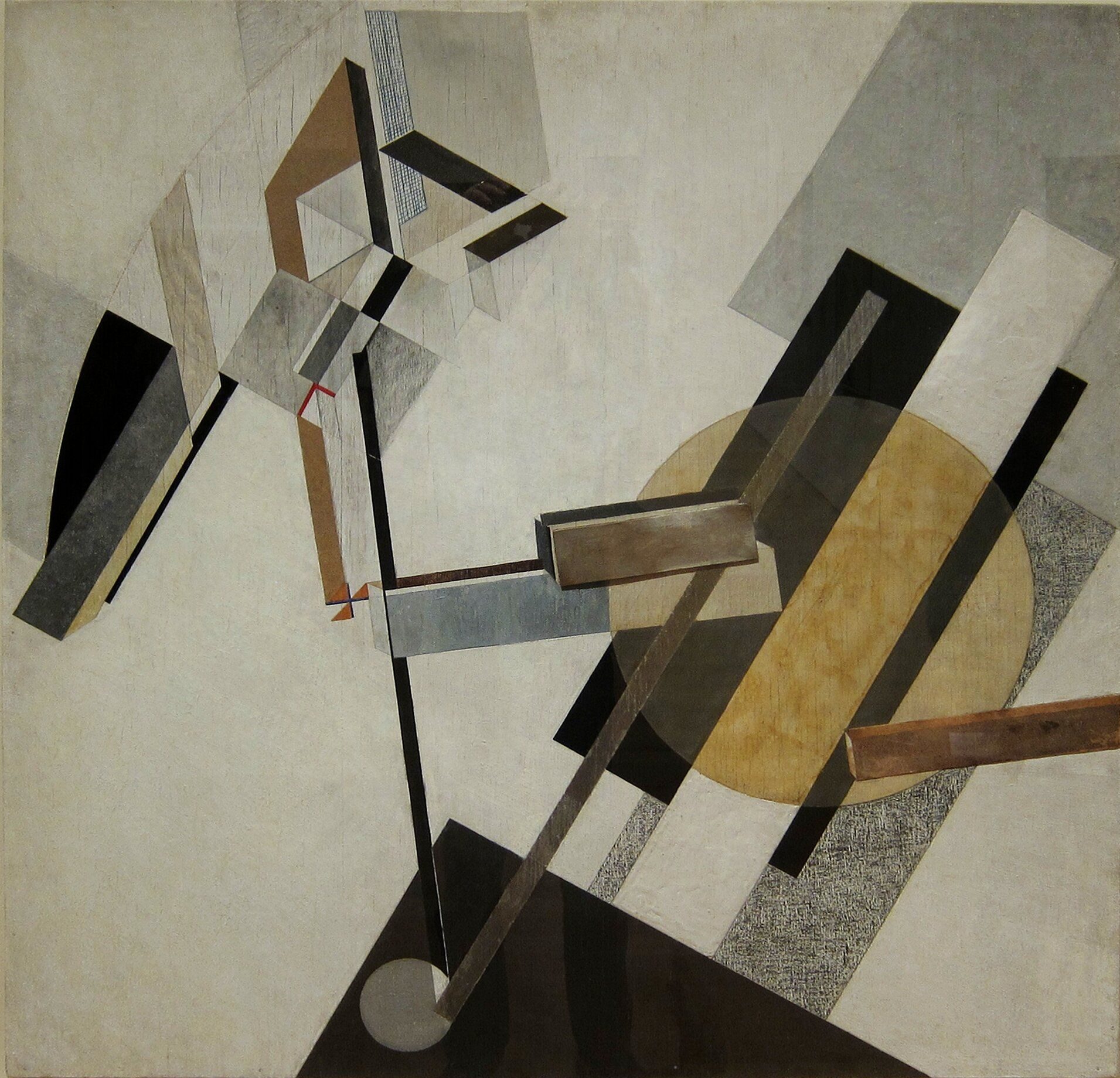
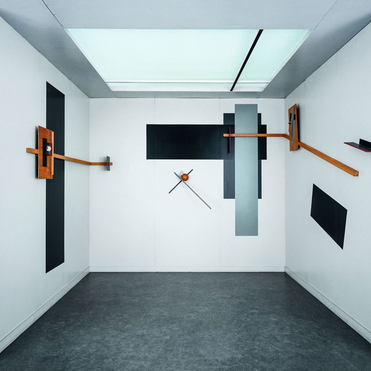
The Russian Revolution brought him back. In 1919 Marc Chagall appointed him to the faculty of the Vitebsk Popular Art School, where he met Kazimir Malevich. Lissitzky set aside figurative Jewish folk illustration and took up Suprematism — then pushed Malevich’s flat geometric language into architecture and print. The result was PROUN, a body of work he described as “the station where one changes from painting to architecture”.

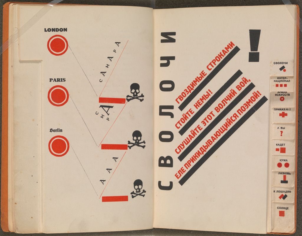
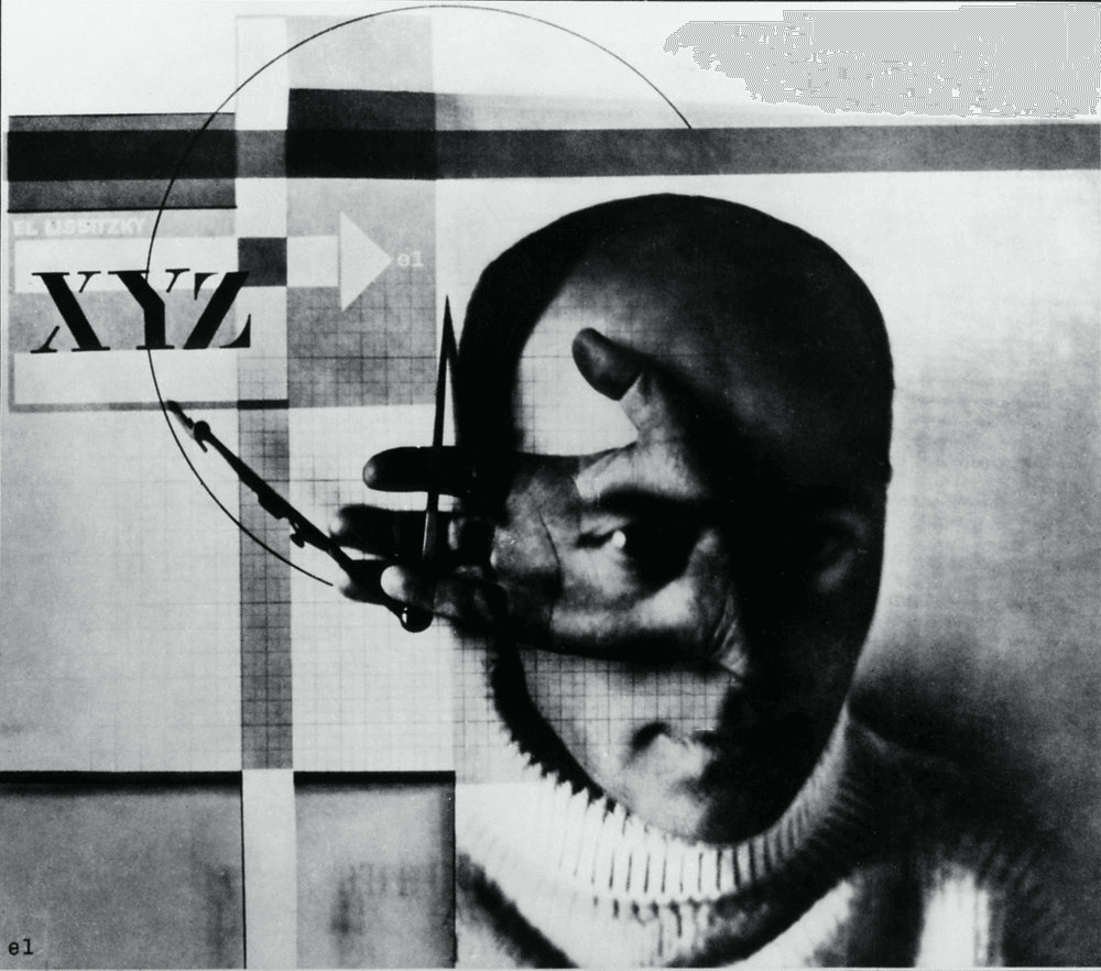
From 1921 Lissitzky taught at VKhUTEMAS in Moscow and then moved to Berlin as a Soviet cultural ambassador, where he met Theo van Doesburg, Kurt Schwitters and László Moholy-Nagy. The Berlin years produced his most concentrated graphic output: Of Two Squares, For the Voice, the journal Veshch / Gegenstand / Objet edited with Ilya Ehrenburg, and his photomontage self-portrait The Constructor.

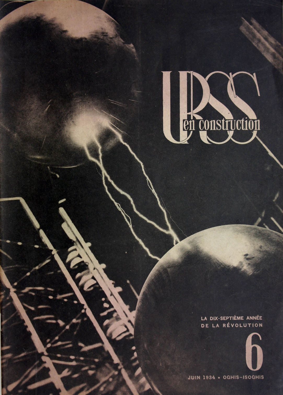
Tuberculosis cut his life short. Diagnosed in 1923, he spent the 1930s working primarily on Soviet exhibition and propaganda design, including the journal USSR in Construction. He died in Moscow in 1941, aged 51.

02

Design philosophy

Lissitzky’s central claim was that the designer is a constructor, not a decorator. Typography, poster, book, building — all were for him applications of the same constructive logic, and all served a new collective society.

“The words on the printed sheet are learnt by sight, not by hearing.” — El Lissitzky, Topography of Typography (1923)

From that premise he argued the printed page was a visual artefact first. Type should not imitate handwriting, and the book should not imitate a bound manuscript. For the Voice takes this to its logical conclusion: Mayakovsky’s poems are composed entirely from a standard compositor’s type-case, with rules, bullets and inverted letters used as visual elements — typography treated as architecture.

His second premise was spatial. PROUN treated the picture plane as a stage on which geometric elements hang in a constructed depth. That spatial thinking is what he carried into graphic design: a page is a field with vectors, not a surface with ornament.

03

Key works

Beat the Whites with the Red Wedge (1919) — lithographic poster produced in Vitebsk during the Civil War. A red triangle pierces a white circle above fragmented Cyrillic type. The first widely seen example of Suprematist geometry used as political argument.

PROUN series (1919–1923) — paintings, lithographs and installations that extended Malevich’s Suprematism into architectural space. The 1923 Prounenraum at the Grosse Berliner Kunstausstellung turned an entire room into a PROUN; a reconstruction lives at the Stedelijk Van Abbemuseum.

Of Two Squares (1920, published 1922) — a Suprematist children’s book in six lithographic plates. A red square and a black square arrive from the cosmos and reorganise Earth. Published in Berlin by Scythians Press.

For the Voice (1923) — Mayakovsky’s poems, set and designed by Lissitzky using only the materials of a compositor’s type-case. Each of the thirteen poems has a thumb-index tab. Published in Berlin by Gosizdat. The book remains a touchstone for avant-garde typography.

The Constructor (1924) — photomontage self-portrait combining the artist’s hand holding a compass over graph paper with a superimposed portrait. A direct statement of the designer-as-engineer idea.

USSR in Construction (1932–1941) — large-format Soviet propaganda journal. Lissitzky designed major issues across the 1930s, extending his typographic method into photomontage and photojournalism.

Iconic works

Beat the Whites with the Red Wedge, 1919

Beat the Whites with the Red Wedge

1919

Suprematist propaganda lithograph produced in Vitebsk during the Russian Civil War, commissioned to support Bolshevik forces. The Russian title is "Клином красным бей белых" (Klinom krasnym bey belykh), and a red triangle piercing a white circle used abstract geometry as political argument in place of figurative depiction. Prints are held in several public collections including the Museum of Modern Art, New York.
Beat the Whites with the Red Wedge (1919–20). · El Lissitzky. Wikimedia Commons / public domain · Public domain
PROUN 19D, El Lissitzky, 1920–21

PROUN 19D

1920

One of the key works from the PROUN series — the acronym stands for Project for the Affirmation of the New. Lissitzky began the series in Vitebsk in 1919 after meeting Kazimir Malevich, describing it as the station where one changes from painting to architecture. PROUN extended Malevich's Suprematism into three-dimensional space. PROUN 19D is held at the Museum of Modern Art, New York.
PROUN 19D (1920–21), oil on canvas. Museum of Modern Art, New York. · El Lissitzky. Wikimedia Commons / public domain · Public domain
Of Two Squares (Pro Dva Kvadrata), 1922

Of Two Squares (Pro Dva Kvadrata)

1922

Suprematist picture book written and designed in 1920, published in Berlin by Scythians Press in 1922. The Russian title is "Про два квадрата" (Pro Dva Kvadrata). Six lithographic plates narrate the arrival of a red square and a black square from the cosmos, subtitled "a Suprematist tale in 6 constructions". Copies are held at the Museum of Modern Art, New York, and the Harvard Art Museums.
Of Two Squares (Pro Dva Kvadrata) (1920, published 1922). Scythians Press, Berlin. · El Lissitzky. Wikimedia Commons / public domain · Public domain
For the Voice (Dlia Golosa), 1923

For the Voice (Dlia Golosa)

1923

Collaboration with the poet Vladimir Mayakovsky, published in Berlin by Gosizdat in 1923. The Russian title is "Для голоса" (Dlia Golosa), and Lissitzky set its thirteen poems using only compositor's type-case materials, giving each poem a thumb-index tab for navigation. Original copies are held at the British Library and the Museum of Modern Art, New York; a facsimile edition with commentary by Gerald Janecek was published by MIT Press in 2000.
For the Voice (Dlia Golosa) (1923). · El Lissitzky. Wikimedia Commons / public domain · Public domain
Proun Room reconstruction, Stedelijk Van Abbemuseum Eindhoven, 1965

Proun Room (Prounenraum)

1923

Room-sized installation created for the Grosse Berliner Kunstausstellung in 1923, in which PROUN geometric elements were applied to the walls, ceiling and floor as a total environment. The original was dismantled after the exhibition. A reconstruction made with the involvement of Sophie Lissitzky-Küppers, the artist's widow, is now held at the Stedelijk Van Abbemuseum, Eindhoven, which also houses the principal Lissitzky archive outside Russia.
Proun Room (Prounenraum) (1923). Reconstruction, Stedelijk Van Abbemuseum, Eindhoven, 1965. · Stedelijk Van Abbemuseum, Eindhoven. Wikimedia Commons / public domain · Public domain
The Constructor, El Lissitzky, 1924, self-portrait photomontage

The Constructor (self-portrait photomontage)

1924

Photomontage self-portrait produced in 1924, combining a photograph of the artist's hand holding a compass over graph paper with a superimposed image of his face. The work presents the designer as constructor, consistent with the argument Lissitzky set out in "Topography of Typography" (1923). Prints are held in several public collections including the Yale University Art Gallery, New Haven.
The Constructor (1924). Gelatin silver print, 107 × 118 mm. Victoria and Albert Museum, London. · El Lissitzky. Victoria and Albert Museum (Inv. PH142-1985). Wikimedia Commons / public domain · Public domain
USSR in Construction no. 6, 1934, cover designed by El Lissitzky

USSR in Construction (SSSR na stroike)

1932

Large-format Soviet propaganda journal running from 1930 to 1941. Lissitzky designed major issues through the 1930s alongside Sophie Lissitzky-Küppers, extending his typographic method into large-format photomontage and photojournalism. The journal reached a print run of 50,000 copies across several languages and is held in major institutional collections worldwide.
USSR in Construction (SSSR na stroike), no. 6, 1934. Wikimedia Commons. · El Lissitzky. Wikimedia Commons / public domain · Public domain

04

Influence & legacy

Lissitzky’s Berlin years put him at the centre of European modernism. He worked directly with Theo van Doesburg (De Stijl), László Moholy-Nagy and Walter Gropius at the Bauhaus, Kurt Schwitters in Hannover, and Jan Tschichold in Munich. Tschichold credited Lissitzky as the decisive influence on Die neue Typographie (1928), the book that carried Lissitzky’s ideas into every German printing office.

The lineage runs from Lissitzky through Tschichold and the Bauhaus into Swiss Style, and from Swiss Style into the digital design systems of the present. The New York Russian-avant-garde revival of the 1980s (Neville Brody, early The Face typography) is a second, later wave of the same influence.

Major holdings exist at MoMA (New York), the Stedelijk Van Abbemuseum (Eindhoven), the Tretyakov Gallery (Moscow), and the Getty Research Institute. His archive sits at the Van Abbemuseum.

Learn at TGDS

Lissitzky’s constructor logic — typography as architecture, the page as a field with vectors — sits behind how we teach typography and constructed layout:

Courses

Further reading

Books

  • El Lissitzky, Of Two Squares (Scythians Press, Berlin, 1922).
  • El Lissitzky and Vladimir Mayakovsky, For the Voice (Gosizdat, Berlin, 1923). Facsimile edition with commentary by Gerald Janecek, MIT Press, 2000.
  • Sophie Lissitzky-Küppers, El Lissitzky: Life, Letters, Texts (Thames & Hudson, 1968) — the primary source, written by his widow.
  • Margarita Tupitsyn, El Lissitzky: Beyond the Abstract Cabinet (Yale University Press, 1999).
  • Peter Nisbet, El Lissitzky 1890–1941 (Harvard Art Museums, 1987) — exhibition catalogue.

Get Started.

You can enrol any day of the year. We are online and study is self-paced, there is no pressure. Enrol when you are ready to start, from anywhere in the world. If you would like to chat or email, feel free to get in touch.

Brochures, Phone Calls & Questions

You can download a free brochure, book a phone call with one of our course advisors, or simply ask a question.

Other ways to get in touch

Australia 1300 655 485

International +61 1300 655 485

Ask Anything info@thegraphicdesignschool.com

Get a quote accounts@thegraphicdesignschool.com

Acknowledgement of Country
The Graphic Design School acknowledges the Traditional Custodians of Country throughout Australia and their continued spiritual connection to land.
We pay respect to Elders past, present and emerging.
Always was, always will be.
RTO Provider № 91706