Design history · Basel school + grid-breaking typography

Wolfgang Weingart

The Swiss typographer who broke Swiss typography.

Wolfgang Weingart (1941–2021) trained in traditional letterpress at a Stuttgart type shop, then joined the Allgemeine Kunstgewerbeschule Basel in 1968 — and spent the next four decades dismantling the strict grid system he had been trained in. His 1970s typographic experiments — letter-spaced, over-printed, over-scaled, screen-layered, deliberately illegible — catalysed American and European postmodern graphic design not through manifesto but through demonstration.
Wolfgang Weingart, German-Swiss typographer, Tüllinger Vineyard, 2011
Wolfgang Weingart at Tüllinger Vineyard, 2011. Photograph by Neuwein. · Photo by Neuwein, 2011. CC BY-SA 3.0 via Wikimedia Commons.

Key facts

Born
6 February 1941, Konstanz, Germany
Died
12 July 2021, Basel, Switzerland
Nationality
German-Swiss
Era
New Wave typography · Swiss postmodernism · Basel school
Studios
Hollenstein Cliché (apprenticeship, 1958–63) · Allgemeine Kunstgewerbeschule Basel (faculty, 1968–2004)
Known for
Typographische Monatsblätter covers (1971–72) · Kunstkredit Basel poster series (1976–83) · teaching Dan Friedman, April Greiman, Willi Kunz

01

Biography

Wolfgang Weingart was born in Konstanz, southern Germany, in 1941. He did a preparatory year at the Merz Akademie in Stuttgart, then in 1958 apprenticed at Hollenstein Cliché — a traditional hand-typesetting shop in Stuttgart still setting letterpress books in metal. The five-year apprenticeship gave him craft fluency in letterpress that almost no subsequent designer of his generation had: he could feel the resistance of the platen, adjust leading by touch, compose a chase by hand.

In 1963 he moved to Basel and spent four years as an independent typographer, taking small client work and correspondence courses. In 1968, Emil Ruder and Armin Hofmann invited him to join the faculty of the Allgemeine Kunstgewerbeschule Basel (the Basel School of Design) as tutor of typography. He was 27.

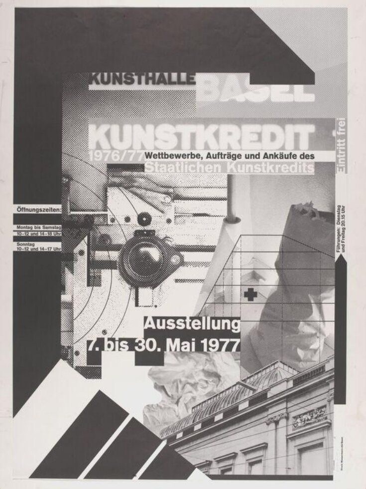
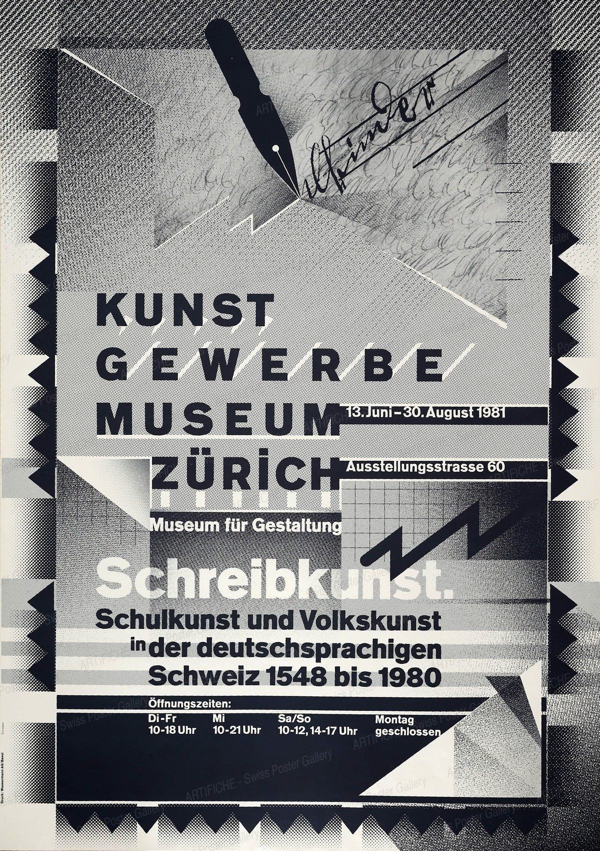
Weingart arrived at Basel trained in the strict International Typographic Style his new colleagues had helped codify. He left that style within three years — not out of reaction, but out of investigation. The 1971–72 editorial tenure at Typographische Monatsblätter is the public record of the break: letter-spaced headlines, over-printed imagery, broken grids, deliberate illegibility as a compositional tool. The TM period produced the vocabulary American writers would later call the New Wave.

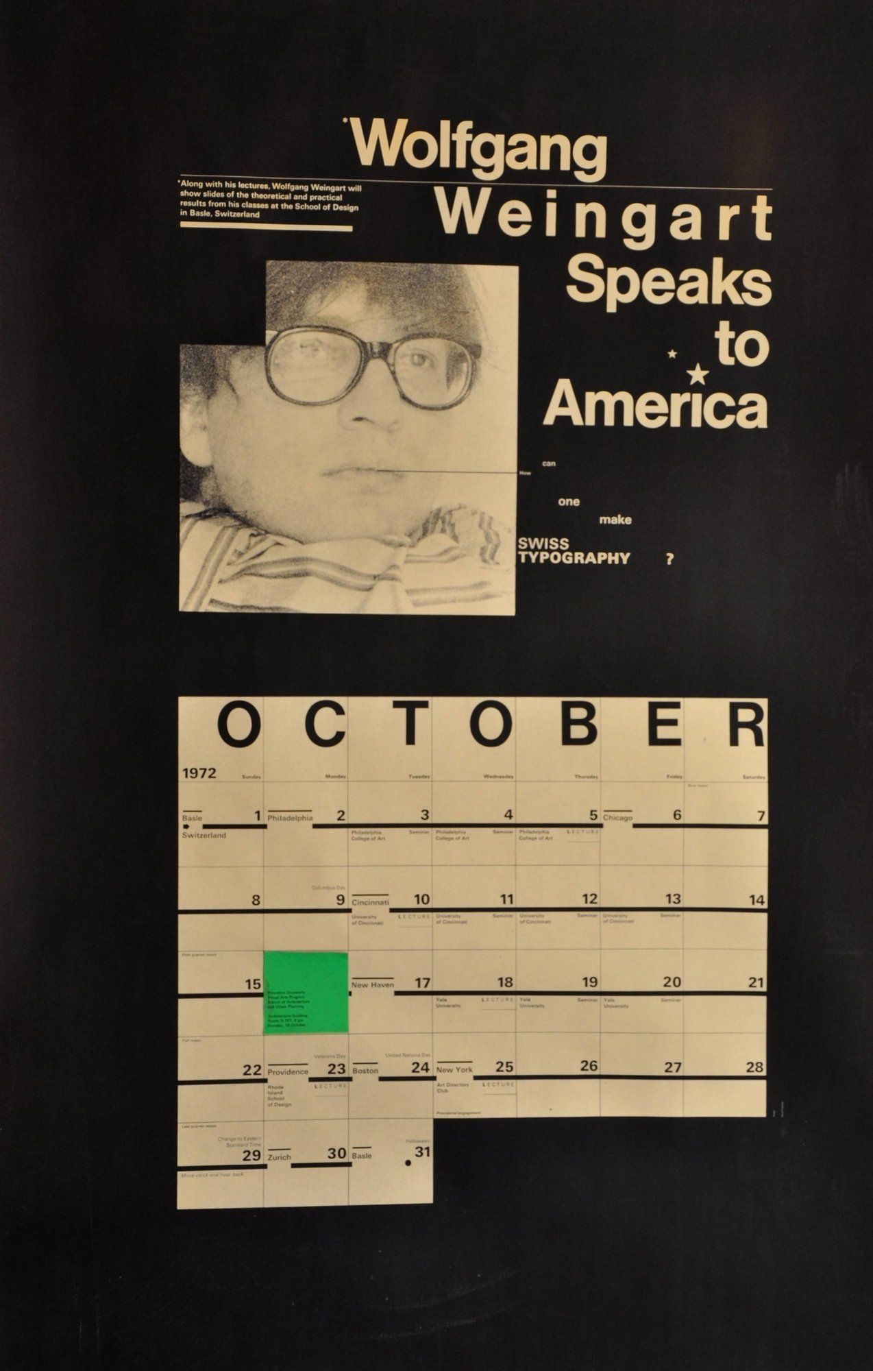
From 1974 until 1996 Weingart co-directed the Yale Summer Program in Graphic Design at Brissago on Lake Maggiore — a three-week intensive that brought American graduate students to Switzerland each summer. Together with Paul Rand’s Yale faculty, Brissago was the primary conduit transmitting Weingart’s typographic argument to American designers.

His Basel students formed the core of American postmodern typography: Dan Friedman (1968–70), April Greiman (1970–71), Willi Kunz (1967–70), Laurie Haycock Makela and dozens more. He retired from teaching in 2004 after a 36-year Basel tenure and died in Basel in July 2021. AIGA awarded him its Medal in 2013.

02

Design philosophy

Weingart’s working position — stated across lectures and in My Way to Typography — is that Swiss typography had become an orthodoxy, and orthodoxies are the death of craft. His project from 1968 onwards was to preserve the discipline of Swiss typography (grid, hierarchy, typographic craft) while refusing its aesthetic doctrine (monochrome, quiet, monolithic).

“Typography is an art. Good typography is art.” — Wolfgang Weingart

Three commitments organised the work. Typography as investigation: Weingart’s Basel teaching was almost entirely demonstration-based — students watched him compose, decompose, and re-compose a single piece of text across dozens of variants. The finished artefact mattered less than the process of arriving at it.

Disruption as technique: His signature moves — extreme letter-spacing, over-printing, typographic staircases, deliberate typographic “mistakes” — were not anti-Swiss but an excavation of what the Swiss tradition had suppressed. The 1970s posters are studies in what the Swiss grid does when it is deliberately strained.

Historical reference as material: Weingart taught the history of typography — Gutenberg, Tschichold, Renner — as the base from which contemporary experiments should work outwards. His posters routinely quote historical typographic specimens at radically shifted scale, making the quotation itself part of the composition.

03

Key works

Typographische Monatsblätter editorial period (1971–72) — cover designs and typographic essays for the Swiss typography journal. The first published record of Weingart’s departure from Swiss orthodoxy; the series in which the New Wave vocabulary was worked out issue by issue.

Kunstkredit Basel poster series (1976–83) — annual state arts-grant posters. The 1977 edition — “Kunsthalle Basel Kunstkredit 76–77” — is held by MoMA, the V&A, and LACMA. It applies hand-layered lithographic screens to make the printing process’s rosette pattern the poster’s dominant visual element.

Schreibkunst poster (1981) — calligraphic specimens layered over gridded type at extreme scale contrasts. Held at LACMA (accession M.2015.102.1). The poster argues that modernist grids and historical calligraphy are cumulative rather than opposed — a characteristically Weingart reversal of the standard modernist account.

18 Didone lecture poster series (1988) — systematic typographic variations on a single Didone typeface. Treated as a demonstration sequence rather than stand-alone posters; the series is the clearest record of Weingart’s “typography as investigation” method in its most portable form.

My Way to Typography (2000) — Lars Müller Publishers autobiography and teaching document, over 500 pages. The primary source for Weingart’s account of his own practice.

Iconic works

Typographische Monatsblätter issue 5, May 1972, cover designed by Wolfgang Weingart

Typographische Monatsblätter covers (TM)

1972

Cover designs for Typographische Monatsblätter (TM) during Weingart's editorial tenure from 1971 to 1972. TM was the Swiss Typographers' Union journal, founded 1933, and the primary public forum for Weingart's experiments. He applied letter-spaced headlines, over-printed imagery, broken grids, and deliberate illegibility as compositional tools — all using letterpress techniques he had mastered in Stuttgart. The 1972 TM issues are the first published record of what American writers later called the New Wave. Weingart served on the TM editorial board from 1970 to 1988 and produced the "TM Communication" supplement series from 1972 onwards. The Letterform Archive, San Francisco, holds fifteen original covers from the 1972–73 print runs alongside process materials donated by former Weingart student Jim Farris.
Typographische Monatsblätter issue 5, May 1972. Cover designed by Wolfgang Weingart. · Cover photograph from Modernism101 dealer inventory. Typographische Monatsblätter issue 5, May 1972. Statutory educational licence. · AU statutory
Kunsthalle Basel Kunstkredit 76–77 poster, 1977, by Wolfgang Weingart

Kunstkredit Basel — 1977/78 poster

1977

Poster for the annual Basel state arts-grant programme, part of a series commissioned from 1976 to 1983. The 1977 edition — "Kunsthalle Basel Kunstkredit 76–77", offset lithograph, 128 × 90.2 cm — is held in the permanent collections of the Museum of Modern Art, New York, the Victoria and Albert Museum, London, and the Los Angeles County Museum of Art. Weingart built the composition by hand-layering lithographic screens to foreground the half-tone dot as visible material — the rosette pattern that the printing process normally suppresses becomes the poster's dominant graphic element. The technique of making the process visible rather than concealing it is the clearest single statement of his working method.
Kunsthalle Basel Kunstkredit 76–77 poster (1977). Offset lithograph, 128 × 90.2 cm. Victoria and Albert Museum, London. · © Victoria and Albert Museum, London. Museum number: E.2179-2009. Statutory educational licence. · AU statutory
Schreibkunst exhibition poster, Museum für Gestaltung Zürich, 1981, by Wolfgang Weingart

Schreibkunst (The Art of Writing) exhibition poster

1981

Poster commissioned by the Kunstgewerbemuseum Zürich (now Museum für Gestaltung Zürich) for the 1981 exhibition Schreibkunst, tracing Western writing traditions from 1548 to 1980. The offset lithograph (127.64 × 90.17 cm) is held at the Los Angeles County Museum of Art (accession M.2015.102.1). Weingart combined calligraphic specimens, a fountain-pen nib, and gridded type at contrasting scales to argue — in a single image — that modernist typography and historical calligraphy are not opposing traditions but connected ones. The composition is structured as a grid at the detail level even as it appears chaotic at a distance — a characteristic Weingart move in which the order is present but deliberately obscured.
Schreibkunst (The Art of Writing), Museum für Gestaltung Zürich, 1981. Offset lithograph. · Artifiche Swiss Poster Gallery. Statutory educational licence. · AU statutory
18 Didone lecture poster by Wolfgang Weingart, SFMOMA collection

18 Didone — lecture poster series

1988

Lecture-announcement posters designed during Weingart's American and Japanese teaching tours in the late 1980s, when he visited Yale, CalArts, Cranbrook, and RISD. The "18 Didone" title refers to the Didone classification — high-contrast serifs developed in the late 18th century by Firmin Didot and Giambattista Bodoni. Each poster in the series varied a single Didone typeface across a fixed format, producing a sequence rather than individual objects. The series demonstrates Weingart's "typography as investigation" method in its most direct form: the same typeface examined from eighteen angles, with the sequence as the argument. Held in the SFMOMA collection (accession 2014.776, gift of Aaron Marcus).
18 Didone lecture poster (c. 1988). Gift of Aaron Marcus. San Francisco Museum of Modern Art. · San Francisco Museum of Modern Art (SFMOMA), accession 2014.776. Gift of Aaron Marcus. Statutory educational licence. · AU statutory
Weingart — My Way to Typography, Lars Müller Publishers, 2000, book cover

Weingart — My Way to Typography

2000

Published by Lars Müller Publishers, Baden, Switzerland, in 2000 (ISBN 978-3-03778-013-2), with a revised edition in 2014 titled Wolfgang Weingart: Typography. The book covers Weingart's complete career from his Hollenstein apprenticeship through his four decades at Basel, reproducing student exercises, process materials, and finished work across more than 500 pages. It is the primary published source for Weingart's own account of his typographic practice — part autobiography, part expanded teaching document. The 2000 edition is organised chronologically; the 2014 revision adds critical essays by former students and colleagues.
Weingart — My Way to Typography (Lars Müller Publishers, 2000). ISBN 978-3-03778-013-2. · Publisher product image from Lars Müller Publishers. Statutory educational licence. · AU statutory

04

Influence and legacy

Weingart’s most direct legacy is the generation of American typographers he trained at Basel and Brissago. Dan Friedman, April Greiman, Willi Kunz, Laurie Haycock Makela — each carried the Weingart vocabulary back to the United States in the 1970s and applied it to American conditions. The 1980s American postmodern typography movement is in significant part a Basel export.

His teaching model — demonstration-based, investigation-oriented, typography-as-discipline — shaped Basel typographic pedagogy for four decades and influenced American graduate programmes (Yale, CalArts, Cranbrook, RISD) that imported Basel-trained faculty.

His refusal of the Swiss-postmodern binary — holding typographic craft while breaking stylistic orthodoxy — opened ground that designers across the 1980s and 1990s occupied. Neville Brody at The Face, Rudy VanderLans and Zuzana Licko at Emigre, Jonathan Barnbrook and Peter Bilak all work on terrain Weingart cleared, though none of them would describe their work as Weingart-derived. That is partly the measure of how completely his experiments were absorbed.

Learn at TGDS

Weingart’s typography-as-investigation method — breaking the Swiss grid from within, demonstration-based teaching, historical reference as working material — maps to our typography fundamentals and grid modules:

Courses

  • Certificate IV in Design (CUA40720) — covers typography fundamentals, grid systems, and the Swiss typographic tradition Weingart broke open from inside.
  • Intensive Foundation Course — 11 modules in typography, layout and image-making. The same Swiss-grid foundation Weingart was trained in before he departed from it.

Related movements & people

Further reading

Books

  • Wolfgang Weingart, Weingart: My Way to Typography (Lars Müller, 2000).
  • Wolfgang Weingart, Typography (Lars Müller, 2014) — retrospective monograph.
  • Richard Hollis, Swiss Graphic Design: The Origins and Growth of an International Style 1920–1965 (Laurence King, 2006).
  • Steven Heller, “The Graphic Design of Wolfgang Weingart” (PRINT, 2013).
  • Rick Poynor, No More Rules: Graphic Design and Postmodernism (Yale University Press, 2003).

Online

Get Started.

You can enrol any day of the year. We are online and study is self-paced, there is no pressure. Enrol when you are ready to start, from anywhere in the world. If you would like to chat or email, feel free to get in touch.

Brochures, Phone Calls & Questions

You can download a free brochure, book a phone call with one of our course advisors, or simply ask a question.

Other ways to get in touch

Australia 1300 655 485

International +61 1300 655 485

Ask Anything info@thegraphicdesignschool.com

Get a quote accounts@thegraphicdesignschool.com

Acknowledgement of Country
The Graphic Design School acknowledges the Traditional Custodians of Country throughout Australia and their continued spiritual connection to land.
We pay respect to Elders past, present and emerging.
Always was, always will be.
RTO Provider № 91706