Design history · 1980s–1990s postmodern practice

Tibor Kalman

The designer who insisted graphic design has something to say — and a duty to say it.

Tibor Kalman (1949–1999) is the Hungarian-American designer whose studio M&Co and magazine Colors made the case that graphic design is a form of public discourse. A mentor to Stefan Sagmeister and an engine of late-twentieth-century design conscience, his insistence on meaning over surface reshaped what designers thought the job was for.

Key facts

Born
6 July 1949, Budapest, Hungary
Died
2 May 1999, San Juan, Puerto Rico
Nationality
Hungarian-American
Era
Postmodern · Socially-engaged design · Editorial
Studios
M&Co (founder, 1979–1993; 1997–1999) · Colors magazine (editor-in-chief, 1991–1995)
Known for
Colors magazine · M&Co · Talking Heads album art · Benetton editorial direction · designer-as-provocateur ethic

Biography

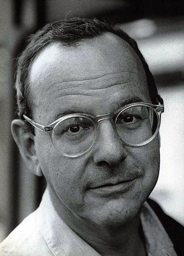
Tibor Kalman was born in Budapest in 1949 to a Jewish family that fled Hungary during the 1956 uprising. He grew up in Poughkeepsie, New York, and entered New York University in 1967, initially studying journalism and history. Politics pulled him in — he dropped out to work in a Cuban-solidarity brigade and later returned to take a poorly-paid in-house design job at the then-struggling Barnes & Noble bookstore, where he taught himself graphic design on the job through the 1970s.

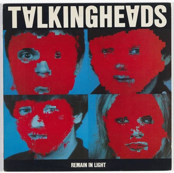
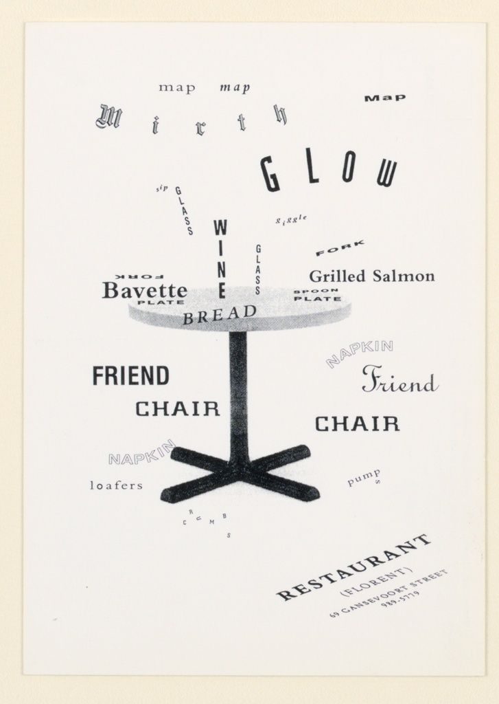
In 1979 he left Barnes & Noble and founded M&Co with his wife Maira Kalman, deliberately cultivating a studio that would take commercial work as a means of subsidising ideas work. Through the early 1980s M&Co built a reputation on album art (Talking Heads, David Byrne, Brian Eno), restaurant and shop identities (Florent, Restaurant 44, Red Square), and a growing suspicion of graphic design as a vocation.

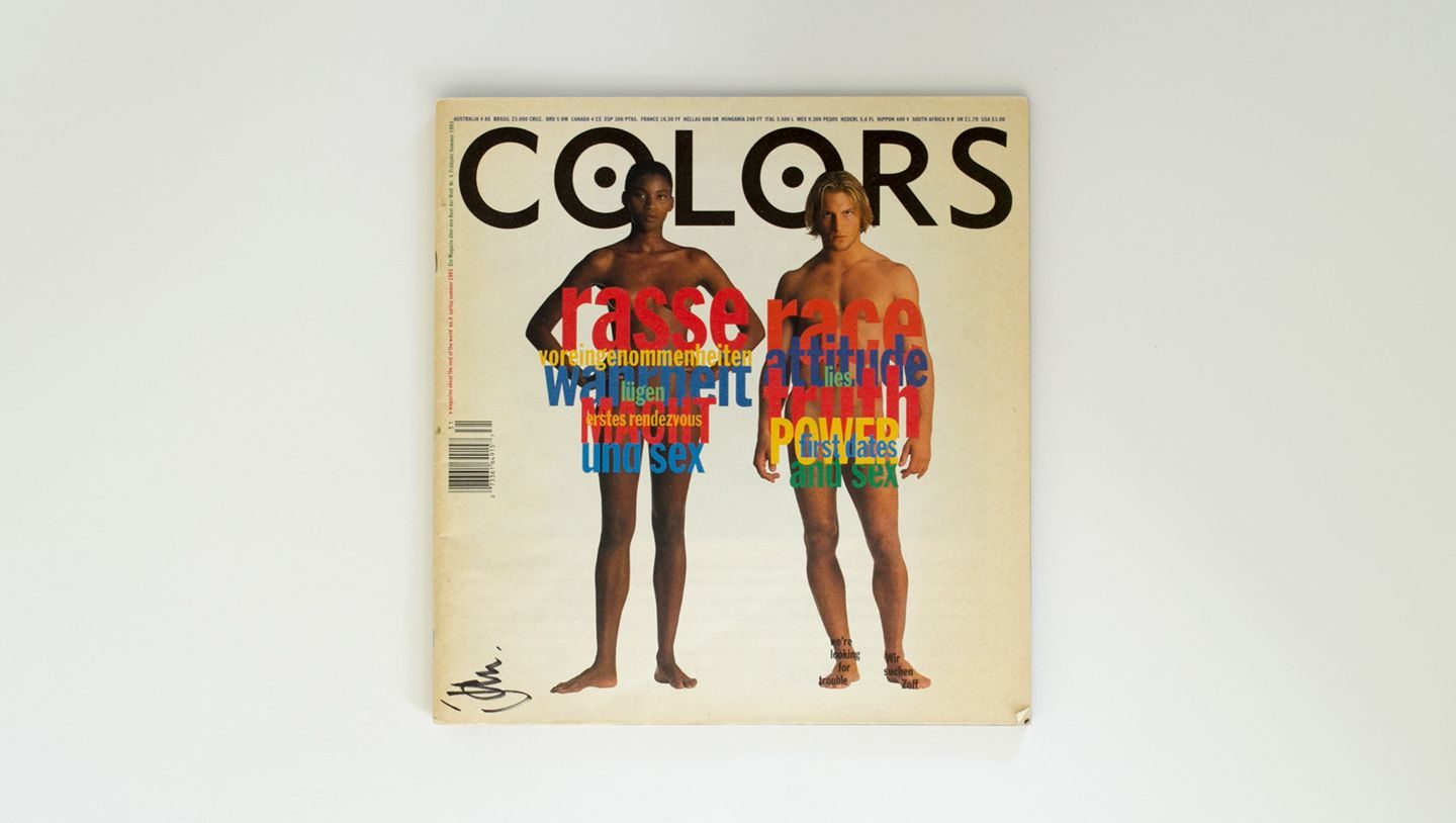
In 1991 Kalman was invited by Oliviero Toscani and Luciano Benetton to edit Colors, the quarterly magazine Benetton funded but did not direct. He moved M&Co to Rome for four years and produced 13 issues organised around single social themes — race, AIDS, ecology, shopping, death. The magazine became the most widely-circulated socially-engaged editorial design of the 1990s.

He closed M&Co in 1993 to edit Colors full-time, reopened it in 1997 after falling out with Benetton, and was diagnosed with non-Hodgkin lymphoma shortly after. He died in Puerto Rico in May 1999, aged 49. His mentorship of Stefan Sagmeister — who briefly worked at M&Co in 1993 before founding Sagmeister Inc. — carried forward his designer-as-author ethic into the 2000s.

Design philosophy

Kalman’s working premise was blunt: graphic designers work in a public medium, and have a corresponding civic duty. The 1998 manifesto he co-wrote with Karrie Jacobs and Michael Bierut, “Good Design Is a Good Idea”, restated the position plainly — design is a verb; beauty without argument is ornament.

“You have to choose between one of two paths — to work for yourself by working against the design establishment, or to work within the system and try to wake it up.” — Tibor Kalman

Three commitments organised the work. First, heterogeneity. Kalman designed consistent identities the way a photographer develops a project — through variation, not repetition. Restaurant Florent’s identity system rejected the brand-guideline orthodoxy and is still studied as the counter-example.

Second, anti-slickness. M&Co deliberately cultivated a vernacular look — hand-lettering, found typography, cheap paper stocks — long before it was fashionable. The studio’s rule was that polish is the enemy of attention.

Third, meaning over form. Colors magazine ran on the principle that a graphic designer can move the needle on a social question as effectively as a columnist can. It succeeded often enough to establish the category.

Key works

Talking Heads — Remain in Light (1980) — red-painted portraits of the band members, computer-manipulated at a time when “computer- manipulated” meant a mainframe and three weeks of rendering. One of the first albums to use digital image-making as an aesthetic decision, not just an affordability shortcut.

Restaurant Florent identity (1985) — the Meatpacking District 24-hour diner whose logo, menus, matchbooks and business cards all looked different by design. The identity that made the case against corporate consistency.

Colors magazine issue 4 — “Race” (1993) — featured a digitally-manipulated cover of Queen Elizabeth II reimagined as a black woman, alongside similar treatments of Michael Jackson as white, Spike Lee as white, and Arnold Schwarzenegger as black. The clearest demonstration of Kalman’s “design as editorial argument” position.

Benetton United Colors campaigns (1991–1994) — Oliviero Toscani’s photography plus Kalman’s editorial direction. Ads showing a dying AIDS patient, a soldier’s blood-stained uniform, a newborn with uncut umbilical cord. The campaigns got Benetton sued repeatedly and sold clothes extremely well.

Perverse Optimist (1998) — the book Kalman authored a year before his death, co-designed with Michael Bierut. A retrospective framed not around “greatest hits” but around the arguments each project made.

Iconic works

Remain in Light album art, 1980

Talking Heads — Remain in Light album art

1980

Cover for Talking Heads' fourth studio album, commissioned by Sire Records and released 8 October 1980. Designed at M&Co with Tina Weymouth, applying computer-altered digital processing to red-painted photographs of the band's four members. The treatment is among the first widely-seen uses of digital image manipulation as primary cover art on a major-label release.
Talking Heads — Remain in Light (Sire, 1980). · Tibor Kalman, TalkingHeads, Tina Weymouth, Chris Frantz Album cover for TalkingHeads, Remain in Light 1980 · Museum editorial
Restaurant Florent identity, 1985

Restaurant Florent identity

1985

Identity system for Florent Morellet's 24-hour diner at 69 Gansevoort Street, New York City (Meatpacking District), commissioned in 1985 and sustained through the restaurant's closure in 2008. Different typefaces, paper stocks, and compositions were used for each application (menus, business cards, matchbooks, signage), a deliberate argument against the brand-as-consistent-wallpaper orthodoxy. M&Co treated each printed piece as an independent design problem rather than a variation on a fixed template.
Restaurant Florent identity (M&Co, 1985). · 1989 postcard 'Mirth' — Cooper Hewitt collection (accession 1993-151-304), offset lithograph, typographic arrangement with table imagery. 15.1 × 10.3 cm. · Public domain
Colors magazine issue covers

Colors magazine

1991

Quarterly magazine funded by Benetton, edited by Kalman from issue 1 (November 1991) through issue 13 (1995). Each issue took a single theme (race, AIDS, shopping, death) and treated it through photography and captions rather than extended prose. Issue 4 (race) featured a digitally-altered cover portrait of Queen Elizabeth II presented as a Black woman. Published simultaneously in English, French, Italian, and Spanish, the magazine was produced at M&Co's Rome office and distributed internationally through Benetton's retail network.
Colors magazine (Benetton / M&Co, 1991–1995). · Colors Magazine cover (specific issue from context: Issue 4, Race). Design Assembly NZ article on the New Zealand government's attempted censorship of the Queen Elizabeth image. · Museum editorial
Benetton United Colors campaign

Benetton "United Colors" editorial direction

1993

Art direction of Oliviero Toscani's photography for the Benetton United Colors campaigns during Kalman's Rome posting (1991-1995). Death-row inmates, AIDS patients, and soldiers with bloodied uniforms appeared in campaigns commissioned by Luciano Benetton that abandoned product imagery in favour of social provocation. The campaigns generated regulatory bans in several European markets and substantial commentary on the ethics of commercial advertising.
Benetton "United Colors" campaign art direction (1993). · Colors Magazine Issue 4 (1993, Races) cover — designed by Kalman, official Benetton publisher archive; includes the controversial doctored portrait series. · Museum editorial
(un)FASHION book cover, 2000

(un)FASHION

2000

Posthumously completed book published by Harry N. Abrams (New York, 2000), co-authored with Maira Kalman and finished after Tibor Kalman's death in May 1999. A photographic survey of global working and vernacular dress (uniforms, workwear, occupational clothing, folk dress) presented as a deliberate corrective to the fashion industry's commercial priorities. Research for the book was begun during Kalman's final years in New York and Rome.
(un)FASHION, Tibor & Maira Kalman (Abrams, 2000). · 2005 paperback reissue (ISBN 9780810992290); later edition, same design as 2000 hardcover. · Museum editorial
Tibor Kalman — Perverse Optimist book cover, 1998

Perverse Optimist

1998

Monograph co-edited by Peter Hall and Michael Bierut, covering M&Co's output from 1979 to 1998, published by Princeton Architectural Press (New York, 1998) and simultaneously by Booth-Clibborn Editions (London). Kalman contributed design and essays documenting the studio's working method and client selection criteria before his death in May 1999. The book remains the primary published record of M&Co's full project archive.
Tibor Kalman — Perverse Optimist (Princeton Architectural Press, 1998). · High-resolution product image from UK-based specialist print retailer; '_grande' format suggests optimized quality. · Museum editorial

Influence & legacy

Kalman’s most visible legacy is the roster of designers he mentored or hired: Stefan Sagmeister, Scott Stowell, Alexander Gelman, Emily Oberman, Bonnie Siegler — all of whom went on to shape the next two decades of New York practice. Sagmeister in particular credits Kalman for the conceptual model his own studio is built on.

His broader influence is harder to bound. The designer-as-author model Kalman proved viable at M&Co is now the default model for ambitious independent practice worldwide. Studios that run their own magazines, make their own books, take on self-initiated projects between client commissions — they are all, consciously or not, working from Kalman’s playbook.

Colors magazine’s template — single-theme issues, photography plus short captions, social argument on a Benetton budget — has been imitated (rarely equalled) by magazines and brand editorial programmes ever since. The 1991–1995 issues are still collectable and still teachable.

Learn at TGDS

Kalman’s ethic connects to several parts of our curriculum. If his approach interests you, the most direct next steps are:

Courses

  • Certificate IV in Design (CUA40720) — covers the editorial, typography and conceptual-thinking foundations that socially-engaged practice requires.
  • Intensive Foundation Course — 11 modules in typography, layout and image-making. The same craft Kalman applied across Colors and his M&Co editorial work. Certificate of completion, not the Cert IV.

Related movements & people

Further reading

Books

  • Tibor Kalman, Perverse Optimist (Princeton Architectural Press, 1998).
  • Tibor Kalman & Maira Kalman, (un)FASHION (Abrams, 2000).
  • Peter Hall & Michael Bierut (eds.), Tibor Kalman: Perverse Optimist (Booth-Clibborn, 1998).
  • Véronique Vienne, Tibor Kalman: Design and Undesign (Yale University Press, 2013).

Online

Get Started.

You can enrol any day of the year. We are online and study is self-paced, there is no pressure. Enrol when you are ready to start, from anywhere in the world. If you would like to chat or email, feel free to get in touch.

Brochures, Phone Calls & Questions

You can download a free brochure, book a phone call with one of our course advisors, or simply ask a question.

Other ways to get in touch

Australia 1300 655 485

International +61 1300 655 485

Ask Anything info@thegraphicdesignschool.com

Get a quote accounts@thegraphicdesignschool.com

Acknowledgement of Country
The Graphic Design School acknowledges the Traditional Custodians of Country throughout Australia and their continued spiritual connection to land.
We pay respect to Elders past, present and emerging.
Always was, always will be.
RTO Provider № 91706