Design history · Movements

The Bauhaus

The school that taught modernism how to see.

The Bauhaus (1919–1933) was the German school of art, design and architecture that redrew the relationship between craft, art and industry. In fourteen years it produced the grid-first, sans-serif, functional visual vocabulary that still underwrites most graphic design taught today — including the typography and layout modules at The Graphic Design School.
Bauhaus Dessau building facade — Walter Gropius, 1926
Walter Gropius, Bauhaus Dessau building, 1925–26. The workshop wing's glass curtain wall became the school's visual icon and a milestone of twentieth-century modernist architecture. · Photograph of the Bauhaus Dessau building facade, Wikimedia Commons, CC BY-SA 3.0.

Key facts

Founded
April 1919, Weimar, Germany
Dissolved
11 April 1933, Berlin (under Nazi pressure)
Locations
Weimar (1919–1925) · Dessau (1925–1932) · Berlin (1932–1933)
Directors
Walter Gropius (1919–1928) · Hannes Meyer (1928–1930) · Ludwig Mies van der Rohe (1930–1933)
Era
Weimar-Republic modernism · Constructivism-adjacent pedagogy
Known for
Unified art-craft-industry curriculum · Sans-serif typography · Grid-first layout · Preliminary Course (Vorkurs)

01

History & context

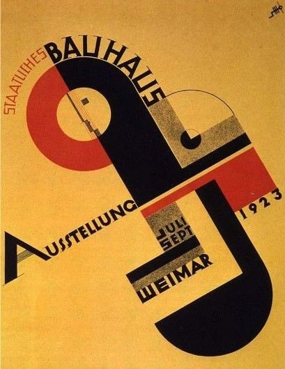
The Bauhaus was founded in Weimar in April 1919 by the architect Walter Gropius, weeks after the end of the First World War and six months after the fall of the German monarchy. Gropius combined two existing institutions — the Grand-Ducal Saxon School of Arts and Crafts and the Weimar Academy of Fine Art — into a single teaching workshop whose central claim was that fine art, craft and industrial design belonged in the same curriculum.

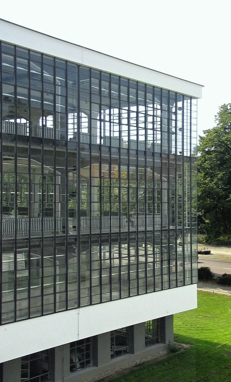
The school ran for fourteen years across three cities. Weimar (1919–1925) under pressure from conservative local authorities. Dessau (1925–1932) in the purpose-built Gropius campus that became the school’s visual icon. Berlin (1932–1933) in a rented telephone factory until the Nazi Party forced closure on 11 April 1933.

Three directors shaped its curriculum: Gropius (1919–1928, the unifier), Hannes Meyer (1928–1930, a Swiss Marxist who pushed the school towards social-housing architecture), and Ludwig Mies van der Rohe (1930–1933, who reorganised it around architecture until political conditions made continuation impossible).

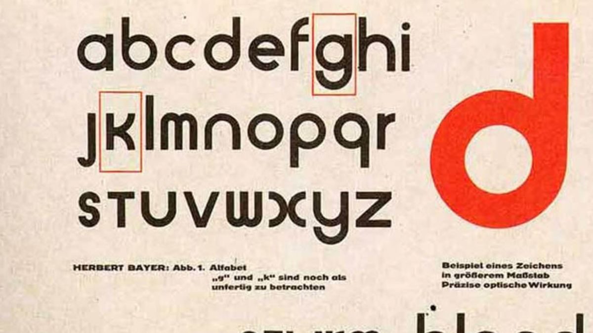
Graphic design at the Bauhaus was never a named department — the school only formalised typography as a discipline in 1925 — but every workshop produced print, posters, books and identity systems. The output was the discipline.

02

Principles

The Bauhaus operated on four load-bearing principles that still propagate through modern graphic design pedagogy.

Form follows function. Coined by Louis Sullivan and appropriated at the Bauhaus, the idea that a design’s form should be derived from what it has to do — not from historical ornament — became the movement’s spine.

“Art and technology — a new unity.” — Walter Gropius, programme for the 1923 Bauhaus exhibition

The Vorkurs (Preliminary Course). Every student, regardless of specialism, spent their first year on material studies, tactile exercises and colour theory. The course, run first by Johannes Itten and then by Moholy-Nagy and Josef Albers, is the direct ancestor of every modern art-school foundation year.

Art + craft + industry. The school’s founding premise was that artists needed workshop training and craftsmen needed aesthetic training. Both needed to understand industrial production.

Lowercase, asymmetric, sans-serif. Under Bayer’s direction from 1925, all school printing moved to lowercase Universal-alphabet geometric sans serif, asymmetric layouts and grid-based composition. Bayer’s argument: “we do not speak a capital A and a small a” — a manifesto for phonetic, rationalised typography that routed directly into Swiss postwar design.

03

Key works

Bauhaus Manifesto (1919) — Gropius’ founding programme, wrapped in Feininger’s expressionist woodcut “Cathedral”. The cover signals the school’s early expressionist phase; the text inside signals everything it would become.

Universal typeface (Bayer, 1925) — the geometric, lowercase-only sans serif that underwrote Dessau-era printing. Never released commercially, but quoted in every subsequent single-case typography argument.

Bauhaus Dessau building (Gropius, 1926) — the glass-and-steel workshop wing became one of the most photographed modernist buildings. UNESCO World Heritage site since 1996.

Moholy-Nagy’s Bauhaus Books series (1925–1930) — fourteen volumes of Bauhaus theory designed by Moholy-Nagy himself. The asymmetric, photomontaged covers are a direct precursor of the New Typography Tschichold codified the same year.

Joost Schmidt’s prospectuses and posters (1923 onwards) — exhibition posters for the 1923 Weimar show, later Dessau prospectus covers. Schmidt ran the typography workshop after Bayer’s departure and remains the least-famous but most-consistent voice of Bauhaus graphic design.

Key works & examples

Lyonel Feininger, Cathedral woodcut — Bauhaus Manifesto cover, 1919

Bauhaus Manifesto

1919

Gropius' founding statement, wrapped in Lyonel Feininger's expressionist woodcut "Cathedral". The text argued for a unified workshop where architects, painters and sculptors trained together — "the new guild of craftsmen, without the class distinctions that raise an arrogant barrier between craftsman and artist." The cover's medieval Gothic imagery was deliberate: the school was reaching back past the academy to reclaim craft knowledge it believed the industrial revolution had broken.
Lyonel Feininger, *Cathedral* (Kathedrale) — woodcut for the Bauhaus Manifesto cover, Weimar 1919. Public domain. · Lyonel Feininger, woodcut, 1919. Wikimedia Commons (CC licence via Sailko). · Public domain
Joost Schmidt, Bauhaus Ausstellung poster, Weimar 1923

Bauhaus Ausstellung poster (Joost Schmidt)

1923

Schmidt's exhibition poster for the 1923 Weimar show — the first time the Bauhaus opened its doors to the public — was produced in the school's print workshop. The composition is built entirely from circles and rectangles: no decoration, no ornament, only structure. It remains one of the clearest demonstrations of the Bauhaus argument that design method, not artistic instinct, produces visual force.
Joost Schmidt, *Bauhaus Ausstellung* (Bauhaus Exhibition) poster, Weimar 1923. Public domain. · Joost Schmidt, 1923. Wikimedia Commons, public domain. · Public domain
Herbert Bayer, Universal typeface proof sheet, c. 1926 — V&A collection

Universal typeface (Herbert Bayer)

1925

Lowercase-only geometric sans designed by Bayer at the Dessau Bauhaus. Never released commercially in its original form but its proof sheets — showing the construction geometry and unresolved characters — circulated widely. It underwrote the school's printed matter after 1925 and anchored Bayer's argument that German typography should drop capital letters entirely. The logic: we do not speak a capital A and a small a, so why write two different letter shapes for the same sound?
Herbert Bayer, Universal typeface proof sheet, c. 1926. Victoria and Albert Museum, London. · Herbert Bayer, proof sheet c. 1926. Victoria and Albert Museum collection (2006AM9802). Statutory educational licence. · Museum editorial
László Moholy-Nagy, Bauhausbücher vol. 8 cover, 1925

Bauhausbücher vol. 8 — Moholy-Nagy, Malerei Fotografie Film

1925

Moholy-Nagy designed the entire Bauhausbücher (Bauhaus Books) series — fourteen volumes of Bauhaus theory published by Albert Langen Verlag between 1925 and 1930. The covers are a direct application of the school's typography workshop: asymmetric grid, sans-serif, primary colour against white, no ornament. Volume 8, *Malerei Fotografie Film* (Painting Photography Film), was Moholy-Nagy's own text on how photography and film were reshaping visual culture. It remains among the most-read books to come out of the school.
László Moholy-Nagy, *Malerei Fotografie Film* — Bauhausbücher vol. 8 cover, 1925. Public domain. · László Moholy-Nagy, 1925. Wikimedia Commons, public domain. · Public domain
Marianne Brandt, tea service — silver and ebony, Bauhaus metal workshop, 1924

Marianne Brandt — tea service, metal workshop

1924

Brandt's metal workshop pieces are the sharpest rebuttal to the myth that the Bauhaus was purely a graphic design school. The tea service — silver and ebony, every surface resolved geometrically — was produced in the Dessau metal workshop under László Moholy-Nagy's direction. It was designed to be manufactured. The hemisphere of the pot, the disc of the lid, the angled handle: each component is a standard geometric form joined without decorative transitions. This is what "form follows function" looked like when someone actually built it.
Marianne Brandt, tea service, silver and ebony, Bauhaus metal workshop, 1924 (produced through 1929). Smart Museum of Art. · Photograph by Sailko, CC BY 3.0. Smart Museum of Art collection. Wikimedia Commons. · CC BY
Bauhaus Dessau workshop wing glass curtain wall — Walter Gropius, 1926

Bauhaus Dessau — workshop wing curtain wall

1926

The glass curtain wall of the Dessau workshop wing is the building's defining element. Gropius specified full-height glazing across three floors of the workshop block — not for decoration but to flood the workspaces with light and to make the building's structural logic visible from outside. The frame carries the load; the glass fills the frame; the wall is not a wall in the traditional sense. It is this logic, more than any single typeface or poster, that connects Bauhaus to the glass towers of postwar commercial architecture.
Walter Gropius, Bauhaus Dessau — workshop wing curtain wall, 1925–26. Wikimedia Commons, public domain. · Photograph by Cethegus, 2005. Wikimedia Commons, public domain. · Public domain
Anny Wottitz, contrast study — Vorkurs (Preliminary Course), Bauhaus c. 1923

Preliminary Course (Vorkurs) — contrast study

1923

Anny Wottitz's contrast study from Johannes Itten's Vorkurs (Preliminary Course). Every Bauhaus student, regardless of intended specialism, began with a year of material exercises: contrasting textures, weights, colours, forms. The course forced students to experience visual and tactile properties directly before learning to represent them. Itten called it "learning to see." Josef Albers, who took over part of the course from 1923, called the same exercises "learning to think visually." The Vorkurs is the ancestor of every contemporary art-school foundation year.
Anny Wottitz, contrast study — Vorkurs (Preliminary Course), Bauhaus, c. 1923. Wikimedia Commons, public domain. · Anny Wottitz. Wikimedia Commons, public domain. · Public domain

04

Influence & legacy

When the school closed in 1933, its staff scattered. Moholy-Nagy went to Chicago and founded the New Bauhaus (later IIT Institute of Design). Josef Albers went to Black Mountain College and then Yale, shaping two generations of American design education. Gropius and Mies van der Rohe went to Harvard and IIT respectively. Bayer went to the United States and a postwar career in corporate identity.

The indirect legacy is harder to bound. Swiss postwar typography — Müller-Brockmann, Ruder, Hofmann — builds directly on Bauhaus grid pedagogy. American corporate modernism — Rand, Bass, Vignelli — quotes Bauhaus principles throughout. Every art-school foundation year descends from the Vorkurs. The IKEA catalogue and every Apple product box sit somewhere on a line that starts in Dessau.

The Bauhaus’s unfinished argument — that design is a social, political, technological act, not an aesthetic preference — keeps it relevant nearly a century later. Its sealed archive in Berlin and its restored campus in Dessau both remain working research institutions.

Learn at TGDS

The Bauhaus — Vorkurs foundation, grid-first layout, Bayer’s lowercase sans-serif — sits behind the typography, grid and identity modules of our curriculum:

Courses

  • Certificate IV in Design (CUA40720) — our flagship qualification. Typography, grid, identity and layout modules all work with the Bauhaus/Swiss lineage as the reference frame.

Related movements & people

Further reading

Books

  • Magdalena Droste, Bauhaus 1919–1933 (Taschen, 1990; revised 2019). The definitive single-volume history.
  • Frank Whitford, Bauhaus (Thames & Hudson, 1984). Concise critical introduction.
  • Walter Gropius (ed.), Staatliches Bauhaus Weimar 1919–1923 (Bauhausverlag, 1923). The school’s own retrospective, now available in facsimile.
  • Jan Tschichold, Die neue Typographie (1928). The most influential typographic consequence of Bauhaus teaching.

Online

Get Started.

You can enrol any day of the year. We are online and study is self-paced, there is no pressure. Enrol when you are ready to start, from anywhere in the world. If you would like to chat or email, feel free to get in touch.

Brochures, Phone Calls & Questions

You can download a free brochure, book a phone call with one of our course advisors, or simply ask a question.

Other ways to get in touch

Australia 1300 655 485

International +61 1300 655 485

Ask Anything info@thegraphicdesignschool.com

Get a quote accounts@thegraphicdesignschool.com

Acknowledgement of Country
The Graphic Design School acknowledges the Traditional Custodians of Country throughout Australia and their continued spiritual connection to land.
We pay respect to Elders past, present and emerging.
Always was, always will be.
RTO Provider № 91706