Switzerland entered the postwar decade with two unusual assets: a banking-and-pharmaceutical economy that needed clear international communication, and two design schools — the Kunstgewerbeschule Zürich and the Schule für Gestaltung Basel — already teaching the New Typography Tschichold had codified in 1928.
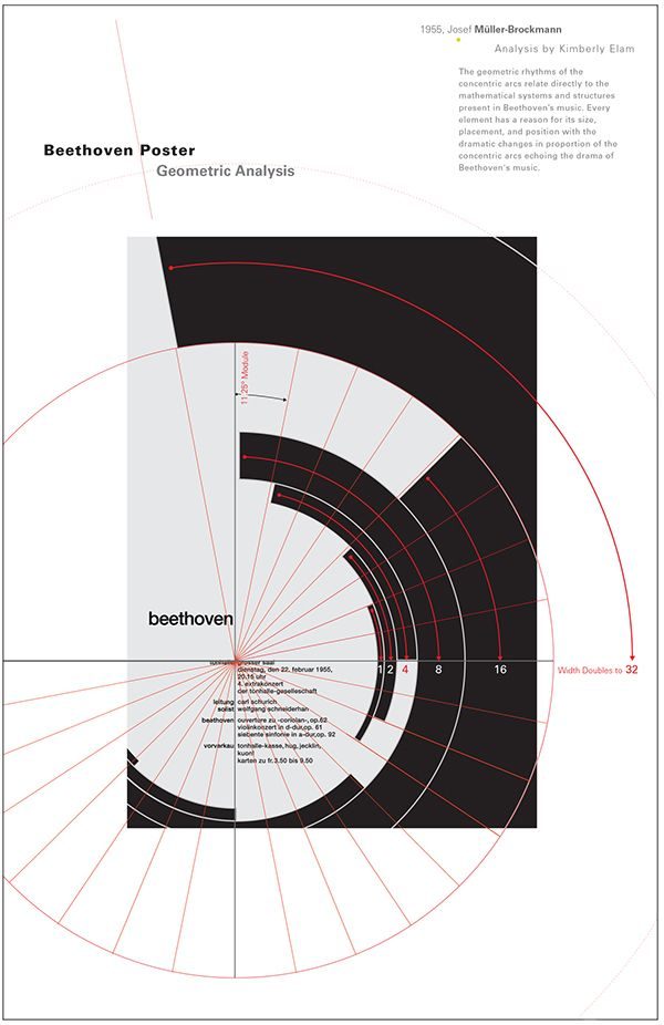
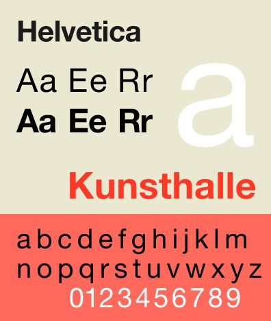
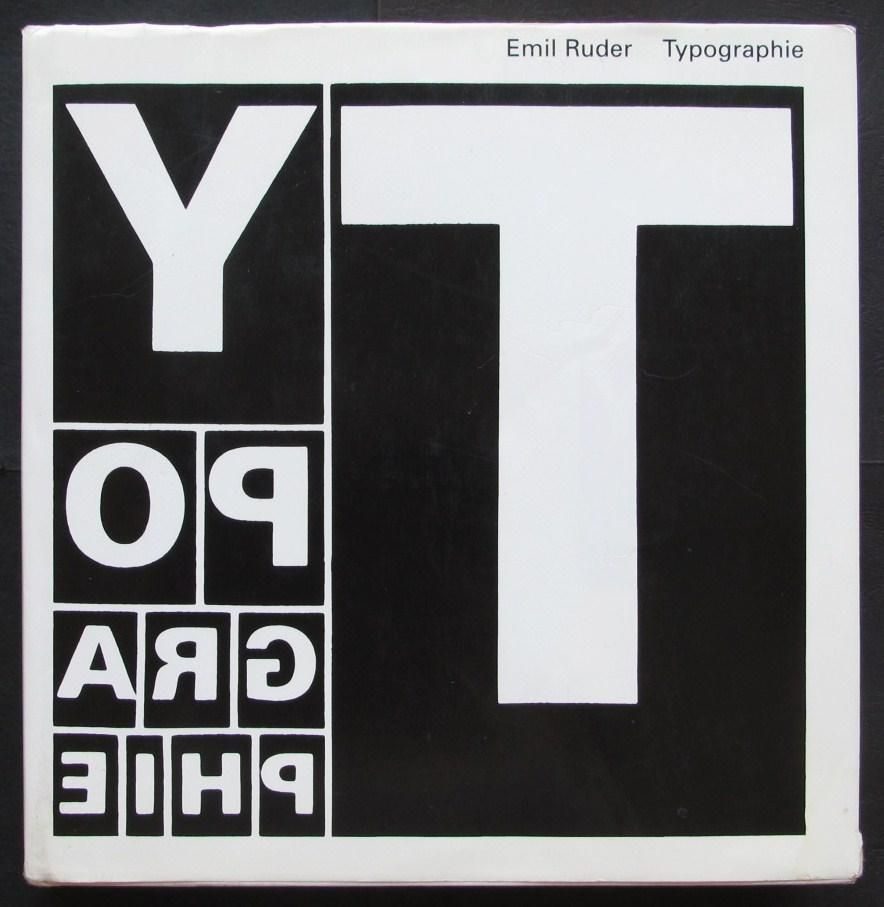
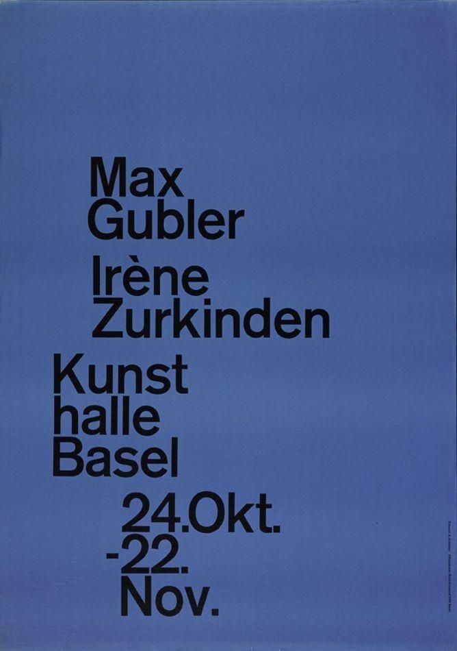
By the late 1940s, the Zürich and Basel faculties were producing a distinct graphic design language: mathematical grid systems, sans-serif typography, objective photography and asymmetric composition. The style had no manifesto. It had a curriculum and a body of work.
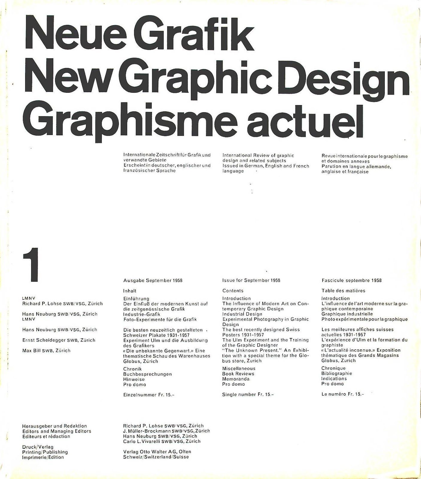
In 1958, the editors of what would become its most influential vehicle — the trilingual journal Neue Grafik / New Graphic Design / Graphisme actuel — published the first issue from Zürich. Eighteen issues over seven years exported the Swiss approach to design offices in London, New York, Milan and Tokyo. By 1965, the journal’s English-language name had supplied the style’s global label: the International Typographic Style.
The movement peaked in the 1960s, absorbed into mainstream corporate identity practice by the 1970s, and was subjected to the Basel counter-moves of Wolfgang Weingart (postmodern typography) and the American counter-moves of David Carson and Emigre magazine in the 1980s and 1990s.
Its vocabulary survived the counter-moves. The grid, the sans-serif, the asymmetric composition are now default professional practice.