Design history · 1980s record sleeve + identity

Peter Saville

The designer who turned the record sleeve into an encyclopedia of design history.

Peter Saville (born 1955) is the British graphic designer who, as co-founder of Factory Records, remade the album cover as a reference-rich art object. Sleeves for Joy Division, New Order and Factory's roster — Unknown Pleasures, Power, Corruption & Lies, Blue Monday — gave the 1980s one of its most recognisable visual vocabularies.

Key facts

Born
9 October 1955, Manchester, England
Nationality
British
Era
Postmodern record-sleeve · Reference-rich art direction · Identity
Studios
Factory Records (co-founder + art director, 1978–1992) · Peter Saville Associates (1990s) · The Apartment (c. 1999) · Independent consultancy (2004–present)
Known for
Unknown Pleasures (Joy Division, 1979) · Power, Corruption & Lies (New Order, 1983) · Blue Monday (New Order, 1983) · Manchester city brand (2004)

Biography

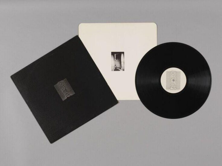
Peter Saville was born in Manchester in 1955 and trained at Manchester Polytechnic. While still a student he met the television presenter Tony Wilson and the musician Alan Erasmus, and in 1978 the three of them co-founded Factory Records. Saville’s first Factory work was the poster for the label’s opening night at the Russell Club — FAC 1, numbered as a catalogue item, a running gag Factory would maintain for every object it ever produced.

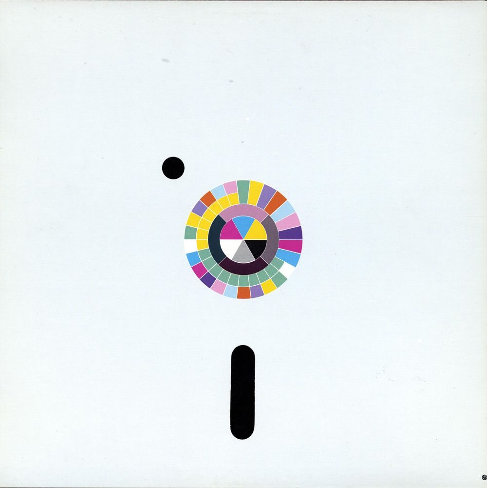
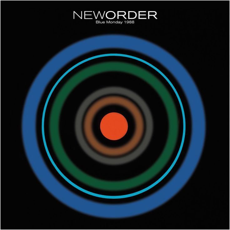
Over the next fourteen years Saville art-directed Factory in parallel with his own studio. The Joy Division and New Order sleeves are the work for which he is best known internationally, but the Factory output covered hundreds of records, posters, flyers and ephemera. He also worked as art director of the lifestyle magazine Arena from 1985 to 1988.

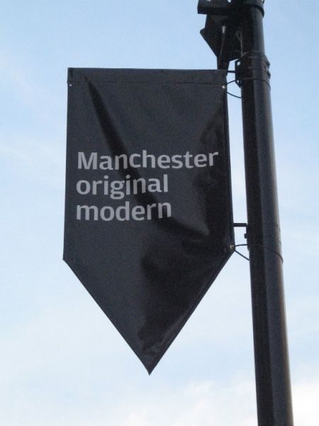
After Factory’s collapse in 1992 he moved to London and continued as an independent consultant. Subsequent commissions included work for Yohji Yamamoto, Christian Dior, Stella McCartney, Givenchy, Raf Simons and Burberry, and the long-running creative direction of the City of Manchester from 2004. He was appointed CBE in 2014.

Design philosophy

Saville’s working method is appropriation. Pull an image from design history — a Fantin-Latour painting, a Bauhaus colour wheel, a pulsar radio-frequency chart, an industrial code sheet — and let its existing cultural weight carry most of the meaning. The designer’s job is the choice, the context and the typography, not the making of a new image.

That was, in 1979, a confrontational position. The dominant assumption in post-punk record sleeve design was that the designer’s role was to illustrate the band. Saville’s argument was that the sleeve was an exhibition caption for the record, and that its visual authority came from the library of existing visual culture it could quote.

Typographically the discipline is tight. Garamond, Futura, Helvetica set small; numbers at the foot of the cover; back-of-sleeve credits more extensive than most books. The legibility of a Saville sleeve at arm’s length is low by design; the sleeve is meant to reward the reader who picks it up.

Key works

Unknown Pleasures (1979) — Joy Division’s debut, with the CP 1919 pulsar plot. No text on the front, black-on-black sleeve. The single-most-reproduced record cover of the last half-century.

Power, Corruption & Lies (1983) — New Order’s second album. Lifts Henri Fantin-Latour’s 1890 still life, runs a colour-coded alphabet cipher down the spine. The peak Saville statement of sleeve-as-found- object.

Blue Monday (1983) — 12-inch floppy-disc sleeve. Best-selling 12-inch single ever. Reportedly loss-making per unit because of the production cost. Re-issued in 1988 with a new colour system.

Technique (1989) / Republic (1993) — later New Order covers, with the same typographic discipline applied to wildly different found images (a Mediterranean cherub, a Japanese waiter, a burning house).

Manchester — Original Modern (2004) — civic identity system for the city. The long-running worked example of Saville’s method applied outside music.

Iconic works

Unknown Pleasures cover, 1979

Unknown Pleasures (Joy Division)

1979

Cover for Joy Division's debut album, released on Factory Records (FACT 10, June 1979). The central image is a stacked plot of 100 radio-pulse profiles from pulsar CP 1919, sourced from Harold D. Craft Jr.'s 1970 doctoral thesis at Cornell University and later reproduced in the Cambridge Encyclopedia of Astronomy (1977). The front carries no band name, no album title, and no typography. The sleeve was produced in black-on-black card stock with the pulsar plot printed in white. It remains among the most widely reproduced record covers of the twentieth century.
Unknown Pleasures (Joy Division, Factory FACT 10, 1979). · V&A Museum collection. Offset lithograph record inner-sleeve, 30.5 × 30.9 cm physical. IIIF-served image, editable to higher resolution by changing URL parameters. Museum holds original artifact. · AU statutory
Power, Corruption & Lies cover, 1983

Power, Corruption & Lies (New Order)

1983

Cover for New Order's second album (Factory FACT 75, released May 1983). The front image is Henri Fantin-Latour's oil painting "A Basket of Roses" (1890), held in the permanent collection of the National Gallery, London. Saville sourced the image from a National Gallery postcard rather than a formal photographic commission. A colour-coded alphabet cipher printed down the spine encodes the album title; the front face carries no text. The painting remains on display at the National Gallery.
Power, Corruption & Lies (New Order, Factory FACT 75, 1983). · Back cover: colour decoder system for Saville's cipher (band name + album title + FACT 75). Same source as front cover. · Museum editorial
Blue Monday 12-inch sleeve, 1983

Blue Monday (New Order)

1983

12-inch single sleeve for New Order (Factory FAC 73, released March 1983). The outer sleeve is die-cut and shaped to mimic a standard floppy disc, with colour-coded hole perforations corresponding to New Order's colour identity system. The production costs of the die-cutting and specialist print finish reportedly exceeded the unit sale margin, making each copy commercially loss-making for Factory Records. A revised edition with a new colour treatment was released in 1988. Blue Monday is the best-selling 12-inch single in UK chart history.
Blue Monday (New Order, Factory FAC 73, 1983). · 1988 revised edition with updated color treatment; confirmed public domain (geometric shapes/text only per Wikimedia classification) · Public domain
Manchester city brand — Original Modern

Original Modern — Manchester city brand

2004

City identity commission for Manchester City Council, developed following Saville's appointment as Creative Director for the City of Manchester in 2004. The positioning phrase "Original Modern" frames the city as a place where industrial and cultural modernity have always coexisted, from the Hallé Orchestra and the Cooperative movement through to Factory Records. The typographic system, set in Helvetica Neue, has been applied across civic signage, cultural campaigns, and the Council's official communications for more than two decades.
Manchester city brand, Original Modern (2004). · Cerysmatic Factory archive holds 13 design documentation images from the Original Modern project; relative paths extracted from primary source page · AU statutory

Influence & legacy

Saville’s Factory covers are permanent design-history reference points. The Joy Division pulsar sleeve has been reproduced on T-shirts, phone cases and corporate decks so relentlessly that its origin as a plate from the Cambridge Encyclopedia of Astronomy is now a trivia question. That kind of cultural saturation is itself a form of argument — the method works.

His direct influence runs through every record-sleeve designer of the 1990s and 2000s who treated the cover as a curated image rather than an illustration — Tom Hingston, Vaughan Oliver’s 4AD work, the Non- Format studio, and the late-1990s Blue Note Records redesigns all owe a line to him.

The Manchester civic commission, ongoing for twenty years, has also made him a reference for discussion of place-branding done without the usual market-research vocabulary. Designed by Peter Saville (Frieze, 2003) and the 2020 Design Museum retrospective remain the two best single surveys.

Learn at TGDS

Saville sits across our typography, identity and cultural-history teaching. If his work interests you, the most direct next steps are:

Courses

Further reading

Books

  • Designed by Peter Saville (Frieze, 2003).
  • Estate 1 — 2 — 3 (Peter Saville, Strelka Press, 2012).
  • Emily King, Peter Saville: Designed by Peter Saville — A New Order (Carroll / Fraut, 2003).
  • Factory Records: The Complete Graphic Album (Thames & Hudson, 2006).

Get Started.

You can enrol any day of the year. We are online and study is self-paced, there is no pressure. Enrol when you are ready to start, from anywhere in the world. If you would like to chat or email, feel free to get in touch.

Brochures, Phone Calls & Questions

You can download a free brochure, book a phone call with one of our course advisors, or simply ask a question.

Other ways to get in touch

Australia 1300 655 485

International +61 1300 655 485

Ask Anything info@thegraphicdesignschool.com

Get a quote accounts@thegraphicdesignschool.com

Acknowledgement of Country
The Graphic Design School acknowledges the Traditional Custodians of Country throughout Australia and their continued spiritual connection to land.
We pay respect to Elders past, present and emerging.
Always was, always will be.
RTO Provider № 91706