Design history · Iconic works

Nike Swoosh (Carolyn Davidson, 1971)

The $35 logo that became a global brand language.

The Nike Swoosh was designed in 1971 by Portland State University graphic design student Carolyn Davidson for a $35 fee. Fifty-plus years and several revisions later, it is one of the most recognisable marks on earth — a reference case-study for single-stroke identity design. A counter-example to "logos should be complicated" taught in our brand identity modules at TGDS.
The Nike Swoosh, Carolyn Davidson, 1971, public domain
Carolyn Davidson, Nike Swoosh mark, 1971. Public domain via Wikimedia Commons. · Public domain. Logo consists only of simple geometric shapes and does not meet the threshold of originality needed for copyright protection. Nike Swoosh is a registered trademark of Nike Inc. Used here under statutory educational licence for editorial commentary.

Key facts

Designed
1971, Portland State University, Oregon
Designer
Carolyn Davidson (then-student, later senior designer at Nike)
Fee paid
$35 initial payment · stock gift worth $643,000 in 1983 · undisclosed since
First product
Nike Cortez running shoe, 1972 Munich Olympics
Revisions
1985 (wordmark refinement) · 1995 (standalone Swoosh mark)
Known for
Single-stroke brush-like mark · Kinetic, "motion" quality · Global sportswear brand recognition

01

History & context

In 1971, Phil Knight was running Blue Ribbon Sports — a small Oregon company importing Onitsuka Tiger running shoes for American distance runners. He needed to break from Onitsuka, launch his own brand, and have a mark ready quickly and cheaply.

Knight taught accounting part-time at Portland State University. One of his students, Carolyn Davidson, was a graphic design student at the same institution. He hired her at $2 an hour.

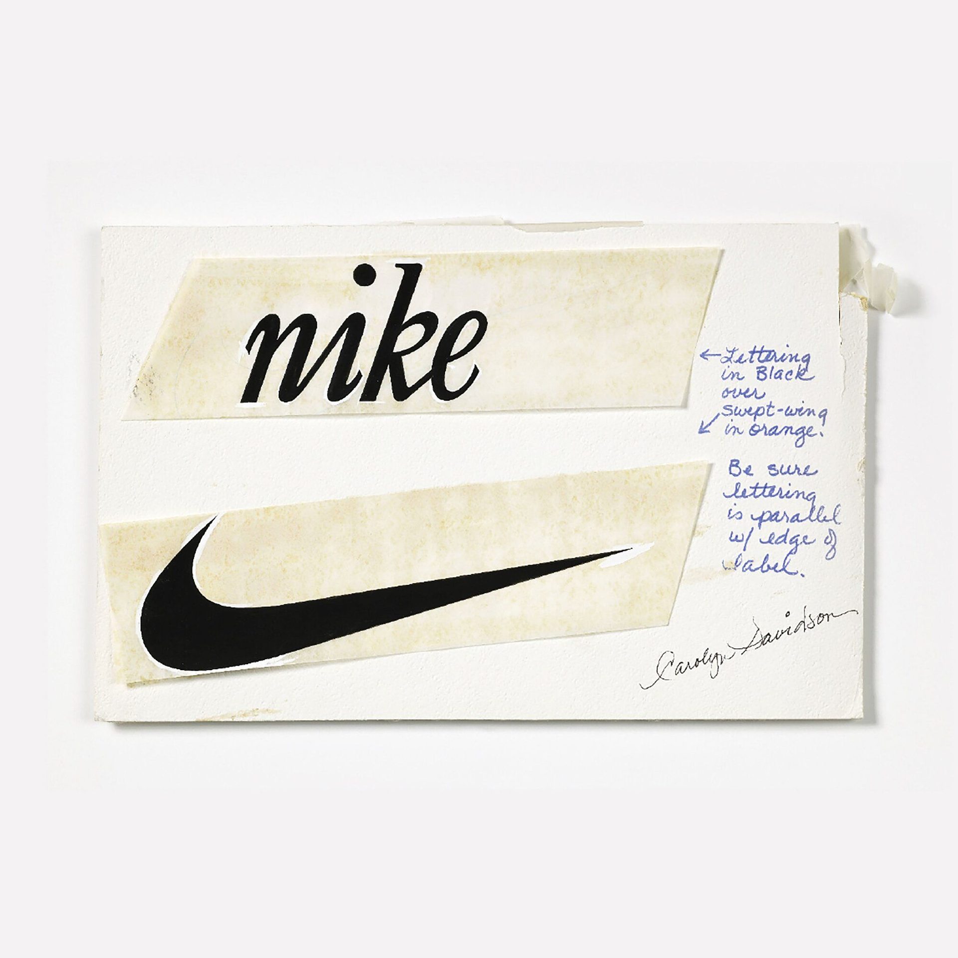
Davidson presented several options in summer 1971. The brief was loose: something that evoked motion, felt distinct from Adidas’s three stripes and the Onitsuka stripe. Davidson showed a single-stroke mark she later described as “looking like a wing”. Knight’s recorded response: “I don’t love it, but maybe it’ll grow on me.”

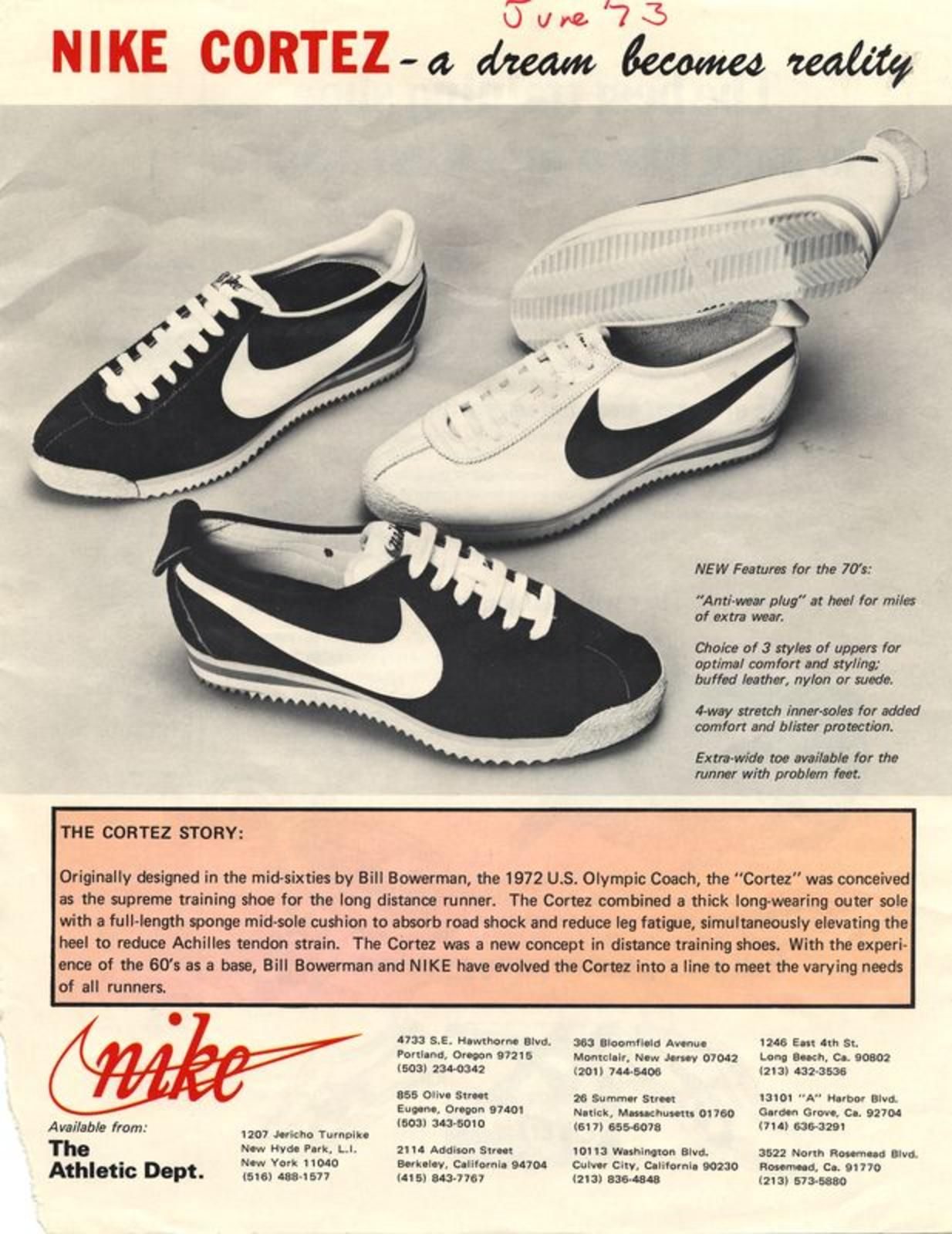
The mark appeared on its first product — the Nike Cortez running shoe — at the 1972 Munich Olympics. The name Nike, after the Greek goddess of victory, had been chosen by Blue Ribbon Sports employee Jeff Johnson just before launch. Davidson submitted her final invoice for $35 — roughly $260 in 2026 money.

In 1983, Knight invited Davidson to a company dinner and handed her a gold Swoosh ring and a certificate for 500 Nike shares, worth roughly $643,000 at the time. She kept them.

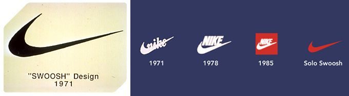
The mark was paired with the company name for most of its first 24 years — the NIKE wordmark set in Futura Bold, all caps, cradled within the Swoosh. In 1995, Nike dropped the wordmark entirely. The mark Davidson drew in 1971 had become self-sufficient. That is still the form Nike uses.

02

Design principles

The Swoosh is often cited as an example of minimalism in logo design. That framing is only partially right. More precisely, it shows how a mark can carry meaning without being representational.

Single stroke. The mark is a single continuous curve — sweeping from top-left down and back up to a point. Closer to a brushstroke than an icon. It prints in any ink, at any scale, in any colour. It works at one centimetre and on a stadium hoarding.

“I don’t love it, but maybe it’ll grow on me.” — Phil Knight, 1971

Motion in the form. The Swoosh’s asymmetry implies forward movement. The arc reads as a shape in motion, not a static symbol — which matters for a sportswear brand whose entire proposition is physical performance.

No literal reference. The mark depicts nothing: no shoe, no foot, no track, no trophy. An abstract mark does not date, and it does not tie the brand to a single product category. Nike has since sold footwear, apparel, equipment, digital services and branded experiences. The Swoosh has held across all of them.

Unchanged for 50-plus years. The mark Davidson drew in 1971 is functionally identical to the mark Nike uses now. The 1995 revision dropped the wordmark; the Swoosh itself has never been redrawn. That longevity is rare in commercial identity design.

03

Key works (variations)

Original Swoosh (1971) — Davidson’s single-stroke mark on tissue paper, presented alongside alternatives to Knight’s team. First used commercially on the Nike Cortez at the 1972 Munich Olympics.

Mark-and-wordmark phase (1972–1994) — for most of its first two decades, the Swoosh appeared alongside the NIKE wordmark in Futura Bold, all caps, cradled within the arc. This was the form used through the Air Jordan launch (1984) and the “Just Do It” campaign (1988, Wieden+Kennedy).

Standalone mark (1995) — the wordmark was dropped entirely. The Swoosh alone became Nike’s primary mark. The form Davidson drew in 1971 remains unchanged.

Reproduction reach — the Swoosh appears embossed, embroidered, debossed, screen-printed, knit, woven, moulded and digitally rendered across Nike’s global product range. The mark functions at one centimetre on a shoelace tag and at ten metres on a stadium fascia.

Brand valuation — Interbrand and BrandZ consistently place the Nike brand among the top 20 most valuable globally. The Swoosh is the primary carrier of that value — a mark generated by a $35 commission in 1971.

Key works & examples

Exhibition photograph of Carolyn Davidson's original Swoosh design drawing, 1971, Vitra Design Museum

Original Swoosh drawing (1971)

1971

Davidson's original mark, drawn on tissue paper during the summer of 1971 and presented to Phil Knight and the Blue Ribbon Sports team alongside several alternative sketches. Knight's recorded response: "I don't love it, but maybe it'll grow on me." The mark was paired initially with a lowercase wordmark. Davidson's final invoice was $35 — roughly $260 in 2026 money.
Carolyn Davidson, original Swoosh design drawing, 1971. Exhibition photograph, Vitra Design Museum. · Exhibition photograph of Carolyn Davidson's original Swoosh design drawing, 1972, from the Vitra Design Museum Form Follows Motion exhibition. Statutory educational licence for editorial commentary. · AU statutory
Nike Cortez running shoe advertisement, 1972–73, showing the Swoosh mark

Nike Cortez — first product appearance (1972)

1972

The Swoosh made its first public appearance on the Nike Cortez running shoe at the 1972 Munich Olympics. The Cortez had originally been developed by Bill Bowerman for Onitsuka Tiger as the Corsair; Blue Ribbon Sports relaunched it under the new Nike brand with Davidson's mark stitched to the upper. This was the Swoosh's commercial debut.
Nike Cortez advertisement, 1972–73. First commercial appearance of the Swoosh. · Nike Cortez advertisement, June 1973. Internet Archive. Statutory educational licence. · AU statutory
Nike Swoosh logo evolution timeline 1971 to 1995, showing mark-only and mark-with-wordmark versions

Logo evolution — 1971 to 1995

1971

The Swoosh went through two major phases across 24 years. For most of the 1970s and 1980s, it appeared alongside a NIKE wordmark set in Futura Bold — all caps, the word cradled within the mark. By the mid-1990s the brand had reached the point where the wordmark was unnecessary. In 1995 Nike standardised the standalone Swoosh as its primary mark. The mark itself — Davidson's original single-stroke curve — was never redrawn.
Nike Swoosh logo evolution, 1971–1995. Public domain via Wikimedia Commons. · Wikimedia Commons. Public domain. Nike Swoosh is a registered trademark of Nike Inc. Used here under statutory educational licence. · Public domain
Nike Swoosh standalone mark, current form since 1995, public domain

Standalone Swoosh mark (1995)

1995

From 1995, the Swoosh alone became Nike's primary mark — no wordmark, no supporting text. The decision reflected decades of consistent brand investment through sponsorship, advertising and product placement. The form Davidson drew in 1971 remains unchanged. The standalone Swoosh is now one of the most immediately recognised marks in the world.
Nike Swoosh, standalone mark, 1995 onwards. Public domain via Wikimedia Commons. · Wikimedia Commons (Logo_NIKE.svg). Public domain. Nike Swoosh is a registered trademark of Nike Inc. Used here under statutory educational licence. · Public domain

04

Influence & legacy

The Swoosh sits at an instructive pivot point in identity history. The dominant school of the same era — Rand, Bass, Vignelli, Chermayeff and Geismar — built geometric marks accompanied by thick presentation volumes explaining the logic behind every curve and proportion.

The Swoosh arrived on tissue paper for $35.

What the Swoosh makes concrete is that a mark’s meaning comes from the brand that fills it, not from the mark’s internal complexity. Nike spent fifty years investing in the Swoosh: through athlete sponsorship, the “Just Do It” campaign, the Air Jordan sub-brand, Olympics sponsorship, and global retail presence. The mark absorbed that investment and now carries it.

That argument has not displaced the Rand tradition. Rigorous, evidence-based identity systems still matter — particularly for organisations without Nike’s marketing scale. The Swoosh is a counter-example worth knowing, not a rule to follow: a mark does not need to be complicated to be effective. It needs to be reproducible, memorable, and backed by consistent long-term brand commitment.

Carolyn Davidson continued working at Nike as a senior graphic designer after 1971, contributing to packaging and product collateral. She retired in the 1980s. Her $35 commission in 1971 became one of the most consequential acts in the history of commercial graphic design.

Learn at TGDS

The Swoosh — single-stroke mark, $35 origin, fifty years unchanged — is a core reference for minimal-mark identity teaching. The most direct next steps are:

Courses

Related movements & people

Further reading

Books

  • Phil Knight, Shoe Dog: A Memoir by the Creator of Nike (Scribner, 2016). First-hand account of Blue Ribbon Sports’ launch and the 1971 Davidson commission.
  • Interbrand, Best Global Brands report (annual). Nike consistently in top 20 since 2000.
  • Naomi Klein, No Logo (Knopf Canada, 2000). Influential critical account of Nike’s brand-investment strategy in the 1990s.

Online

Get Started.

You can enrol any day of the year. We are online and study is self-paced, there is no pressure. Enrol when you are ready to start, from anywhere in the world. If you would like to chat or email, feel free to get in touch.

Brochures, Phone Calls & Questions

You can download a free brochure, book a phone call with one of our course advisors, or simply ask a question.

Other ways to get in touch

Australia 1300 655 485

International +61 1300 655 485

Ask Anything info@thegraphicdesignschool.com

Get a quote accounts@thegraphicdesignschool.com

Acknowledgement of Country
The Graphic Design School acknowledges the Traditional Custodians of Country throughout Australia and their continued spiritual connection to land.
We pay respect to Elders past, present and emerging.
Always was, always will be.
RTO Provider № 91706