Design history · Contemporary ornamental typography

Marian Bantjes

The designer who argued ornament is not a crime.

Marian Bantjes (born 1963) is the Canadian graphic artist, typographer and lettering designer who rebuilt ornament's reputation in a profession that had spent a century rejecting it. Working from Bowen Island, British Columbia, she produces editorial identities, custom lettering and book-length arguments for beauty as a serious design category.

Key facts

Born
1963, Canada
Nationality
Canadian
Era
Contemporary · Ornamental typography · Illustrative lettering · Letterpress + digital
Studios
Digitopolis (partner, 1994–2003) · Independent practice, Bowen Island, BC (2003–present)
Known for
Stefan Sagmeister collaborations (Aiga NY, Print magazine) · Saks Fifth Avenue identity · Wired magazine Valentine feature · *I Wonder* (2010) · *Pretty Pictures* (2013)

Biography

Marian Bantjes was born in Canada in 1963. She trained not as a graphic designer but as a book typesetter — working in the pre-digital and early-digital typography shops of Vancouver through the 1980s, where she learned the craft from production practice rather than from art school. She has repeatedly credited this route as the single most formative fact of her career: typesetting taught her the grid before she ever thought about breaking it.

From 1994 to 2003 she was a partner in Digitopolis, a Vancouver graphic-design studio, working on conventional identity, publication and promotional design. She co-owned the business for nine years before selling her share, moving to Bowen Island off the British Columbian coast, and reconstituting herself as an independent graphic artist rather than a graphic designer — a distinction she has defended in every subsequent interview.

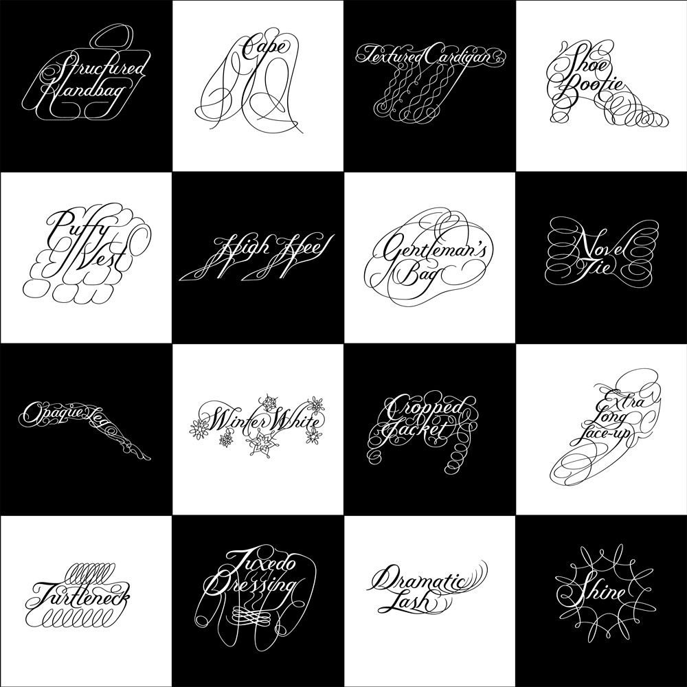
Her independent practice from 2003 onward refused the studio model entirely: no staff, no office, direct client work from a home studio. The early Bowen Island work was almost entirely hand-drawn ornamental typography — pen, ink, scanner — aimed at editorial clients (Print, Eye, Wired, The New York Times Op-Ed) who wanted something that no Adobe Illustrator combination could produce.

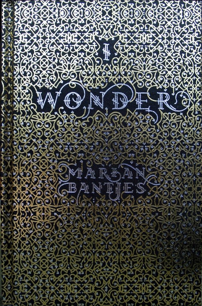
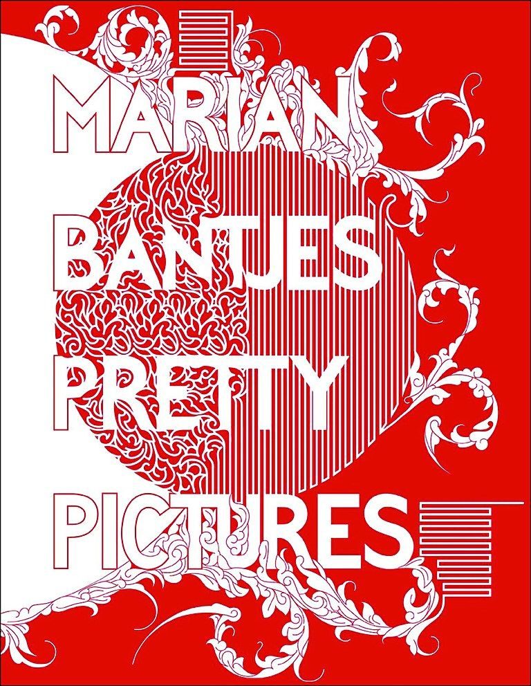
The 2007 Saks Fifth Avenue identity, commissioned by Michael Bierut at Pentagram, was the work that moved her from editorial-designer respect to identity-designer visibility. Her 2010 TED talk — “Intricate Beauty by Design” — and the companion book I Wonder established ornamental typography as a legitimate contemporary category after a century of modernist rejection.

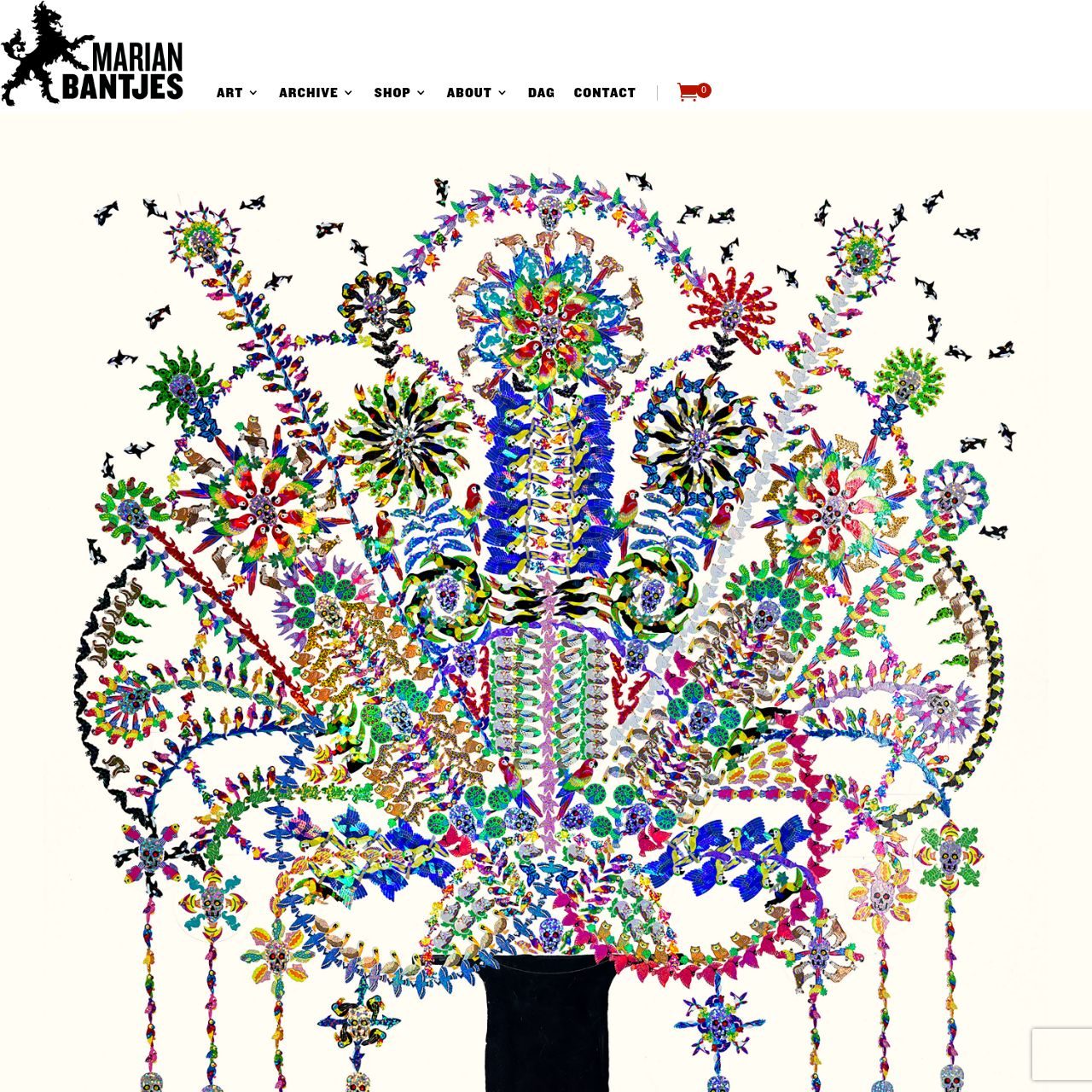
She has continued to work from Bowen Island, producing editorial covers, custom lettering commissions, book-length illustrated works, and AGI-level advocacy for beauty as a serious design category. She has taught and lectured widely but has never held a full-time teaching post.

Design philosophy

Bantjes’s position — stated clearly in her 2010 TED talk and throughout I Wonder — is that beauty is a functional property, not a decorative afterthought, and that ornament is a legitimate design tool that modernism wrongly defined out of the profession.

“Why do we assume that common sense or common taste is really common?” — Marian Bantjes, I Wonder (2010)

Three commitments organise the work. First, hand before software. Bantjes draws most of her lettering on paper before any vectorisation — not for craft-ideology reasons but because she has observed that hand-drawn marks survive scaling and reproduction in ways digital marks do not.

Second, specificity over style. Each Bantjes lettering commission is purpose-drawn for its specific publication, client and context. Her practice refuses the “signature style” that contemporary illustration culture rewards — a position she has defended repeatedly against commercial pressure to standardise.

Third, beauty as argument. I Wonder is organised around the claim that beauty is a mode of thinking. Curiosity, wonder, ornament and delight are treated as cognitive tools, not emotional reactions. This argument — with Sagmeister’s Beauty Show three years later — is the clearest contemporary rehabilitation of beauty as a design criterion.

Key works

Saks Fifth Avenue identity (2007) — ornamental reconstruction of the Saks wordmark into 64 tiles that recombine for every application. Commissioned by Pentagram’s Michael Bierut. Still the most-cited example of ornamental lettering applied at identity scale in the 2000s.

Stefan Sagmeister — Things I Have Learned in My Life So Far (custom lettering, 2005–) — several entries in Sagmeister’s long-running autobiographical project were drawn by Bantjes at Sagmeister’s commission. The recurring collaboration is one of the clearest contemporary examples of designer-to-designer lettering commissioning.

Wired magazine Valentine Issue (2008) — cover and feature-opener for the February 2008 issue, built from ornamental Valentine imagery. Demonstrated Bantjes’s ability to carry an entire magazine issue at full editorial scale.

I Wonder (2010) — Thames & Hudson / Monacelli Press book-length monograph-cum-manifesto. Every spread is custom- designed; the book is both a catalogue of Bantjes’s ornamental practice and an argument for ornament as a mode of thinking.

Pretty Pictures (2013) — Thames & Hudson retrospective covering a decade of commercial and editorial commissions. Organised chronologically and annotated by Bantjes; probably the clearest account of how contemporary lettering commissions actually work.

Iconic works

Saks Fifth Avenue identity, 2007

Saks Fifth Avenue identity

2007

Pentagram-commissioned (Michael Bierut) ornamental update of the Saks wordmark, broken into 64 tiles that could recombine for packaging, bags, and window displays. The campaign, titled "Want It", formed part of a broader Saks rebrand and appears across shopping bags, boxes, tissue paper, and window installations. One of the highest-profile identity programmes to use custom ornamental lettering in the 2000s.
Saks Fifth Avenue identity (with Pentagram, 2007). · Additional Want It campaign execution showing ornamentation and pattern integration across the seasonal signage and applications · Museum editorial
Obsession made my life worse and my work better lettering

Stefan Sagmeister — Things I Have Learned in My Life So Far (custom lettering)

2005

Custom typographic installations for Sagmeister's long-running autobiographical project. The *obsession made my life worse and my work better* piece and several later entries were drawn by Bantjes at Sagmeister's commission. Bantjes's contributions include lettering rendered in unconventional materials, among them sugar poured to resemble breakfast cereal. The broader project was published in book form by Abrams in 2008 and includes installations shown on billboards, projections, and magazine spreads worldwide.
Custom lettering for Stefan Sagmeister — Things I Have Learned in My Life So Far (2005). · Additional sugar work spread or detail shot from the Bantjes–Sagmeister collaboration, archived by The Marginalian. · Museum editorial
Wired Valentine issue feature

Wired magazine — The Valentine Issue

2008

Cover and feature-opener illustration for *Wired* magazine's February 2008 issue. Ornamental typography constructed from Valentine's imagery (hearts, roses, arrows) reading as a love letter to the magazine's technology subjects. Bantjes has produced hand-drawn valentines annually since 2005, sending them to clients and colleagues; the Wired commission extended that practice into editorial work at full magazine scale.
Wired magazine Valentine Issue (February 2008). · Marian Bantjes' 2008 hand-drawn Valentine greetings with ornamental letter forms—not a Wired publication, but matches the Valentine + ornamental description from the brief. · AU statutory

Houghton Mifflin — Dictionary of the English Language dust jacket

2005

Ornamental dust-jacket lettering for the American Heritage Dictionary, fourth edition. Produced in the early period of Bantjes's independent practice after leaving Digitopolis in 2003, the commission was among her first book-jacket projects for a major commercial publisher. The mark that first demonstrated Bantjes's range for large-commercial-client work.
American Heritage Dictionary dust jacket (Houghton Mifflin, 2005).
I Wonder book cover, 2010

I Wonder

2010

Thames & Hudson / Monacelli Press illustrated book presenting Bantjes's ornamental argument for wonder, curiosity, and beauty as serious design categories. Every spread is custom-designed; the book functions as both monograph and manifesto. The hardcover edition was produced with gold and silver foil on satin cloth, gilded page edges, and five-colour printing. A copy is held in the permanent collection of the Cooper Hewitt, Smithsonian Design Museum, New York.
I Wonder, Marian Bantjes (Thames & Hudson, 2010). · Cover image from Marian Bantjes' official portfolio; shows original 2010 hardcover with gold and silver foil stamping on black satin cloth and gilded page edges. · Museum editorial
Pretty Pictures book cover, 2013

Pretty Pictures

2013

Thames & Hudson monograph covering a decade of Bantjes's commercial and editorial work, spanning 272 pages with approximately 800 images including sketches and rejected concepts. The volume carries a foreword by design writer and critic Rick Poynor. Also the first mass-market publication to treat contemporary ornamental lettering as a design category worth book-length treatment.
Pretty Pictures, Marian Bantjes (Thames & Hudson, 2013). · Communication Arts magazine book review (Jan 2014); confirms 'scarlet- and silver-foil-wrapped monograph' binding. · Museum editorial

Influence & legacy

Bantjes is the most visible member of a contemporary lettering generation that includes Jessica Hische, Luke Lucas, Martina Flor, Alex Trochut and Jonathan Barnbrook. That the profession takes custom ornamental lettering seriously as an identity and editorial category today is in significant part because Bantjes’s 2007 Saks work made mainstream identity clients pay for it.

Her advocacy for ornament as a thinking tool — in I Wonder, in her TED talk, in her lectures — has reshaped how contemporary graphic-design education treats the modernist rejection of decoration. Many undergraduate typography courses now assign I Wonder alongside Adolf Loos’s Ornament and Crime as the dialectical pair.

Her “graphic artist, not graphic designer” self-description is probably the most-cited contemporary case for the viability of solo authorial practice outside the studio-and-client structure. Bantjes has worked without staff, without an agent and without an art school for over two decades. The example has mattered.

Learn at TGDS

Bantjes’s practice connects to several modules of our curriculum. If her approach interests you, the most direct next steps are:

Courses

  • Certificate IV in Design (CUA40720) — our Typography module covers custom lettering, ornament, and the ornamental-typography lineage from Art Nouveau to Bantjes.
  • Intensive Foundation Course — 11 modules in typography, layout and image-making. The same craft Bantjes pushed into ornamental hand-lettering territory. Certificate of completion, not the Cert IV.

Related movements & people

Further reading

Books

  • Marian Bantjes, I Wonder (Thames & Hudson, 2010).
  • Marian Bantjes, Pretty Pictures (Thames & Hudson, 2013).
  • Marian Bantjes, Letters, Ornaments, Patterns (monograph serialisations).

Online

Get Started.

You can enrol any day of the year. We are online and study is self-paced, there is no pressure. Enrol when you are ready to start, from anywhere in the world. If you would like to chat or email, feel free to get in touch.

Brochures, Phone Calls & Questions

You can download a free brochure, book a phone call with one of our course advisors, or simply ask a question.

Other ways to get in touch

Australia 1300 655 485

International +61 1300 655 485

Ask Anything info@thegraphicdesignschool.com

Get a quote accounts@thegraphicdesignschool.com

Acknowledgement of Country
The Graphic Design School acknowledges the Traditional Custodians of Country throughout Australia and their continued spiritual connection to land.
We pay respect to Elders past, present and emerging.
Always was, always will be.
RTO Provider № 91706