The London Underground identity is the product of one exceptional patron: Frank Pick, who joined the Underground Electric Railways Company of London in 1906 as an assistant to the company’s publicity manager, and rose to become commercial manager (1912), joint managing director (1928) and vice-chairman (1933).
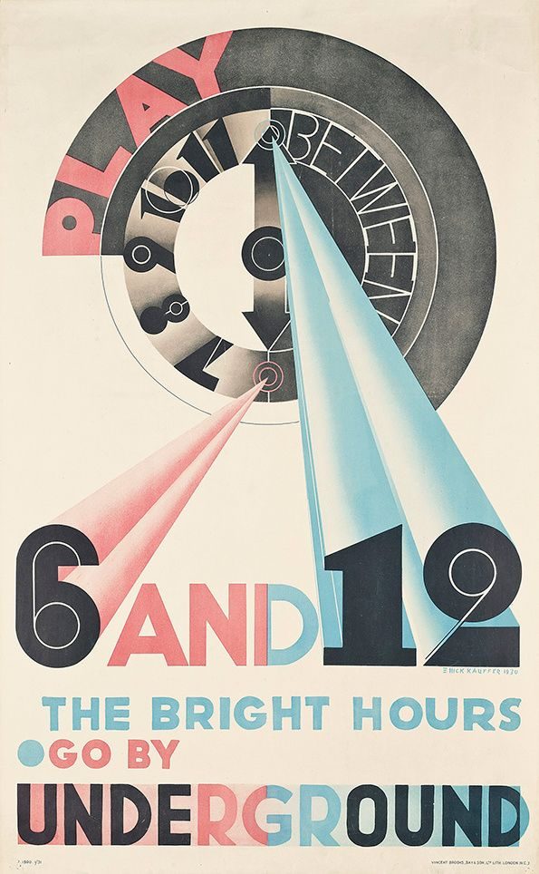
Pick’s view was that the Underground was a public utility with a duty to look well-designed. He commissioned typefaces, posters, maps, station architecture, station furniture, typography for tickets and timetables, and even the graphic treatment of the literature rack in every ticket hall. He employed the best designers in Britain, and when they weren’t good enough, he imported the best designers from Europe.
The identity system unfolded in three major commissions:
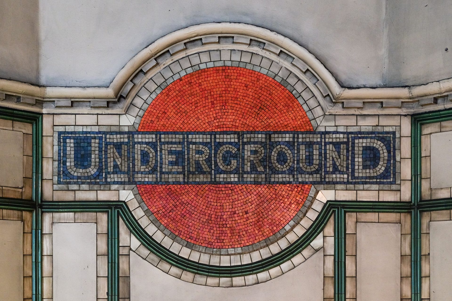
- The Roundel (1908, refined 1919). Originally a solid red disc with UNDERGROUND on a blue bar, refined by Johnston in 1919 into the clean red ring on a blue bar still in use.
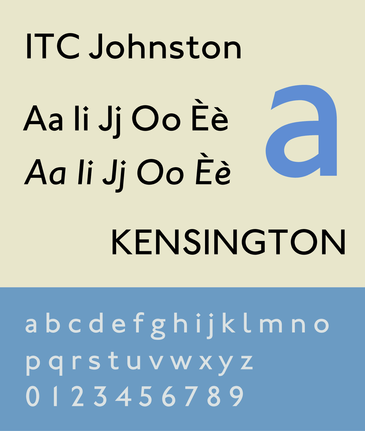
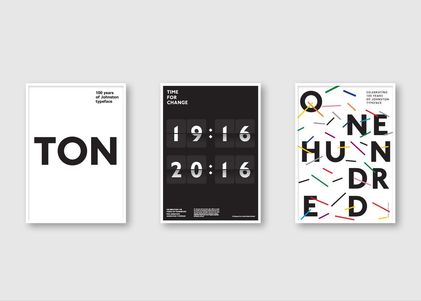
- Johnston Sans (1916). Commissioned from Edward Johnston — the calligrapher who had revived classical calligraphy in Britain — as “a new block-letter alphabet for the Underground”.
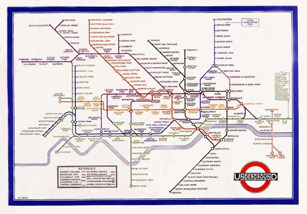
- The Tube Map (1933). Harry Beck’s topological map. Rejected on first submission, accepted after a trial print, and the single most-imitated transit map in history.
Pick’s work built on itself. The typeface, the mark and the map were deployed together across posters (Kauffer, Kramer, Shepard), publicity leaflets, station signage and ticket stock. By 1933, the year the London Passenger Transport Board was formed and the Tube Map launched, the Underground had the most coherent corporate identity in the world.