Lester Beall was born in Kansas City, Missouri in 1903. He studied art history at the University of Chicago, graduating in 1926 — not at an art school. Self-taught as a designer, he opened a freelance studio in Chicago in 1927, producing advertising, magazine covers and editorial layouts.
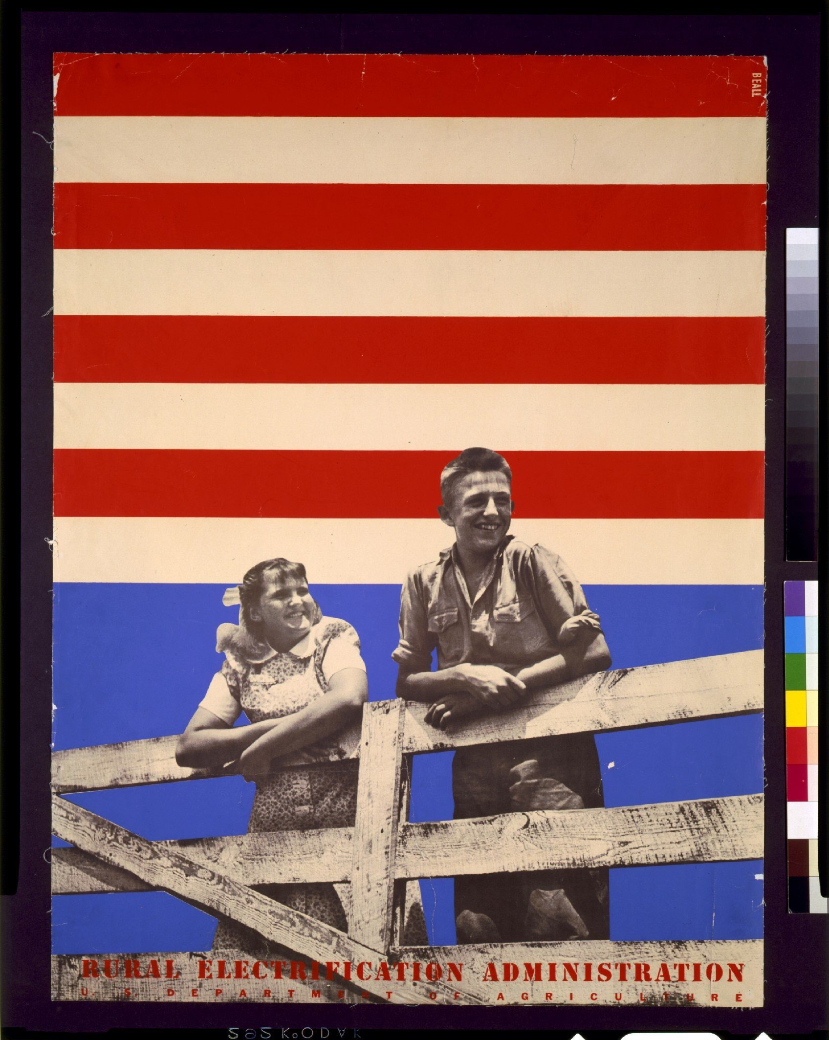
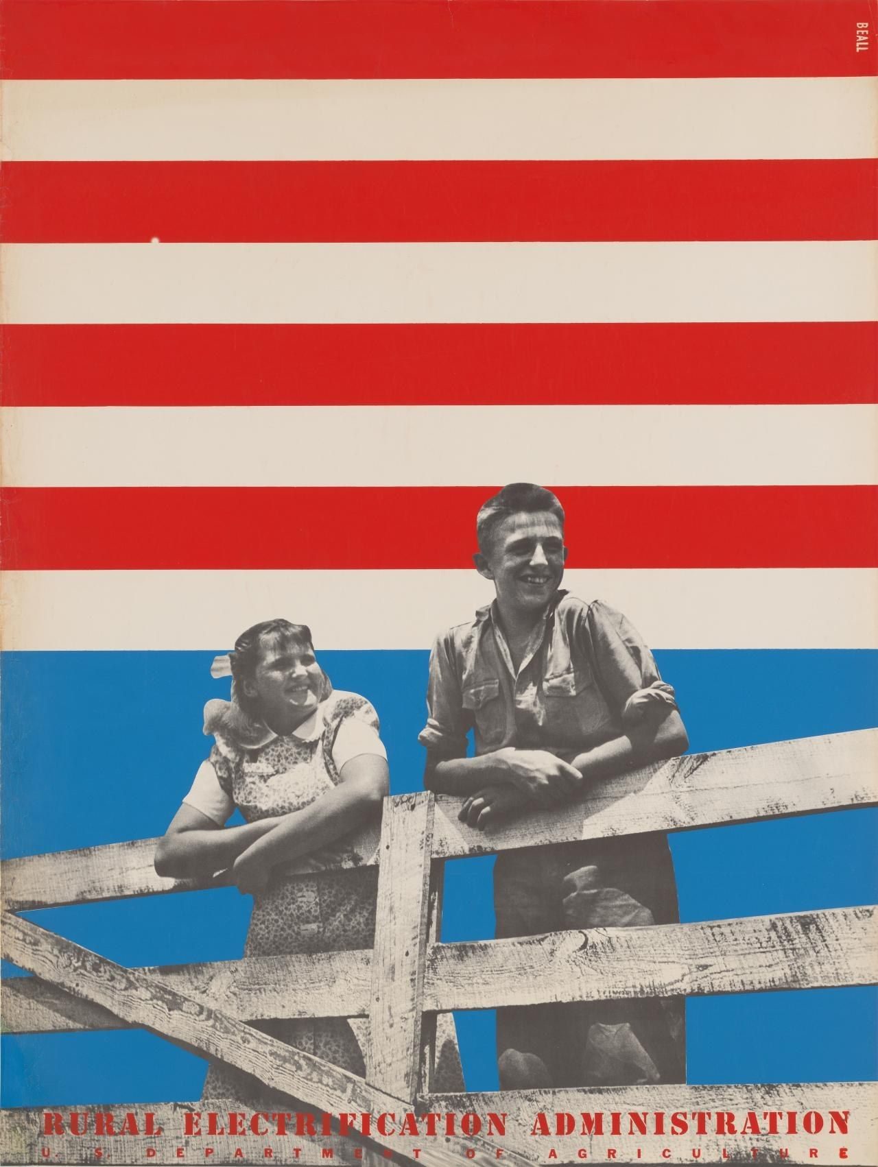
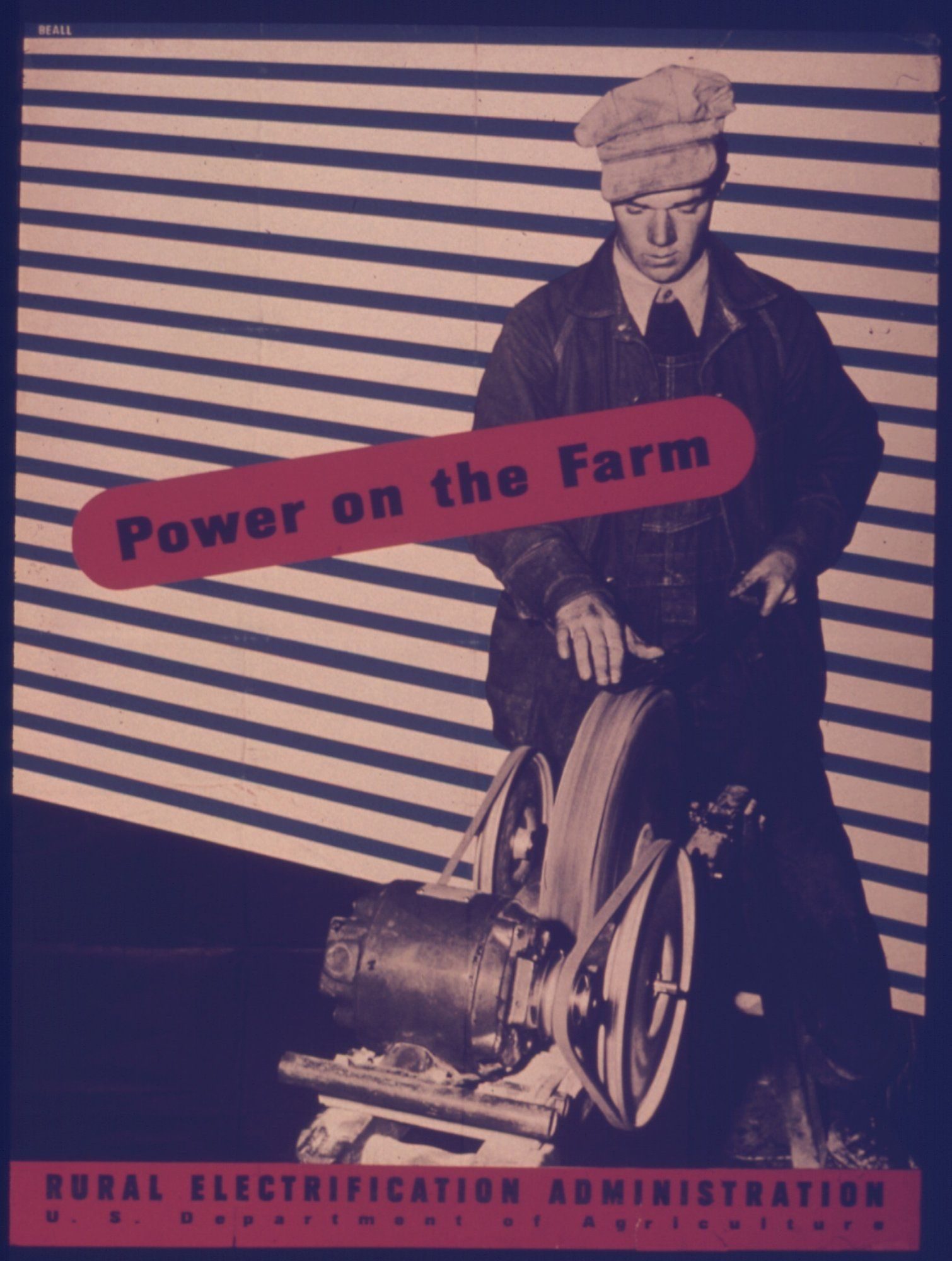
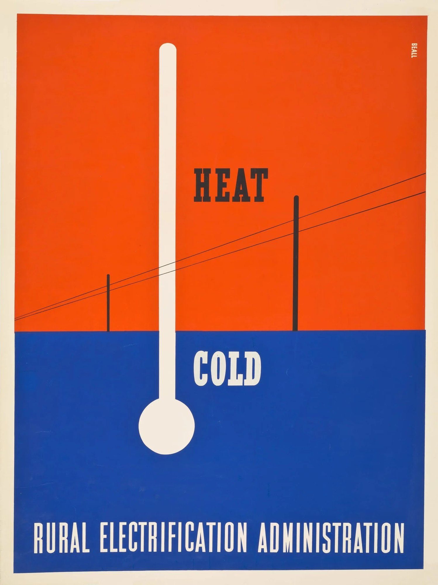
In 1935 he moved to New York and began working for major American magazines — Fortune, Time, House Beautiful — while also taking on poster commissions. In 1937 he received the commission that shaped his first decade: six posters for the federal Rural Electrification Administration, communicating the benefits of electricity to American farmers. The work drew on European modernism — flat colour, sans-serif typography, photomontage — and delivered it in a form calibrated for a rural American audience.
That same year the Museum of Modern Art gave him the first one-man show ever awarded to a graphic designer. Curated by Alfred Barr, the exhibition shifted the standing of graphic design inside American cultural institutions.
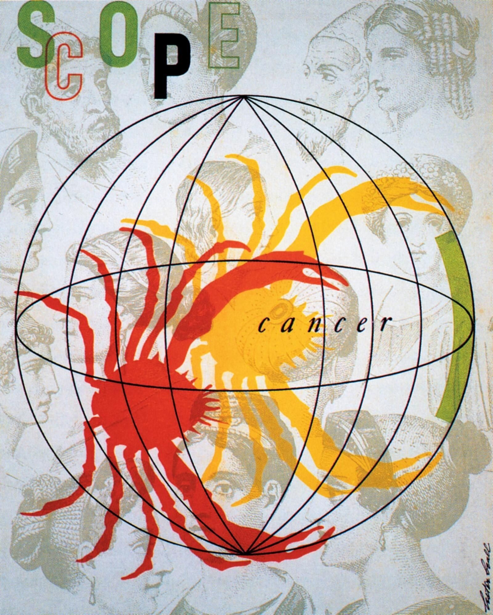
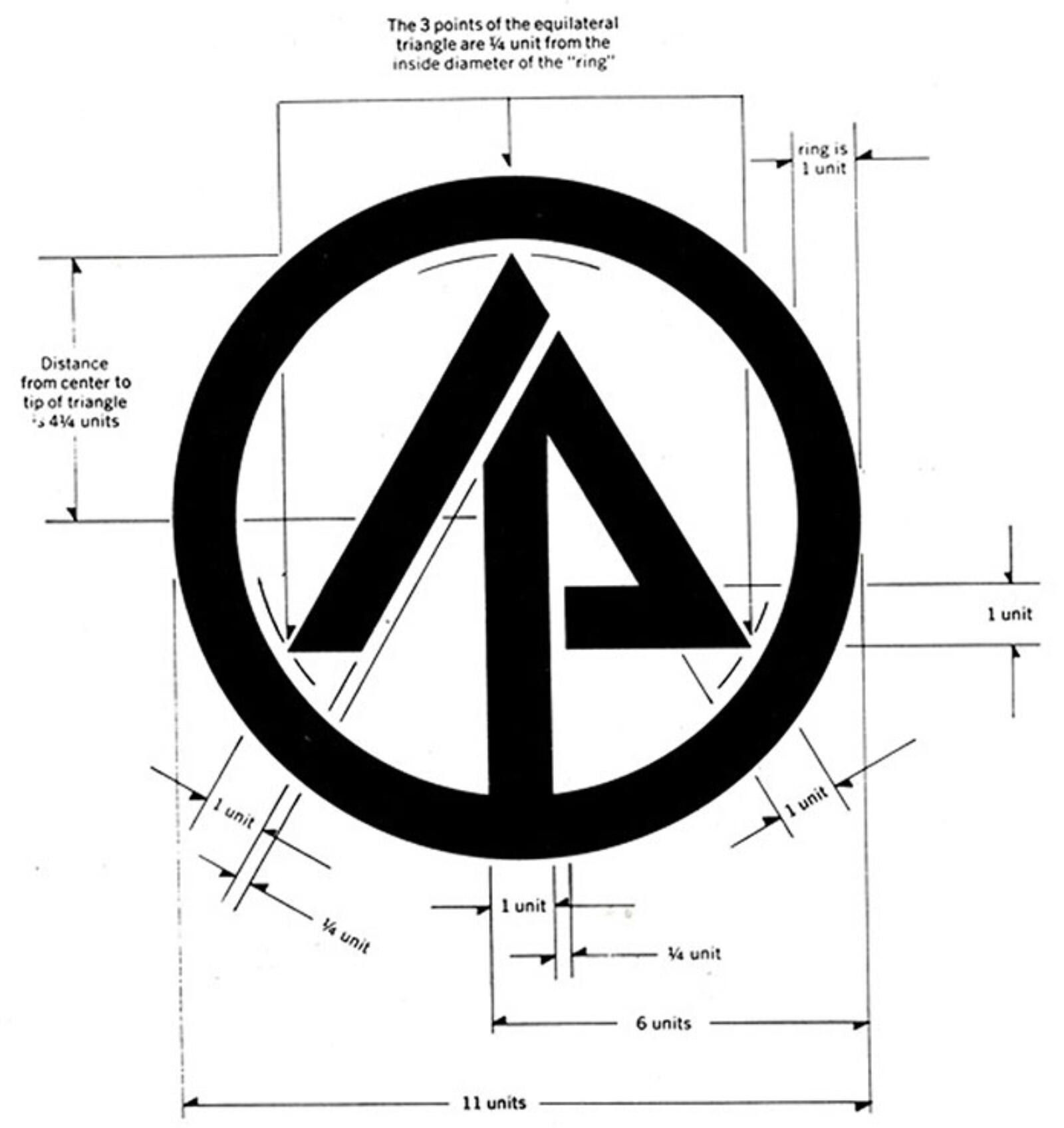
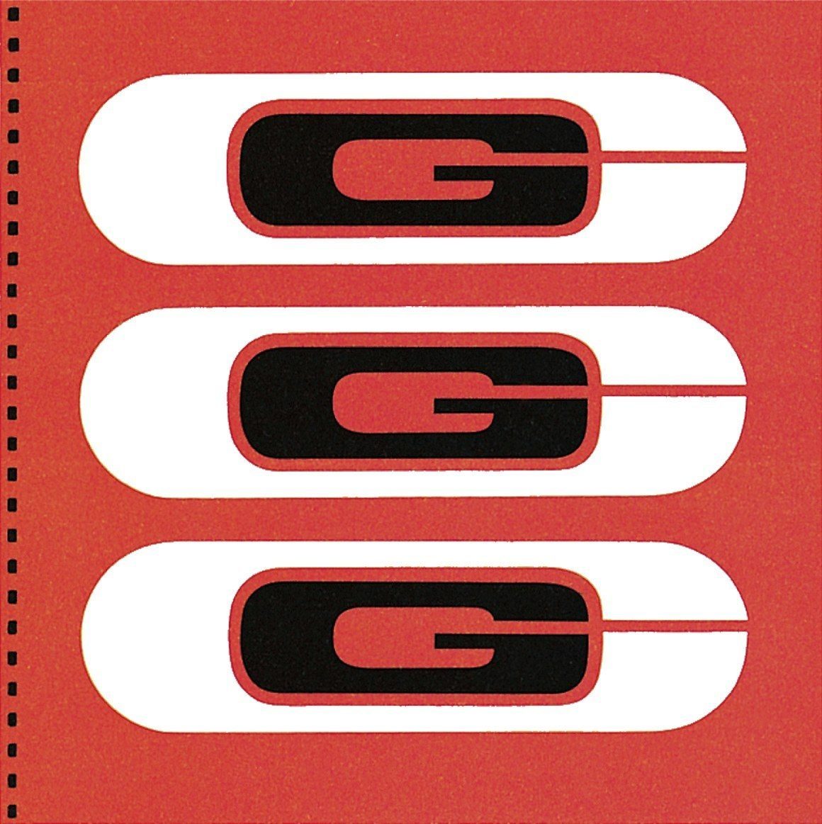
Two more REA series followed, in 1939 and 1941. Through the 1940s and early 1950s he produced Scope magazine for Upjohn — roughly 35 issues. From the late 1950s he moved decisively into corporate identity work: Connecticut General Life Insurance (1959), International Paper Company (1960), Martin Marietta Corporation (1961).
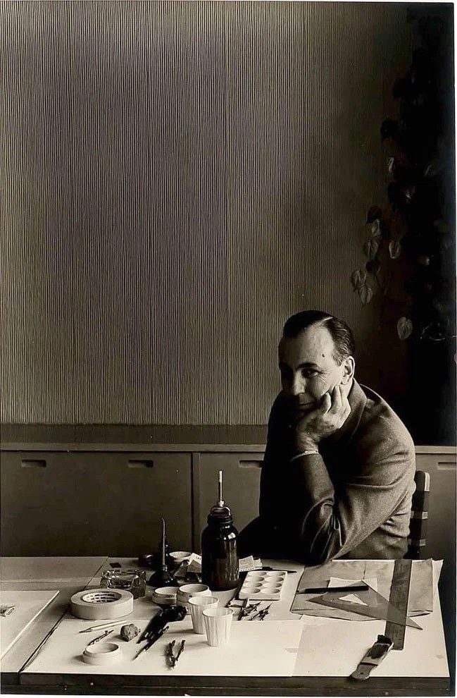
In 1951 he moved his studio to Dumbarton Farm in Brookfield Center, Connecticut, where he lived and worked for the rest of his life. He served as president of the New York Art Directors Club in 1951–1952. He died at Dumbarton in June 1969. The AIGA Medal was awarded posthumously in 1992.