Design history · Contemporary Japanese identity

Kashiwa Sato

The creative director who translated Japanese retail into a global visual language.

Kashiwa Sato (born 1965) is the Japanese creative director whose Samurai Inc. studio has designed the visual identity of most of the major Japanese consumer brands of the last two decades — Uniqlo, Rakuten, Tsutaya, Fuji Xerox, 7-Eleven Japan. His 2006 Uniqlo global rollout is the most internationally visible Japanese identity project of the 2000s.

Key facts

Born
1965, Tokyo, Japan
Nationality
Japanese
Era
Contemporary Japanese identity · Global brand consultancy · Creative direction
Studios
Hakuhodo (art director, 1989–2000) · Samurai Inc. (founder + creative director, 2000–present)
Education
B.A. Visual Communication Design, Tama Art University, Tokyo (1989)
Known for
Uniqlo global identity (2006) · Rakuten identity · Tsutaya · Fuji Film · 7-Eleven Japan · National Art Center Tokyo · Kabukiza signage

Biography

Kashiwa Sato was born in Tokyo in 1965. He graduated from the Visual Communication Design programme at Tama Art University in 1989 — the same cohort that produced several of Japan’s leading contemporary art directors. He joined Hakuhodo, Japan’s second-largest advertising agency, as an in-house art director and spent eleven years there working on large domestic campaigns.

In 2000 he founded Samurai Inc., a small independent studio based in Tokyo’s Minato ward. The founding brief — stated repeatedly in interviews — was to build a Japanese creative consultancy that could operate at the scale of a Western branding firm but retain the craft culture of a Japanese design studio. The studio has stayed deliberately small (fewer than a dozen staff) while taking on commissions that would usually require several hundred.
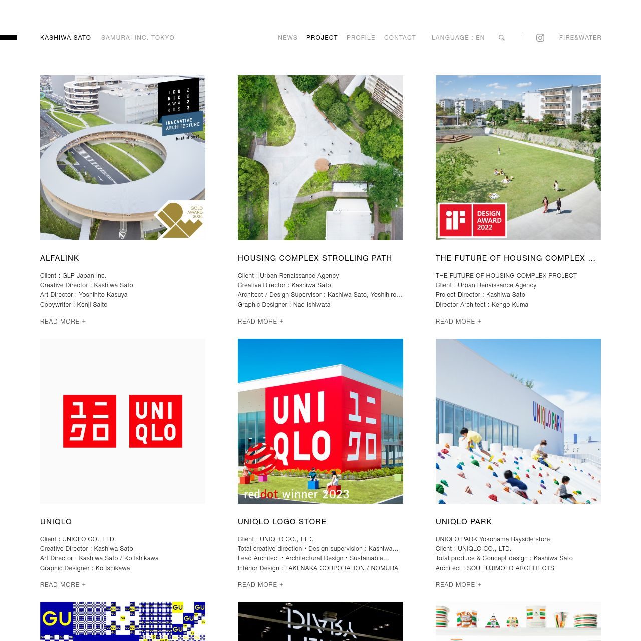
Samurai’s first high-profile commission was the Fuji Xerox corporate identity (2001), followed by NTT DoCoMo, Cup Noodles museum, and 7-Eleven Japan in quick succession. The decisive commission was Uniqlo (2006), where Sato worked directly with founder Tadashi Yanai on the rebranding that accompanied Uniqlo’s 2006 Soho, New York flagship launch — the beginning of Uniqlo’s international expansion.

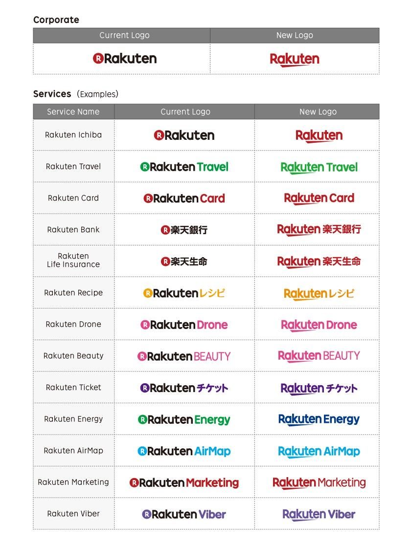
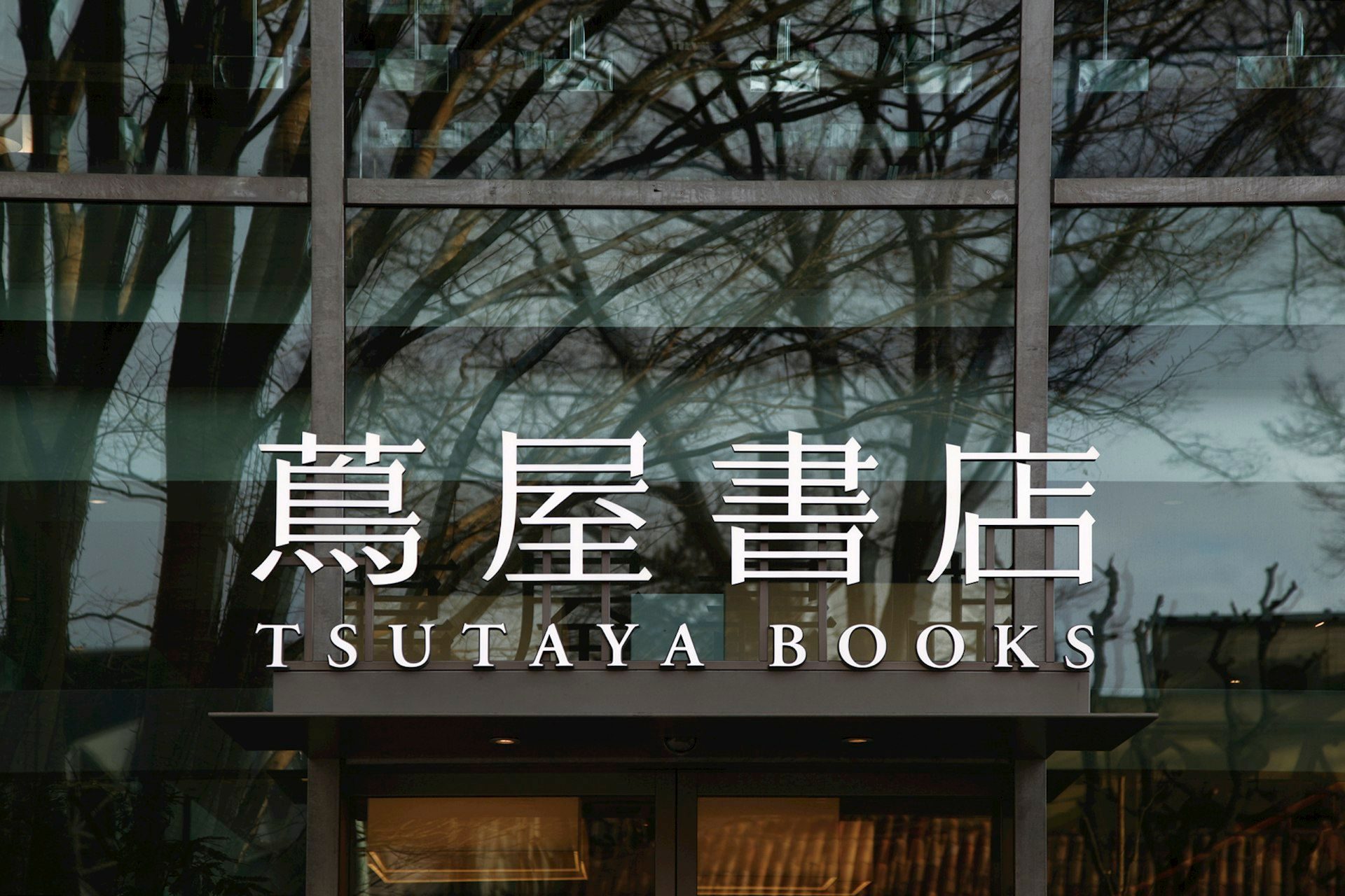
Through the 2010s the studio produced identities for Tsutaya (Daikanyama T-Site, 2011; T-Site Ebisu 2017), Rakuten (global rebrand, 2014), the Kabukiza Theatre rebuild (2013), UNIQLO Paris (Opéra flagship, 2014), and the National Art Center Tokyo identity (2007). Sato also lectures widely in Japan, serves on design-award juries internationally, and has been a Tama Art University visiting professor since 2006.

In 2020 Mori Art Museum mounted “Kashiwa Sato” — a major retrospective covering two decades of Samurai work. It was the most significant contemporary Japanese graphic-design museum exhibition of that decade.

Design philosophy

Sato’s working position — stated across his book Ultimate Thinking and a decade of interviews — is that creative direction is a diagnostic discipline before it is a visual one. The Samurai process starts with a written articulation of the client’s actual business problem; visual work does not begin until the problem has been named and agreed.

“Design is not decoration. Design is thinking made visible.” — Kashiwa Sato

Three commitments organise the work. First, the brand problem must be structural before it is visual. Uniqlo’s 2006 rebrand was preceded by a year of business-model diagnosis; the red wordmark followed the decision that Uniqlo would compete on global simplicity rather than Japanese heritage.

Second, the identity system must be operable at retail. Sato’s studio produces identity programmes that account for every concrete application — shopping-bag paper weight, hanger material, mannequin specification, cash-register typeface — as first-class design variables, not afterthoughts.

Third, bilingual typographic integration. Samurai identities routinely run in both Japanese scripts (kanji, katakana, hiragana) and Latin script simultaneously, with custom adjustments on both sides. The Uniqlo bilingual wordmark is the single most widely-seen example.

Key works

Uniqlo global identity (2006) — red wordmark in Latin and katakana, modular retail system, complete signage specification. The identity that accompanied Uniqlo’s 2006 Soho flagship and made the brand internationally recognisable. Still the primary Uniqlo identity seventeen years later.

Rakuten global rebrand (2014) — magenta wordmark plus custom “R” mark, operating across the group’s dozen service brands. A rare example of a large-scale global rebrand driven from a Tokyo studio rather than from a Western holding consultancy.

Tsutaya Daikanyama T-Site (2011) — identity, signage and architectural graphics for Culture Convenience Club’s flagship bookstore, designed with architects Klein Dytham. One of the most-visited contemporary retail environments in Tokyo; widely credited with reshaping the Japanese bookstore category.

Kabukiza Theatre signage (2013) — signage system for the rebuilt Ginza theatre. Combined traditional Japanese calligraphic forms with contemporary typography. Case study in how modernist identity can integrate with a conservative cultural institution.

National Art Center Tokyo (2007) — typographic logo derived from the Kurokawa-designed building’s facade curves. The signage programme uses the logo’s rhythm throughout the galleries.

UNIQLO Soho New York flagship (2006) — retail interior design and environmental graphics coordinated with the 2006 rebrand. The store that introduced Uniqlo to the American market.

Iconic works

Uniqlo wordmark, 2006

Uniqlo global identity

2006

Complete rebrand for Fast Retailing's Uniqlo, commissioned by founder Tadashi Yanai and timed to the opening of the Soho, New York flagship in November 2006. Samurai Inc. introduced a red square field carrying the brand name in both Latin and katakana scripts simultaneously, a single system usable across Japanese domestic retail and international markets without adaptation. As of 2025, the identity remains in use across more than 2,400 stores in 26 countries.
Uniqlo global identity (Samurai Inc., 2006). · 2006 redesign showing red square with Latin + katakana bilingual wordmark. Sourced from authoritative logo reference database. · Museum editorial
Rakuten wordmark, 2014

Rakuten identity

2014

Global identity refresh for Rakuten, the Japanese e-commerce group, delivered as the company extended its international holdings across shopping, banking, travel and messaging services. Samurai Inc. produced a magenta wordmark with a custom 'R' logotype, designed to scale across the group's portfolio without per-brand localisation. The commission is one of relatively few large-scale consumer-technology rebrands of the 2010s to originate from a non-Western studio.
Rakuten global identity (Samurai Inc., 2014). · Official Rakuten press release (June 26, 2018) showing the new global brand logo and selected service logos designed by Kashiwa Sato; 180.3 KB high-quality JPEG from corporate announcement. · Museum editorial
Tsutaya Daikanyama facade

Tsutaya Daikanyama flagship identity

2011

Identity, signage and architectural graphics for Culture Convenience Club's flagship T-Site bookstore in Daikanyama, Tokyo, designed in collaboration with architects Klein Dytham Architecture. The perforated concrete screens on the building's exterior are formed from repetitions of the Tsutaya 'T' logo motif, integrating the identity into the building fabric rather than applying it as a surface treatment. The project is credited with reshaping expectations of Japanese book retail and establishing Daikanyama as a wider cultural destination.
Tsutaya Daikanyama T-Site identity (2011). · Visual identity applications and particle/dot system variations demonstrating the modular mark concept. · Museum editorial

National Art Center Tokyo identity

2007

Identity for the National Art Center in Roppongi, Tokyo, designed in 2006 for the museum's establishment and carried through to its opening in January 2007. The logo uses calligraphic letterforms whose curves reference the undulating glass facade of the building, designed by architect Kisho Kurokawa, and the signage programme extends this visual rhythm throughout the galleries. In 2021 the museum mounted a major retrospective of Sato's career output, held from February to May of that year.
National Art Center Tokyo identity (2007).

Kabukiza Theatre signage

2013

Signage system for the rebuilt Kabukiza Theatre in Ginza, Tokyo, which reopened in March 2013 following reconstruction to a design by architect Kengo Kuma. Sato's programme integrates calligraphic forms drawn from traditional Japanese theatre lettering with a contemporary typographic grid applied across the building's interior and exterior wayfinding. The commission required reconciling the conventions of one of Japan's most conservative cultural institutions with the functional demands of a large public venue.
Kabukiza Theatre signage system (2013).

Fuji Xerox identity

2001

Corporate identity for Fuji Xerox, the joint venture between Fuji Photo Film and Xerox Corporation, produced shortly after Samurai Inc. was founded in 2000. The project is among the studio's earliest known commissions in the corporate identity sector. The wordmark system was designed to function across office equipment, printed materials and environmental signage.
Fuji Xerox identity (Samurai Inc., 2001).

Ultimate Thinking — The Samurai Way

2012

Bilingual Japanese-English monograph published by Graphic-sha, Tokyo, covering the first decade of Samurai Inc. output from the studio's founding in 2000. The book presents Sato's working method as a series of progressive reductions, examining each project through successive simplifications until a single clarifying concept remains. It provides a detailed account of the Samurai creative-direction process, illustrated with case studies of major commissions from 2000 to 2011.
Ultimate Thinking — The Samurai Way, Kashiwa Sato (Graphic-sha, 2012).

Influence & legacy

Sato’s most visible legacy is Uniqlo itself. The 2006 identity was the design component of a business transformation that took Uniqlo from Japanese domestic leader to global Top-3 apparel retailer; the identity survived that expansion essentially unchanged. Few contemporary identities have operated across so many countries and scales with so little variation.

More broadly, Samurai Inc. is the single most-cited model for Japanese creative consultancy as international practice. Before Samurai, Japanese identity work for global clients was routinely commissioned from Western holding firms; after Samurai, Tokyo studios began taking on the same work. The model has been copied by Groovisions, Nendo, Wieden+ Kennedy Tokyo, and a generation of younger Japanese studios.

His bilingual typographic integration practice has influenced how Japanese brands approach global identity: not as separate Japanese and English identities, but as a single typographic system that works across both scripts. The approach is now standard in Japanese global-facing brand work.

Learn at TGDS

Sato’s practice connects to several modules of our curriculum. If his approach interests you, the most direct next steps are:

Courses

Related movements & people

Further reading

Books

  • Kashiwa Sato, Ultimate Thinking — The Samurai Way (Graphic-sha, 2012).
  • Kashiwa Sato, Kashiwa Sato (Mori Art Museum exhibition catalogue, 2020).
  • Gestalten, Velocity: Kashiwa Sato (Gestalten Verlag, 2011).
  • Kashiwa Sato, “Ultimate Method for Reaching the Essentials” (Samurai Inc. essay series, 2012).

Online

Get Started.

You can enrol any day of the year. We are online and study is self-paced, there is no pressure. Enrol when you are ready to start, from anywhere in the world. If you would like to chat or email, feel free to get in touch.

Brochures, Phone Calls & Questions

You can download a free brochure, book a phone call with one of our course advisors, or simply ask a question.

Other ways to get in touch

Australia 1300 655 485

International +61 1300 655 485

Ask Anything info@thegraphicdesignschool.com

Get a quote accounts@thegraphicdesignschool.com

Acknowledgement of Country
The Graphic Design School acknowledges the Traditional Custodians of Country throughout Australia and their continued spiritual connection to land.
We pay respect to Elders past, present and emerging.
Always was, always will be.
RTO Provider № 91706