Design history · 1960s–1990s Japanese modernism

Ikko Tanaka

The designer who held Swiss grids and ukiyo-e colour logic in the same hand.

Ikko Tanaka (1930–2002) built a visual language that sat comfortably between European modernism and traditional Japanese art. His posters, the founding identity of Muji, and the Seibu Department Stores brand show what happens when a designer refuses the choice between two traditions — and finds that the underlying logic is the same in both.
Ikko Tanaka in his Tokyo studio, c.1970
Ikko Tanaka in his Tokyo studio, c.1970. · Photographer unknown. Published in the 'Ikko Tanaka: Faces. Posters' exhibition, Die Neue Sammlung — The Design Museum, Munich. Courtesy Die Neue Sammlung.

Key facts

Born
13 January 1930, Nara, Japan
Died
10 January 2002, Tokyo, Japan
Nationality
Japanese
Era
Japanese modernism · Corporate identity · Post-war graphic design
Studios
Sankei Shimbun (1952) · Light Publicity (1957) · Nippon Design Center (1960) · Tanaka Ikko Design Studio (1963)
Known for
Nihon Buyo (1981) · Muji founding identity · Seibu brand · Expo '70 Osaka

01

Biography

Ikko Tanaka was born in 1930 in Nara — the ancient capital whose temples, lacquerware and hand-printed ephemera he later named as his strongest formative influence. He trained at Kyoto City University of Arts and took his first design role at the Osaka office of Sankei Shimbun in 1952.

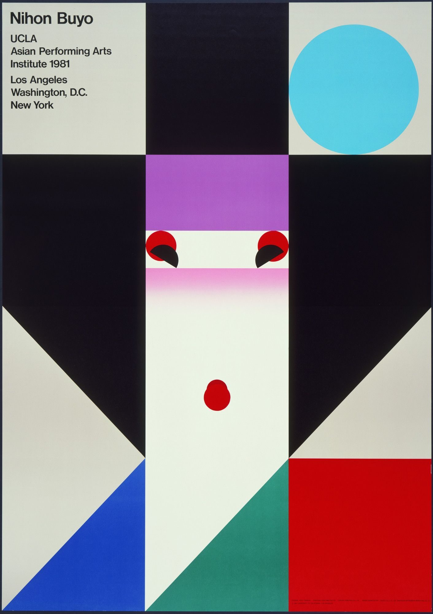
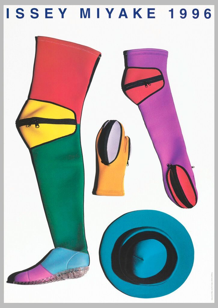
In 1957 he moved to Light Publicity in Tokyo. In 1960 he became a founding member of the Nippon Design Center alongside Yusaku Kamekura and Hiromu Hara — the studio most responsible for the first wave of internationally legible Japanese corporate design. In 1963 he opened Tanaka Ikko Design Studio and built a forty-year practice across posters, books, identity programmes and exhibition design.

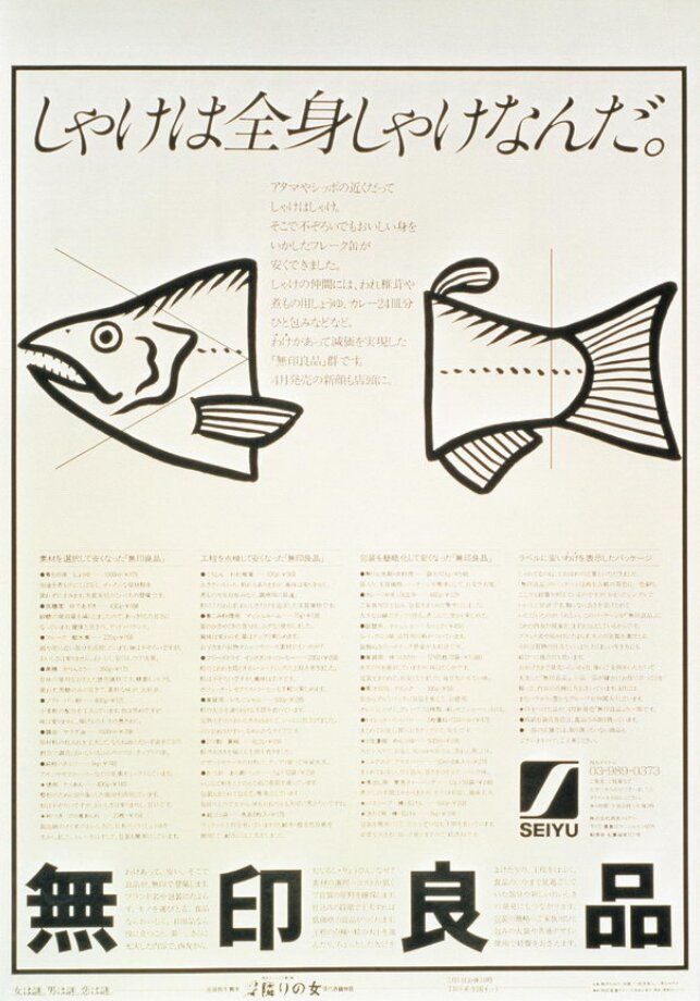
His public profile arrived at Expo '70 in Osaka: Japan’s first world’s fair, and the moment Japanese graphic design was first seen in volume by an international audience. From 1980 he was founding art director of Muji (Ryohin Keikaku) with the writer Kazuko Koike and the interior designer Takashi Sugimoto — a brand whose restraint and typographic quiet still read as characteristically Tanaka.

He worked until his sudden death in January 2002, three days before his 72nd birthday. His archive is held by Musashino Art University and by the DNP Foundation for Cultural Promotion.

02

Design philosophy

Tanaka’s argument was that the European modernist grid and the compositional rules of traditional Japanese art — ukiyo-e, Noh masks, classical textile pattern — address the same underlying problem: how to organise a flat surface. His job was to hold both in play, not to choose between them.

That position produced a particular kind of austerity. Flat colour blocks, precise geometric construction, and the selective use of calligraphic or brush-drawn passages where the content warrants it. He was direct about what Japanese graphic design should not be: decorated with cherry blossoms and Mount Fuji imagery when a tighter composition would be stronger without them.

The Nihon Buyo poster is the clearest worked example: a dancer’s face built entirely from flat rectangles in ukiyo-e colours, laid out on a Swiss-school grid, read internationally as unmistakably Japanese.

03

Key works

World Commercial Design Exhibition (1959) — poster for a Tokyo design exhibition. A field of white arrows on black, interrupted by Japanese typography. One of his earliest MoMA acquisitions, given by the artist.

Seibu Department Stores identity (from 1975) — creative direction for the Seibu group across advertising, in-store communication and the Seibu Museum of Art. The shopping bag’s concentric circles became a fixture of Tokyo street life.

Muji art direction (from 1980) — founding visual language for Ryohin Keikaku’s “no-brand quality goods” stores, with Kazuko Koike and Takashi Sugimoto. Still the brand’s operating logic today.

Nihon Buyo (1981) — poster for a UCLA performance of Japanese classical dance. The most widely reproduced single Tanaka image; the moment his East–West method became visible in a single glance.

Issey Miyake posters (1984 onwards) — a multi-decade poster series with the fashion designer, applying his typographic discipline to fashion-editorial photography.

Iconic works

Nihon Buyo, 1981 — geometric face composed of flat colour planes on a grid

Nihon Buyo

1981

Poster for a UCLA performance of Japanese classical dance. The face is built from flat rectangles — black for the hair mass, cream for the skin, red semicircles for the eyes — arranged on a Swiss-school grid. It works simultaneously as ukiyo-e composition and modernist geometry. Tanaka used this approach in many later posters; this is the first and most concentrated version.
Nihon Buyo (1981), offset lithograph. UCLA Asian Performing Arts Institute. · Ikko Tanaka. Nihon Buyo, 1981. Offset lithograph, 103 × 72.8 cm. Gift of the College of Fine Arts, UCLA. The Museum of Modern Art, New York. © Estate of Ikko Tanaka. Statutory educational licence. · AU statutory
World Commercial Design Exhibition, 1959 — white arrows on black with Japanese typography

World Commercial Design Exhibition (1959)

1959

Poster for the 1959 World Commercial Design Exhibition in Tokyo, held at Seibu Department Store Ikebukuro. A field of white directional arrows on black, interrupted by Japanese typography. The arrows read as movement, commerce and message simultaneously — a compressed argument for what graphic design does. Gift of the artist to MoMA.
World Commercial Design Exhibition (1959), lithograph. · Ikko Tanaka. World Commercial Design Exhibition, 1959. Lithograph, 72.4 × 52.1 cm. Gift of the artist. The Museum of Modern Art, New York. © Estate of Ikko Tanaka. Statutory educational licence. · AU statutory
Seibu Department Stores shopping bag design — concentric blue and green circles

Seibu Department Stores identity

1975

Tanaka became creative director of the Seibu group in 1975, having worked on Seibu Theatre posters from 1973. The shopping bag design — concentric blue and green circles tiled across white — became one of the most recognised retail graphics in postwar Japan. The pattern is simple enough to print cleanly at any scale, distinct enough to read from across a street.
Seibu Department Stores shopping bag design (c.1975), wrapping paper pattern. · Ikko Tanaka. Seibu Department Stores shopping bag design, c.1975. © Estate of Ikko Tanaka. Statutory educational licence. · AU statutory
Muji early advertising — fish and bones illustration with Seiyu / Muji branding

Muji art direction

1980

In 1980, Ryohin Keikaku launched Muji — "no-brand quality goods" — with Tanaka as founding art director alongside the writer Kazuko Koike and the interior designer Takashi Sugimoto. The visual language he established: plain packaging, minimal typography, no logo excess. The 1981 fish-waste ad ran in Seiyu supermarkets and set the tone. That restraint still reads as characteristically Muji four decades on.
Muji (Ryohin Keikaku) advertising, c.1981. Fish-waste campaign, Seiyu supermarkets. · Ikko Tanaka. Muji advertising, c.1981. © Estate of Ikko Tanaka. Statutory educational licence. · AU statutory
Issey Miyake 1996 poster — neoprene garments and accessories on white ground

Issey Miyake poster (1996)

1996

Tanaka worked with the fashion designer Issey Miyake for more than fifteen years, producing a series of posters that applied his typographic rigour to fashion-editorial photography. This 1996 example, photographed by Irving Penn, shows neoprene accessories arranged on a white ground — objects treated with the same flat attention as the geometric elements in his cultural posters. Cooper Hewitt, Smithsonian Design Museum, accession 1996-130-2.
Issey Miyake poster (1996). Photography by Irving Penn. · Ikko Tanaka (designer), Irving Penn (photographer). Issey Miyake, 1996. Lithograph on wove paper, 103.8 × 72.7 cm. Smithsonian Institution, Cooper Hewitt Design Museum, accession 1996-130-2. © Estate of Ikko Tanaka / © Irving Penn Foundation. Statutory educational licence. · AU statutory

04

Influence and legacy

Tanaka is the reference point for most discussions of modern Japanese graphic design. Kashiwa Sato, Kenya Hara and Taku Satoh name him as a direct predecessor. His Muji art direction set a template for restrained retail branding that has been reproduced in Europe and North America from the late 1990s onwards — often without the attribution.

Outside Japan, his work appears in the standard survey texts alongside Müller-Brockmann, Hofmann and Cassandre. The influence runs through the international poster tradition and, more quietly, through the product and packaging aesthetics of every retailer that has borrowed Muji’s logic of restraint.

The DNP Graphic Design Archive, built partly around his work, remains one of the primary research sources for historians of Japanese graphic design.

Learn at TGDS

Tanaka’s method — ukiyo-e colour logic held inside a Swiss grid — runs through the typography and identity units at TGDS:

Courses

Further reading

Books

  • Ikko Tanaka: Graphic Master (Thames & Hudson, 1997).
  • Ikko Tanaka: Posters 1953–1979 (Heibonsha).
  • Richard Hollis, Graphic Design: A Concise History — chapter on postwar Japanese design (Thames & Hudson, 1994).

Get Started.

You can enrol any day of the year. We are online and study is self-paced, there is no pressure. Enrol when you are ready to start, from anywhere in the world. If you would like to chat or email, feel free to get in touch.

Brochures, Phone Calls & Questions

You can download a free brochure, book a phone call with one of our course advisors, or simply ask a question.

Other ways to get in touch

Australia 1300 655 485

International +61 1300 655 485

Ask Anything info@thegraphicdesignschool.com

Get a quote accounts@thegraphicdesignschool.com

Acknowledgement of Country
The Graphic Design School acknowledges the Traditional Custodians of Country throughout Australia and their continued spiritual connection to land.
We pay respect to Elders past, present and emerging.
Always was, always will be.
RTO Provider № 91706