Herbert Matter was born in Engelberg, Switzerland, in 1907. He studied painting at the École des Beaux-Arts in Geneva and then in Paris with Fernand Léger and Amédée Ozenfant at the Académie Moderne. In 1929 he joined the Paris studio of A.M. Cassandre, where he learned lithographic-poster craft from one of the most technically accomplished poster designers of the interwar period.
Through the early 1930s Matter also worked with Le Corbusier on photography commissions for the architectural publication L’Esprit Nouveau. The combination of Cassandre’s poster discipline and photographic practice with Corbusier gave him the method he would use for the rest of his career: the photograph as a structural element of the design, not an illustration pasted in.
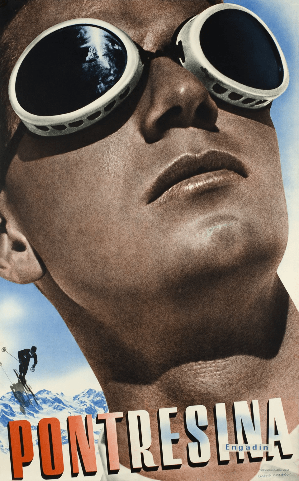
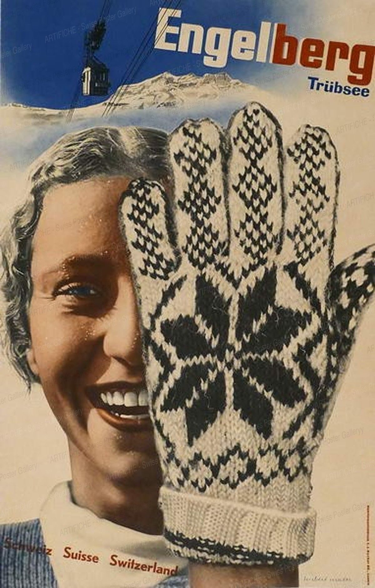
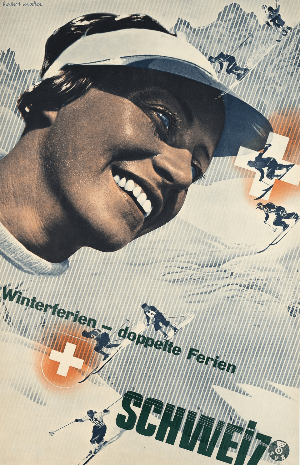
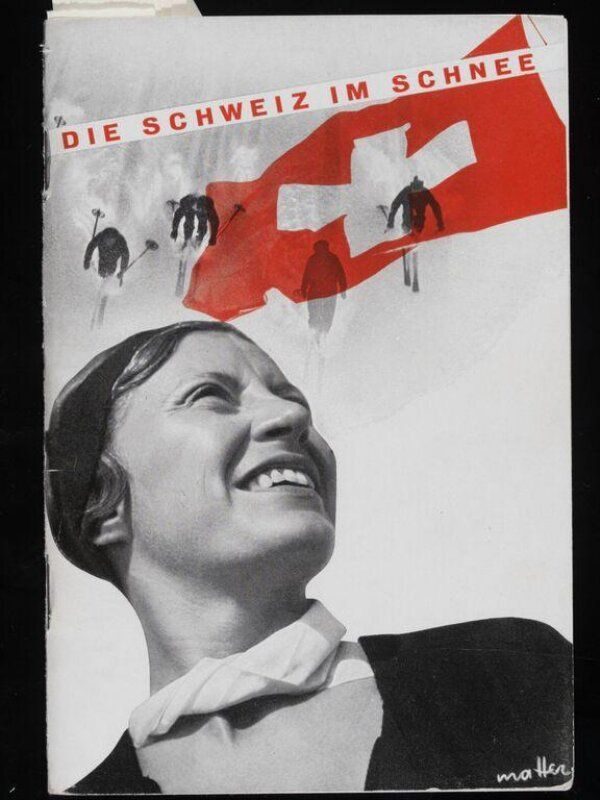
In 1934 he returned to Switzerland and took a commission from the Swiss National Tourist Office to produce a series of tourism posters. The 1934–36 series — Pontresina · Engadin, Engelberg · Trübsee, Winterferien, All roads lead to Switzerland — established photomontage as a viable method for commercial poster design and are now held in the collections of MoMA, the Cooper Hewitt, and major European institutions.
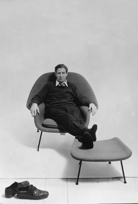
He moved to the United States in 1936 and worked as a photographer for Harper’s Bazaar under Alexey Brodovitch and for Vogue and Fortune through the 1940s. In 1946 Florence Knoll recruited him as design consultant for the newly independent Knoll Associates furniture company — a relationship that ran for twenty years and produced the identity and catalogue system that made Knoll visible as a modernist furniture brand.
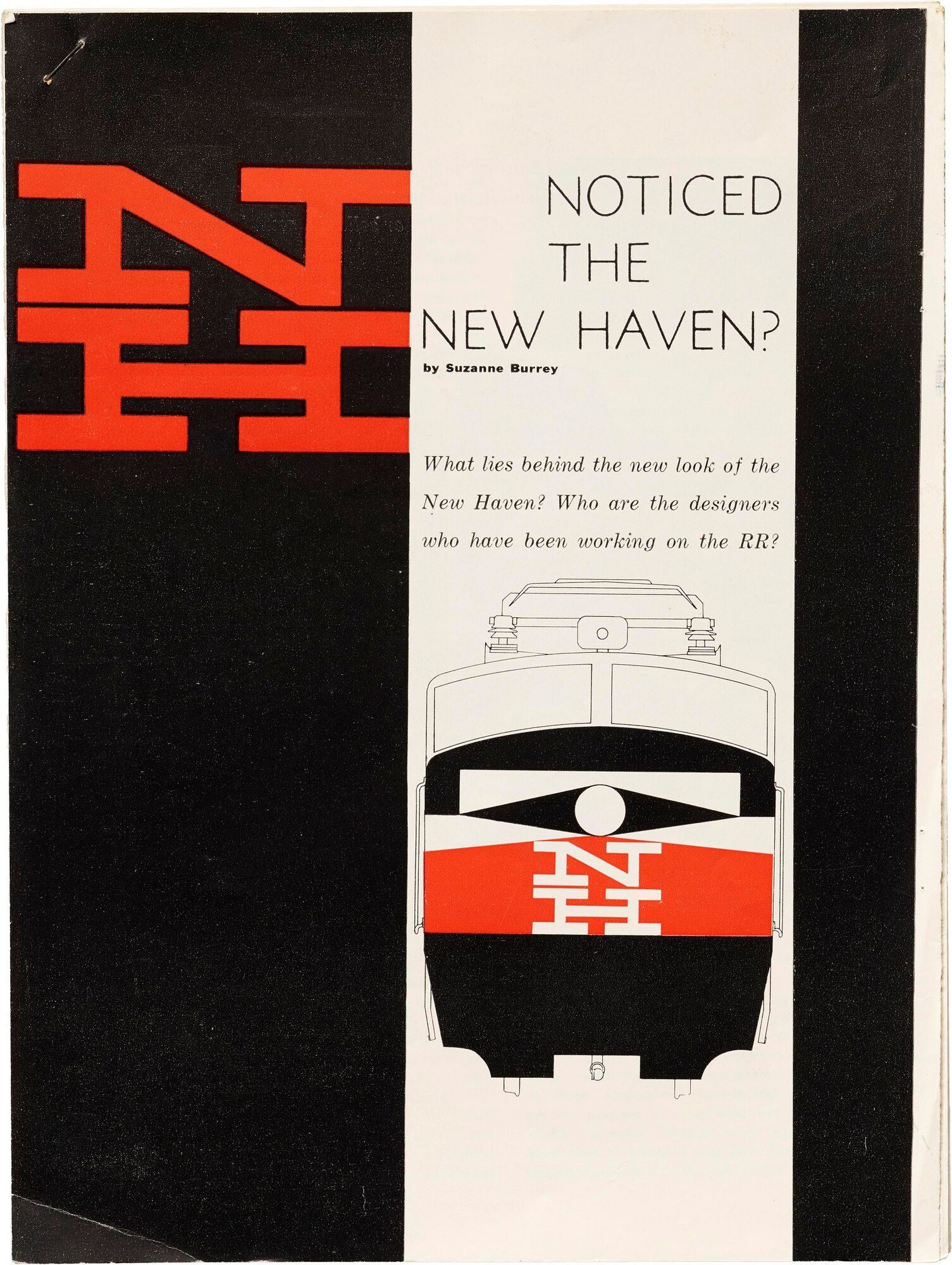
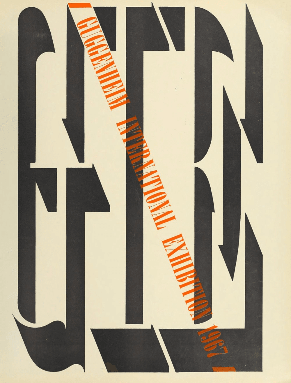
In 1952 he joined the Yale School of Art faculty at Paul Rand’s invitation, teaching photography and graphic design until 1976. His postwar American identity work — New Haven Railroad (1954), Guggenheim Museum (1967), the CBS corporate photographic archive — carried the Swiss photographic-poster method into American corporate identity. He died in Southampton, New York, in 1984; AIGA awarded him its Medal the previous year.