In 1956, Eduard Hoffmann, director of the Haas’sche Schriftgiesserei in Münchenstein outside Basel, gave a brief to a freelance typographer: modernise the foundry’s grotesk range and take market share from Berthold’s Akzidenz-Grotesk, the typeface that had sat at the top of the European sans-serif market for nearly 60 years.
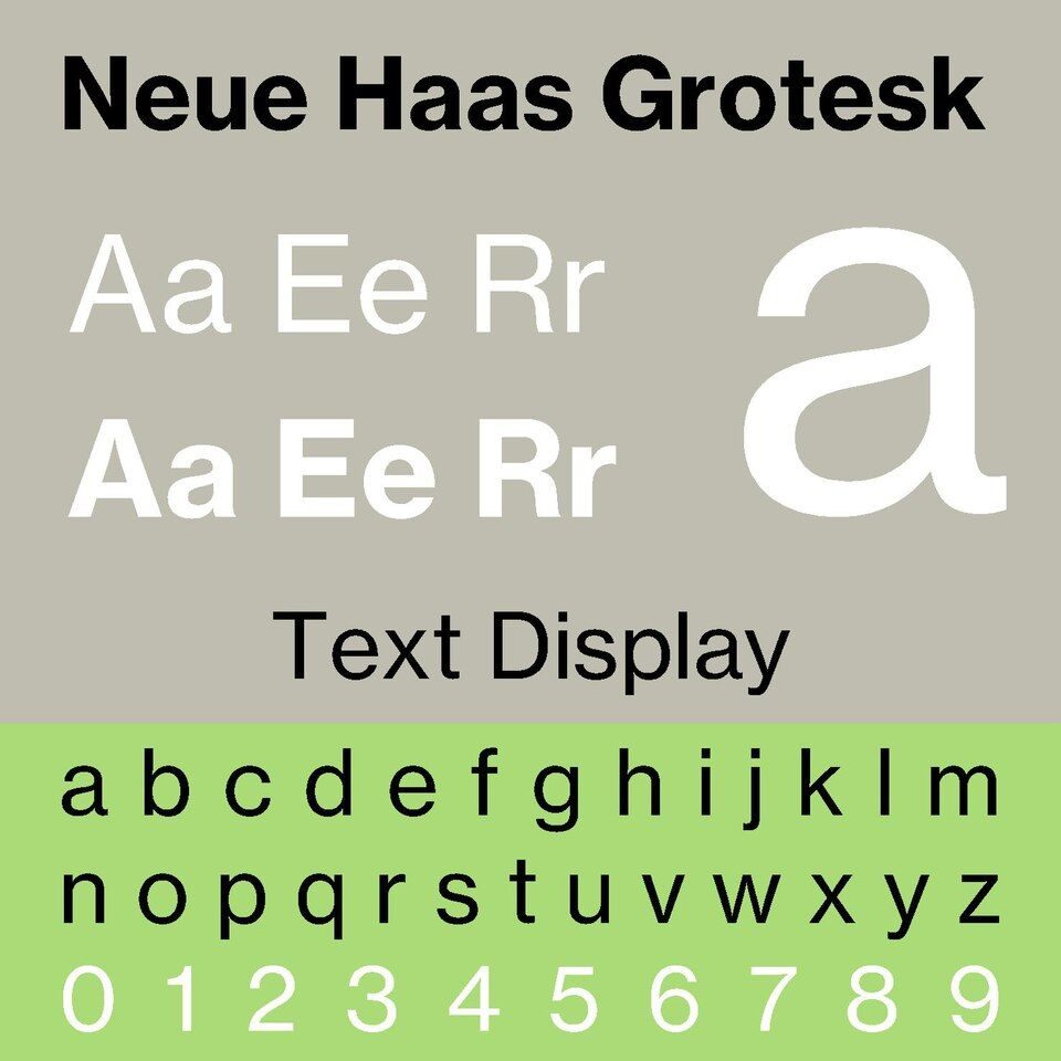
Max Miedinger drew tighter apertures and cleaner terminals than the Berthold original. The release was called Neue Haas Grotesk. Five weights shipped in 1957. Distribution was regional — Swiss foundry trade only.
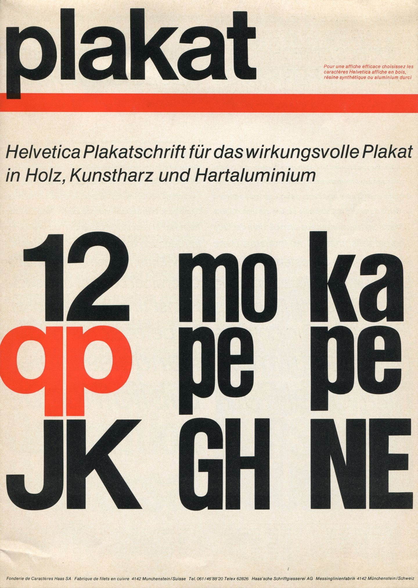
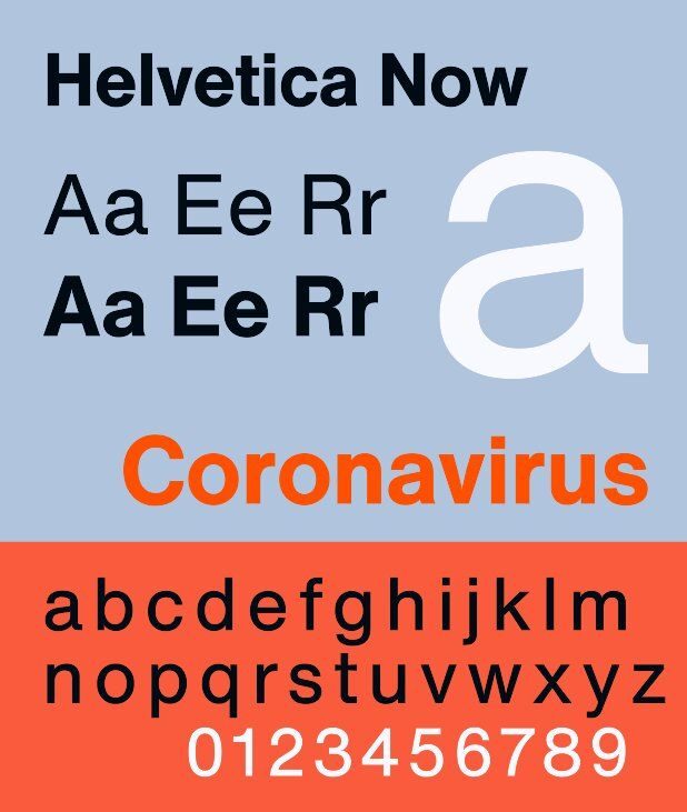
What changed the scale was a rename. Haas’s German parent D. Stempel AG released the typeface internationally in 1960 as Helvetica — from Confoederatio Helvetica, the Latin name for Switzerland. Linotype licensed it the following year and began producing it for hot-metal, phototypesetting and, eventually, digital systems. A Latin name travelled where a Swiss foundry name didn’t.
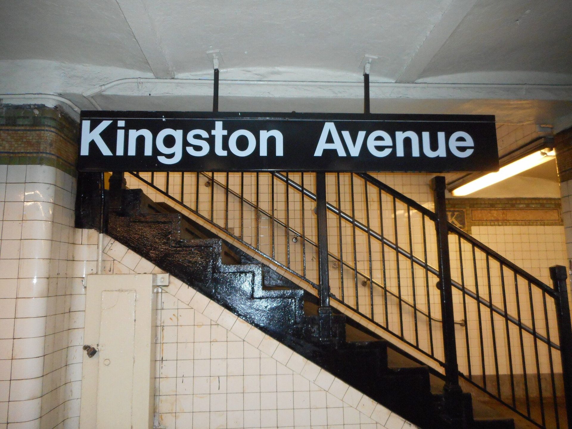
Through the 1960s Helvetica became the working typeface of Swiss Style, and Swiss Style became the visual language of postwar corporate identity. IBM, American Airlines, Lufthansa, Knoll, BMW and the New York subway (via Vignelli) are the most-cited cases. Many more organisations adopted it without anyone commissioning a specific identity programme — Helvetica simply came bundled with the equipment.
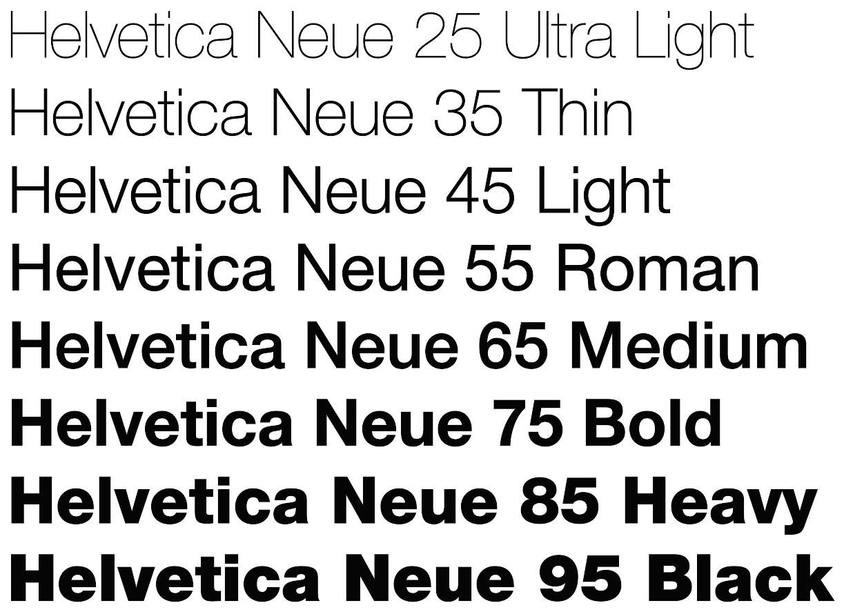
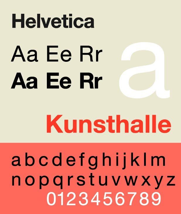
Helvetica Neue (Linotype, 1983) rationalised the family into a numbered 51-weight system. Helvetica Now (Monotype, 2019) rebuilt it from scratch with three optical sizes and language coverage that Miedinger and Hoffmann never contemplated.