Design history · Movements

De Stijl

The Dutch movement that reduced design to red, blue, yellow and the right angle.

De Stijl (1917–1931) was the Dutch movement that proposed a single universal visual language built from primary colours, black grids and right angles. From Mondrian's paintings to Rietveld's chairs and van Doesburg's typography, it argued that art, architecture, furniture and graphic design should all share one geometric grammar. That grammar fed directly into the Bauhaus, Swiss Style and most modernist layout teaching practised today, including at The Graphic Design School.
Theo van Doesburg, Contra-Composition XVI, 1925 — oil on canvas, Kunstmuseum Den Haag
Theo van Doesburg, *Contra-Composition XVI*, 1925. Oil on canvas, 100 × 180 cm. Kunstmuseum Den Haag. · Theo van Doesburg (1883–1931); public domain (author died 1931). Via Wikimedia Commons. Kunstmuseum Den Haag collection.

Key facts

Founded
October 1917, Leiden, Netherlands
Active period
1917–1931 (movement) · journal *De Stijl* 1917–1932
Founding editor
Theo van Doesburg (publisher of the journal *De Stijl*, 1917–1932)
Key figures
Piet Mondrian · Theo van Doesburg · Gerrit Rietveld · Bart van der Leck · J.J.P. Oud · Vilmos Huszár
Also known as
Neoplasticism (Mondrian's term for the painting wing)
Known for
Primary palette · Black grids · Right angles · Geometric abstraction · Total design (architecture · graphics · furniture)

01

History & context

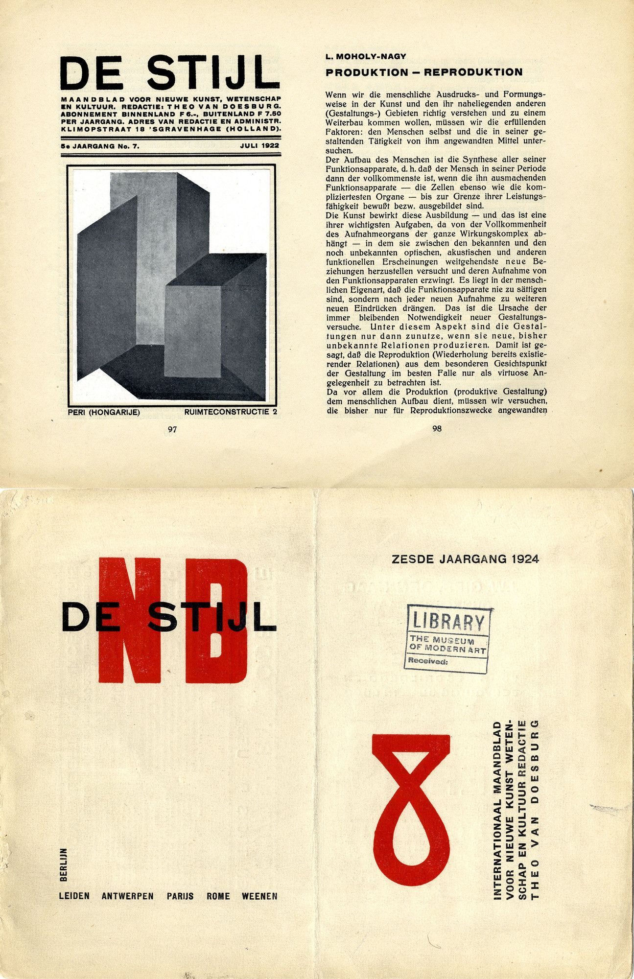
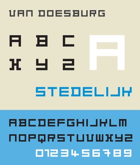
De Stijl began as a journal. Theo van Doesburg, a 34-year-old Dutch painter and former conscript, published the first issue from Leiden in October 1917. The Netherlands had stayed neutral through the First World War, and the small Dutch art world was fed up with pre-war painting. Van Doesburg gathered the painter Piet Mondrian, the architect J.J.P. Oud, the painter and typographer Vilmos Huszár, and the painter Bart van der Leck around a single proposition: art and design should be reduced to universal elements — straight lines, right angles, primary colours — that any culture could share.

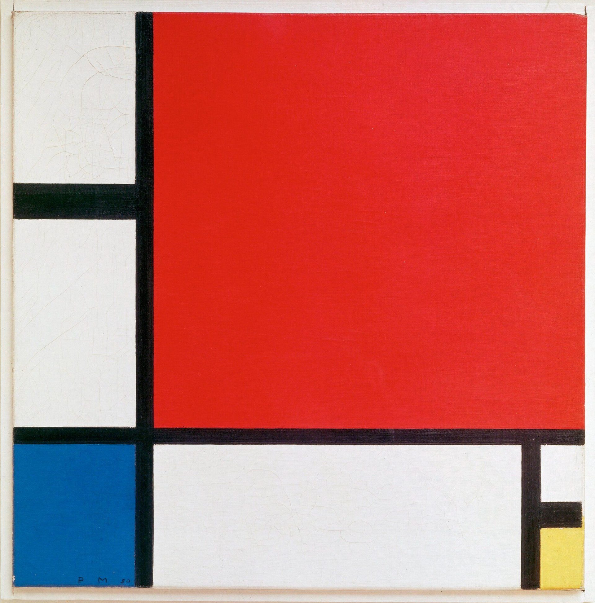
Mondrian called the painting wing Neoplasticism (Nieuwe Beelding). Van Doesburg called the broader movement De Stijl (“the style”). The journal’s eight pages carried manifestos, essays, plates and polemics — published monthly when it appeared, across fifteen years.

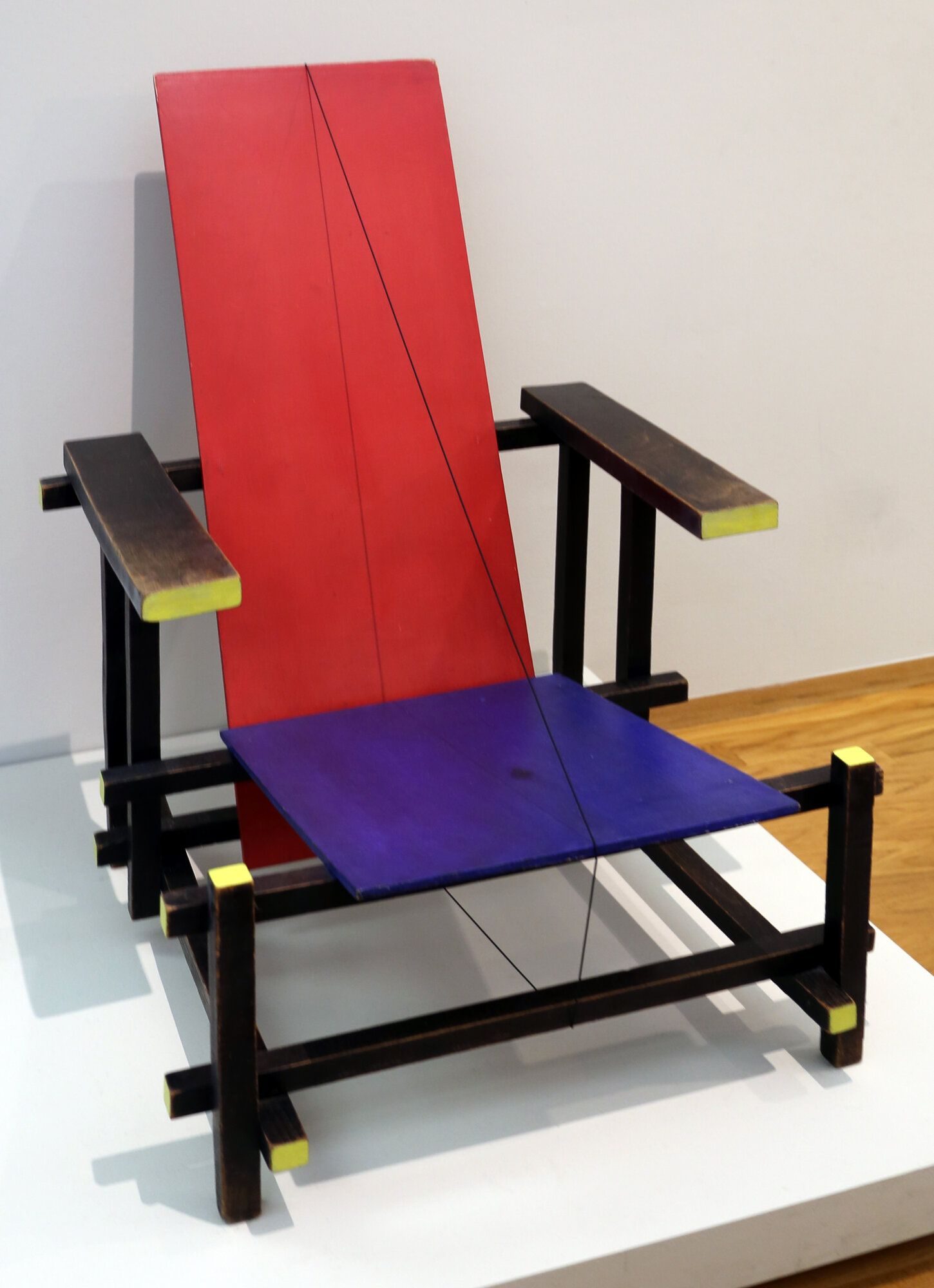
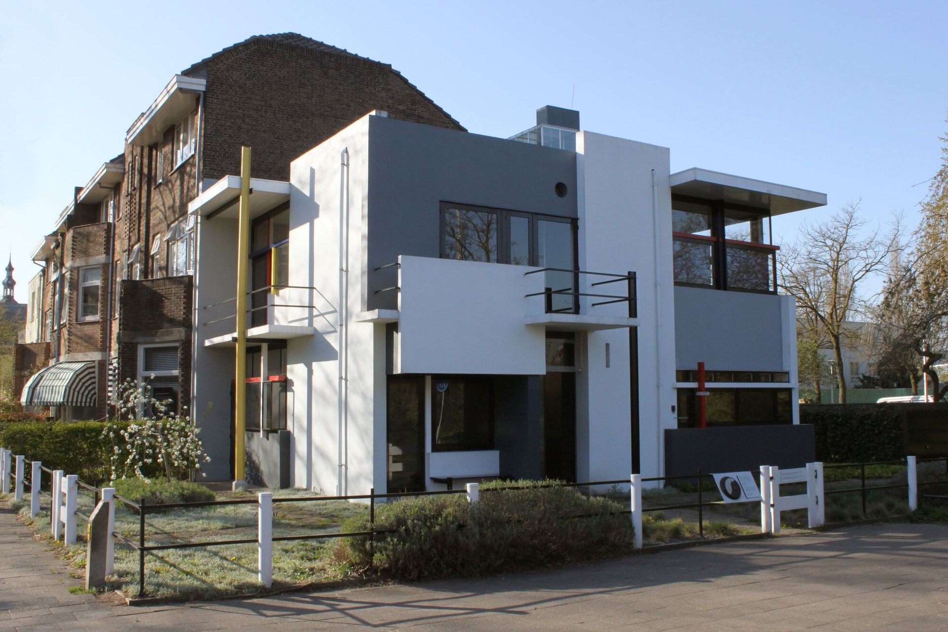
The architectural and design wing matured around 1923–1924. Gerrit Rietveld joined the movement in 1919 with his uncompromising Red and Blue Chair (designed 1918, repainted 1923), then built the Schröder House in Utrecht in 1924 — the movement’s only completed building. Oud applied the principles to social housing in Rotterdam.

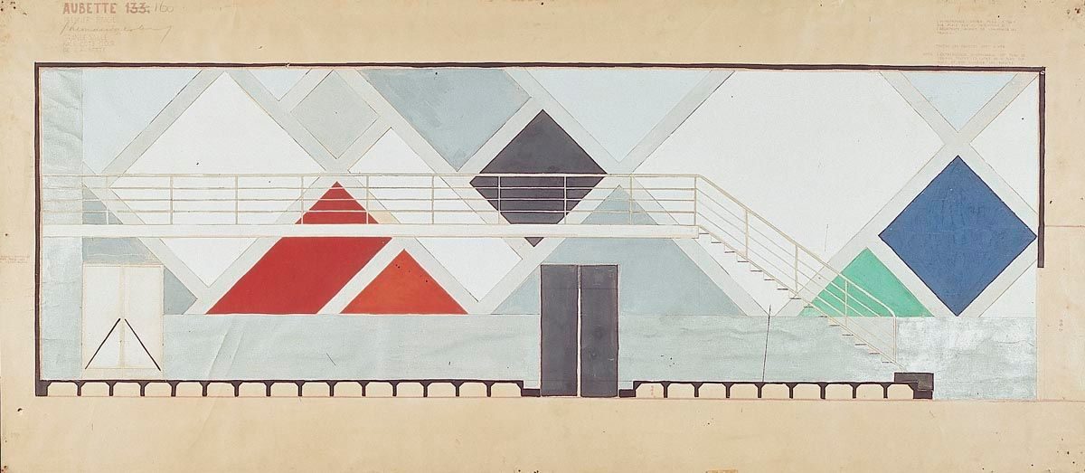
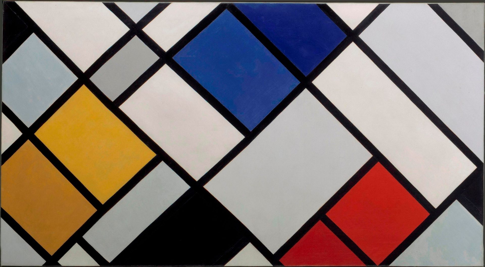
The movement fractured in the late 1920s. Van Doesburg argued for an “Elementarist” extension that allowed diagonals and tilted planes, breaking Mondrian’s strict orthogonal rule. Mondrian resigned from the journal in 1925. Van Doesburg pushed on, opened the Café L’Aubette in Strasbourg in 1928 (with Hans Arp and Sophie Taeuber-Arp), and was preparing to formalise Concrete Art when he died in 1931. The journal published one final memorial issue in 1932, then ended.

By the time the movement closed, several of its principals had already moved on to the Bauhaus (van Doesburg lectured there from 1922) and to international careers. Mondrian moved to Paris then London then New York, where his Broadway Boogie Woogie (1942–1943) became the late capstone of the movement’s painting tradition.

02

Principles

De Stijl operated on a small set of categorical rules.

“We must realise that art and life are no longer separate domains. The idea that art is an illusion divorced from real life must disappear.” — Theo van Doesburg, De Stijl manifesto, 1918

Reduction to universals. Diagonal, curve, ornament, perspective, historical reference — all rejected. Only the horizontal, the vertical, the right angle. Only primary colours (red, blue, yellow), neutrals (black, white, grey).

The orthogonal grid. Every composition built on a structure of black horizontal and vertical lines. The grid is not a layout aid; it is the work.

Primary palette only. Red, blue, yellow plus black, white and grey. Mondrian’s late paintings allow no other colours. Rietveld’s chair allows no other paint. The movement’s editorial design followed.

Total design. A painting, a chair, a house facade, a typeface and a magazine cover should all be reducible to the same rules. The Schröder House is the proof of concept.

Asymmetric composition. Symmetry implied a centre, a hierarchy, a focal point. De Stijl preferred dynamic equilibrium — masses balanced asymmetrically across the orthogonal grid.

Universalism over national style. The movement explicitly rejected Dutch romantic-nationalist painting, which is what made it instantly exportable. The grid is national to nowhere.

03

Key works

De Stijl journal (van Doesburg, 1917–1932) — the movement’s primary site. Eight-page monthly, edited single-handedly. The cover lettering and internal layout are themselves canonical De Stijl works.

Red and Blue Chair (Rietveld, 1918/1923) — designed in unpainted wood in 1918 and repainted in primary colours in 1923 after Rietveld joined the movement. Versions are in MoMA and the Stedelijk Museum.

Mondrian’s mature compositions (1920–1944) — black grid on white, occasional red, blue and yellow rectangles. The works collectively form the movement’s painting record. The 1930 Composition with Red, Blue and Yellow (Zürich Kunsthaus) is the best-known single example.

Schröder House (Rietveld, 1924) — three-storey terrace house in Utrecht. The only completed De Stijl building. UNESCO World Heritage since 2000.

Architectuur typeface (van Doesburg, 1919) — geometric square- grid alphabet, lowercase only. The direct typographic precursor of Bayer’s Universal alphabet at the Bauhaus.

Café L’Aubette (van Doesburg with Arp & Taeuber-Arp, 1928) — Strasbourg leisure complex. Geometric colour fields tilted at 45 degrees. The work that broke Mondrian’s strict orthogonal rule and ended Mondrian’s involvement with the movement.

Key works & examples

De Stijl journal covers composite, 1917–1928, edited by Theo van Doesburg

De Stijl journal (Theo van Doesburg, ed.)

1917

The movement ran as a journal first. Van Doesburg published issue 1 from Leiden in October 1917 — eight pages, austere typography, cover masthead by Vilmos Huszár. The journal did not just document De Stijl; it was the movement's primary platform, carrying manifestos, essays, plates and polemics for fifteen years.
*De Stijl* journal covers, 1917–1928. Edited by Theo van Doesburg. Cover type by Vilmos Huszár (1917–1921). People's Graphic Design Archive. · Composite of De Stijl journal covers from the People's Graphic Design Archive. Theo van Doesburg, ed.; cover type by Vilmos Huszár. Public domain (published 1917–1932, >70 years). Source: People's Graphic Design Archive. · Public domain
Piet Mondrian, Composition II in Red, Blue, and Yellow, 1930

Composition with Red, Blue and Yellow (Piet Mondrian)

1930

Mondrian's mature canvases — black gridlines on white, with occasional red, blue and yellow rectangles — are the movement's paintings. This 1930 canvas in Zürich's Kunsthaus is among the most-recognised examples. Mondrian called the method *Nieuwe Beelding* (Neoplasticism): painting reduced to its irreducible elements — straight line, right angle, primary colour.
Piet Mondrian, *Composition II in Red, Blue, and Yellow*, 1930. Oil on canvas, 46 × 46 cm. Kunsthaus Zürich. · Piet Mondrian (1872–1944); public domain (author died 1944, >70 years). Wikimedia Commons. · Public domain
Gerrit Rietveld, Red and Blue Chair, 1918 (painted 1923), Kunstmuseum Den Haag

Red and Blue Chair (Gerrit Rietveld)

1923

Rietveld designed the chair in unpainted wood in 1918 and repainted it in De Stijl's primary palette in 1923 after joining the movement. The structure is assembled from standard rectangular components — nothing bent, nothing sculpted. The chair is in MoMA and the Stedelijk Museum, and remains a widely-reproduced piece of modern furniture.
Gerrit Rietveld, *Red and Blue Chair*, 1918 (painted 1923). Kunstmuseum Den Haag. · Photograph by Sailko, 2017 (CC BY 3.0). Kunstmuseum Den Haag collection. Wikimedia Commons. · CC BY
Rietveld Schröder House, Utrecht, 1924 — exterior view from street

Rietveld Schröder House

1924

The Schröder House in Utrecht is the movement's only completed total-design building. White stucco walls, primary-coloured trim and sliding partitions reconfigure the upper floor. Designed by Rietveld with Truus Schröder-Schräder in 1924, it is a UNESCO World Heritage site and is now operated as a museum by the Centraal Museum Utrecht.
Gerrit Rietveld and Truus Schröder-Schräder, *Schröder House*, Utrecht, 1924. UNESCO World Heritage Site since 2000. · Photograph by Hay Kranen (CC BY 3.0). Via Wikimedia Commons. · CC BY
Van Doesburg, Architectuur typeface, 1919 — geometric square-grid alphabet

Architectuur typeface (Theo van Doesburg)

1919

Van Doesburg's geometric alphabet, designed for the magazine *Architectuur*, draws every letterform on a strict 5×5 square grid — lowercase only, modular, no curves. A direct precursor of Herbert Bayer's Universal typeface at the Bauhaus six years later, it shows how De Stijl's orthogonal rules translated from canvas to type.
Theo van Doesburg, *Architectuur* typeface, 1919. Geometric square-grid alphabet, lowercase only. · Rendered sample from Wikipedia infobox; van Doesburg (1883–1931), public domain. Wikimedia Commons. · Public domain
Theo van Doesburg, colour design for the Ciné-Dancing at the Café L'Aubette, Strasbourg, 1927

Café L'Aubette interiors (van Doesburg, Arp, Taeuber-Arp)

1928

The Strasbourg leisure complex — cinema, ballroom, café — decorated by van Doesburg with Hans Arp and Sophie Taeuber-Arp. Van Doesburg's colour fields tilt at 45 degrees, breaking Mondrian's strict orthogonal rule. The argument over the diagonal eventually fractured the movement; Mondrian resigned from the journal in 1925. The Aubette was restored in 1994 and is now a museum.
Theo van Doesburg, *Final colour design for the Ciné-Dancing at the Aubette*, 1927. Pencil, gouache, India ink on heliography. Rijksmuseum, Amsterdam. · Theo van Doesburg (1883–1931); public domain (author died 1931). Rijksmuseum, Amsterdam (RP-T-BR-2012-1). Via Wikimedia Commons. · Public domain

04

Influence & legacy

De Stijl’s direct influence on graphic design ran through three channels. Van Doesburg lectured at the Bauhaus in 1922 and ran a parallel course in Weimar in 1923. His lectures shifted the Bauhaus away from Itten’s expressionist Vorkurs towards the grid-and-primary-colour pedagogy that dominated the school after 1925. Bayer’s Universal typeface (1925) is unthinkable without van Doesburg’s Architectuur (1919). Moholy-Nagy’s covers for the Bauhaus Books series quote De Stijl directly.

Jan Tschichold absorbed De Stijl’s typography through Bauhaus contacts and codified it into Die neue Typographie (1928). From Tschichold the principles routed into Swiss postwar design and from there into every modernist editorial system in use today.

The movement’s reach extended well beyond design practice. Yves Saint Laurent’s “Mondrian dress” (1965) brought the primary-colour grid to fashion. Tom Wolfe’s From Bauhaus to Our House uses Schröder as a shorthand for the whole ambition of modernist domestic architecture. Corporate identity systems built on flat primary-colour blocks against white grids have a direct line back to van Doesburg’s journal pages, whether their designers traced it or not.

The movement’s central proposition — that one visual language can serve painting, furniture, architecture and graphic design simultaneously — has not been settled in either direction. It remains a working assumption of design education.

Learn at TGDS

De Stijl’s primary palette, orthogonal grid and total-design logic propagate through our typography and layout modules:

Courses

  • Certificate IV in Design (CUA40720) — our flagship qualification. Layout, typography and identity modules all draw from the De Stijl / Bauhaus / Swiss lineage.
  • Intensive Foundation Course — the 11-module foundation course. Typography and layout fundamentals on the same orthogonal-grid principles De Stijl codified. Certificate of completion, not the Cert IV.

Related movements & people

Further reading

Books

  • Hans L. C. Jaffé, De Stijl 1917–1931: The Dutch Contribution to Modern Art (J. M. Meulenhoff, 1956). The standard scholarly survey.
  • Carel Blotkamp (ed.), De Stijl: The Formative Years 1917–1922 (MIT Press, 1986).
  • Theo van Doesburg, Grundbegriffe der neuen gestaltenden Kunst (Bauhausbuch 6, 1925). Van Doesburg’s Bauhaus-published manifesto.
  • Yve-Alain Bois, Painting as Model (MIT Press, 1990) — the chapter on Mondrian remains the best art-historical reading.
  • Marijke Kuper et al., Gerrit Rietveld 1888–1964: A Centenary Exhibition (Centraal Museum Utrecht, 1992).

Get Started.

You can enrol any day of the year. We are online and study is self-paced, there is no pressure. Enrol when you are ready to start, from anywhere in the world. If you would like to chat or email, feel free to get in touch.

Brochures, Phone Calls & Questions

You can download a free brochure, book a phone call with one of our course advisors, or simply ask a question.

Other ways to get in touch

Australia 1300 655 485

International +61 1300 655 485

Ask Anything info@thegraphicdesignschool.com

Get a quote accounts@thegraphicdesignschool.com

Acknowledgement of Country
The Graphic Design School acknowledges the Traditional Custodians of Country throughout Australia and their continued spiritual connection to land.
We pay respect to Elders past, present and emerging.
Always was, always will be.
RTO Provider № 91706