Design history · Movements

Constructivism

The avant-garde that turned typography into a political instrument.

Constructivism was the Russian avant-garde movement, active from 1915 to the early 1930s, that recast art as a tool for building a new social order. Its graphic legacy — geometric abstraction, photomontage, diagonal typography and red-and-black agitprop — is the structural ancestor of Bauhaus print, Swiss Style and most modernist editorial design taught today, including at The Graphic Design School.
Cover of Aleksei Gan, Konstruktivizm, Tver 1922 — the founding manifesto of the movement
Aleksei Gan, *Konstruktivizm*, Tver, 1922. The text that named the movement and declared art superseded by industrial production. · Aleksei Gan / Wikimedia Commons (public domain)

Key facts

Emerged
1915–1917, Moscow and Petrograd, Russia
Active period
1915–1934 (suppressed under Stalinist Socialist Realism)
Key institutions
VKhUTEMAS (Moscow, 1920–1930) · INKhUK (1920–1924)
Key figures
Aleksandr Rodchenko · El Lissitzky · Varvara Stepanova · Liubov Popova · Vladimir & Georgii Stenberg · Gustav Klutsis · Aleksei Gan
Adjacent
Suprematism (Malevich) · Productivism · De Stijl · Bauhaus
Known for
Geometric abstraction · Photomontage · Diagonal compositions · Red-and-black palette · Type-as-image · Art in service of revolution

01

History & context

Constructivism is bracketed by two revolutions and one dictatorship.

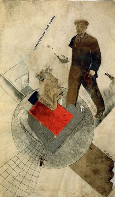
The pre-revolutionary phase began around 1915 with Vladimir Tatlin’s “counter-reliefs” — wall-mounted assemblages of metal, glass and wood that argued for an art of real materials in real space. Kazimir Malevich’s parallel Suprematism — the Black Square shown in Petrograd, December 1915 — gave the movement its vocabulary of pure geometric abstraction.

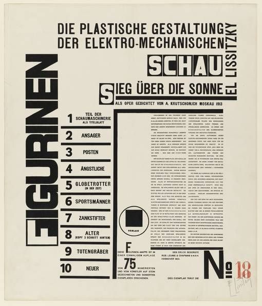
After the October Revolution of 1917, the new Soviet state adopted Constructivism as its preferred avant-garde. The movement was institutionalised across two interlinked schools: VKhUTEMAS (the Higher Art and Technical Studios, Moscow 1920–1930) taught the curriculum, and INKhUK (the Institute of Artistic Culture, Moscow 1920–1924) developed its theory. VKhUTEMAS is the direct counterpart of the Bauhaus and the two schools traded faculty — Lissitzky lectured at the Bauhaus in 1922; Moholy-Nagy adopted Constructivist photomontage methods after meeting him.

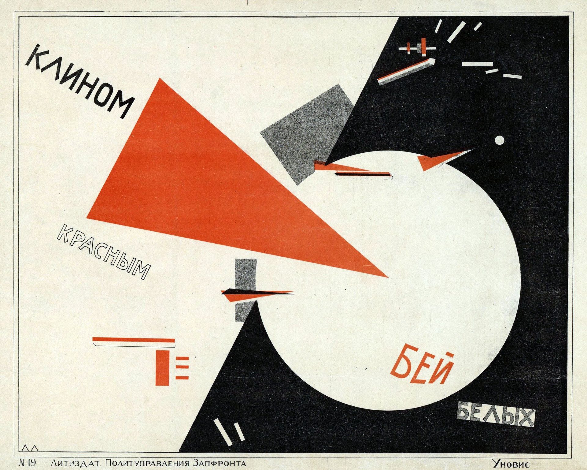
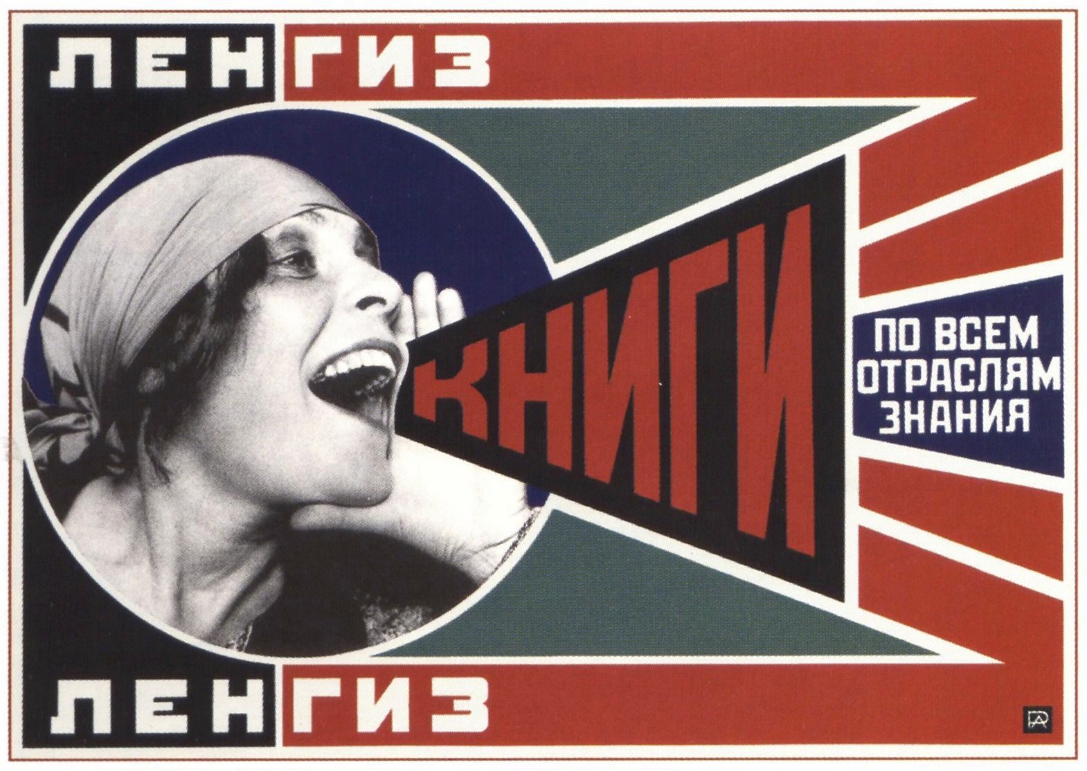
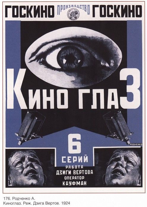
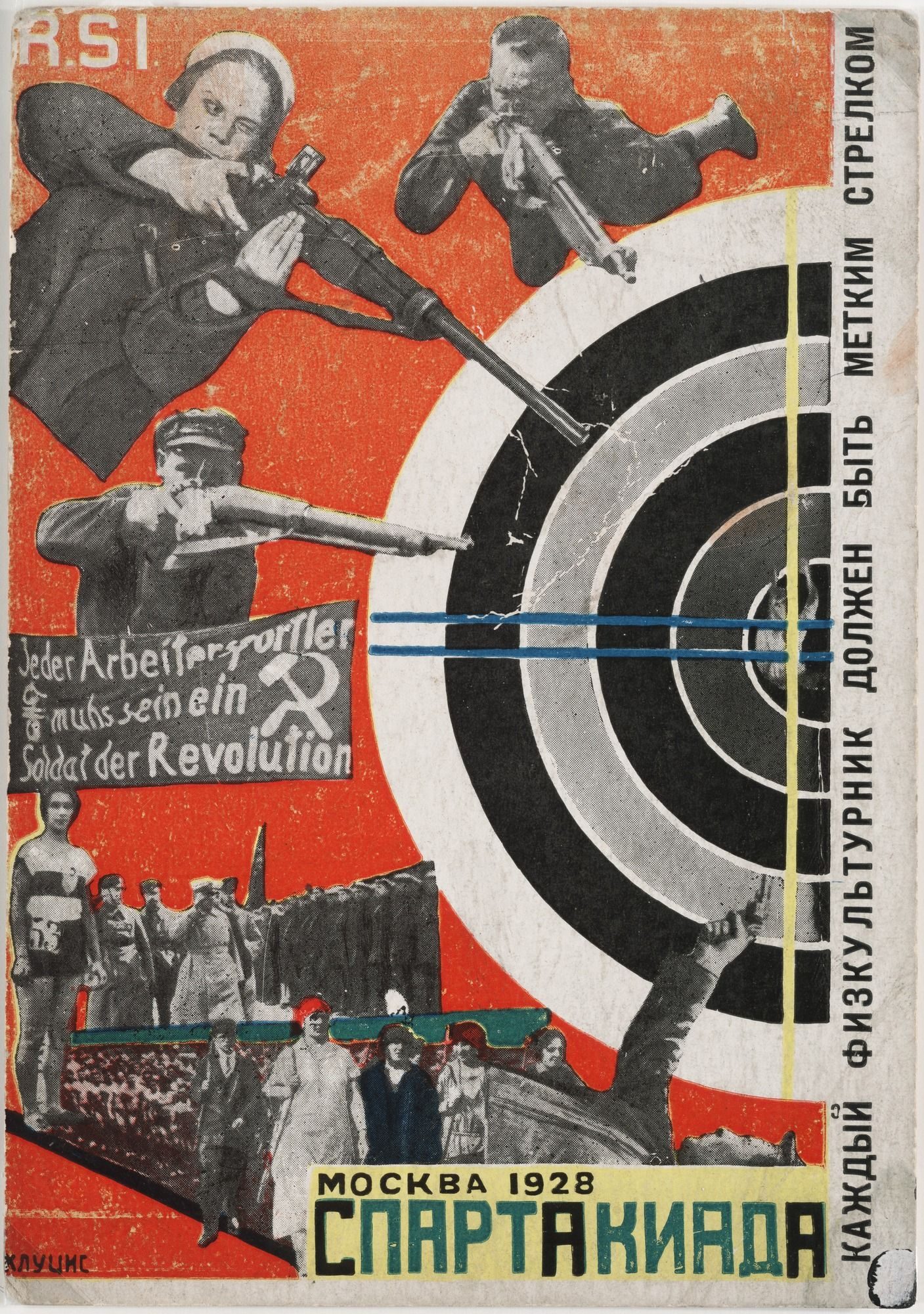
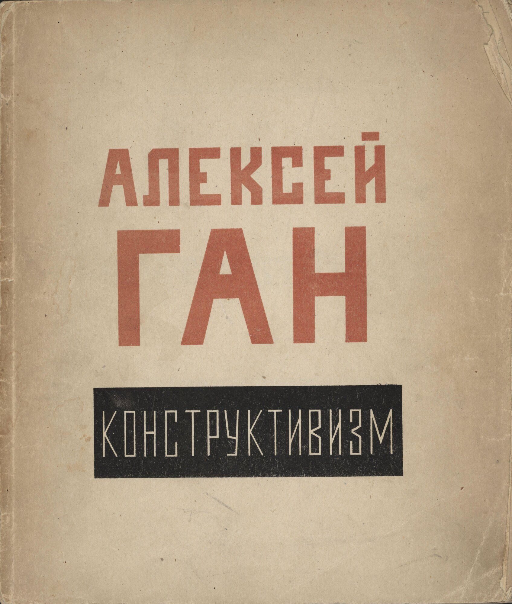
The graphic wing of the movement — Rodchenko, Stepanova, Lissitzky, the Stenberg brothers, Klutsis — moved across posters, books, advertisements, magazines, theatre design and exhibition design. The shared methodology was production art (Productivism): art should be useful, made for industrial reproduction, in service of the revolution.

The movement was effectively shut down in 1932–1934. Stalin’s consolidation of power saw avant-garde art reframed as “formalist”, and the 1934 Soviet Writers’ Congress made Socialist Realism the only sanctioned style. Several Constructivists — Klutsis among them — were imprisoned and shot in the late 1930s. Lissitzky died in 1941; Rodchenko survived but was effectively silenced.

02

Principles

Constructivism’s principles were programmatic before they were aesthetic. The Realistic Manifesto (Naum Gabo, 1920) and Aleksei Gan’s book Konstruktivizm (1922) are the movement’s foundational texts.

“Art is finished. There is no place for it in the workers’ apparatus of life. Labour, technology, organisation — that is today’s ideology.” — Aleksei Gan, Konstruktivizm, 1922

Production art (Productivism). Art exists to be useful, made for industrial reproduction, in service of social revolution. The poster, the magazine cover, the textile pattern and the theatre set are all proper sites for the avant-garde — easel painting is not.

Geometric abstraction. Pure forms — circle, square, triangle, rectangle, line — used non-representationally. Shape carries meaning by composition and contrast, not by depiction.

Photomontage. Photographs cut, layered and reassembled. The camera produces fragments of reality; the designer assembles them into political arguments. Klutsis and Rodchenko developed the method in parallel with Heartfield’s Berlin work.

Diagonal composition. Vertical and horizontal axes belong to the old order. Constructivist layouts work on diagonals, asymmetries, dynamic counter-balances.

Red, black and white. Red carries the political charge; black provides structural anchor; white is active negative space, not empty paper. The palette became so identified with the movement that almost every later political-graphic-design exercise quotes it.

Sans-serif type, set as image. Cyrillic sans-serifs (often hand-drawn) deployed as compositional elements in their own right. Type sets at angles, scales jump, words become objects. The practice routes directly into Tschichold’s Die neue Typographie (1928) and from there into Swiss postwar design.

03

Key works

Beat the Whites with the Red Wedge (Lissitzky, 1919) — the Civil-War poster that founded the visual grammar. A red triangle driving into a white circle, set against geometric Cyrillic type. Pure abstraction, deployed as political messaging.

Books! Please! advertising poster (Rodchenko, 1925) — Lilya Brik photomontaged shouting through stacked red-and-black geometric type. A template for the agitational advertising photomontage that followed.

For the Voice (Lissitzky / Mayakovsky, 1923) — typographic poetry book with thumb-tabbed icons. Typography as user interface, forty years before the term existed.

Rodchenko’s Kino-Glaz poster (1924) — a giant eye frames Vertov’s film series. Photomontage and perspectival distortion combine in a design that informed Soviet film-poster typography through the 1920s. The Stenberg brothers extended this vocabulary across more than three hundred cinema posters (1923–1933), including Battleship Potemkin, Man with a Movie Camera and October.

Klutsis’ photomontages (from 1920) — from his early electrification works to the 1928 Spartakiad postcard series, Klutsis developed Soviet political photomontage as a repeatable graphic form, predating Heartfield’s Berlin work.

USSR in Construction (1930–1941) — large-format propaganda magazine designed in rotation by Lissitzky, Rodchenko, Stepanova and Klutsis. State-funded, printed at exhibition scale, and the final sustained vehicle for Constructivist graphic methods before Socialist Realism was mandated in 1934.

Key works & examples

El Lissitzky, Beat the Whites with the Red Wedge, 1919

Beat the Whites with the Red Wedge (El Lissitzky)

1919

Lissitzky's Civil-War poster — a red triangle driving into a white circle on a black ground. One of the earliest examples of pure geometric abstraction deployed as political messaging. The visual grammar (diagonal red form, sans-serif Cyrillic, asymmetric layout) became the movement's template.
El Lissitzky, *Beat the Whites with the Red Wedge*, 1919. · El Lissitzky / Wikimedia Commons (public domain) · Public domain
Rodchenko, Books! poster for Lengiz, 1925

Books! advertising poster (Aleksandr Rodchenko)

1925

Rodchenko's red-and-black poster for the Leningrad State Publishing House (Lengiz), photomontaging Lilya Brik shouting through stacked geometric type. The composition — face cropped to mouth, letters scaled to shout — became a template for agitational advertising photomontage across Soviet graphic production and is now one of the defining images of the movement.
Aleksandr Rodchenko, *Books!*, Lengiz advertising poster, 1925. · Aleksandr Rodchenko / statutory educational licence · AU statutory
El Lissitzky, For the Voice, 1923 cover

For the Voice (Mayakovsky / Lissitzky)

1923

Lissitzky's typographic edition of Mayakovsky's poems, designed for reading aloud. Each poem indexed by a typographic icon on a tabbed thumb-index. The first canonical example of typography-as-interface and a direct ancestor of every later editorial micro-typography experiment from Tschichold onwards.
El Lissitzky design for Vladimir Mayakovsky, *For the Voice* (*Dlya Golosa*), Berlin/Moscow 1923. · El Lissitzky / MoMA collection · Museum editorial
Aleksandr Rodchenko, Kino-Glaz poster, 1924 — giant eye, photomontage composition

Kino-Glaz film poster (Aleksandr Rodchenko)

1924

Rodchenko's poster for Dziga Vertov's *Kino-Glaz* (Film Eye) series — a giant eye dominates the composition, framing the film's premise that the camera perceives what the human eye cannot. Photomontage and perspectival distortion combine in a design that shaped Soviet film-poster typography across the decade. The Stenberg brothers' parallel film-poster practice (over three hundred posters from 1923 to 1933, including *Man with a Movie Camera* and *Battleship Potemkin*) developed from Constructivist methods like these.
Aleksandr Rodchenko, *Kino-Glaz* (Film Eye), poster for Dziga Vertov's film series, 1924. · Aleksandr Rodchenko / statutory educational licence · AU statutory
USSR in Construction magazine, c. 1930 — large-format Soviet propaganda publication

USSR in Construction (multiple designers)

1930

Large-format propaganda magazine published 1930–1941 in five languages, with each issue designed by a different Constructivist hand — Lissitzky, Rodchenko, Stepanova and Klutsis all contributed. State-funded, printed at exhibition scale, distributed internationally. It became the final sustained vehicle for Constructivist graphic methods before Socialist Realism was mandated in 1934.
*USSR in Construction*, Moscow, from 1930. · Smithsonian Institution / public domain · Public domain
Gustav Klutsis, Electrification of the Entire Country, 1920, photomontage

Electrification of the Entire Country (Gustav Klutsis)

1920

Klutsis's 1920 photomontage integrates a Lenin portrait with an electrification grid, one of his first documented uses of the cut-and-paste photographic method he would develop throughout the 1920s. His subsequent election photomontages for the Communist Party — photographic fragments under sans-serif headlines — preceded Heartfield's Berlin work and established Soviet political photomontage as a distinct graphic form.
Gustav Klutsis, *Electrification of the Entire Country*, 1920. · Gustav Klutsis / Wikimedia Commons (public domain) · Public domain
Aleksei Gan, Konstruktivizm book cover, Tver 1922 — red rule, compressed grid, bold Cyrillic

Konstruktivizm book cover (Aleksei Gan)

1922

Gan's *Konstruktivizm* (1922) is the text that gave the movement its name and declared art superseded by industrial production. The cover — bold Cyrillic sans-serif, compressed grid, red rule — enacts the manifesto's arguments before the reader opens it. VKhUTEMAS students used it alongside their coursework as a design document in its own right.
Aleksei Gan, *Konstruktivizm*, Tver, 1922. The founding theoretical text of the movement. · Aleksei Gan / Wikimedia Commons (public domain) · Public domain
Gustav Klutsis, Spartakiad postcard, 1928 — photomontage athletes in diagonal Constructivist composition

Spartakiad postcard series (Gustav Klutsis)

1928

Klutsis designed nine postcards for the 1928 All-Union Spartakiad — Soviet mass athletics staged as a counterpoint to the Olympic Games. Athletes are cut from photographs and assembled into diagonal compositions under bold sans-serif type. The series demonstrates Constructivism's mobility across print formats: the same vocabulary of photomontage and geometric layout that drove the agitprop poster translated directly into sports promotion and souvenir print.
Gustav Klutsis, *Spartakiad* postcard series, 1928. · Gustav Klutsis / Wikimedia Commons (public domain) · Public domain

04

Influence & legacy

Constructivism’s direct influence on Western graphic design ran through three channels.

The first was Lissitzky himself. He spent 1922–1925 in Germany and Switzerland, lectured at the Bauhaus, designed for the Hannover Provinzialmuseum, and persuaded Moholy-Nagy to adopt photomontage and asymmetric typography. His Self-Portrait (The Constructor) (1924) became one of the foundational images of European modernism.

The second was Jan Tschichold. Die neue Typographie (1928) systematised Constructivist principles — asymmetric layout, sans-serif type, photographic illustration, the grid as structure — into a professional handbook for German printers. The book transmitted Constructivist methodology into the corporate-print tradition that became Swiss Style after 1945.

The third was photomontage. Heartfield in Berlin, Hannah Höch in Berlin, Bayer at the Bauhaus, and the entire postwar advertising industry are downstream of Klutsis and Rodchenko. The form is so thoroughly absorbed that its origin is rarely cited.

Less direct legacies: Reid Miles’ Blue Note record covers (1955–1969) quote Constructivist typography throughout. Neville Brody’s 1980s The Face magazine is closer to Lissitzky than to contemporary typography. Shepard Fairey’s “Hope” poster (2008) is a straight descendant of Klutsis. Every red-and-black political poster on Earth is a Constructivist artefact.

The movement’s central provocation — that graphic design is a political act — has been argued for and against ever since. Constructivism is the position the argument is for or against.

Learn at TGDS

Constructivism is the structural ancestor of most modernist graphic design we teach. Its photomontage, diagonal composition, and type-as-image principles feed directly into our curriculum:

Courses

  • Certificate IV in Design (CUA40720) — our flagship qualification. Typography, layout and identity modules all draw from the Bauhaus / Constructivism / Swiss lineage.
  • Intensive Foundation Course — 11 modules in typography, layout and image-making, covering the foundations Constructivism built its asymmetric photomontage practice from. Certificate of completion, not the Cert IV.

Related movements & people

Further reading

Books

  • Christina Lodder, Russian Constructivism (Yale University Press, 1983). The standard scholarly survey.
  • Aleksei Gan, Konstruktivizm (Tver, 1922). The movement’s founding manifesto, available in facsimile and translation.
  • Margarita Tupitsyn, El Lissitzky: Beyond the Abstract Cabinet (Yale, 1999).
  • Christopher Mount, The Stenberg Brothers: Constructing a Revolution in Soviet Design (MoMA, 1997).
  • Magdalena Dabrowski, Leah Dickerman & Peter Galassi, Aleksandr Rodchenko (MoMA, 1998).

Get Started.

You can enrol any day of the year. We are online and study is self-paced, there is no pressure. Enrol when you are ready to start, from anywhere in the world. If you would like to chat or email, feel free to get in touch.

Brochures, Phone Calls & Questions

You can download a free brochure, book a phone call with one of our course advisors, or simply ask a question.

Other ways to get in touch

Australia 1300 655 485

International +61 1300 655 485

Ask Anything info@thegraphicdesignschool.com

Get a quote accounts@thegraphicdesignschool.com

Acknowledgement of Country
The Graphic Design School acknowledges the Traditional Custodians of Country throughout Australia and their continued spiritual connection to land.
We pay respect to Elders past, present and emerging.
Always was, always will be.
RTO Provider № 91706