Design history · American corporate identity

Chermayeff & Geismar

Sixty years of abstract marks for the institutions that shaped postwar America.

Chermayeff & Geismar — founded 1957, partnered since 1960, now Chermayeff & Geismar & Haviv — is the New York design studio behind more enduring American corporate marks than any other. Chase Manhattan, Mobil, PBS, National Geographic, Smithsonian, NBC: the studio has drafted the visual infrastructure of postwar American institutional life.
Ivan Chermayeff at AIGA New York 30th Anniversary Gala, June 2012
Ivan Chermayeff (1932–2017), photographed at the AIGA/NY 30th Anniversary Gala, New York, June 2012. · Photograph by Peter Muka for AIGA New York. CC BY 2.0 via Wikimedia Commons.

Key facts

Founded
1957 (New York) as Brownjohn, Chermayeff & Geismar Associates · partnership since 1960
Founders
Ivan Chermayeff (1932–2017) · Thomas Geismar (b. 1931)
Current name
Chermayeff & Geismar & Haviv (2013–present, with Sagi Haviv)
Era
Postwar American corporate identity · Modernist logo design
Known for
NBC peacock · Mobil · Chase Manhattan · PBS · National Geographic · Smithsonian · Showtime · MoMA

01

Biography

The studio began in 1957 as Brownjohn, Chermayeff & Geismar Associates — three designers in their mid-twenties sharing a Manhattan office. Robert Brownjohn was the eldest and most restless. Ivan Chermayeff, then 25, was the son of the modernist architect Serge Chermayeff and had studied at Harvard, IIT Institute of Design, and Yale School of Art under Josef Albers. Tom Geismar, also 25, had trained at Brown and the Rhode Island School of Design before Yale, where he and Chermayeff overlapped. Brownjohn returned to London in 1960. The other two kept the office and the work.

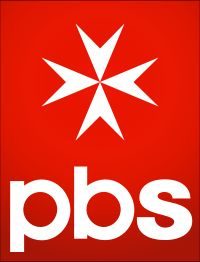
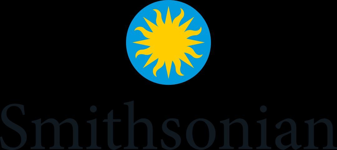
The first decade produced a sequence of commissions that, in retrospect, defined what corporate identity would look like for the next thirty years. Chase Manhattan in 1960 — four geometric wedges, no banking imagery, debated by the board for months before approval. Mobil Oil in 1964 — wordmark plus red O plus a complete gas-station architecture programme. Xerox, Pan Am, the Smithsonian, National Geographic, PBS: the studio worked through the roster of American institutional life as it expanded in the postwar decades.

In 2006 the partnership was joined by Sagi Haviv (b. 1974), who had been interning and working at the studio since 2003. He became a full partner in 2013, at which point the name changed to Chermayeff & Geismar & Haviv. Ivan Chermayeff died in December 2017. Geismar and Haviv continue the practice from the same New York studio.

02

Design philosophy

In their 2011 book Identify, Chermayeff, Geismar and Haviv put the working position plainly: a good logo is appropriate, distinctive, and simple — in that order. Appropriateness first. The mark has to belong to this client, in this moment, doing this thing. Distinctiveness next: enough strangeness to stick in memory. Simplicity last: everything that can come out has come out.

“If you have to explain the logo, it’s probably the wrong logo.” — Ivan Chermayeff

Three habits follow from that. Commit to abstraction. Chase Manhattan’s octagon described nothing literal — no keys, no columns, no monetary imagery — and the board took months to approve it. The studio has been making that argument to clients ever since.

Revise, don’t replace. The NBC peacock, the PBS profile, Mobil’s wordmark: none of these were greenfield designs. Each was a reduction of something that already existed. The working discipline is subtractive — take out what isn’t earning its place.

The manual matters as much as the mark. Chase’s 1961 identity manual, Mobil’s architectural specifications for pump islands and forecourt signage, NBC’s typographic system: these are what gave the logos durability. A mark without a system for applying it is an object without a context.

03

Key works

Chase Manhattan Bank (1960) — the mark that made abstract bank identity mainstream. Four geometric quadrants, no banking imagery. The board debated it for months. It has now survived every CEO and every merger for over six decades.

Mobil Oil (1964) — wordmark in a purpose-drawn sans-serif with the O in red. Tom Geismar’s single decision made the name legible at highway speed from two directions. The broader programme covered gas-station architecture, pump-island colour, and Pegasus placement. This is what an identity programme meant before the term became a pitch-deck word.

PBS (1984) — the 1971 single-profile P-as-face was Herb Lubalin’s design. Geismar’s 1984 revision stacked three overlapping profiles, dropped the letterform, and produced a quieter, more resolved mark. It has served as PBS’s primary logo for forty years.

National Geographic Society (1979) — the yellow border formalised as a standalone device. No type required. Still the Society’s primary mark.

NBC peacock (1986) — reduced from Graham’s 1956 eleven-feather bird to six feathers, no body, no legs. Holds at favicon size. That is not incidental.

Smithsonian Institution (1998), MoMA (1964), Xerox (revised 2008), Pan Am (1955, with Brownjohn), US Bicentennial (1976), Screen Gems (1965), Showtime (1997) — a working list of American institutional identity from the 1950s to the 2000s. Most of these marks are still in use.

Iconic works

Chase Manhattan Bank 1961 Annual Report cover showing the C&G octagon logo

Chase Manhattan Bank logo

1960

Four geometric wedges rotating around a central square to form an external octagon — the first major American bank mark that carried no literal banking imagery. When Brownjohn, Chermayeff & Geismar presented the proposal, the Chase board debated it for months before approving. The four quadrants were originally printed in black, brown, green, and blue; the current solid-blue version dates to the JPMorgan Chase merger. Still in use, essentially unchanged, since 1961. Source: Chase Manhattan Bank 1961 Annual Report, Chermayeff & Geismar Collection, SVA Archives, New York.
Chase Manhattan Bank 1961 Annual Report (Chermayeff & Geismar Collection, SVA Archives). · SVA Archives, Chermayeff & Geismar Collection (accession 10270). Educational use. · AU statutory
Mobil wordmark with red O, 1964

Mobil logo

1964

Wordmark in a purpose-drawn sans-serif, with the O in red — a single decision that made the name readable at highway speed from either direction of approach. Tom Geismar led the commission. Beyond the letterforms, the identity programme specified gas-station architecture, pump-island colour treatment, and a standardised Pegasus supergraphic, separating the horse from the wordmark so each could work independently. The programme remained unchanged in its essentials for forty years.
Mobil logo (1964, Tom Geismar / Chermayeff & Geismar). · Public domain. Wikimedia Commons. · Public domain
PBS triple-profile logo, 1984

PBS identity (1984 triple-profile revision)

1984

The 1971 single-profile P-as-face was Herb Lubalin's work. Geismar's contribution came thirteen years later: the 1984 revision that stacked three overlapping profiles and removed the letterform, leaving only the faces. The stacked mark is quieter and more resolved than the original — it reads as crowd, not as letter. The triple-profile has been PBS's primary mark ever since.
PBS triple-profile mark (Tom Geismar / Chermayeff & Geismar, 1984). · Public domain. Wikimedia Commons. · Public domain
National Geographic Society yellow rectangle logo

National Geographic Society logo

1979

The yellow border had wrapped the Society's magazine since the 1890s. Chermayeff & Geismar formalised it as an independent device: a rectangle that stands alone, without type, as an identifying mark. The brief argument was that a border is a metaphor for a Society that takes you to other places. The mark still serves as the Society's primary identity, one of the most recognised publishing marks in the world.
National Geographic Society yellow rectangle (Chermayeff & Geismar, 1979). · Public domain. Wikimedia Commons. · Public domain
NBC six-feather peacock, 1986

NBC peacock

1986

John J. Graham's 1956 peacock had a head, a body, legs, and eleven feathers. The Chermayeff & Geismar version has six. Head, body, and legs are gone; what remains is the feather fan and the six-colour spectrum. The reduction happened incrementally across two decades of revisions; the 1986 version is the settled result. It holds at favicon size. That is not incidental — it is the point.
NBC peacock, 1986 (Chermayeff & Geismar; revising John J. Graham, 1956). · Public domain. Wikimedia Commons. · Public domain
Smithsonian Institution sun logo, 1998

Smithsonian Institution identity

1998

A stylised sun — adapted from a nineteenth-century Smithsonian seal — unified nineteen museums, research centres, and administrative offices under a single identity system for the first time. The commission came from Secretary I. Michael Heyman, who asked the studio to create a mark that could carry across the full breadth of Smithsonian operations. The sun device's pre-existing use on the seal gave it institutional authority that a purely new form would have lacked.
Smithsonian Institution identity system (Chermayeff & Geismar, 1998). · United States federal government work. Public domain via Wikimedia Commons. · Public domain
Showtime spotlight logo, 1997

Showtime logo

1997

A spotlight beam striking a sphere, with the network name set tight beneath. The mark had to work on a cable-box panel at one centimetre and on an exterior building sign at thirty metres — a range that most marks fail. The geometry is simple enough that it scales without compromise. The commission preceded Showtime's push into original drama; the identity system was designed to read as prestige entertainment without the clutter of the incumbent cable aesthetic.
Showtime logo (Chermayeff & Geismar, 1997). · Public domain. Wikimedia Commons. · Public domain

04

Influence and legacy

What Chermayeff & Geismar established is not a style — it is a category. The abstract corporate mark, carrying no literal reference to the client’s industry, is now the default shape of American institutional identity. Banks, broadcasters, oil companies, civic institutions: the space they all operate in was defined, in substantial part, by this studio’s work between 1960 and 1986.

Practices that followed — Pentagram, Wolff Olins, Landor, Collins, Base — build on assumptions the studio put in place. That is a different kind of influence from being copied. It means the conversation has moved inside the framework they built.

Ivan Chermayeff taught at Yale School of Art for thirty-seven years, overlapping with Paul Rand, Herbert Matter and Alvin Eisenman. Tom Geismar served as AIGA president in 1965–1966 and has spent decades making the case that civic and cultural institutions — libraries, zoos, museums — deserve the same rigorous identity work as commercial clients.

Sagi Haviv’s continuation of the practice from 2013 is the clearest evidence that succession was handled well. The studio applies its own rules to itself: revise, don’t replace.

Learn at TGDS

The C&G catalogue — Chase to Mobil to NBC to Smithsonian — runs through our identity and logo curriculum as primary case material. If you want to understand how abstract marks work and why clients take years to approve them, this is the studio to study.

Courses

Related movements & people

Further reading

Books

  • Ivan Chermayeff, Tom Geismar & Sagi Haviv, Identify: Basic Principles of Identity Design in the Iconic Trademarks of Chermayeff & Geismar (Print Publishers, 2011). The studio’s own account of their work, logo by logo.

Online

Get Started.

You can enrol any day of the year. We are online and study is self-paced, there is no pressure. Enrol when you are ready to start, from anywhere in the world. If you would like to chat or email, feel free to get in touch.

Brochures, Phone Calls & Questions

You can download a free brochure, book a phone call with one of our course advisors, or simply ask a question.

Other ways to get in touch

Australia 1300 655 485

International +61 1300 655 485

Ask Anything info@thegraphicdesignschool.com

Get a quote accounts@thegraphicdesignschool.com

Acknowledgement of Country
The Graphic Design School acknowledges the Traditional Custodians of Country throughout Australia and their continued spiritual connection to land.
We pay respect to Elders past, present and emerging.
Always was, always will be.
RTO Provider № 91706