Design history · American mid-century editorial design

Bradbury Thompson

The Kansas printer who spent twenty-three years turning a paper-company house magazine into one of the most sustained typographic experiments in American design.

Bradbury Thompson (1911–1995) designed 61 issues of Westvaco Inspirations for Printers (1938–1962), a house magazine that became the primary vehicle for mid-century typographic experimentation in America. He also designed the format for Smithsonian Magazine (1970), co-founded Yale's graphic design programme, produced the Washburn College Bible (1979), and received the AIGA Medal in 1975.
Bradbury Thompson at Rochester Institute of Technology, 1983
Bradbury Thompson, 1983. · RIT News and Events, Vol. 15 No. 7, 29 September 1983. No copyright notice; public domain under US law (PD-US). Via Wikimedia Commons.

Key facts

Born
25 March 1911, Topeka, Kansas
Died
1 November 1995, Riverside, Connecticut
Nationality
American
Era
American mid-century editorial design · Experimental typography · Book design
Studios
Westvaco Inspirations for Printers (designer, 1938–1961) · Mademoiselle (art director, 1945–1959) · Smithsonian Magazine (format design, 1970) · Yale School of Design (faculty, 1956–1995)
Education
Washburn University, Topeka (B.A., 1934) · self-taught in design
Known for
Westvaco Inspirations for Printers (61 issues, 1938–1961) · Monalphabet experimental typeface (1950) · Washburn College Bible (1979) · art direction of Mademoiselle · 40 years teaching at Yale

01

Biography

Bradbury Thompson was born in Topeka, Kansas in 1911. He studied at Washburn University, graduating in 1934 with a degree in economics and an art minor. His only formal design training came from editing and designing the university yearbook. After a brief period at Capper Engraving in Topeka, he moved to New York in 1938.

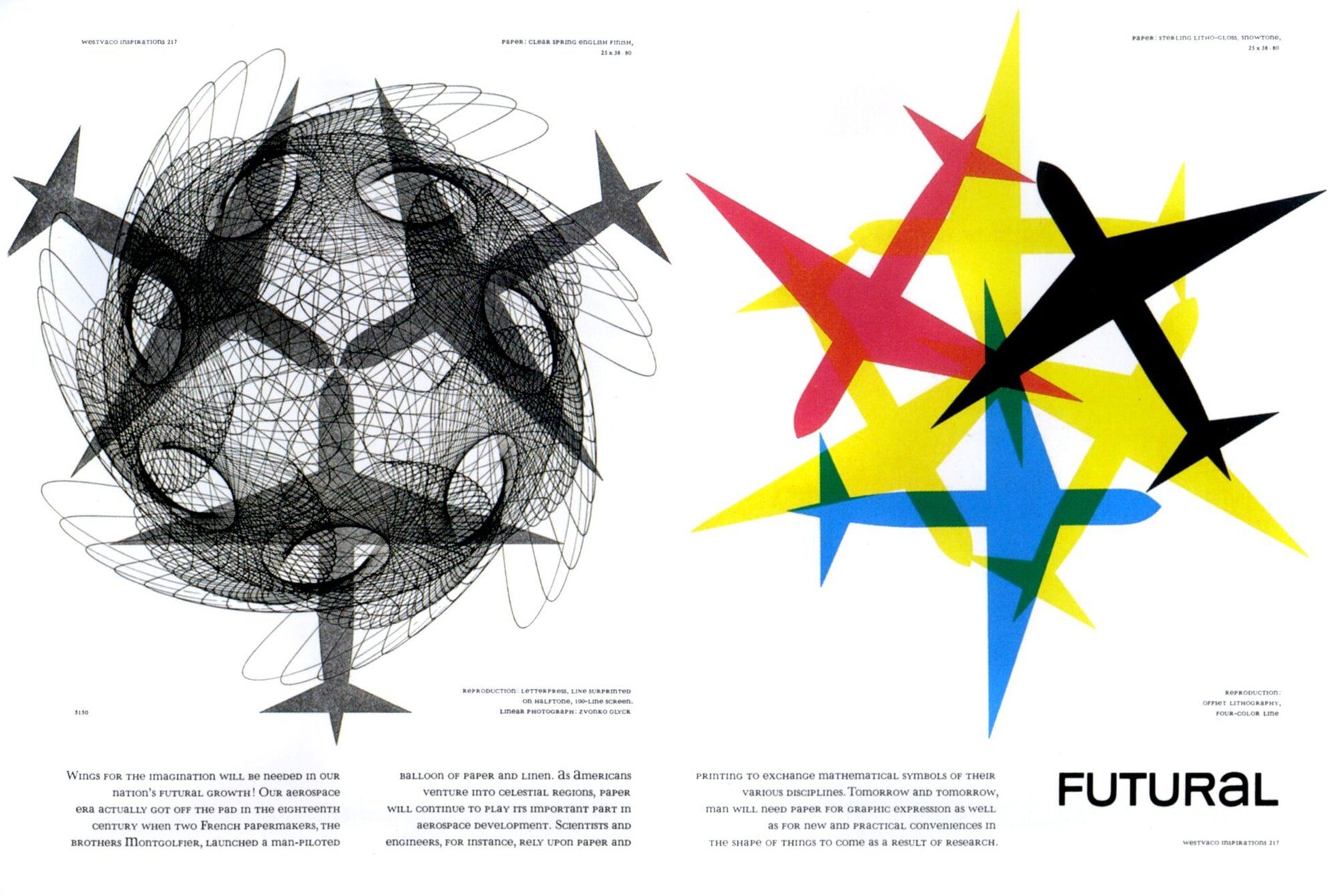
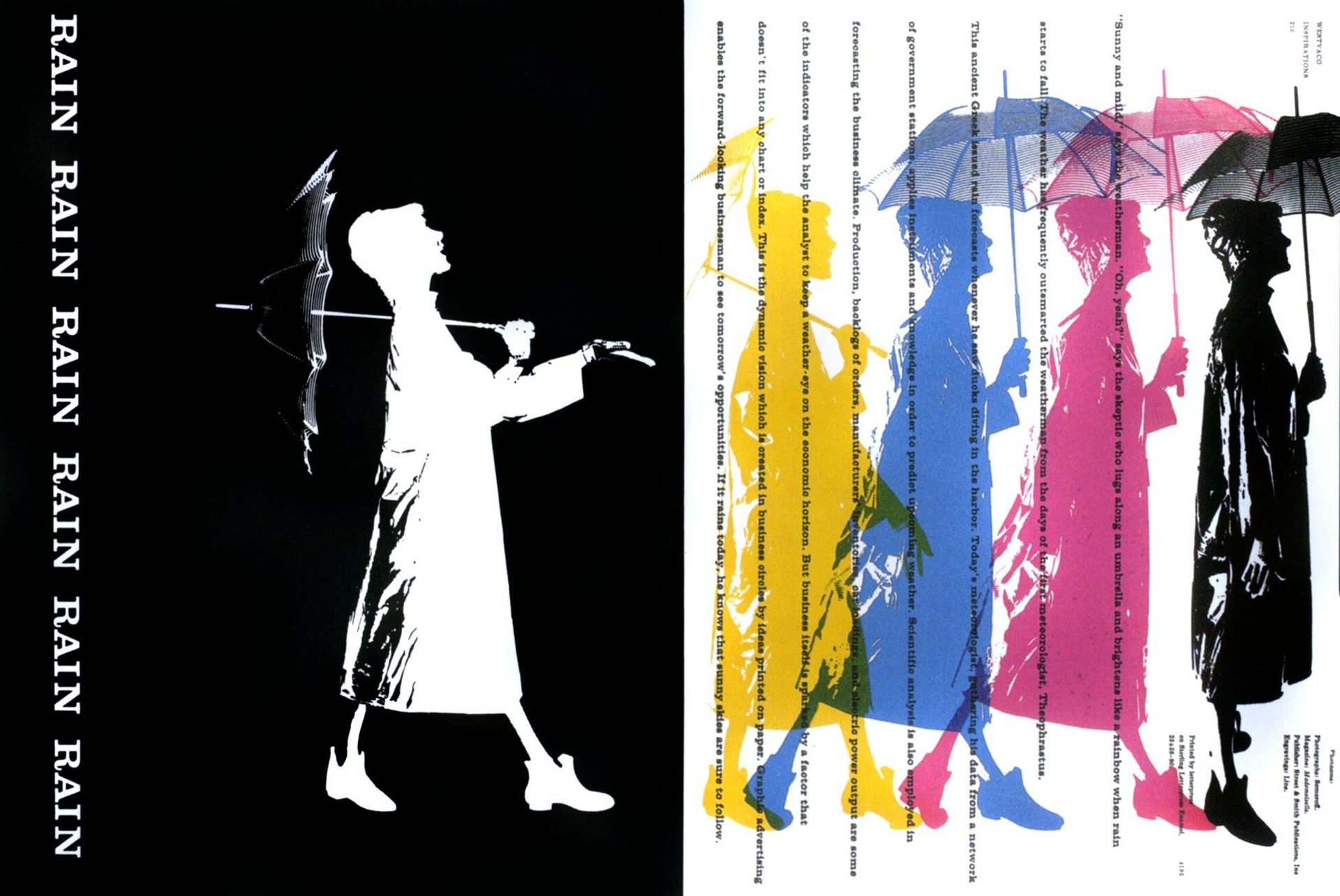
That year he began designing Westvaco Inspirations for Printers, the house magazine of West Virginia Pulp & Paper Company. The brief was to demonstrate paper stocks and printing techniques to American printers. Thompson kept the commission for twenty-three years, producing 61 issues across which he developed a consistent working method: layering Renaissance woodcuts, 19th-century engravings and modernist typefaces in a single composition, treating each historical source as current material rather than archive.

In 1945 he became art director of Mademoiselle at Condé Nast, a post he held for fourteen years. He was also a prolific US commemorative stamp designer from the early 1960s through the 1970s, producing over 90 stamps including the entire Universal Postal Union painting series (1974) and the Christmas Traditional series. In 1956 he joined the Yale School of Design faculty, where he taught alongside Alvin Eisenman, Norman Ives and Herbert Matter for nearly forty years.

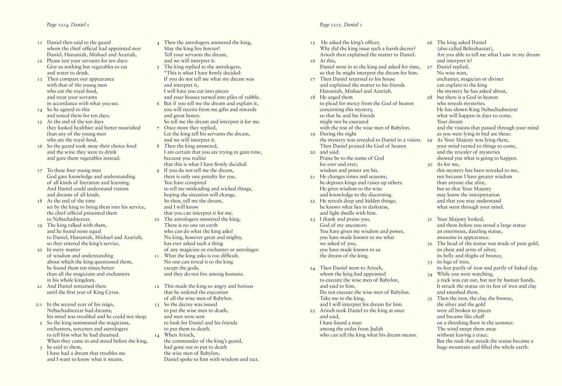
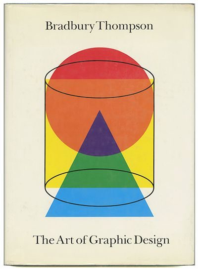
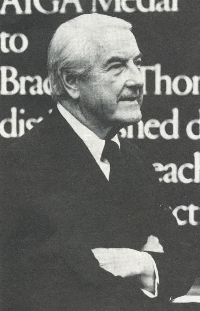
In 1979 he completed the Washburn College Bible — a sense-lined, three-volume King James edition set in Sabon, commissioned by his alma mater and deposited with the Library of Congress. He received the AIGA Medal in 1975. His retrospective book The Art of Graphic Design was published by Yale University Press in 1988. He died in Riverside, Connecticut on 1 November 1995.

02

Design philosophy

Thompson’s working position was that typography is where a graphic designer’s judgement is most exposed, and that American typography had spent decades running behind European practice. Westvaco Inspirations was his instrument for closing that distance.

“Design is thinking made visual.” — Bradbury Thompson

Historical continuity as working material. Thompson combined Renaissance woodcuts, 19th-century engravings and modernist typefaces in the same layout as a deliberate argument: the designer’s job is to bring historical material forward, not quarantine it as archive. Westvaco gave him 61 issues to demonstrate this in print, at scale, to a working audience of American printers.

Experiments in the document, not in manifestos. The Alphabet 26 proposal (1950) appeared inside an ordinary issue of Westvaco — set, printed, distributed. Thompson’s typographic experiments were always tested in a physical publication rather than argued in prose. The Washburn College Bible is the same impulse applied to long-form typesetting: a theoretical question about legibility and spoken rhythm, answered by actually producing the book.

Design education as craft plus critical reading. His forty years at Yale rested on a straightforward premise: graphic design is a discipline serious enough to teach at university level, and the curriculum should cover both production craft and the history of what print has been capable of.

03

Key works

Westvaco Inspirations for Printers (1938–1962) — 61 issues across twenty-three years. Each issue demonstrated a paper stock or printing technique; each was also a sustained argument for the range of American typographic possibility. Thompson’s method — laying Renaissance engravings alongside modernist typefaces, using colour overprinting to create rhythm across a spread — was consistent across the entire run. The complete set is held by the Cooper Hewitt.

Alphabet 26 / Monalphabet (1950) — a single-case roman merging uppercase and lowercase forms into one set. Published inside Westvaco Inspirations No. 152. Never cut as a commercial typeface, but cited in subsequent unicase type experiments and reproduced in full in Thompson’s 1988 monograph.

Washburn College Bible (1979) — three volumes, 1,800 pages, 398 copies. Thompson set the King James text in Sabon at 14-point, breaking each line at the natural pause in spoken scripture. The method applied the same logic he used in Westvaco — argument by execution, in print — to the most demanding long-form typesetting problem he could find. In the permanent collection of the Library of Congress.

Mademoiselle art direction (1945–1959) — fourteen years applying a rigorous editorial grid to a mainstream women’s magazine. The 1958 “Rain, Rain, Rain” spread, which reprinted a single raincoat figure five times in successive colours, is the clearest example of his Westvaco overprinting logic applied to commercial editorial work.

US commemorative stamps (1960s–1970s) — over 90 stamps, including the Christmas Traditional series (which introduced Old Master paintings to the US stamp programme), the Universal Postal Union painting series (1974), and the Oliver Wendell Holmes stamp (1978). Thompson’s stamp work reached a genuinely mass audience with the same typographic care he applied elsewhere.

Iconic works

Westvaco Inspirations for Printers spread, Bradbury Thompson, 1938–1962

Westvaco Inspirations for Printers (61 issues)

1938–1962

The house magazine of West Virginia Pulp & Paper Company, designed by Thompson across 61 issues between 1938 and 1962. Each issue was built around a specific paper stock or printing technique. Thompson's method was to layer Renaissance woodcuts, 19th-century engravings and modernist typefaces within a single layout — demonstrating what the paper could do while arguing, issue by issue, for a broader idea of American typographic possibility. The complete run is held in the permanent collection of the Cooper Hewitt, Smithsonian Design Museum, New York.
Westvaco Inspirations for Printers (1938–1962). · Spread from Westvaco Inspirations; courtesy Smashing Magazine archive (smashingmagazine.com). Statutory educational licence. · AU statutory
Alphabet 26 by Bradbury Thompson, 1950 — single-case typeface proposal

Alphabet 26 (Monalphabet) typeface proposal

1950

A single-case alphabet that merged uppercase and lowercase letterforms into one unified roman family, first published in Westvaco Inspirations No. 152 (1950). Thompson's proposition was practical: one case is less to learn than two, and a merged alphabet could be set more compactly. The proposal was never cut as a working commercial typeface, but it is widely referenced in subsequent unicase type experiments and reproduced in full in Thompson's 1988 monograph.
Alphabet 26 (Monalphabet) typeface proposal (1950). · Bradbury Thompson, Alphabet 26 (1950). Public domain — typeface letterform charts are not eligible for copyright. Via Wikimedia Commons. · Public domain
Washburn College Bible, 1979 — sense-line typography spread, Bradbury Thompson

Washburn College Bible

1979

A three-volume edition of the King James Bible, commissioned by Washburn University (Topeka, Kansas). Thompson set the text in Sabon at 14-point, flush-left and ragged-right, breaking each line at the natural pause in spoken scripture rather than at the column margin. The result is a Bible that reads like a score rather than a wall of prose. Only 398 copies of the original edition were produced; a single-volume Oxford edition followed in 1980. A copy is held in the permanent collection of the Library of Congress, Washington D.C.
Washburn College Bible (1979). · Spread from the Washburn College Bible (Oxford University Press / Washburn University, 1979). Statutory educational licence. · AU statutory
Mademoiselle magazine spread, art directed by Bradbury Thompson, c.1958

Mademoiselle magazine art direction

1945–1959

Fourteen years as art director of Condé Nast's Mademoiselle. Thompson brought the same typographic discipline he applied at Westvaco to a mainstream women's magazine — a rigorous editorial grid, deliberate type scale, and restrained colour. The 1958 "Rain, Rain, Rain" spread, where a raincoat figure was reprinted five times in different colours as a typographic rhythm device, is the most cited example of his overprinting method applied to editorial work. Issues from this run are held in US library collections including the New York Public Library.
Mademoiselle magazine spread (c.1958), art directed by Bradbury Thompson. · Spread from Mademoiselle (c.1958); courtesy Smashing Magazine archive (smashingmagazine.com). Statutory educational licence. · AU statutory
Smithsonian Magazine, 1989, showing the Thompson-designed nameplate and layout grid

Smithsonian Magazine format design

1970

Thompson designed the format, masthead and typographic specification for the first issue of Smithsonian Magazine in January 1970. His choice of Baskerville as the primary text face — an 18th-century roman revived by Linotype — established a tone of scholarly authority that the magazine has carried ever since. The grid and nameplate remained largely intact through the magazine's first two decades. A 1989 table-of-contents page shows the structure essentially as Thompson left it.
Smithsonian Magazine, 1989, showing the Thompson nameplate and layout (original design 1970). · Smithsonian Magazine, table of contents (1989). Baskerville typeface; layout and nameplate by Bradbury Thompson (1970). Statutory educational licence. Via Fonts in Use. · AU statutory
The Art of Graphic Design, Bradbury Thompson, Yale University Press, 1988

The Art of Graphic Design

1988

Thompson's retrospective monograph, published by Yale University Press in 1988 and reissued in a 30th-anniversary edition in 2018. The book moves between essays on typography, reproductions of historical print and memoir, drawing on more than four decades of work across editorial design, book design and postage-stamp design. It won the George Wittenborn Memorial Award as best art book of 1988 from the Art Libraries Society of North America. The book remains in print and is widely used in graphic design programmes.
The Art of Graphic Design (Yale University Press, 1988). · Cover of The Art of Graphic Design (Yale University Press, 1988). Statutory educational licence. Via Modernism 101. · AU statutory

04

Influence and legacy

Thompson’s reach into subsequent practice runs mainly through three channels.

Teaching. Nearly forty years at Yale — alongside Alvin Eisenman, Norman Ives and Herbert Matter — produced generations of American editorial designers and design educators, including Chris Pullman and Philip Burton. The Yale curriculum Thompson helped build is still the template for university-level graphic design education in the United States.

The Westvaco model. Thompson’s approach — turning a corporate house publication into a sustained typographic experiment, distributed free to a professional audience — was taken up by other paper companies and design publishers through the 1960s and 1970s. The underlying logic (argument through execution, not manifesto) remains the most direct route a working designer has to making the case for what typography can do.

Sense-line typesetting. Thompson’s treatment of the Washburn College Bible — breaking text at the natural spoken pause rather than at the column margin — became the standard approach in Bible typography and has been applied to poetry, legal drafting, and any long-form text where phrasing shapes comprehension. His method worked because it came from a designer who had spent decades thinking about how type behaves on a page, not from a theorist describing how it should.

Learn at TGDS

Thompson’s work is a study in what serious typographic practice looks like over a long career. Two TGDS courses cover the core skills his output draws on:

Courses

  • Certificate IV in Design (CUA40720) — the typography, grid and editorial design fundamentals that Westvaco Inspirations demonstrated issue by issue across twenty-three years. Government-recognised qualification under the Australian Qualifications Framework (RTO 91706).
  • Intensive Foundation Course — 11 modules in typography and design fundamentals. Certificate of completion, not the Cert IV.

Further reading

Books

  • Bradbury Thompson, The Art of Graphic Design (Yale University Press, 1988; reissued 2017).
  • Richard Hollis, Graphic Design: A Concise History (Thames & Hudson, 2001) — chapter on American post-war editorial design.
  • Philip B. Meggs & Alston W. Purvis, Meggs’ History of Graphic Design (Wiley, 6th ed., 2016).

Online

Get Started.

You can enrol any day of the year. We are online and study is self-paced, there is no pressure. Enrol when you are ready to start, from anywhere in the world. If you would like to chat or email, feel free to get in touch.

Brochures, Phone Calls & Questions

You can download a free brochure, book a phone call with one of our course advisors, or simply ask a question.

Other ways to get in touch

Australia 1300 655 485

International +61 1300 655 485

Ask Anything info@thegraphicdesignschool.com

Get a quote accounts@thegraphicdesignschool.com

Acknowledgement of Country
The Graphic Design School acknowledges the Traditional Custodians of Country throughout Australia and their continued spiritual connection to land.
We pay respect to Elders past, present and emerging.
Always was, always will be.
RTO Provider № 91706