Design history · 1980s feminist conceptual

Barbara Kruger

The designer who made the magazine pull-quote a political weapon.

Barbara Kruger (born 1945) is the American artist and designer who pulled the vocabulary of magazine editorial — black-and-white photography, red sans-serif captions — onto museum walls and sixty-foot billboards. Works like Your body is a battleground (1989) and I shop therefore I am (1987) turned the language of advertising back on the culture that made it.

Key facts

Born
26 January 1945, Newark, New Jersey, USA
Nationality
American
Era
Postmodern · Feminist conceptual · Text-as-image
Background
Parsons School of Design (1965) · Mademoiselle magazine designer (1966–1969) · House & Garden picture editor (1969–1975)
Known for
Your body is a battleground (1989) · I shop therefore I am (1987) · Untitled (We don't need another hero) (1987) · large-scale museum and public installations

Biography

Barbara Kruger was born in Newark, New Jersey in 1945 into a working-class household. She studied briefly at Syracuse and then at Parsons School of Design in New York, where her teachers included the photographer Diane Arbus and the designer Marvin Israel. She left without a degree in 1966 and went straight into magazine publishing.

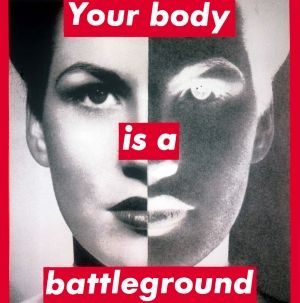
For nearly a decade her day job was editorial design. She was a designer at Mademoiselle under Alexander Liberman, then picture editor at House & Garden, Aperture and other Condé Nast titles. That apprenticeship — cropping photographs, writing captions, laying out pages — is the origin of the visual grammar she later turned into her own practice: stock photograph, red-bordered caption, Futura Bold Oblique typography.

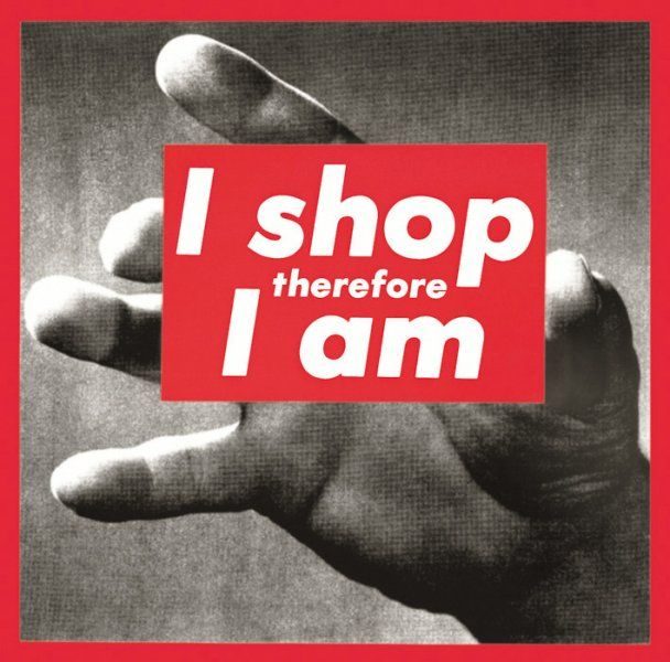
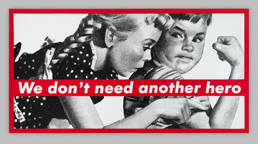
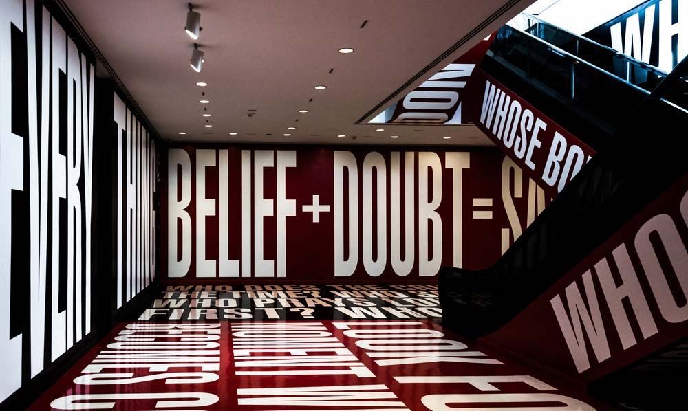
From the early 1980s she worked as an artist full-time, exhibiting first at Mary Boone Gallery in New York and quickly across museum spaces in the US and Europe. The 1987 works — I shop therefore I am and We don’t need another hero — moved her into the public imagination outside the art world. She won the Venice Biennale Golden Lion for Lifetime Achievement in 2005 and the National Medal of Arts in 2021. She teaches at UCLA and continues to exhibit.

Design philosophy

Kruger’s entire method is taken from the magazine. Found black-and-white photography, bold centred caption, red border, Futura Bold Oblique set tight. That’s not a stylistic choice dressed up as an idea — it is the idea. Her argument is that the visual language of advertising and editorial is the most politically loaded set of design conventions of the twentieth century, and that the job of the critical designer is to wield those conventions back against the content they usually deliver.

The vocabulary has stayed remarkably stable across forty years. A Kruger from 1982 and a Kruger installation from 2022 share the same two typefaces, the same colour palette, the same sentence structure (first-person pronoun plus declarative). That consistency is not nostalgia; it is the method proving, by repetition, that the magazine’s visual authority is the actual subject.

The typography discipline is strict. Futura Bold Oblique is the anchor. Helvetica Ultra Condensed is the occasional accent. Words like you, we, your, our are load-bearing — Kruger’s sentences almost always address the viewer as second person, which is how advertising addresses its reader, which is the joke being turned.

Key works

Untitled (We don’t need another hero) (1987) — billboard-scale photomontage. One of the earliest Kruger works to move out of the gallery into public space.

Untitled (I shop therefore I am) (1987) — the tightest single line Kruger ever made. A reworking of Descartes through the vocabulary of the 1980s consumer decade.

Untitled (Your body is a battleground) (1989) — poster for the Women’s March on Washington. The single most reproduced Kruger image and the template used by activist designers ever since.

Belief+Doubt (Hirshhorn, 2012–2022) — room-scale installation at the Smithsonian’s Hirshhorn Museum. Walls, floor and escalators overwritten in the Kruger vocabulary. A demonstration that the method scales from poster to architecture.

Serpentine Gallery and Arts Club Chicago commissions (2014–2019) — extended recent practice in public-space installation, carrying the 1980s vocabulary into the smartphone era without adjusting it.

Iconic works

Your body is a battleground, 1989

Untitled (Your body is a battleground)

1989

Poster produced for the 9 April 1989 Pro-Choice March on Washington in support of reproductive rights. The photographic silkscreen on vinyl (284 x 284 cm) was first exhibited at Fred Hoffman Gallery, Santa Monica, and entered the collection of The Broad, Los Angeles, in June 1989. The composition was re-issued as an overprinted activist poster following the 2022 overturning of Roe v. Wade.
Untitled (Your body is a battleground) (1989). · Museum collection page from The Broad (Los Angeles), which holds the original 1989 silkscreen work. · Museum editorial
I shop therefore I am, 1987

Untitled (I shop therefore I am)

1987

Photographic silkscreen on vinyl showing a black-and-white hand holding a card that reads "I shop therefore I am." The phrase reworks Descartes' "I think therefore I am" through the vocabulary of 1980s consumer culture. The Museum of Modern Art, New York holds a 1990 offset lithograph edition of the work in its permanent collection.
Untitled (I shop therefore I am) (1987). · Serigraph on vinyl version held in Pinault Collection (280×283 cm); museum-hosted image with higher institutional authority. · Museum editorial
Untitled (We don't need another hero), 1987

Untitled (We don't need another hero)

1987

Screenprint on vinyl pairing a vintage photograph of two white children with white-on-red captions. The Whitney Museum of American Art, New York, holds the primary collection example, measuring 276.5 x 531.3 cm, gifted from the Emily Fisher Landau Collection in 2012 (accession 2012.180). One of Kruger's earliest public-space works, addressing the heroic-masculine premise embedded in advertising's visual grammar.
Untitled (We don't need another hero) (1987). · Primary museum collection image from the Whitney Museum of American Art (accession 2012.180), the definitive institutional source for this work. · Museum editorial
Belief+Doubt installation, Hirshhorn Museum, 2012

Belief+Doubt

2012

Permanent room-scale installation at the Hirshhorn Museum and Sculpture Garden (Smithsonian Institution), Washington, D.C., commissioned in 2012 for the museum's lower-level lobby. Vinyl text covers walls, floor, and escalator panels with open-ended questions about power, law, and consumption. The installation demonstrates that the Kruger vocabulary, developed in print, scales to architectural space without modification.
Belief+Doubt (Hirshhorn Museum, 2012–2022). · Authoritative encyclopedic source; full installation view, lower-level lobby context · Museum editorial

Influence & legacy

Kruger’s typographic grammar has been copied, quoted, parodied and licensed more often than almost any other single designer’s work — Supreme’s red-and-white box logo is the most notorious of many uncredited borrowings. Her influence runs through activist poster practice, feminist graphic design, brand identity that wants to look politically credible, and three decades of magazine and editorial photography that has adopted her caption-over-image syntax.

Inside the discipline she is one of the most important worked arguments for design-as-politics: a case study in how a rigid set of formal rules, applied consistently for forty years, becomes a position. Her work is a fixture in every survey of contemporary art that touches on graphic design, and a fixture in every graphic-design programme that takes cultural criticism seriously.

A major retrospective, Barbara Kruger: Thinking of You. I Mean Me. I Mean You., toured from the Art Institute of Chicago (2021) through LACMA and MoMA (2022) — the definitive recent survey.

Learn at TGDS

Kruger sits across our typography and cultural-history teaching. If her work interests you, the most direct next steps are:

Courses

  • Certificate IV in Design (CUA40720) — covers typography, editorial composition, identity systems and the cultural history that lets you read work like Kruger’s with a trained eye.
  • Fashion & Illustration — editorial and image-making, where Kruger’s picture-editor training is a direct reference point.

Further reading

Books

  • Barbara Kruger: Thinking of You. I Mean Me. I Mean You. (Art Institute of Chicago / Yale University Press, 2021).
  • Barbara Kruger (Rizzoli, 2010).
  • Barbara Kruger, Remote Control: Power, Cultures, and the World of Appearances (MIT Press, 1994).

Get Started.

You can enrol any day of the year. We are online and study is self-paced, there is no pressure. Enrol when you are ready to start, from anywhere in the world. If you would like to chat or email, feel free to get in touch.

Brochures, Phone Calls & Questions

You can download a free brochure, book a phone call with one of our course advisors, or simply ask a question.

Other ways to get in touch

Australia 1300 655 485

International +61 1300 655 485

Ask Anything info@thegraphicdesignschool.com

Get a quote accounts@thegraphicdesignschool.com

Acknowledgement of Country
The Graphic Design School acknowledges the Traditional Custodians of Country throughout Australia and their continued spiritual connection to land.
We pay respect to Elders past, present and emerging.
Always was, always will be.
RTO Provider № 91706