Design history · Movements

Arts & Crafts (graphic design)

The Victorian movement that rebuilt the book — and laid the foundation for modern typography.

Arts & Crafts (1860–1920) was the English movement, founded on John Ruskin's social criticism and led by William Morris, that rejected industrial mass production and rebuilt the book, the textile and the decorative object as a hand-made craft. Its book-design wing — the Kelmscott, Doves, Ashendene and Vale private presses — re-established Western typography after a century of industrial decline and laid the direct foundation for twentieth-century book design taught at The Graphic Design School.
William Morris, the Kelmscott Chaucer, opening page, 1896 — the most-celebrated single book of the Arts & Crafts movement
William Morris and Edward Burne-Jones, *The Works of Geoffrey Chaucer* (the Kelmscott Chaucer), Hammersmith 1896. The most-celebrated single book of the Arts & Crafts movement. · Title pages of the Kelmscott Chaucer, 1896. Wikimedia Commons.

Key facts

Active period
c. 1860–1920 (peak 1880–1910; book-design wing 1891–1916)
Origin
Mid-Victorian England — Pugin, Ruskin, Morris — formalised through Morris & Co. (1861) and the Arts and Crafts Exhibition Society (1888)
Founding figures
William Morris · John Ruskin · Edward Burne-Jones · Walter Crane · Charles Robert Ashbee · Charles Voysey · William Lethaby
Key book figures
William Morris · Emery Walker · T.J. Cobden-Sanderson · Sydney Cockerell · Frederic Goudy · Bruce Rogers · D.B. Updike
Key presses
Kelmscott Press (1891–1898) · Doves Press (1900–1916) · Ashendene Press (1895–1935) · Vale Press (1896–1903) · Eragny Press · Essex House Press
Known for
Private-press book design · Hand-set type · Hand-made paper · Wood-engraved illustration · Custom display typefaces (Golden, Doves, Subiaco) · Honest construction · Anti-industrial polemic

History & context

Arts & Crafts began as social criticism.

The intellectual founder was John Ruskin, the Victorian art critic whose chapter On the Nature of Gothic in The Stones of Venice (1853) argued that mid-Victorian factory labour degraded the worker by separating thought from making. The argument was political, religious and aesthetic at once. Ruskin’s reader William Morris, then a 21-year-old Oxford undergraduate, took the chapter as a programme.

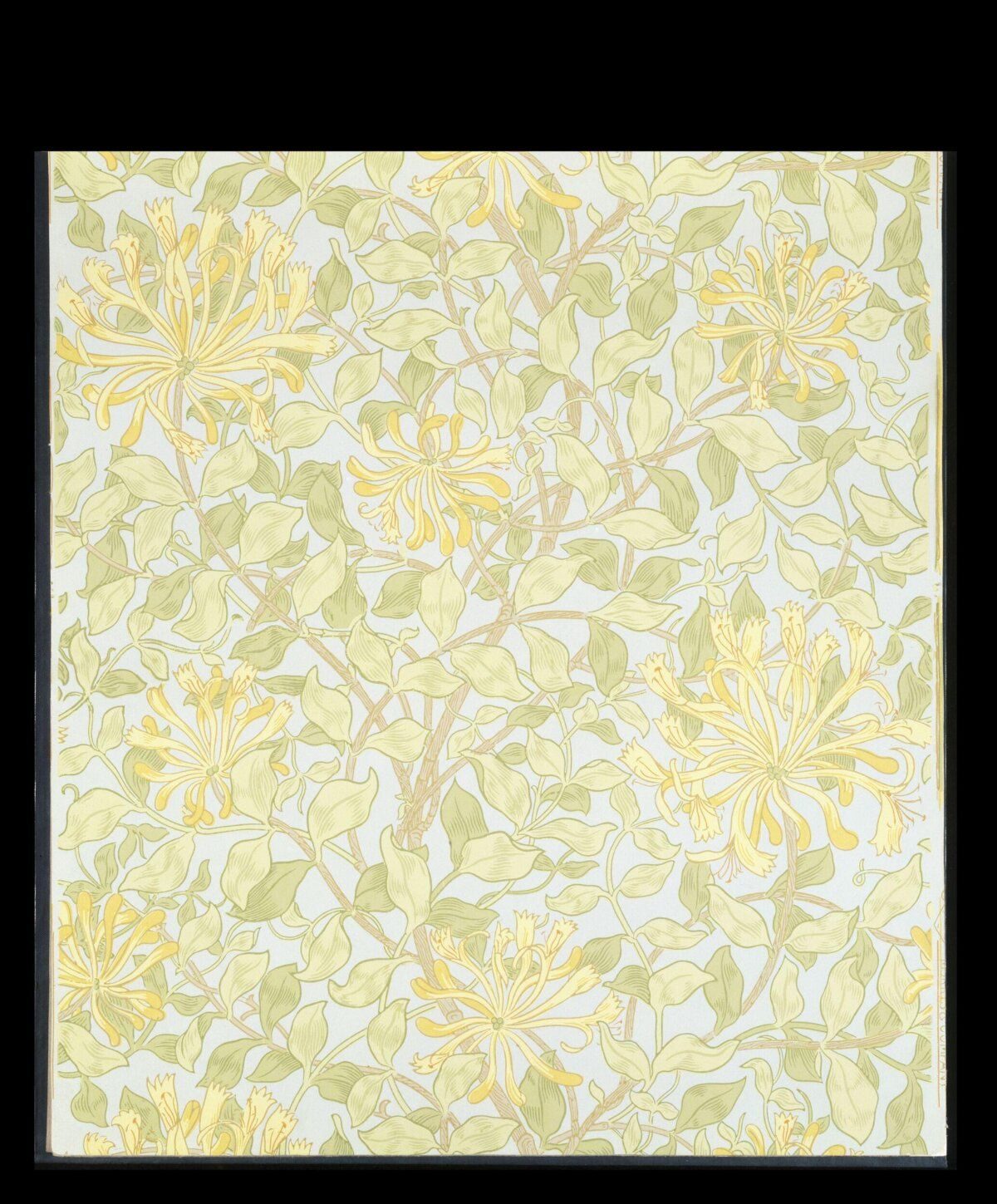
In 1861 Morris co-founded Morris, Marshall, Faulkner & Co. (later Morris & Co.) with the painters Edward Burne-Jones and Dante Gabriel Rossetti, the architect Philip Webb and others. The firm produced stained glass, furniture, wallpaper, textiles and embroidery — all hand-made, all designed by the people who made them, all sold through retail showrooms. Morris & Co. became the commercial backbone of the movement.

The movement was named in 1888, when Walter Crane and others founded the Arts and Crafts Exhibition Society in London. The first exhibition (October 1888, New Gallery, Regent Street) gave the movement its public identity. Six exhibitions followed between 1888 and 1916. By the 1890s the movement had become an international current, with branches in Glasgow (Charles Rennie Mackintosh), Vienna (Hoffmann and the Werkstätte), Munich (Eckmann), Brussels (van de Velde) and the United States (Stickley, Greene & Greene, Frank Lloyd Wright, Elbert Hubbard’s Roycroft community).

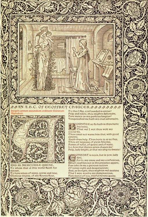
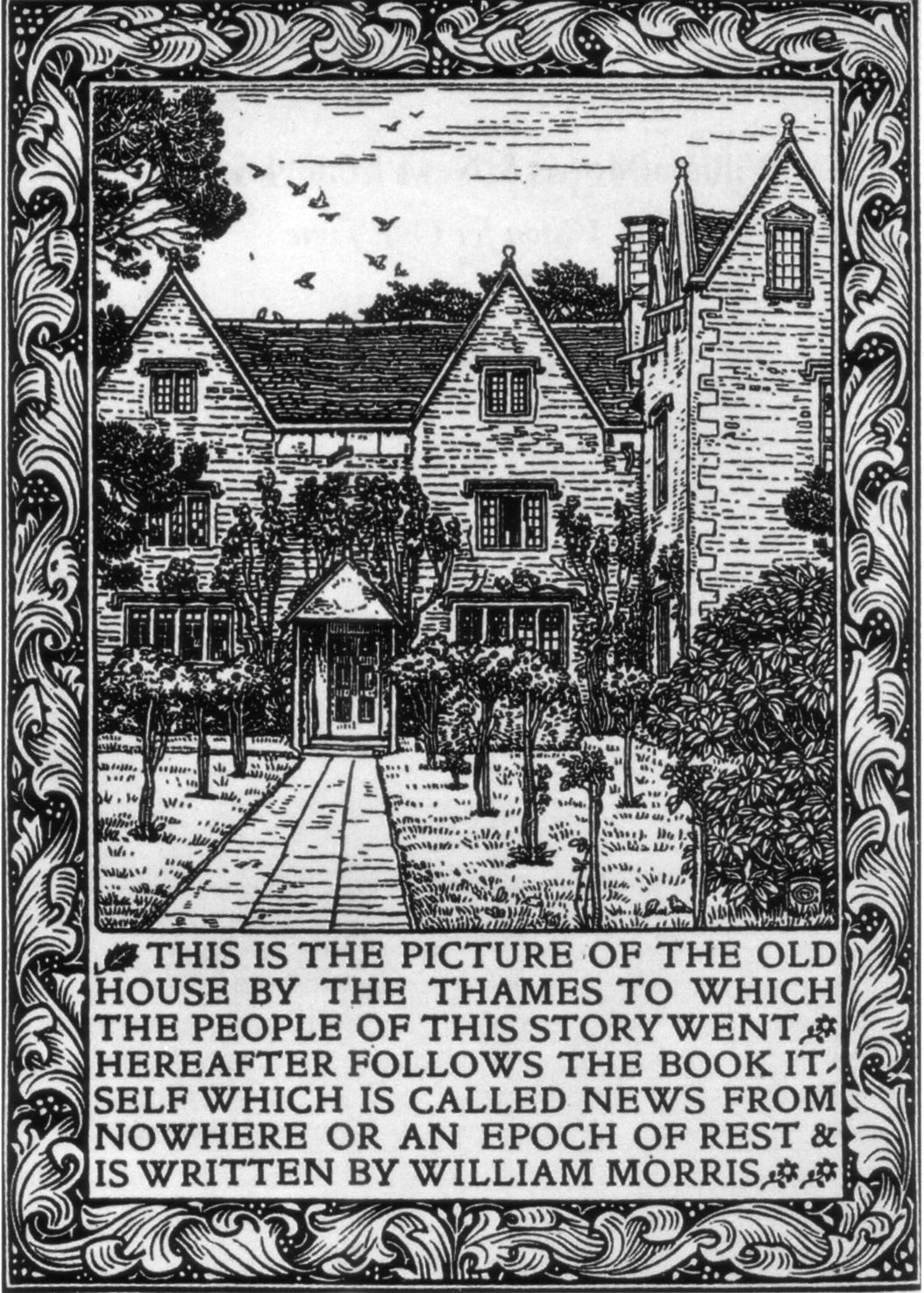
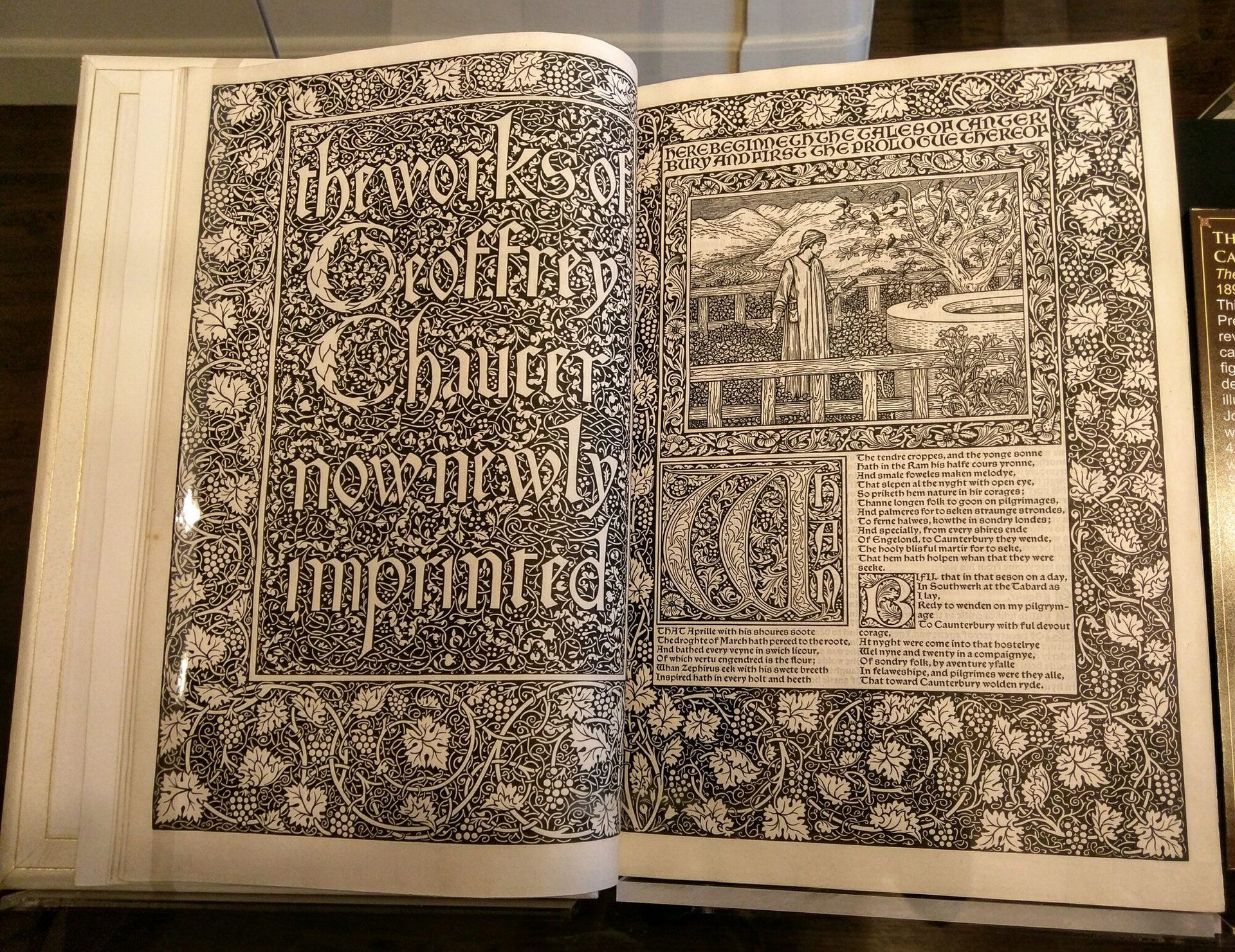
The graphic-design wing was effectively founded on 15 January 1891, when Morris incorporated the Kelmscott Press at his Hammersmith house. Morris had been irritated by a 1888 lecture at the Arts and Crafts Society on printing — the standard industrial books of the day were, he thought, illegible compared with their Renaissance ancestors. He commissioned Joseph Batchelor to make hand-made paper, drew his own typeface (Golden Type, derived from a 1476 face by Nicolas Jenson), and bought a hand press from the Reading firm of Albion. Between 1891 and 1898 the Kelmscott Press issued 53 books in 66 volumes, including the Kelmscott Chaucer (1896) — the movement’s masterpiece.

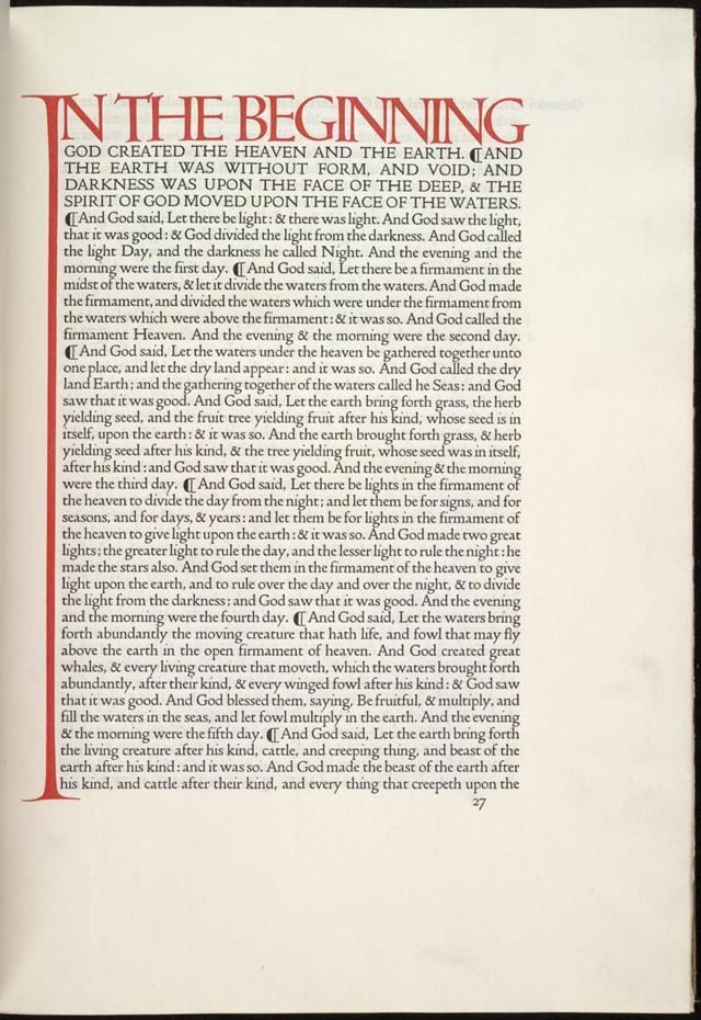
Morris died in October 1896. The Kelmscott Press wound up in 1898. But the model — a small private press, hand-set type, hand-made paper, custom typeface, total integration of text and ornament — was already replicating. T.J. Cobden-Sanderson and Emery Walker founded the Doves Press in Hammersmith in 1900. C.H. St John Hornby founded the Ashendene Press in 1895. Charles Ricketts ran the Vale Press from 1896 to 1903. Lucien Pissarro ran the Eragny Press from 1894. The English private-press tradition — completely outside the industrial publishing system — produced more than five hundred books between 1891 and 1939.

The American branch was different. Daniel Berkeley Updike founded the Merrymount Press in Boston in 1893. Frederic Goudy designed Goudy Old Style (1915) and other types. Bruce Rogers worked at the Riverside Press from 1895 and designed Centaur (1914). The American figures took Morris’ principles and applied them to commercial publishing rather than to private-press limited editions; the result was a twentieth-century American book-design tradition that was handsome, well-typeset and broadly distributed.

The First World War effectively ended the movement as a living practice. The Doves Press shut down in 1916. Morris & Co. closed in 1940. The Bauhaus — itself partly a German Werkbund response to Arts & Crafts — became the new centre of design pedagogy.

Principles

Arts & Crafts had a clear set of operating principles, derived directly from Ruskin and codified by Morris, Cobden-Sanderson and Crane in lectures and essays.

“I do not want art for a few any more than education for a few or freedom for a few.” — William Morris, The Lesser Arts, 1877

Honesty of construction. A book should look like the object it is — printed sheets, sewn signatures, bound covers — not like a machine-finished commodity. Materials should be visible: rag paper, leather, vellum, hand-set metal type. Industrial finishes that disguise the underlying construction were rejected.

Hand-made over machine-made. Industrial mass production was the antagonist. The press should be operated by hand, the type set by hand, the paper made by hand. Morris was explicit that this was not a question of style but of social organisation: the worker should think while making.

Integrated design. The same designer drew the typeface, the ornamental initials, the marginalia, the illustrations and the binding. Morris drew Kelmscott’s three typefaces (Golden, Troy, Chaucer) himself. Cobden-Sanderson supervised every Doves Press page. The principle survives intact in the Bauhaus “total work of art” pedagogy.

Custom typefaces. Each press had its own typeface, designed to be set on its own press, for its own books. Golden Type (Morris, 1890), Troy Type (Morris, 1892), Chaucer Type (Morris, 1893), Doves Type (Walker / Cobden-Sanderson, 1899), Subiaco Type (Hornby, 1902), Vale Type (Ricketts, 1896). These faces reset Western typography after a century of industrial decline.

Reference to medieval and Renaissance models. Morris studied fifteenth-century Italian incunabula and revived the Jenson and Subiaco faces. Cobden-Sanderson studied Nicolas Jenson directly. The argument was that Western typography had peaked around 1490 and declined thereafter; the Renaissance models were the reference point.

Anti-industrial polemic. Morris was a committed socialist from the early 1880s. News from Nowhere (1890) is an explicit utopian-socialist novel. The movement’s social criticism was as important as its aesthetic; Morris’ lectures The Lesser Arts (1877) and Useful Work versus Useless Toil (1884) are foundational political documents as much as design texts.

Key works

The Kelmscott Chaucer (Morris and Burne-Jones, 1896) — the masterpiece. Five years in production; 425 paper copies and 13 on vellum; 87 Burne-Jones wood-engravings; Morris’ Chaucer Type throughout. The summit of the private-press tradition.

News from Nowhere (Morris, Kelmscott edition, 1892) — the movement’s clearest political argument, set in Morris’ Golden Type and bound in vellum. The post-industrial society modelled as a printed book.

The Doves Bible (Cobden-Sanderson, 1903–1905) — the austere counter-statement. Set entirely in Doves Type with red versal initials by Edward Johnston and no other ornament. The argument that typography is itself the proper decoration of the book.

Walter Crane’s children’s books (1865–1876) — the illustrative branch of the movement. Routledge Toy Books in Edmund Evans’ colour-printed editions; the most-distributed Arts & Crafts work of the period.

Morris & Co. wallpaper and textile patterns (1862 onwards)Honeysuckle, Strawberry Thief, Willow Bough, Pimpernel. Designs developed across decades; many still in production under licence. The commercial backbone of the movement.

Bruce Rogers’ Riverside Press editions (1900–1912) — the American Arts & Crafts book at its commercial best. Carried Morris’ principles into the Boston / Cambridge publishing industry.

D.B. Updike’s Merrymount Press editions (1893–1949) — the longest-running Arts & Crafts press, run from Boston. Updike’s Printing Types: Their History, Forms and Use (1922) remains the standard reference on the history of Western typography.

Key works & examples

Morris and Burne-Jones, the Kelmscott Chaucer, 1896

The Kelmscott Chaucer (William Morris)

1896

Morris and Burne-Jones' *The Works of Geoffrey Chaucer*, printed at the Kelmscott Press, Hammersmith, in an edition of 425 paper copies and 13 on vellum. 87 wood-engraved illustrations by Burne-Jones, ornamental borders and initials by Morris, set in Morris' own Chaucer Type. Five years in production; finished six months before Morris' death. The summit of the private-press tradition and the single most-reproduced page-design of the movement.
William Morris and Edward Burne-Jones, *The Kelmscott Chaucer*, 1896. · William Morris, *The Works of Geoffrey Chaucer*, Kelmscott Press, 1896. Wikimedia Commons. · Public domain
Doves Press, English Bible, opening of Genesis, 1903

Doves Bible (Cobden-Sanderson and Emery Walker)

1903

The five-volume *English Bible* printed at the Doves Press, Hammersmith, 1903–1905. Set entirely in Doves Type (a single size, a single weight) with red versal initials by Edward Johnston and no other ornament. Argued that the typography itself, set with austere precision, was the proper decoration. The most-influential single counter-statement to Morris' ornamental approach and the foundation of twentieth-century clean book typography.
Doves Press, *English Bible*, Hammersmith, 1903–1905. · Doves Press Bible, 1903. Wikimedia Commons. · Public domain
Kelmscott Press, News from Nowhere, 1892

News from Nowhere (Morris, Kelmscott edition)

1892

Morris' utopian socialist novel, first published in *Commonweal* in 1890 and issued as a Kelmscott Press edition in 1892. Bound in vellum, set in Golden Type, with a wood-engraved frontispiece of Kelmscott Manor by Charles March Gere. The most overtly political Kelmscott book and Morris' clearest argument that the printed book is itself a model for the post-industrial society.
William Morris, *News from Nowhere*, Kelmscott Press, 1892. · Wood-engraved frontispiece of Kelmscott Manor by Charles March Gere, engraved by W.H. Hooper; the iconic frontispiece to the 1892 Kelmscott Press edition. · Public domain
Walter Crane, children's book illustration, c. 1875

Walter Crane's children's books and ornament

1875

Crane's illustrated children's books for Routledge's "Toy Books" series (1865–1876) and Edmund Evans' colour-printed editions brought Arts & Crafts ornament into mass-market publishing. His later books on design theory — *The Bases of Design* (1898), *Line and Form* (1900) — became standard teaching texts in the English design schools. The single most-influential illustrator of the movement.
Walter Crane, illustration for the Routledge Toy Books, c. 1875. · Walter Crane, *Beauty and the Beast*, Routledge Toy Books, 1875. Wikimedia Commons. · Public domain
Morris, Honeysuckle wallpaper, c. 1883

Hammersmith honeysuckle wallpaper (William Morris)

1883

Morris' *Honeysuckle* wallpaper for Morris & Co. is the most-reproduced single example of Morris' decorative pattern design and the visual signature of the broader Arts & Crafts movement. Sixteen-colour wood-block print; still in production under licence. Included here because Morris' wallpaper, textile and book ornament were a single integrated practice — patterns developed for fabric and paper later appearing as Kelmscott borders.
William Morris, *Honeysuckle* wallpaper, Morris & Co., c. 1883. · William Morris, Honeysuckle wallpaper, c. 1883. Victoria and Albert Museum, London. · Museum editorial
Bruce Rogers, Tales of the Genii, Riverside Press, 1901

Cranbrook Tales of the Genii (Bruce Rogers)

1901

Bruce Rogers' edition of *Tales of the Genii* for the Riverside Press, Cambridge, Massachusetts — the canonical American Arts & Crafts book. Rogers ran the Riverside Press' "limited editions" series from 1900 to 1912, then designed Centaur Type (1914) for the Metropolitan Museum of Art. Carried Morris' principles into American commercial publishing and into the twentieth-century Monotype catalogue.
Bruce Rogers, *Tales of the Genii*, Riverside Press, 1901. · Bruce Rogers, *Tales of the Genii*, Riverside Press, 1901. Smithsonian Institution. · Public domain

Influence & legacy

Arts & Crafts’ permanent contribution to graphic design is the modern book. Morris and the private-press tradition reset Western typography after a century of industrial decline. The twentieth-century book typefaces that anyone now sets a novel in — Bembo (Stanley Morison’s 1929 revival), Centaur (Bruce Rogers, 1914), Garamond (multiple revivals from 1917), Caslon, Janson — are direct descendants of the Renaissance models Morris and Cobden-Sanderson studied. Stanley Morison’s work at the Monotype Corporation in the 1920s and 1930s, which produced the standard twentieth-century book-typeface catalogue, was an explicit continuation of the Arts & Crafts revival.

The second contribution is the principle of integrated design. Morris’ insistence that the typeface, the ornament, the illustration and the binding should be one designer’s work routes directly into Peter Behrens’ AEG identity (1907) — the first complete corporate identity system — and from there into Bauhaus pedagogy. Walter Gropius, founder of the Bauhaus, explicitly cited Morris and Ruskin in the 1919 Bauhaus manifesto.

The third contribution is the anti-industrial argument. The argument that the standardised, machine-produced object degrades both maker and user has been argued for and against ever since. The Bauhaus eventually answered it by accepting mass production but designing for it intentionally; the Werkbund (1907) had already attempted the synthesis. The argument re-opened in the 1970s under E.F. Schumacher (Small Is Beautiful, 1973) and again in the contemporary maker-movement / Etsy / craft-revival current.

The fourth contribution is the private press as a continuing practice. The English fine-press tradition (the Folio Society in commercial form; Whittington Press, Tilley Letterpress, Tern Press in genuinely small-scale form) is unbroken from Morris to the present. Letterpress printing, hand-bound books and limited-edition typographic publications are now a recognised contemporary craft, sustained by a network of small presses, art-school programmes and collectors.

The Arts & Crafts ornamental vocabulary — Morris wallpapers, Crane illustration, the medieval revival — is permanently coded as “Victorian aesthetic” in popular culture, and has revived in waves: in the 1960s counterculture, in 1970s psychedelia, in 1990s post-modernism, and in the contemporary “cottagecore” current. The visual surface comes back; the anti-industrial polemic comes back with it.

Learn at TGDS

Arts & Crafts is the foundation of the modern book, the custom typeface and the integrated approach to graphic design. If the movement interests you, the most direct next steps are:

Courses

  • Certificate IV in Design (CUA40720) — our flagship qualification. Typography, layout and editorial modules cover the book-design tradition that runs from Morris through Tschichold to contemporary practice.
  • Intensive Foundation Course — 11 modules in the type, layout and identity craft Arts & Crafts treated as integrated design. Certificate of completion, not the Cert IV.

Related movements & people

Further reading

Books

  • Linda Parry (ed.), William Morris (Philip Wilson / V&A, 1996). The catalogue of the V&A centenary exhibition; currently the standard scholarly reference.
  • Fiona MacCarthy, William Morris: A Life for Our Time (Faber, 1994). The standard modern biography.
  • William S. Peterson, The Kelmscott Press: A History of William Morris’s Typographical Adventure (University of California Press, 1991).
  • Marianne Tidcombe, The Doves Press (British Library / Oak Knoll, 2002). The standard study of the Cobden-Sanderson / Walker collaboration.
  • Daniel Berkeley Updike, Printing Types: Their History, Forms and Use (Harvard University Press, 1922; Dover reprint, 1980). The Merrymount Press founder’s history of Western typography — still in print, still authoritative.
  • John Dreyfus, A History of the Nonesuch Press (Nonesuch, 1981). On the second-generation English fine-press tradition.

Get Started.

You can enrol any day of the year. We are online and study is self-paced, there is no pressure. Enrol when you are ready to start, from anywhere in the world. If you would like to chat or email, feel free to get in touch.

Brochures, Phone Calls & Questions

You can download a free brochure, book a phone call with one of our course advisors, or simply ask a question.

Other ways to get in touch

Australia 1300 655 485

International +61 1300 655 485

Ask Anything info@thegraphicdesignschool.com

Get a quote accounts@thegraphicdesignschool.com

Acknowledgement of Country
The Graphic Design School acknowledges the Traditional Custodians of Country throughout Australia and their continued spiritual connection to land.
We pay respect to Elders past, present and emerging.
Always was, always will be.
RTO Provider № 91706