Design history · Movements

Art Nouveau (graphic design)

The decorative-arts movement that turned the lithographic poster into a fine art.

Art Nouveau (1890–1910) was the international decorative-arts movement that took the whiplash curve and the chromolithographic colour poster and made graphic design a fine-art practice. From Mucha's Sarah Bernhardt posters to Beardsley's Yellow Book illustrations, Toulouse-Lautrec's Moulin Rouge lithographs and the Vienna Secession journal *Ver Sacrum*, the movement set the foundation for twentieth-century commercial graphic design — and the principles of typography, ornament and composition still taught at The Graphic Design School.
Alphonse Mucha, Gismonda poster for Sarah Bernhardt, 1894 — the founding poster of the Art Nouveau graphic style
Alphonse Mucha, *Gismonda*, poster for Sarah Bernhardt at the Théâtre de la Renaissance, Paris, December 1894. The poster that launched Art Nouveau as a graphic-design movement. · anonymer Künstler

Key facts

Active period
c. 1890–1910 (peak 1895–1905; effectively ended by First World War)
Origin
Brussels (Victor Horta) and Paris (Hector Guimard, Eugène Grasset) in the early 1890s
Regional names
Jugendstil (Germany / Austria) · Stile Liberty (Italy) · Modernisme (Catalonia) · Sezessionsstil (Vienna) · Tiffany Style (USA)
Key graphic figures
Alphonse Mucha · Henri de Toulouse-Lautrec · Aubrey Beardsley · Eugène Grasset · Jules Chéret · Will Bradley · Privat Livemont · Théophile Steinlen
Key venues / publications
*La Plume* (Paris) · *The Studio* (London) · *Jugend* (Munich) · *Pan* (Berlin) · *Ver Sacrum* (Vienna) · the lithographic poster boom of 1890s Paris
Known for
Whiplash curves · Floral and organic ornament · Custom display lettering · Idealised female figures · Chromolithographic colour posters · Total decorative integration

History & context

Art Nouveau is bracketed by two technologies and one war.

The technology that made it possible was chromolithographic colour printing at billboard scale. Jules Chéret had industrialised the four-stone process in Paris from the 1860s, printing six-foot posters that Parisian advertisers could paste directly to public hoardings. By the late 1880s the lithographic shops of Paris (Chaix, Cassan, the Imprimerie Bourgerie) were printing in editions of one to ten thousand. The blank Haussmannian wall became the canvas of the avant-garde.

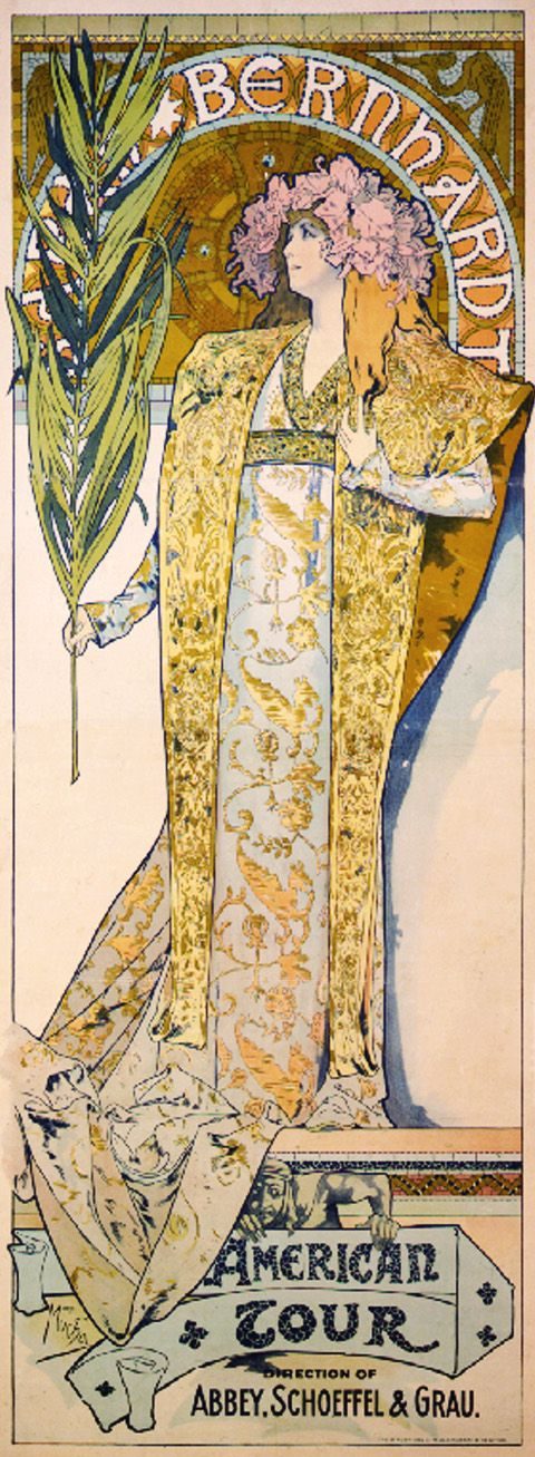
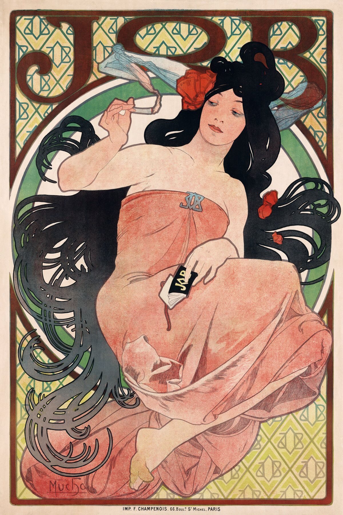
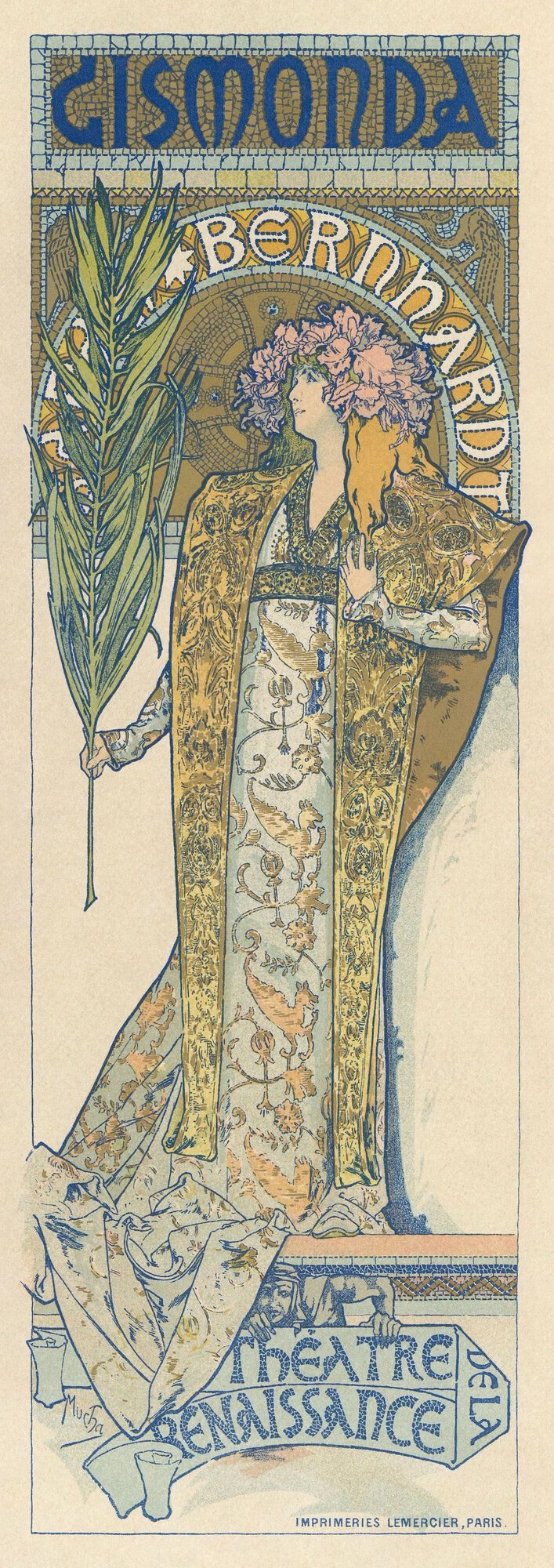
The first wave of the graphic-design movement is conventionally dated from December 1894 and Alphonse Mucha’s overnight Gismonda poster for Sarah Bernhardt. Mucha — a 34-year-old Czech painter working as a hired hand at the Lemercier lithographic shop — drew the poster in three days when no other designer was available over Christmas. Bernhardt signed him to a six-year contract on the strength of it. By 1898 his name was a style.

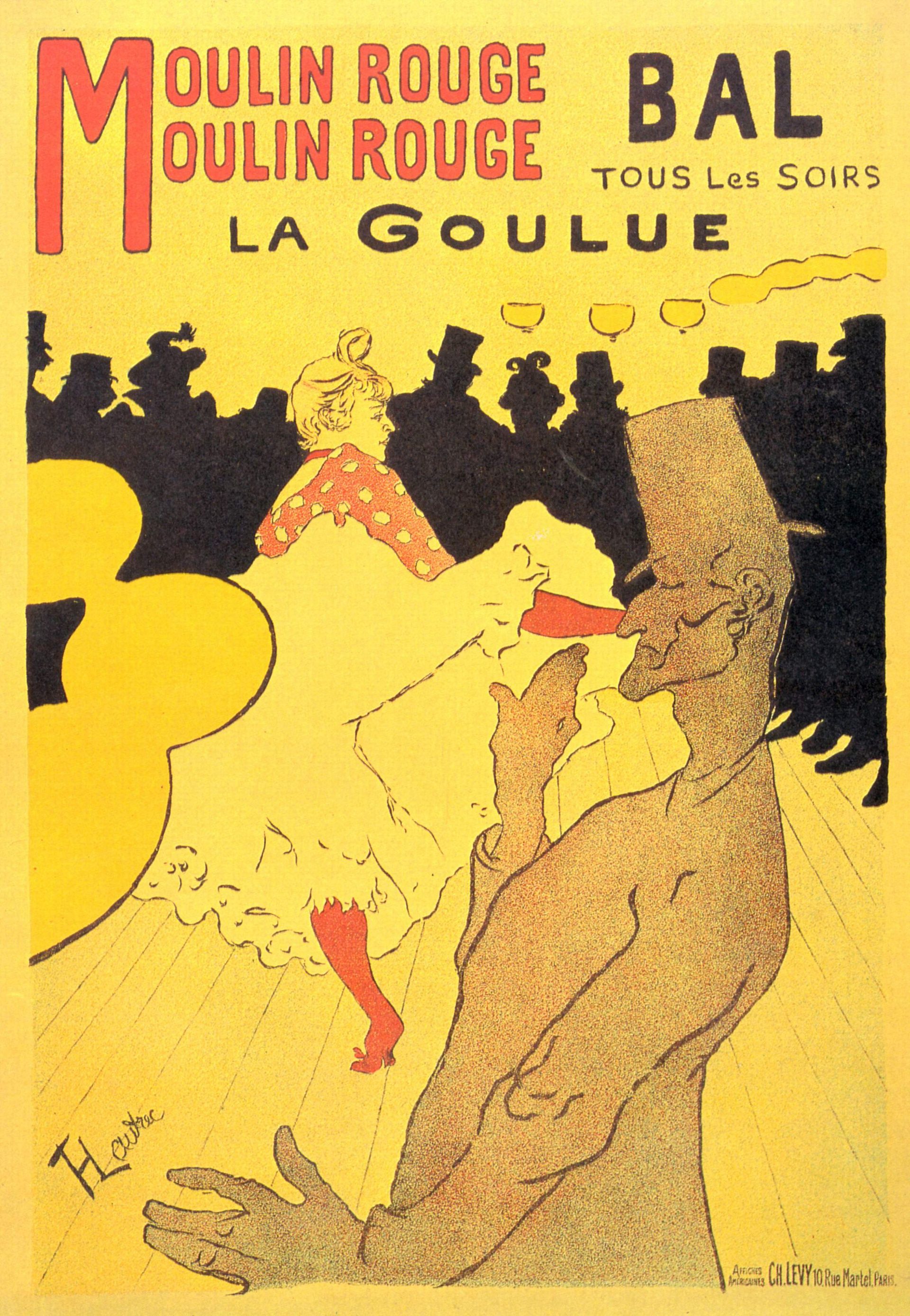
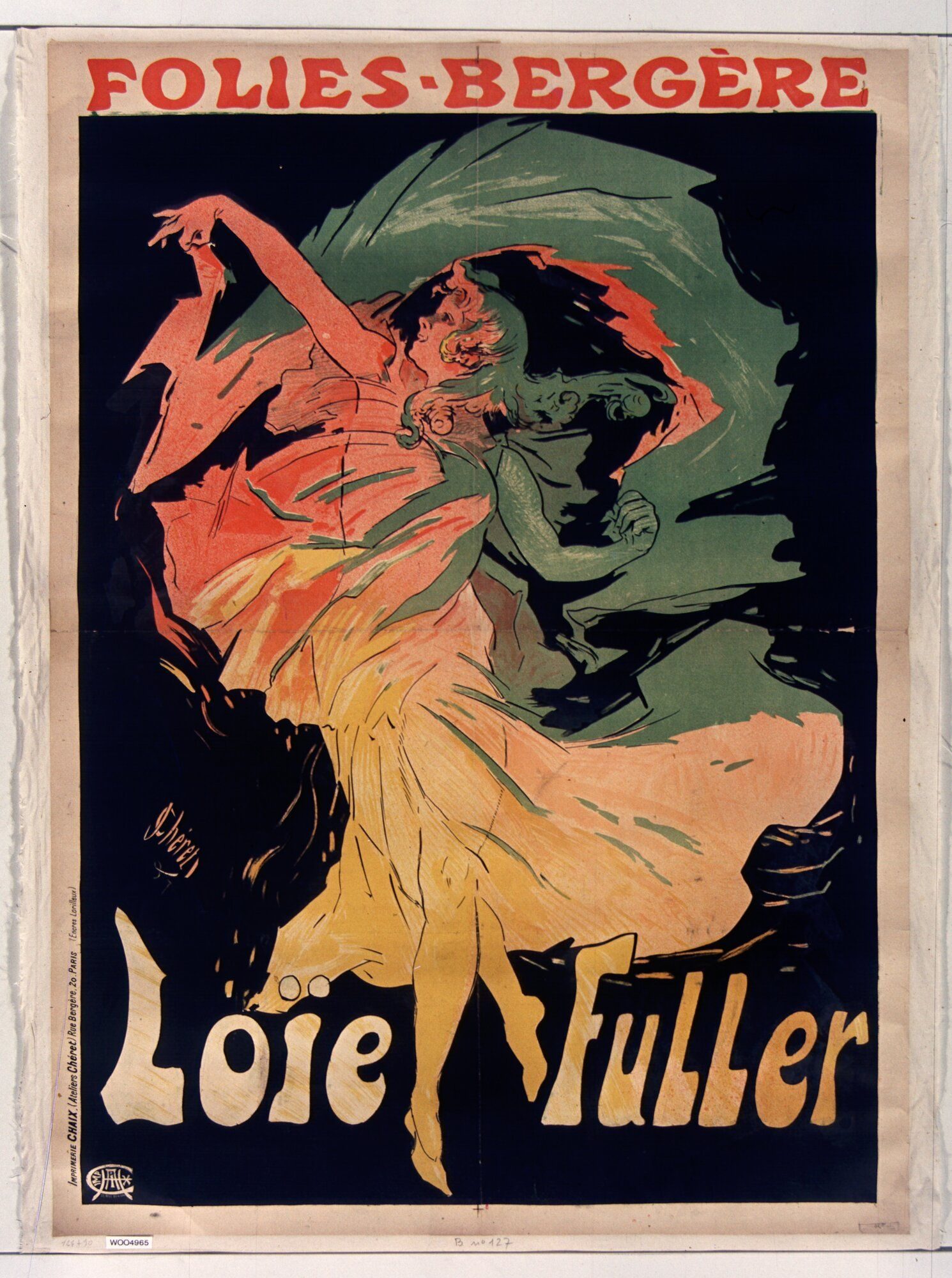
In parallel, Henri de Toulouse-Lautrec had been producing poster work for Montmartre cabarets since Moulin Rouge — La Goulue in 1891. His later posters for Le Divan Japonais, Aristide Bruant and the Folies-Bergère singer Jane Avril define the more austere, flat-colour, Japanese-print-influenced branch of the movement.

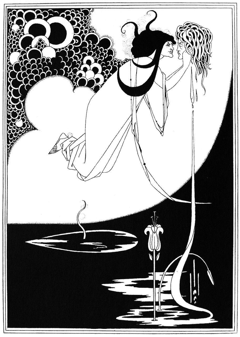
In London, Aubrey Beardsley was already publishing in The Studio (founded 1893) and The Yellow Book (1894–1897). His Salomé illustrations (1894) and Le Morte d’Arthur edition (1893–1894) carried the movement’s English wing. He died of tuberculosis in 1898, aged 25.

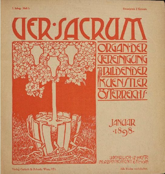
In Vienna, the Secession — Klimt, Moser, Olbrich, Hoffmann — broke away from the conservative Künstlerhaus in 1897. Ver Sacrum launched as the group’s journal in January 1898. Munich had Jugend magazine (founded 1896 — the source of the German word Jugendstil) and Otto Eckmann’s posters. Brussels had Henry van de Velde (later a founding figure of the Bauhaus lineage) and Victor Horta. Catalonia had Modernisme (Domènech i Montaner, Gaudí, Ramon Casas).

The peak years were 1895–1905. The 1900 Paris Exposition Universelle — with its Guimard métro entrances and its full decorative-arts pavilion — was the movement’s institutional apogee. By 1907 a reaction had set in: the Wiener Werkstätte (founded 1903) was already simplifying ornament towards geometric abstraction, and the Deutscher Werkbund (1907) was arguing for industrial standardisation.

The First World War ended Art Nouveau as a living movement. Mucha left Paris for Czechoslovakia and spent the rest of his life on the Slav Epic paintings. Beardsley was long dead. Klimt and Moser died in 1918. The post-war design conversation moved to Weimar — to the Bauhaus — and to Moscow.

Principles

Art Nouveau was a decorative philosophy more than a manifesto. Its working principles were drawn out by practitioners in essays and editorial material rather than declared in advance.

“All things which have a true existence in nature, even the smallest and the meanest, present problems whose complete and conclusive solution would tax the powers of the most consummate decorative artist.” — Walter Crane, The Bases of Design, 1898

Whiplash curve. The defining formal motif: a single asymmetric curve, energetic and continuous, derived from botanical observation (vine tendrils, flower stems, hair). Belgian and French branches lean hard on it; Vienna and Glasgow reduce it towards rectilinear geometry.

Organic ornament. Floral, vegetal and animal forms used structurally rather than as filler. Mucha’s poster borders and Beardsley’s marginal illustrations function as primary composition, not decoration.

Custom display lettering. Type designed for each project, drawn by the same hand as the imagery. Mucha’s posters, Beardsley’s title pages and Eckmann’s Eckmann-Schrift (1900) all demonstrate the principle. The standalone display typeface is an Art Nouveau invention.

Flat colour areas. Chromolithography at scale rewards large, evenly-inked colour fields with crisp linear contours. The Japanese print (then newly-imported into the European market through dealers like Siegfried Bing) modelled the method. Toulouse-Lautrec, Bonnard and Vallotton all studied ukiyo-e directly.

Idealised female figures. Mucha’s poster women became the most-reproduced single iconographic motif of the period, to the point where “Mucha woman” still functions as a stylistic shorthand. Less prominent in Beardsley and the Vienna Secession.

Total decorative integration. The same designer drew the poster, the book cover, the title page, the wallpaper, the furniture and the architectural ornament. Horta’s Hôtel Tassel (Brussels, 1893–1894) and Hoffmann’s Palais Stoclet (Brussels, 1905–1911) are total-design buildings; the Vienna Secession Building’s Beethoven Frieze by Klimt (1902) is its mural. The principle survives intact in the Bauhaus “total work of art” pedagogy.

Key works

Gismonda (Mucha, 1894) — the overnight poster that founded the graphic-design wing of the movement. Drawn in three days for Sarah Bernhardt’s late-December production at the Théâtre de la Renaissance.

Moulin Rouge — La Goulue (Toulouse-Lautrec, 1891) — the poster that proved the lithographic colour poster could be fine art rather than commercial decoration. Three flat colours and silhouetted top hats in the foreground.

Salomé illustrations (Beardsley, 1894) — the eighteen black-and-white plates for Oscar Wilde’s English edition. Pure line, Japanese-print influence, deliberately provocative iconography. The defining Art Nouveau illustration set.

Job cigarette papers poster (Mucha, 1896) — the most-reproduced commercial poster of the decade and the canonical Mucha-style decorative portrait.

Ver Sacrum journal (Vienna Secession, 1898–1903) — the first design publication to integrate ornament, typography and illustration into a single practice. Direct precursor of the Bauhaus pedagogy.

Folies-Bergère / La Loïe Fuller (Chéret, 1893) — late masterpiece by the older figure who industrialised the Parisian colour poster a generation before Mucha and Toulouse-Lautrec inherited the format.

Maple Leaf Rag sheet music covers (Will Bradley, 1894–1900) — the American branch. Bradley’s covers for The Chap-Book and his Massachusetts press The Wayside Press applied Beardsley’s vocabulary to American commercial publishing.

Key works & examples

Mucha, Gismonda poster, Paris, December 1894

Gismonda poster (Alphonse Mucha)

1894

Mucha's overnight poster for Sarah Bernhardt's revival of Sardou's *Gismonda* at the Théâtre de la Renaissance, Paris, late December 1894. Drawn in three days when no other lithographer was available over Christmas. Bernhardt signed Mucha to a six-year contract on the strength of it. The poster invented the vertical, full-figure, flat-colour Art Nouveau style overnight.
Alphonse Mucha, *Gismonda*, Paris, 1894. · …trialsanderrors · CC BY
Toulouse-Lautrec, Moulin Rouge — La Goulue, Paris, 1891

Moulin Rouge — La Goulue (Henri de Toulouse-Lautrec)

1891

Toulouse-Lautrec's first commercial poster, commissioned by Charles Zidler to announce the new dancer La Goulue at the Moulin Rouge. Three flat colours, silhouetted top hats in the foreground, hand-drawn lettering. The poster that proved the lithographic colour poster could be art rather than advertising decoration.
Henri de Toulouse-Lautrec, *Moulin Rouge — La Goulue*, Paris, 1891. · Civica Raccolta di Stampe Bertarelli (Milan) version via Yorck Project; PD-Art; strong resolution, institutional source. · Public domain
Aubrey Beardsley, Salomé illustration for Oscar Wilde, 1894

Salomé illustrations (Aubrey Beardsley)

1894

Beardsley's eighteen black-and-white illustrations for the English edition of Oscar Wilde's *Salomé* (John Lane, The Bodley Head, 1894). Pure flat-tone line, Japanese-print influence, deliberately provocative iconography. The most-reproduced single body of Art Nouveau illustration and a permanent reference point for editorial illustrators.
Aubrey Beardsley, illustration for Oscar Wilde's *Salomé*, 1894. · Aubrey Beardsley · Public domain
Mucha, Job cigarette papers poster, 1896

Job cigarette papers poster (Alphonse Mucha)

1896

Mucha's poster for Job rolling papers — a long-haired woman holding a smoking cigarette against a tile-pattern background of the letters "JOB". The most-reproduced commercial poster of the decade and the canonical example of the Mucha-style decorative portrait that came to stand for Art Nouveau as a whole.
Alphonse Mucha, *Job*, Paris, 1896. · Alphonse Mucha · Public domain
Ver Sacrum journal cover, Vienna Secession, c. 1898

Ver Sacrum journal (Vienna Secession)

1898

*Ver Sacrum* ("Sacred Spring") was the Vienna Secession's monthly journal, edited 1898–1903. Square format, hand-drawn ornament, typography integrated with illustration. Klimt and Moser contributed covers; Otto Wagner wrote architecture essays. The first design publication to argue that page layout, ornament and typography were a single integrated practice — a direct precursor of the Bauhaus' integrated-design pedagogy.
*Ver Sacrum*, Vienna, 1898–1903. · Ver Sacrum inaugural issue (1898 No. 1) cover. PNG format. Referenced in Wikimedia Commons category metadata and Wikidata record as primary visual representation of the journal's first publication. · Public domain
Jules Chéret, Folies-Bergère / La Loïe Fuller, Paris, 1893

Folies-Bergère / La Loïe Fuller (Jules Chéret)

1893

Chéret was the older figure who industrialised the colour- lithograph poster in Paris from the 1860s onwards — his "Chérette" figures, light-on-dark palette and four-stone colour technique established the format Mucha and Toulouse-Lautrec inherited. *Folies-Bergère / La Loïe Fuller* (1893) is one of his late masterpieces and the canonical example of his pre-Mucha poster style.
Jules Chéret, *Folies-Bergère / La Loïe Fuller*, Paris, 1893. · Jules Chéret Folies-Bergère, La Loïe Fuller(Loïe Fuller at the Folies-Bergère) 1893 · Museum editorial

Influence & legacy

Art Nouveau’s permanent contribution to graphic design is the lithographic colour poster as a fine-art form. Before 1890, posters were trade work; after 1900, they were exhibited at international expositions and collected by museums. Every twentieth-century poster designer — from Cassandre and Loupot in 1920s Paris, through Saul Bass and Paul Rand in 1950s New York, to Milton Glaser’s I ♥ NY (1977) and Stefan Sagmeister’s contemporary work — operates inside the cultural space Art Nouveau opened.

The second contribution is integrated decorative typography. Eckmann’s Eckmann-Schrift (1900), Behrens’ Behrens-Schrift (1902) and the Vienna Secession’s hand-lettered display faces established the principle that custom typography and ornament are part of the same design problem. The principle routes directly into Peter Behrens’ AEG identity (1907) — the first complete corporate identity system — and from there into twentieth-century brand design.

The third contribution is Japanese-print compositional method. Toulouse-Lautrec, Bonnard, Beardsley and the Vienna Secession all studied ukiyo-e through the dealer Siegfried Bing’s Maison de l’Art Nouveau (Paris, 1895). Flat-colour areas, asymmetric composition, contour drawing and decorative pattern all enter the European graphic-design tradition through Art Nouveau’s mediation of Japanese sources.

The Modernist reaction against Art Nouveau — the Werkbund (1907), the Wiener Werkstätte’s later geometric phase, the Bauhaus from 1919 — is real but partial. Behrens, who designed AEG’s identity in 1907, was an Art Nouveau designer in 1900; Walter Gropius (Bauhaus founder) trained under Behrens; Mies van der Rohe and Le Corbusier passed through Behrens’ studio. The lineage is one of refinement, not rejection.

Art Nouveau revived in the 1960s as a counterculture aesthetic. Wes Wilson’s San Francisco psychedelic posters for the Fillmore (1966–1967), Peter Max’s commercial work and Milton Glaser’s Bob Dylan poster (1967) are all explicit Mucha quotations. The movement’s commercial infrastructure — colour-saturated posters, ornamental display lettering, decorative female figures — has never disappeared.

Learn at TGDS

Art Nouveau is the foundation of the modern colour poster, the decorative display typeface and the integrated approach to graphic and decorative design. If the movement interests you, the most direct next steps are:

Courses

  • Certificate IV in Design (CUA40720) — our flagship qualification. Typography, layout and identity modules cover the poster tradition that runs from Chéret and Mucha through Cassandre, Bass and contemporary practice.
  • Intensive Foundation Course — 11 modules in the type, image and identity fundamentals Art Nouveau pioneered as integrated design. Certificate of completion, not the Cert IV.

Related movements & people

Further reading

Books

  • Stephan Tschudi-Madsen, The Art Nouveau Style (Dover, 2002, first published as Sources of Art Nouveau, 1956). The standard scholarly survey.
  • Paul Greenhalgh (ed.), Art Nouveau 1890–1914 (V&A Publishing, 2000). The catalogue of the major V&A exhibition; currently the most comprehensive single-volume reference.
  • Phillip Dennis Cate & Mary Shaw (eds.), The Spirit of Montmartre: Cabarets, Humor, and the Avant-Garde, 1875–1905 (Rutgers / Jane Voorhees Zimmerli, 1996).
  • Jiří Mucha, Alphonse Maria Mucha: His Life and Art (Heinemann, 1966). Memoir by the artist’s son.
  • Linda Gertner Zatlin, Aubrey Beardsley: A Catalogue Raisonné (Yale University Press, 2016).
  • Werner Schweiger, Wiener Werkstätte: Design in Vienna, 1903–1932 (Abbeville, 1984).

Get Started.

You can enrol any day of the year. We are online and study is self-paced, there is no pressure. Enrol when you are ready to start, from anywhere in the world. If you would like to chat or email, feel free to get in touch.

Brochures, Phone Calls & Questions

You can download a free brochure, book a phone call with one of our course advisors, or simply ask a question.

Other ways to get in touch

Australia 1300 655 485

International +61 1300 655 485

Ask Anything info@thegraphicdesignschool.com

Get a quote accounts@thegraphicdesignschool.com

Acknowledgement of Country
The Graphic Design School acknowledges the Traditional Custodians of Country throughout Australia and their continued spiritual connection to land.
We pay respect to Elders past, present and emerging.
Always was, always will be.
RTO Provider № 91706