Design history · 1980s New Wave + early digital

April Greiman

The designer who proved the Mac could be a serious design tool.

April Greiman (born 1948) is the American designer whose Los Angeles studio Made in Space produced the earliest convincing argument that the personal computer was a legitimate graphic-design medium. Her 1986 foldout for Design Quarterly #133 — a life-size self-portrait composited entirely in Aldus and MacPaint — set the template for a decade of digital typography.

Key facts

Born
22 March 1948, New York, New York
Nationality
American
Era
Postmodern · New Wave graphic design · Early digital typography
Studios
April Greiman Inc. (1976–1985, Los Angeles) · Made in Space (1985–present, Los Angeles)
Education
Kansas City Art Institute (B.F.A.) · Allgemeine Kunstgewerbeschule Basel (study with Armin Hofmann and Wolfgang Weingart, 1970–71)
Known for
Design Quarterly

Biography

April Greiman was born in New York in 1948. She took her B.F.A. at the Kansas City Art Institute and then in 1970 enrolled at the Allgemeine Kunstgewerbeschule Basel (Basel School of Design), where she studied for a year under Armin Hofmann and Wolfgang Weingart. Weingart was in the process of breaking open the strict Swiss grid from inside; Greiman was there for the breaking.

She returned to the United States in 1971 and settled in Los Angeles in 1976, founding her own studio almost immediately. Through the late 1970s her work with Leonard Koren’s WET magazine became the first major American argument for a New Wave graphic-design idiom — layered, diagonal, colour- saturated, anti-grid — adapted from Weingart’s Basel experiments but sharpened by Los Angeles print production and pop culture.

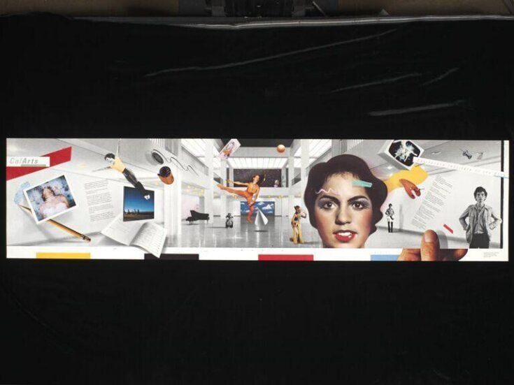
In 1982 she became director of the Graphic Design programme at the California Institute of the Arts — the youngest person, and the first woman, to hold that post. Her two-year tenure cemented CalArts’s reputation as the American postmodern- design counterweight to Yale. The 1984 CalArts identity is the studio’s clearest surviving artefact of the period.

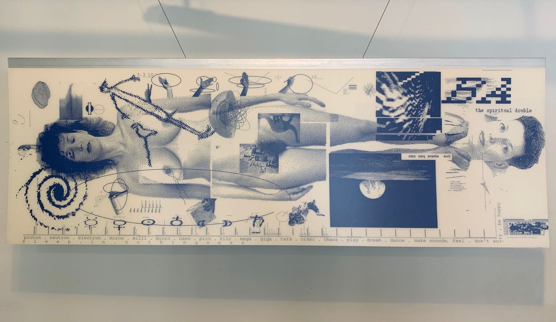
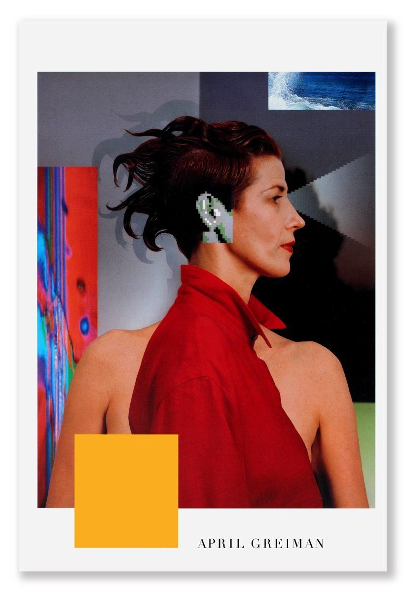
Greiman acquired a Macintosh in early 1984, months after its January launch. She was among the first American graphic designers to treat the computer as a primary design tool rather than a production device. The 1986 Design Quarterly #133 foldout — a life-size self-portrait composited from MacPaint, Aldus PageMaker and video digitising — is both the first sustained argument for digital graphic design and the work that made Greiman internationally famous.

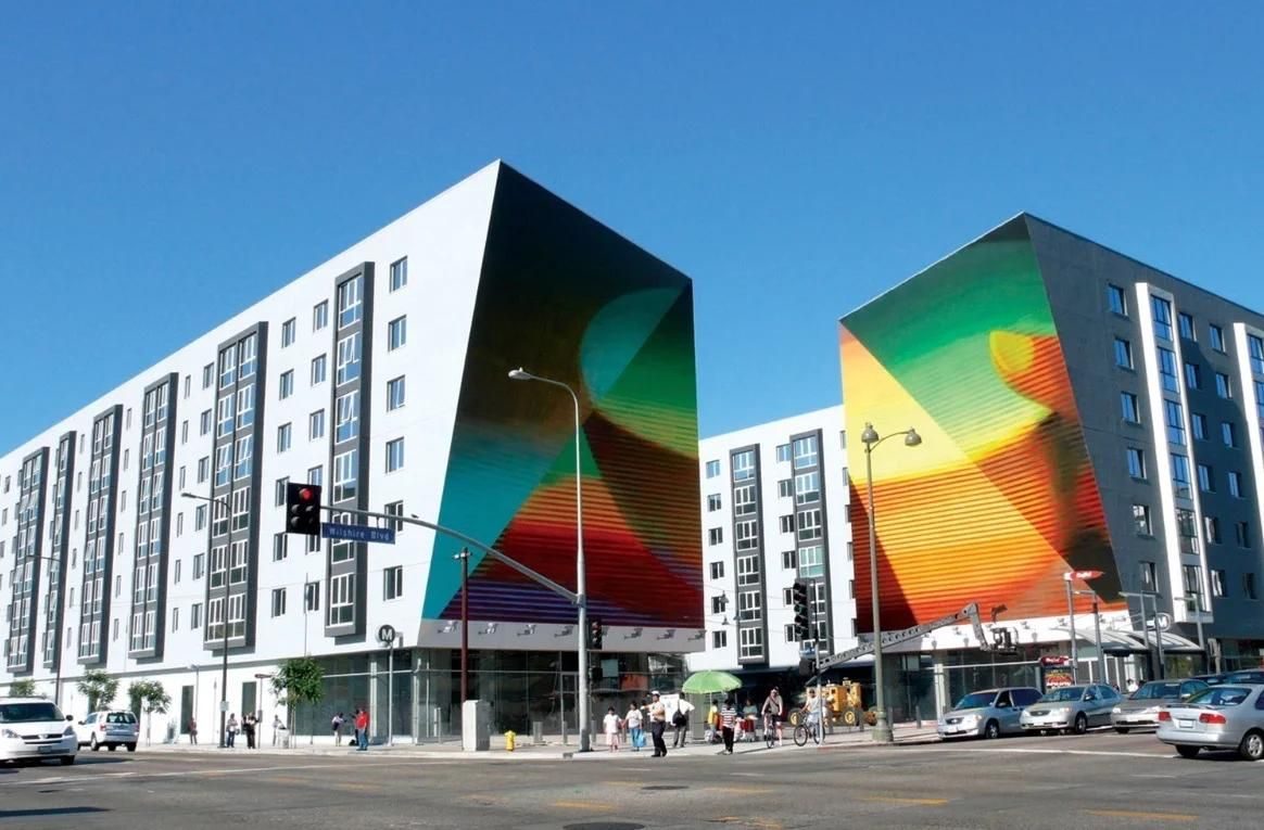
From 1985 her studio renamed itself Made in Space and moved from commercial identity work into environmental graphics, architectural typography and public art. Commissions through the 1990s and 2000s included the Los Angeles Wilshire/Vermont Station public-art installation (2007), the US Census 2000 identity, and long-running work with Los Angeles cultural institutions. She received the AIGA Medal in 1998 and has taught at SCI-Arc for over two decades.

Design philosophy

Greiman’s working position is that the computer is a collaborator, not a tool. Where most 1980s design culture treated the Macintosh as a cheaper way to make the same products, Greiman argued that the machine produced its own aesthetic — bitmapped edges, colour palettes, compositing accidents — and that serious practice meant working with what the machine actually did.

“The computer is another mind. I’m working with it, not against it.” — April Greiman

Three commitments organise the work. First, hybridity. Greiman’s Hybrid Imagery (1990) argued that contemporary practice would be a fusion of hand, photograph, video still and computer render — not a replacement of analog by digital. The position proved substantially correct over the following three decades.

Second, colour as a structural element. Greiman’s Los Angeles-inflected palette — hot pinks, acid yellows, stadium cyans — rejected the Swiss monochrome her Basel training had been built on. She argued colour was typographically functional, not decorative.

Third, the page as architectural space. Her movement from publication design into environmental graphics was consistent with a long-held position that graphic design and spatial design operate on a continuum. The Wilshire/Vermont installation is the clearest demonstration.

Key works

Design Quarterly #133 — “Does It Make Sense?” (1986) — 2-foot-by-6-foot foldout for Walker Art Center. Digital self-portrait with annotation, composited across MacPaint, Aldus PageMaker, and video digitising. The single most-cited piece of first-generation digital graphic design.

WET magazine (1977–1981) — Leonard Koren’s Los Angeles alternative-lifestyle magazine. Greiman’s layouts and covers established the New Wave typographic language that dominated 1980s American graphic design.

CalArts identity (1984) — identity and publication system for the California Institute of the Arts, produced during and after Greiman’s two-year directorship of the graphic-design programme. The identity outlived her tenure.

Lifetime Learning Systems (1986) — complete publication system produced end-to-end on Macintosh. One of the first sustained commercial engagements that demonstrated “designed on a Mac” was now viable for serial publication.

Wilshire/Vermont Station public art (2007) — large-scale tile and signage installation for the LA Metro Purple Line station. Translated Made in Space’s typographic and colour practice into architecture.

Your Turn, My Turn book (1983, with Eric Martin) — early argument for video stills as graphic-design material, made two years before Greiman had a Macintosh.

Iconic works

Design Quarterly 133 foldout, 1986

Design Quarterly

1986

Commissioned by the Walker Art Center and published by MIT Press as issue 133 of Design Quarterly, the foldout was produced on a 512K Macintosh using MacVision digitising hardware alongside MacPaint and Aldus PageMaker. Greiman layered a life-size video-captured self-portrait with timeline diagrams, geological imagery and extended annotation text across the two-foot-by-six-foot sheet. The work is held in the collections of the Walker Art Center, the Cooper Hewitt Smithsonian Design Museum (accession 1995-167-4) and the Museum of Modern Art, New York.
Design Quarterly
CalArts identity

CalArts identity

1984

Greiman served as director of the graphic-design programme at the California Institute of the Arts from 1982 to 1984, the youngest person and first woman to hold the position. The identity system she produced layered typographic forms in the New Wave idiom she had developed through her studio work since the mid-1970s, and the visual language remained in use well beyond her directorship. An earlier CalArts poster designed by Greiman with photographer Jayme Odgers (1978) is held in the Cooper Hewitt Smithsonian Design Museum collection (accession 1981-29-25).
CalArts identity (1984). · People's Graphic Design Archive (crowdsourced collection); 1978 poster (11 × 46 inches). Three-angle documentation; contact archive for licensing terms. · AU statutory
WET magazine covers

WET magazine covers + layouts

1979

Covers and interior layouts for Leonard Koren's Los Angeles alternative lifestyle magazine *WET* (1976–1981), produced in collaboration with photographer Jayme Odgers. The layouts employed layered photography, Japanese papers, hand-drawn imagery, airbrush colour and diagonal composition to develop the New Wave typographic language, adapted from Greiman's Basel training, that shaped American graphic design through the 1980s. Work from the *WET* period was later included in the Victoria and Albert Museum's "Postmodernism" exhibition.
WET magazine cover and layouts (1979). · Cover featured in V&A's 'Postmodernism: Style and Subversion 1970-1990' exhibition. From Dwell's photo gallery. Lower resolution than People's Archive version. · AU statutory
Lifetime Learning Systems identity

Lifetime Learning Systems identity

1986

A full identity and publication system for the adult-education publisher, including covers, workbooks and instructional posters, produced entirely on a Macintosh. The commission was among the first sustained commercial projects Greiman completed end-to-end using the computer, demonstrating that Macintosh-produced work could meet the standards of serial professional publication. The scope of the project helped shift the industry's perception of computer-based design from experimental to viable.
Lifetime Learning Systems identity (1986). · Kano Tan'yū — Mary Griggs Burke Collection, Gift of the Mary and Jackson Burke Foundation, 2015 · Public domain
Wilshire/Vermont Station installation

Wilshire/Vermont Station public art installation

2007

Commissioned by the Los Angeles Metro public art programme, this 8,200-square-foot mural (titled "Hand Holding a Bowl of Rice") spans two exterior facade walls of the mixed-use building at the Wilshire/Vermont Purple Line station in Koreatown, Los Angeles. The image was derived from video footage shot in the surrounding neighbourhood and rendered in oil paint applied directly to the building exterior over 28 consecutive days. The piece references the Hindu goddess Anapurna and the symbolic association of rice with abundance, and was recognised by the Alliance Graphique Internationale.
Wilshire/Vermont Station public art (LA Metro, 2007). · Studio portfolio image from Made in Space (Greiman's practice), showing the rice-bowl design mural installed on station facade. · Museum editorial
Hybrid Imagery book cover, 1990

Hybrid Imagery — The Fusion of Technology and Graphic Design

1990

Published by Watson-Guptill in May 1990, this 160-page monograph documents Greiman's method of merging traditional media (collage, photography, hand-drawn elements) with computer-generated imagery, organised project by project with technical explanations and visual documentation across 179 colour and 125 black-and-white illustrations. The book covers the evolution of the Made in Space studio's practice from layered analog composition to fully developed digital workflows. Copies are held in library collections including the Internet Archive and the Center for Book Arts.
Hybrid Imagery, April Greiman (Watson-Guptill, 1990). · Goodreads/Amazon-hosted catalog image; widely visible metadata copy; may be lower resolution than archival sources. · AU statutory

Influence & legacy

Greiman’s most direct legacy is the American New Wave typographic idiom of the 1980s. Together with Dan Friedman, Katherine McCoy and the Emigre cohort, she helped translate Weingart’s Basel experiments into a distinctly American postmodern graphic-design language. Every layered, diagonal, colour-saturated publication of the late 1980s is downstream of WET and the CalArts work.

Her Macintosh advocacy reshaped how the profession related to the computer. Before Design Quarterly #133, “designed on a computer” was a mild pejorative; after it, digital practice became a legitimate and eventually default mode. Greiman was among the first practitioners to argue — from inside the studio, with finished work — that the machine was a partner.

The Basel-to-Los Angeles lineage she carried has since become a recognised strand of American design education. CalArts, Cranbrook and SCI-Arc have all, in different ways, extended the position that postmodern formal experimentation and serious formal training are compatible practices.

Learn at TGDS

Greiman’s practice connects to several modules of our curriculum. If her approach interests you, the most direct next steps are:

Courses

  • Certificate IV in Design (CUA40720) — covers typography, grid systems, and the postmodern grid- breaking tradition Greiman extended from her Basel training.
  • Intensive Foundation Course — 11 modules in typography, layout and image-making. The same craft Greiman pushed through the Macintosh into early digital editorial work. Certificate of completion, not the Cert IV.

Related movements & people

Further reading

Books

  • April Greiman, Hybrid Imagery — The Fusion of Technology and Graphic Design (Watson-Guptill, 1990).
  • April Greiman, It’s Not What You Think It Is (Artemis, 1994).
  • April Greiman, Something from Nothing (Rotovision, 2002).
  • April Greiman & Philip Meggs, Floating Ideas into Time and Space (L’Arca, 1998).

Online

Get Started.

You can enrol any day of the year. We are online and study is self-paced, there is no pressure. Enrol when you are ready to start, from anywhere in the world. If you would like to chat or email, feel free to get in touch.

Brochures, Phone Calls & Questions

You can download a free brochure, book a phone call with one of our course advisors, or simply ask a question.

Other ways to get in touch

Australia 1300 655 485

International +61 1300 655 485

Ask Anything info@thegraphicdesignschool.com

Get a quote accounts@thegraphicdesignschool.com

Acknowledgement of Country
The Graphic Design School acknowledges the Traditional Custodians of Country throughout Australia and their continued spiritual connection to land.
We pay respect to Elders past, present and emerging.
Always was, always will be.
RTO Provider № 91706