
You Too Can Create Your Very Own Digital Characters


Originally published 2009. Updated March 2026.
Character design is one of the most enduring disciplines in graphic design — and one of the most transferable. Characters appear in branding, editorial illustration, motion graphics, games, apps and animation. The principles that make a compelling character are the same whether you are working on a mascot for a startup or a figure for a graphic novel.
Luke Feldman is an Australian multimedia designer who has written tutorials for international magazines and websites on Illustrator, Photoshop, Flash and After Effects. He is the creator of Scaffs — a world of bizarre, vibrantly coloured characters that have appeared across a wide range of print and digital media.
A note on AI: AI image generation tools can now produce character concepts quickly. They are useful for initial ideation — generating visual directions to react to. But the ability to build a character from scratch, control every line and colour decision, and produce a clean, scalable vector file remains a distinct and valuable skill. This tutorial teaches that skill.
You can read the interview with Luke here.
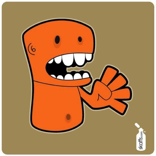
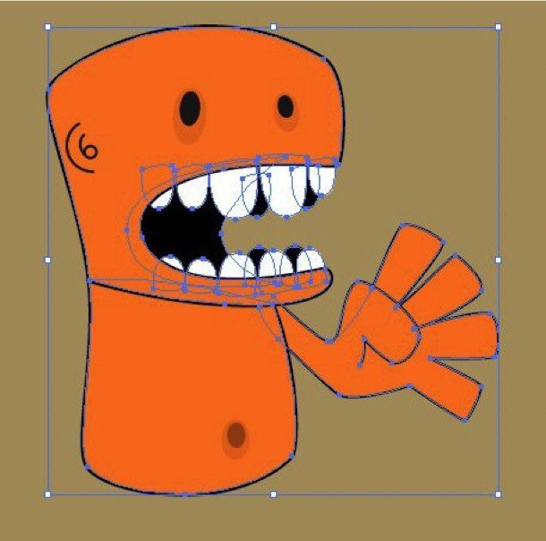
Final Image Preview
This is where we are heading — a clean, fully coloured vector character built from a hand-drawn sketch:

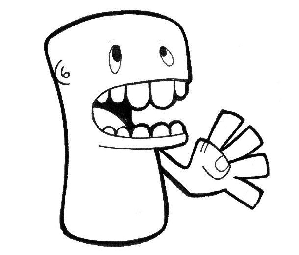
Step 1: Start with a Sketch
Hone your doodling skills — the foundation of every great character is a drawing. Sketch your character by hand, then scan it and save it as a .jpg. Keep the sketch loose at this stage; precision comes later.
I use Photoshop for the scan adjustment, but any image editor that lets you increase the contrast will work.

The finished Illustrator file (CS2 compatible) is included for reference. The tutorial uses Illustrator CS4, but the process is the same across all current versions of Illustrator.
Step 2: Decide on Your Output
Before opening Illustrator, know what this character is for.
A print design needs CMYK colour mode and a minimum of 250 dpi. A web or screen design uses RGB at 72–96 dpi. Getting this wrong at the start means correcting it later — which is always more work than doing it right from the beginning.
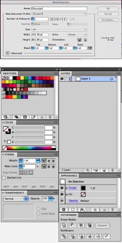
Step 3: Set Up Your Illustrator Document
Create a new document via File > New. For this tutorial, we are working in CMYK at 300 dpi (print output).
Make sure the following panels are visible — all available from the Window menu:
- Layers Panel
- Stroke Panel
- Color Panel
- Appearance Panel
- Pathfinder Panel

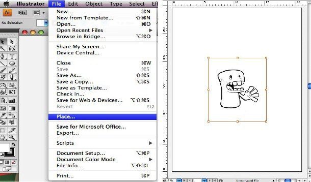
Step 4: Place the Sketch
Import your scanned sketch via File > Place. Name this layer ‘Sketch’ by double-clicking the layer name in the Layers Panel.

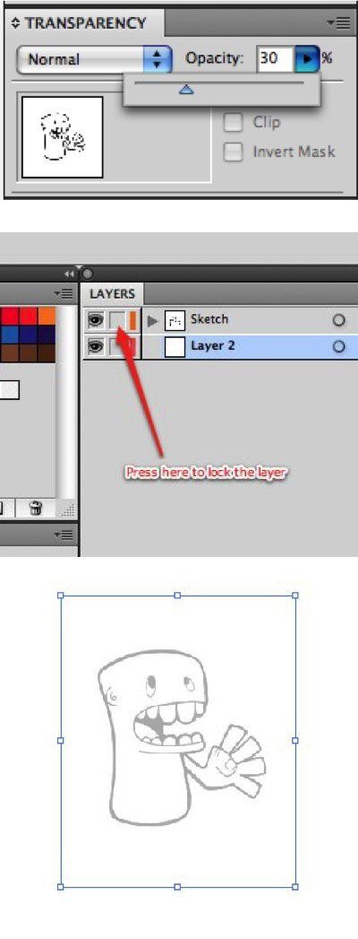
Step 5: Set Sketch Transparency and Lock the Layer
Select the sketch image and set transparency to 30%. This lets you trace over it while seeing your vector lines clearly.
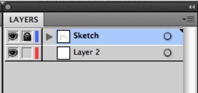
Lock the Sketch layer by clicking the checkbox next to the Eye icon in the Layers Panel. Locking it means you cannot accidentally select or move it while tracing.

Step 6: Create the Artwork Layer
Create a new layer via the Layers Panel dropdown menu — select New Layer and name it ‘Artwork’. Shortcut: Command-L (Mac) or Ctrl-L (PC).
All your vector work will live on this layer.

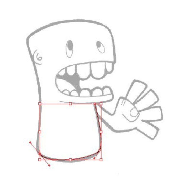
Step 7: Trace the Character Outline
Select the Pen Tool and set the Stroke weight to 1 in the Stroke Panel. Colour: Black (C:100 M:100 Y:100 K:100).
Trace the character in this order — working from large to small keeps the proportions right:
- Body
- Head
- Arm

Step 8: Add the Details
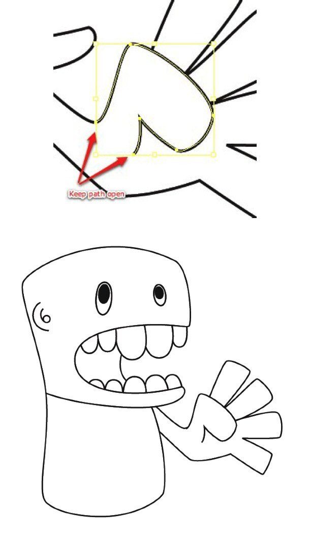
Continue tracing the remaining elements. When drawing the thumb, leave the path open — do not connect the endpoints.
- Thumb (open path)
- Ear and eyes — use the Ellipse Tool for the eyes
- Teeth and mouth
Getting the main body shape right first, then going back to add details, produces a more coherent character. The proportions stay honest to the original sketch.

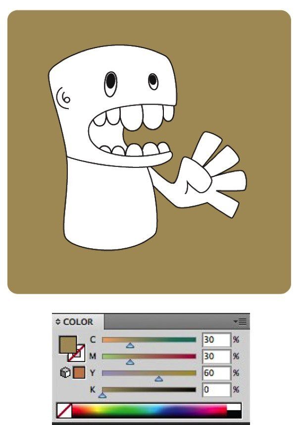
Step 9: Add a Background
Create a new layer (Command-L or Ctrl-L) and name it ‘Background’. Place it below the Artwork layer.
Use the Rounded Rectangle Tool to draw a simple background shape with Fill colour C:30 M:30 Y:60 K:0 (a warm neutral). Lock this layer when done.

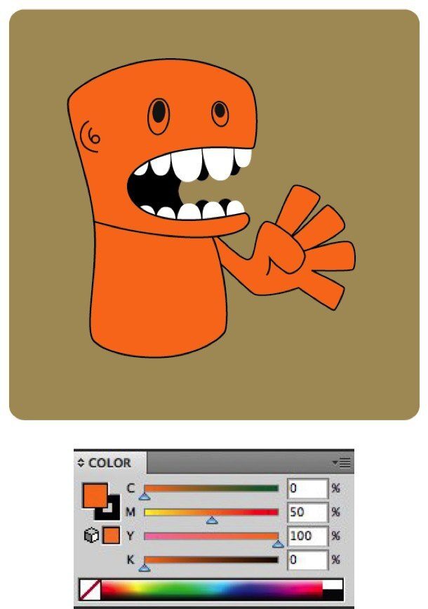
Step 10: Add Colour
Create an orange colour using the Color Panel: C:0 M:50 Y:100 K:0. Use the Panel’s dropdown to select Create New Swatch — this adds it to your Swatches Panel for easy reuse.
Select the Artwork layer. Fill the body, head and arms with the new orange. Darken it slightly around the eye area using C:0 M:50 Y:100 K:10.

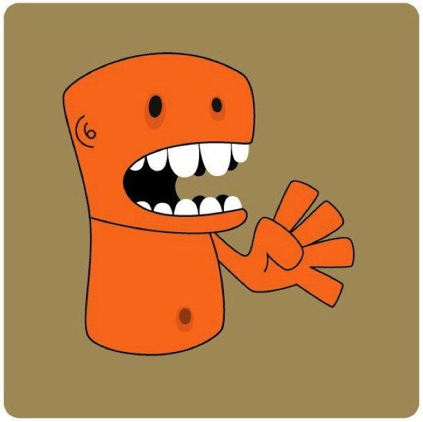
Step 11: Add a Belly Button
Using the Ellipse Tool, draw two concentric circles for the belly button. Both use the same orange as the body — the slight tonal difference between inner and outer ellipses comes from the overlap.

Step 12: Set Up the Border
Select the Artwork layer. Select all the elements you want a border around: head, body, arm, thumb, teeth and mouth. Copy them (Command-C or Ctrl-C).

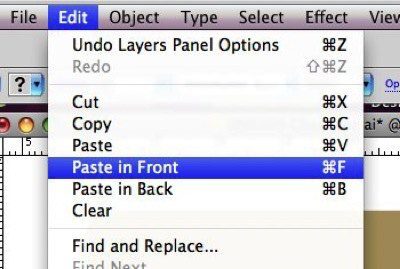
Step 13: Create the Border Layer
Create a new layer named ‘Border’. With it selected, paste in front using Edit > Paste in Front (Command-F or Ctrl-F). Paste in Front places the objects in exactly the same position, in front of whatever is currently selected.
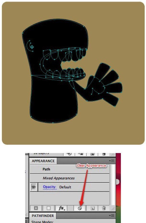
Turn off the Artwork layer visibility so you can work cleanly on the Border layer.

Step 14: Clear Appearance and Fill Black
With the Border objects selected, open the Appearance Panel and use its dropdown to select Clear Appearance. This removes all existing strokes and effects — which prevents errors when merging with the Pathfinder Tool.
Fill the cleaned objects with Black (C:100 M:100 Y:100 K:100).

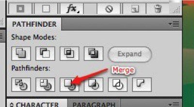
Step 15: Merge with Pathfinder
With the Border objects still selected, go to the Pathfinder Panel and select Merge. This combines all objects into one unified shape.
Add a Stroke with weight 6, colour Black (C:100 M:100 Y:100 K:100).

Step 16: Add the Outer Border
Copy the merged object and paste it behind using Edit > Paste in Back (Command-B or Ctrl-B). Paste in Back places it in exactly the same position, behind the current selection.
Change the Fill and Stroke colour to C:15 M:15 Y:30 K:0 (a lighter warm tone). Increase the Stroke weight to 10. This creates the layered border effect.


Step 17: Experiment and Extend
The techniques in this tutorial — Pen Tool tracing, Pathfinder operations, layered borders — can produce a wide range of character styles. Graffiti, retro, comic book, flat design: the same Illustrator workflow underpins all of them.
The Pathfinder Panel in particular is worth exploring further. Combined with colour, it can create stencil and cut-out effects that would take much longer to achieve by hand.
What to Try Next
Character design connects to almost every area of graphic design — branding, motion, publishing, games, apps. The vector skills you practised here are the same ones used across all of them.
A few directions worth exploring:
- Colour variations — build the same character in three different colour palettes and observe how the personality changes
- Style variations — try the same character in a flat design style, then in a more illustrated style
- Expression range — design the same character with five different expressions; this is a core character design skill for any animation or branding project
- AI as a starting point — tools like Adobe Firefly can generate character concept sketches quickly. Use them as inspiration to react to, then build your own version from scratch in Illustrator
At TGDS, we teach Illustrator as part of our core graphic design curriculum — covering not just the tools, but the thinking behind character and illustration work.
Want to develop your illustration and character design skills? Explore our graphic design courses.
Related reading: Putting Together an Effective Portfolio — how to present tutorial and self-initiated work effectively.
Ready to start your design career?
Study graphic design online, at your own pace, with 1:1 support from our Support Angels. Accredited RTO since 2008.
Explore our courses