
26 Logos & Their Design Evolution
26 Logos & Their Design Evolution
Originally published 2014. Updated March 2026.
Some logos are so embedded in daily life that we stop seeing them. The golden arches, the bitten apple, the swoosh — they feel permanent, inevitable. But every one of them started somewhere else.
Below are 26 of the world’s most recognisable logos, traced through their design evolution. Some changes were bold reimaginings. Others were quiet refinements that took decades to land where they are today. Some, frankly, were missteps. You decide.
It’s hard to argue with the Art Pauls and the Paul Rands of the design world — but it’s worth trying.
Why Logos Change
A logo redesign is rarely just an aesthetic decision. Brands rebrand when they enter new markets, respond to cultural shifts, adapt to new media, or simply try to shake off the associations of an earlier era.
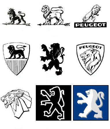
The move from detailed, ornate marks to simpler, flatter forms has been the dominant direction over the past two decades — driven partly by digital screens, where fine detail disappears at small sizes, and partly by a broader cultural shift toward minimalism. Since this post was first published in 2014, that trend has only accelerated. Peugeot returned to a heraldic flat lion in 2021. Firefox stripped back its flame in 2019 and again in 2023. Burberry reclaimed its equestrian knight after years of a cleaner wordmark.
The lesson, repeated across every logo here: simplicity ages well. Complexity tends to date.
Adobe

Apple

AT&T


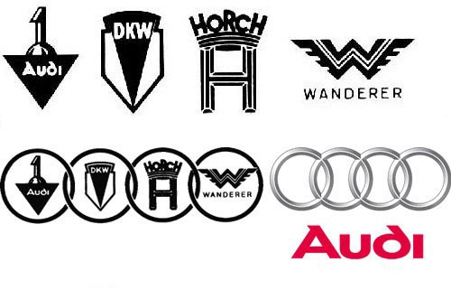
Audi

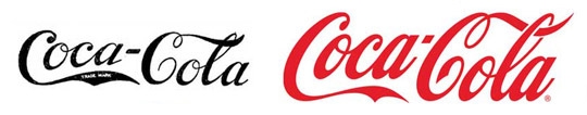
Coca Cola

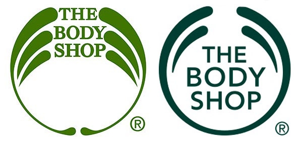
The Body Shop

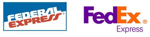
FedEx

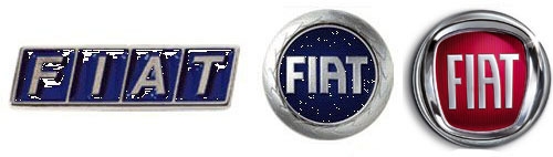
Fiat

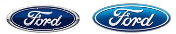
Ford

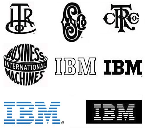
IBM

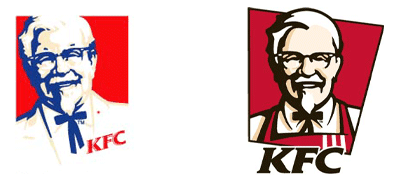
KFC

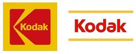
Kodak

Mist


MSN


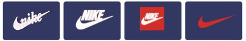
Nike

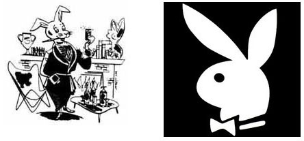
Playboy

Peugeot

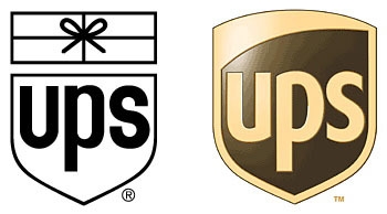
UPS

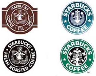
Starbucks

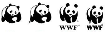
WWF

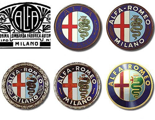
Alfa Romeo

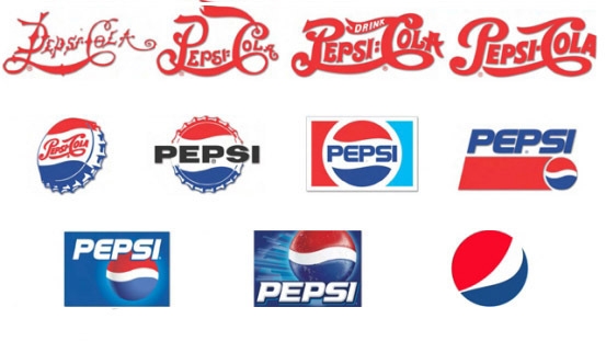
Pepsi

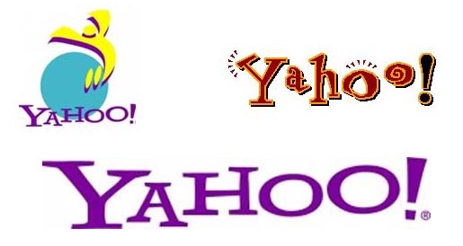
Yahoo

Internet Explorer


Firefox


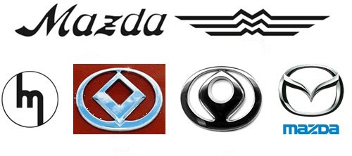
Mazda

What These 26 Logos Teach Us
Look across these evolution timelines and a few patterns emerge. The most enduring marks are those built on strong, simple geometry — the Nike Swoosh, the FedEx arrow, the Apple silhouette. They reproduce at any size, in any colour, in any medium. The logos that have aged least well are those that chased the aesthetic moment of their era rather than building on a more fundamental form.
The other consistent pattern: companies that understand their own history make better rebrands. Peugeot’s return to heraldry, Alfa Romeo’s preservation of the Milanese cross, Coca-Cola’s unwillingness to abandon its script — these are acts of brand archaeology, not nostalgia.
If you’re studying logo design, it’s worth spending time with each of these families of marks. The decisions behind them — what was changed, what was kept, and why — are as instructive as any textbook.
Curious about the principles behind great logo design? Read our post on 6 things to keep in mind when designing a logo, or explore logo design resources and the work of David Airey.
At The Graphic Design School, logo design is core to the curriculum — not as a set of rules, but as a discipline with a long and genuinely fascinating history. If you want to develop your own approach to identity work, our Certificate IV in Graphic Design covers branding, visual identity, and the thinking behind mark-making.
Ready to start your design career?
Study graphic design online, at your own pace, with 1:1 support from our Support Angels. Accredited RTO since 2008.
Explore our courses