
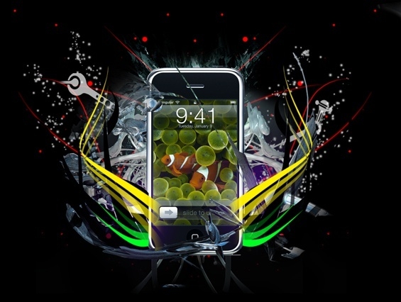
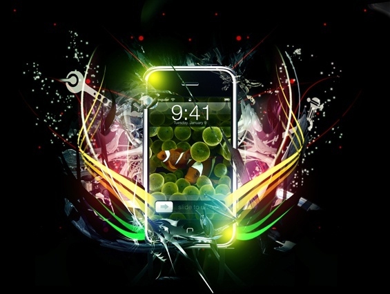
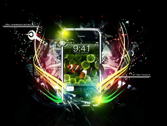
Create a Smartphone Advertising Poster in Photoshop

Originally published 2009. Updated March 2026.
Advertising poster design is one of those skills that transfers across every medium. Whether you are creating a product launch visual for a client or building a showpiece for your portfolio, the principles are the same: bold composition, controlled lighting, and a product that commands the frame.
This tutorial walks through the full Photoshop workflow for building a dynamic smartphone advertising poster — from blank canvas to finished composite. The techniques here — brush layering, blending modes, C4D renders, colour grading — are still current and directly applicable to product advertising work.
Note: The downloadable PSD file and high-resolution final image below are currently being restored from archive. Check back soon, or work through the tutorial with your own product image.
Step 1
Open Photoshop and set up your canvas. You need room to work — a 940 x 710 px canvas is a reasonable starting point, but adjust to suit your project.
Pick a solid, dark background colour and fill it with the bucket tool (shortcut: G). Dark backgrounds make lighting effects far easier to control than light ones. For this tutorial, use black.
Step 2
Grab a decorative brush set and create flowing, pen-tool-style shapes around the centre of the canvas. If you need to install a new brush set, read the section below first.
Installing Brushes
Download your brush set — it will arrive as a .abr file or inside a .zip. Unzip if needed.
In Photoshop, select the brush tool (B) and open the brushes dropdown from the top bar:

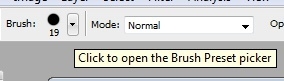
Click the menu icon in the top-right corner and choose Load Brushes. Select your .abr file. The new brushes appear at the end of your current list and are ready to use.
Step 2 (Continued)
The brush set used in this tutorial can be found at DeviantArt — search for decorative or abstract brush sets. Full credit goes to the original creators.
Once your brush is loaded, draw a few flowing shapes outward from the centre of the canvas, plus some small circles spread across the composition:


Colour choice matters here and will inform the whole piece. Warm colours (red, orange, yellow) read as energetic and bold. Cool colours (blue, green, purple) feel more sophisticated. Commit to a direction and maintain it throughout.
Duplicate the layer (right-click > Duplicate), then flip it horizontally via Ctrl/⌘+T > right-click > Flip Horizontally. Centre the reflected shape below the original:


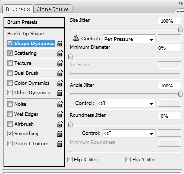
Step 3
Now work with Photoshop’s default Soft Round brush (9px, pre-installed). Open Brush Settings and apply the following configuration:


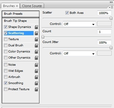
Brush across the canvas in white, covering the main working area. Set this layer to Normal blending mode at around 85% opacity. The result should be a soft, atmospheric texture:

Step 4
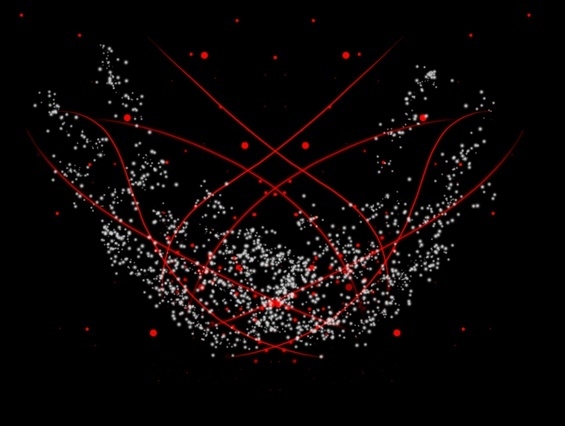
Using the Pen Tool, draw tech-style shapes radiating from the centre of the image. Abstract brush sets that mimic circuit board or mechanical forms work well here. Use a soft brush eraser to soften the edges of some shapes:
Step 5
This step introduces C4D renders — Cinema 4D renders that designers use as compositing elements in Photoshop. If you are already familiar with them, skip this paragraph.
C4D renders fall into two types. Effect C4Ds provide lighting elements: glows, lens flares, reflections. Render C4Ds are abstract 3D forms used to add depth and complexity to a composition. Both types are widely available on DeviantArt — search for “C4D render” or “C4D pack”.
All C4Ds used in this tutorial are visible in the provided .psd file. Download it to see exactly which elements were used.
Find a flowing Render C4D in a bright colour that complements your brush shapes. Resize it, erase the sections that do not fit, and position it to follow the direction of your Pen Tool shapes:

Duplicate it, flip horizontally, and position symmetrically on the other side:
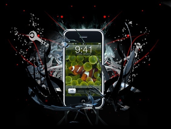
Step 6
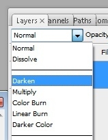
Add a second C4D — compact, with few stray elements — to the centre of the canvas. Set its layer blending mode to Lighten using the dropdown in the Layers panel:

Then go to Filter > Distort > Ocean Ripple and apply these settings:
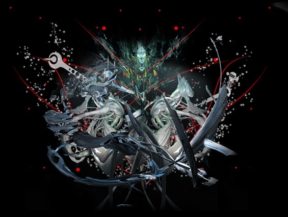
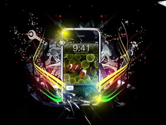
Erase any areas that do not blend cleanly with a soft brush. Your composition should now look something like this:

Step 7
Select a third C4D that functions as a ‘shell’ — a form that appears to wrap around or frame the product you will place in the next step. Position it carefully, keeping in mind where your phone will sit. The .psd file makes this relationship clearer if you are unsure:

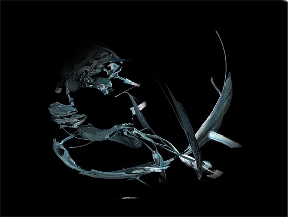
Here is the shell C4D isolated on a black background for clarity:

Step 8
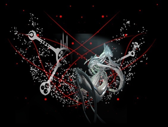
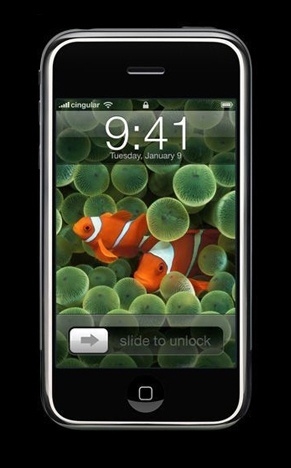
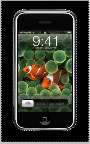
Now place your product. Start with a clean product photograph on a plain background.
Open the image in a separate Photoshop file. Right-click the Background layer and choose Layer from Background. Crop tightly around the product using the Crop tool ©.
If the background is plain, use the Magic Wand (W) and experiment with Tolerance settings until you have a clean selection. Delete the background. For complex backgrounds, trace around the product with the Pen Tool instead — set anchor points, hold Shift for straight lines, click-and-drag for curves. A completed path looks like this:


Right-click any point with the Pen Tool selected and choose Make Selection. Press ⌘/Ctrl+Shift+I to invert the selection, then delete to remove the background:


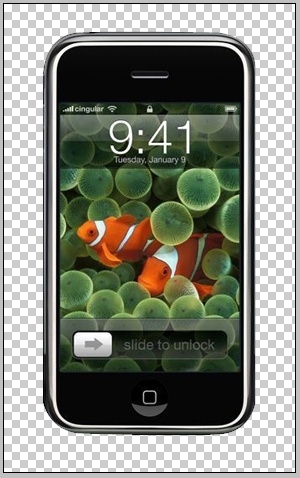
Place the product into your main composition, centred in the frame:

Now use the shell C4D to make the product feel embedded in the composition. With a very small soft-brush eraser, erase the parts of the product layer that the shell C4D passes over. Lower the product layer’s opacity temporarily to see the overlap clearly:

An alternative: duplicate the shell C4D layer and move the copy above the product layer. Erase only the parts you do not want. Some people find this method more intuitive.
Step 9
The composition is starting to work. Now tighten it up. Using the Pen Tool, draw black shapes around the product to contain the visual weight and reduce clutter. Mirror them on the other side for symmetry:


Step 10
Add lighting. Take a 200px soft brush, choose a light, cool colour (a soft purple works well), and set opacity to 40–50%. Brush gently around the base of the product:

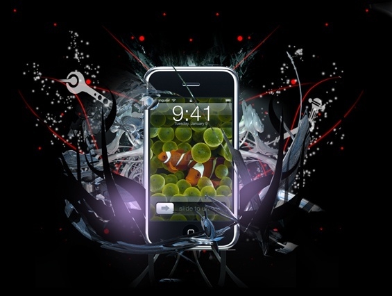
Set this layer to Colour Dodge blending mode. Adjust opacity until the light feels integrated, not bolted-on:

Step 11
Bring the Pen Tool out again for two more sets of shapes in bright, solid colours. Vary opacity across shapes for a more dynamic result. Mirror everything for symmetry. Brush sets work equally well here as an alternative:


Step 12
Add gradient maps to unify the colour palette. Click the adjustment layer button at the bottom of the Layers panel and choose Gradient Map. Add two maps:

Soft Light; 25–35% Opacity

Luminosity; 90–100% Opacity
The image will now read slightly darker and more cohesive. Ignore the orange-red tint for now — that gets corrected in Step 15.
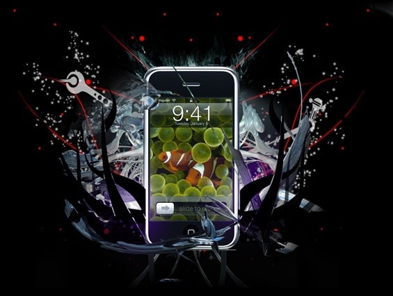
Step 13
Add lighting detail. Choose a 200px soft brush in 2–3 light colours and 1–2 darker ones. Brush around the corners and sides of the product to build up localised light. The .psd file is particularly useful here — check it if you get stuck:

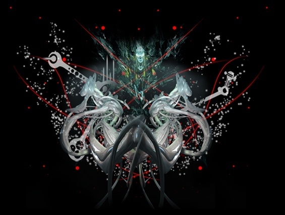
After building up the lighting layers, your composition should look like this:

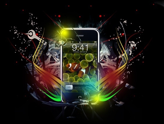
Set all lighting layers to Linear Dodge (Add) blending mode. Adjust opacity on each individually until the balance feels right:

Step 14
Optional but effective: place two small C4Ds matching the style of your shell C4D into the product corners where you did not add lighting. Set them to Screen blending mode:

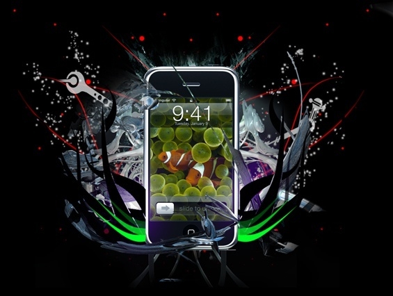
Step 15
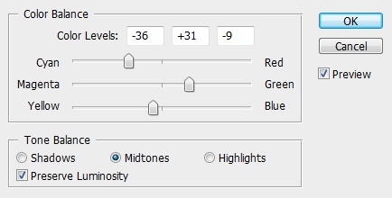
Add another black-and-white gradient map at 45–55% opacity in Luminosity. Then add a Colour Balance adjustment layer (same method as adding gradient maps). Push the sliders toward the dominant colours in your piece — in this case, green and cyan:

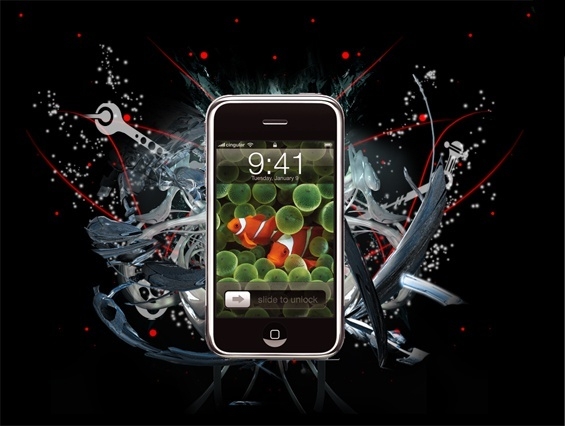
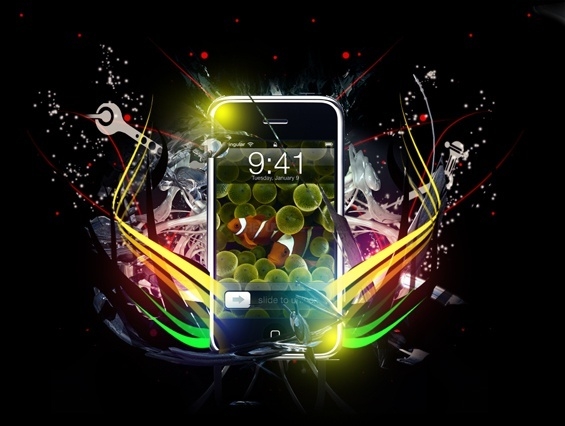
This is also the moment to add any final Pen Tool work. The piece should now look close to complete:

Step 16
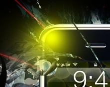
Create a new layer and go to Image > Apply Image. Then Filter > Blur > Gaussian Blur. Set this layer to Colour Dodge at 70–80% opacity. Erase any areas that look too intense:


Step 17
Typography is optional here — this tutorial focuses on compositing, not text techniques. If you want to add copy, keep it minimal and use the .psd for reference on how the original was typeset.
Either way, create a new layer and use a soft brush in your background colour to paint over any elements you want to reduce or clean up. This is your final compositing pass:


Step 18
Create a reflection. Apply the image to a new layer (Image > Apply Image), then flip it vertically via Ctrl/⌘+T > right-click > Flip Vertically. Position it below the product where a surface reflection would be plausible. Set the layer to Screen at 15–20% opacity:


Apply a Gaussian Blur of around 0.3, then erase most of the reflection with a soft brush at 60% opacity, keeping only a hint of it:

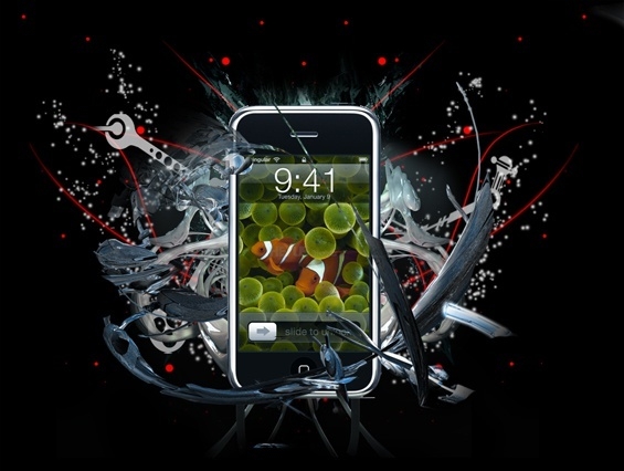
Final Step
Apply the image one last time (Image > Apply Image), then go to Filter > Sharpen > Sharpen. Leave this layer on Normal mode and bring the opacity down until the sharpening feels controlled rather than harsh. Erase any areas that go too crisp with a soft brush. Take your time here — this final sharpening pass is what separates a polished result from an almost-there one.
Closing Remarks
The techniques in this tutorial — brush layering, blending modes, C4D compositing, colour grading — are a solid foundation for product advertising work in Photoshop. Swap the smartphone for any product and the same workflow applies.
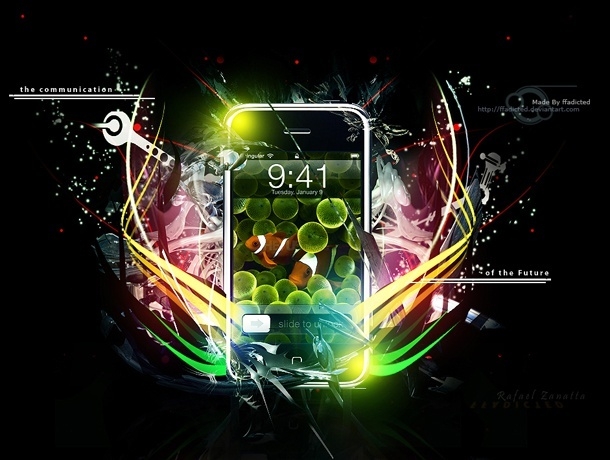
Tutorial by Rafael Zanatta.
Want to build your Photoshop and advertising design skills further? Explore our graphic design courses — we cover compositing, typography, layout and print across all skill levels.
Related reading: Putting Together an Effective Portfolio — on how tutorial work like this fits into a design portfolio.
Ready to start your design career?
Study graphic design online, at your own pace, with 1:1 support from our Support Angels. Accredited RTO since 2008.
Explore our courses